Creating Text Buttons

By Team equinux Links and Buttons

As well as dozens of font options and text styles, Mail Designer 365 also enables you to create stylish text buttons and badges in your newsletters. This step-by-step guide shows you how to get started and add a splash of color into your email designs.

Why are text buttons better?

You may already be familiar with the shapes and image elements within Mail Designer 365. While image-based elements can be a great addition to your email design, it is not recommended to create emails that consist entirely of images. In particular, important information such as links and call-to-actions within your email should be text-based where possible.

Here are just a few reasons why text buttons are better...

  • Compatibility: In contrast to images, text buttons will show up in all email clients, even when images are turned off (i.e. for mobile users with data saving activated) or don't render correctly
  • Spam compliance: Emails that are image-heavy are much more likely to land in spam. Including text buttons balances out your email's text:image ratio, which is generally recommended to be about 60:40
  • Accessibility: Screen readers can’t decipher images without an alt text so using text buttons guarantees your email's core call to action can be understood by everyone in your audience
  • Email size: Opting for text buttons instead of images reduces your email's overall size. Emails that are too big come with many issues, including increased spam risk, higher bounce rate and slow loading

Use cases for badges and buttons

A lot of the time when writing copy for an email, you will need to emphasise certain words and phrases. This ensures important information immediately stands out to the recipient, which is especially useful for readers quickly skimming your email for the essentials.

Badges and buttons within text can be used hand in hand with classic marketing techniques such as creating a sense of urgency – i.e. through time-sensitive language ("Hurry, ends midnight!") – or to highlight buzzwords like "new" or "sale" which instantly grab the reader's attention.

A text button effectively does the same job as a badge, whilst also allowing you to insert a link. In comparison to boring text links, text buttons jump out at the recipient and entice them to click – making them a great choice for your email's most important call-to-action:

Inserting a badge

Found an area of text you wish to emphasise? Highlight the text, then go to Insert > Badge in the Mail Designer 365 menu:
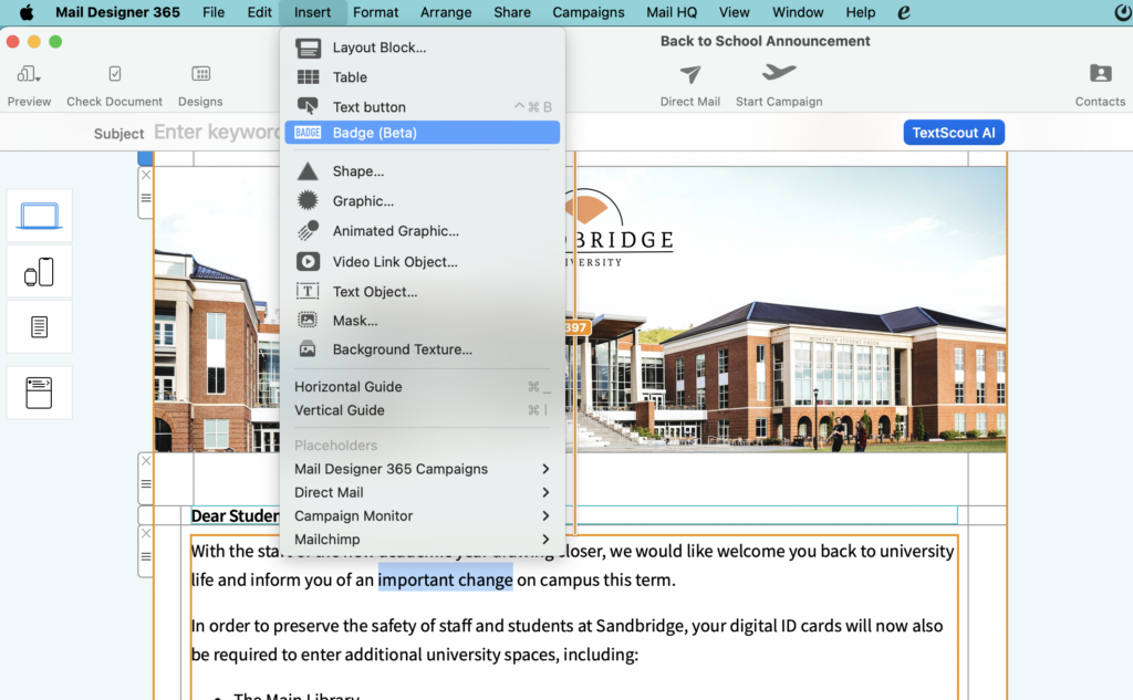
A default style will then be applied to your text. Use the control panel to update the style and match it perfectly to your email design. First up, try using the color picker to update the background color of your text badge:
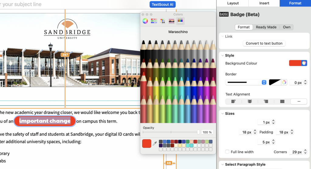
Then, play around with the padding and rounding controls to give the badge the shape you want. Rounded corners create the perfect "pill button" shape, or opt for harder edges for a classic highlight effect.

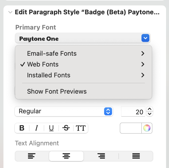
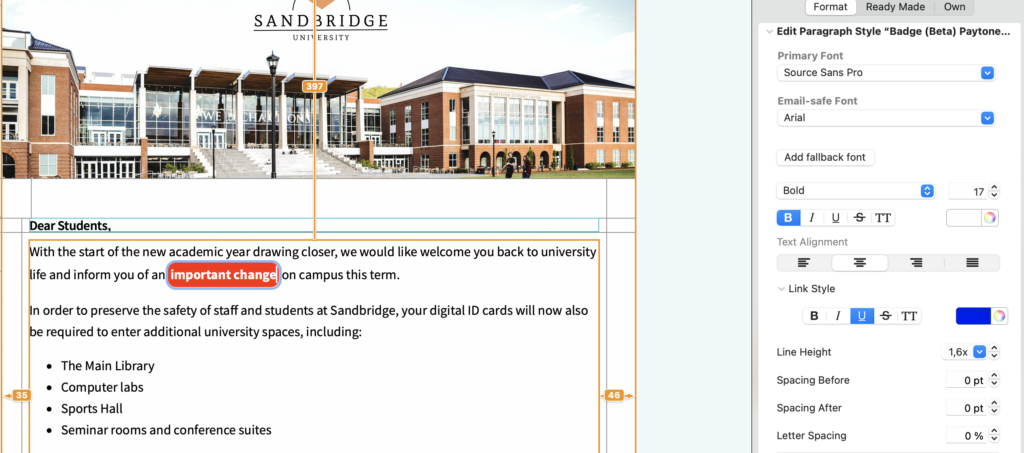
Finally, use the text style editor to update the font, size, alignment and boldness of your text:
Inserting a button

Adding a text button follows a really similar workflow to adding a text badge. Start by selecting the text you will be using for your button, then go to Insert > Text Button in the Mail Designer 365 menu.
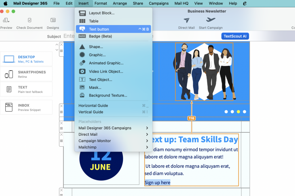
The first option you will see in the control panel is the link field. Enter the URL for your button here:
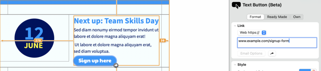
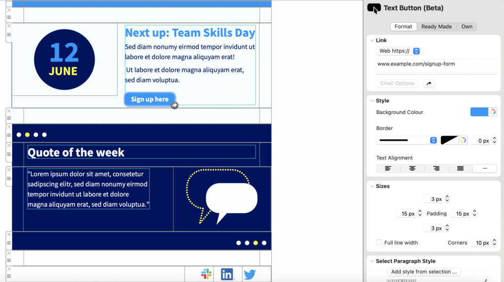
You can now proceed to adjust the style of your button, as described in the previous section:
Saving styles

If you are regularly sending emails for your business, it's best practice to keep designs consistent, as this helps to create a strong identity for your brand which customers will recognise and relate to. With this in mind, saving style options across your team is a great way to ensure buttons, badges and text stay the same across all your email communication.

Once you're happy with how a badge or button looks, switch to the "Own" tab and click "Save badge/button style":
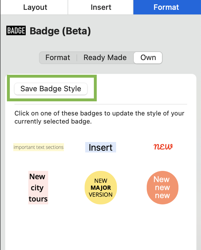
You can then give the style a name, e.g. "important text" and save it for the rest of your team to reuse again and again:
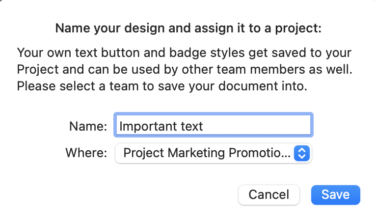
In future, saved badge and button styles can be found under the "Own" tab.

Using predefined styles

In a hurry or need some inspiration for your badge or button styles? Mail Designer 365 also offers a range of predefined options that you can quickly apply to text for an instant style upgrade.

Once you've selected your chosen text and opened the editor, switch to the panel "Ready Made" to explore all options:
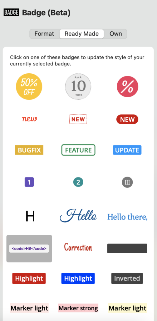
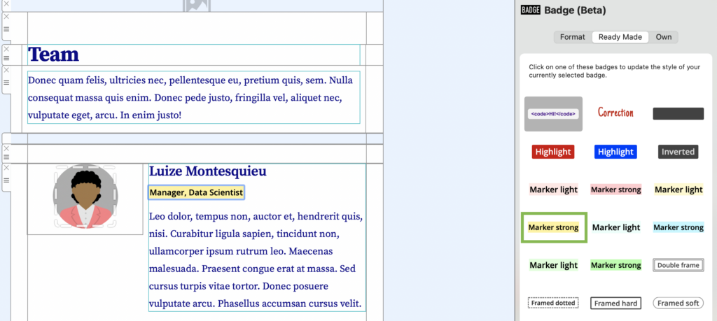
Click on a preview to apply the style to your text. Here we've opted for a bold highlighter effect – great for outlining key information, for example in office newsletters:
Get started with Mail Designer 365 today

Start your 7 day free trial to try out Text Badges and Buttons and create stylish email newsletters for your business on your Mac.
No credit card required
Compatible from macOS 10.13 onwards

Format link styles

By Hans-Peter Links and Buttons

Mail Designer 365 allows you to format link styles to make your links stand out in your email design.

Adding link styles

To get started, highlight the text which you want to link and add the link address under "Add link" in the "Style" menu.

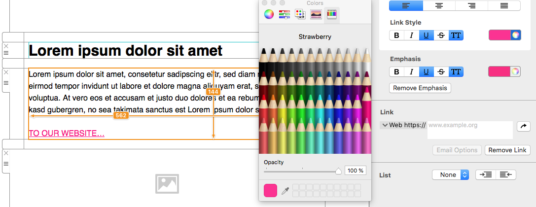
You will now see a standard, blue link. To format this link, scroll to "Link style" in the "Style" menu. Here you can format the color and the style (e.g. bold, italic, all caps) of your link.

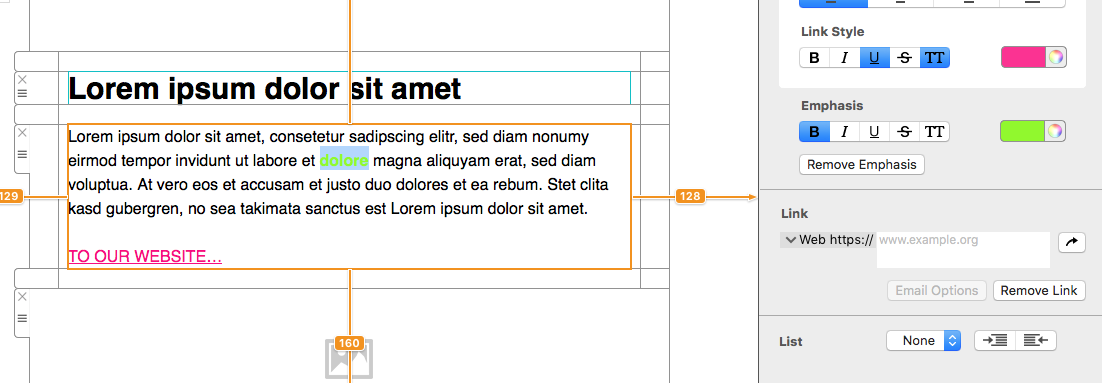
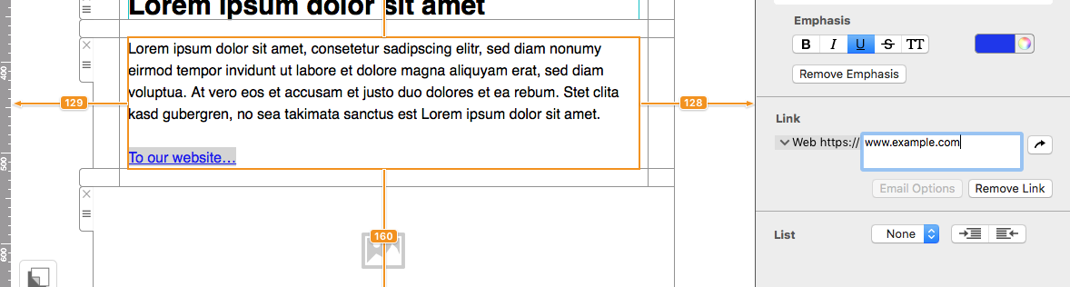
To just change the style of one particular link, highlight the link and go to "Emphasis" in the "Style" menu, where you can then change the stye and color.

How to Change the Link Format in an Email

By Hans-Peter Links and Buttons

A consistent link format helps readers recognize clickable text and makes an email easier to scan. In Mail Designer 365, you can set the shared appearance for text links and then apply emphasis to an individual link when it needs a different treatment. This guide explains both options and includes practical checks for readable, dependable links.

How to Add a Text Link

Start by highlighting the words you want readers to click. In the Style menu, use “Add Link” and enter the destination address. Choose meaningful linked words that describe the destination, such as “View the spring collection” or “Read the setup guide.” Avoid relying on vague text such as “click here” when a more descriptive phrase is available.

Add a text link before changing its link format

After adding the address, review it carefully. A complete web address should point to the intended page, while an email link should use the correct recipient address. Descriptive link text also gives readers useful context before they interact with the message.

Choose a Consistent Link Format

A newly added link uses the standard link appearance. To change the shared link format, open “Link Style” in the Style menu. You can adjust the color and choose treatments including bold, italic, underline, strikethrough, and all caps.

Link Style controls for a consistent email link format

Choose a treatment that is clearly distinguishable from ordinary body text. Color can support that distinction, but it should not be the only visual cue. Underlining is familiar to many readers and can make inline links easier to identify. Bold can add emphasis, while extensive use of all caps or strikethrough may make longer phrases harder to read.

Keep the same link style throughout a message unless there is a clear reason to create an exception. Consistency reduces visual noise and helps subscribers understand which text is interactive. It also prevents one ordinary text link from competing with the main call-to-action button.

Format One Specific Text Link

Sometimes one link needs to differ from the shared style. Select that link and use “Emphasis” in the Style menu to configure it separately. This is useful when the surrounding background, hierarchy, or context requires a more visible treatment.

Apply emphasis to one text link in Mail Designer 365

Use exceptions sparingly. If every link receives a different color or treatment, readers lose the predictable pattern that makes links easy to recognize. First establish the shared style, then use individual emphasis only where it improves comprehension.

Link Format Checks Before Sending

Preview the email and scan it as a recipient would. Each linked phrase should be readable against its background and visually recognizable without requiring the reader to guess. Check that the linked wording still makes sense on its own and that nearby links are not crowded together.

Send a test message and open every link. Confirm that each destination loads, uses the expected secure address, and does not lead to an outdated or unintended page. If a destination includes campaign tracking, verify the parameters without changing the actual page address.

Also review the message at a narrow width. Text can wrap differently on smaller screens, so a long linked phrase may occupy several lines. Make sure the line breaks remain readable and that links are not placed so closely together that selecting the intended one becomes difficult.

Common Text Link Formatting Tips

Use one dependable link format for ordinary inline links, reserve buttons for the primary action, and keep linked wording concise but descriptive. Maintain sufficient visual contrast and avoid styling ordinary text so that it looks clickable when it is not. Finally, test the actual message rather than relying only on the editor view. These checks create a clearer hierarchy and a more predictable experience for subscribers.

How to Add Multiple Links to an Image

By Team equinux Links and Buttons

To add multiple links to an image in an HTML email, divide the background into separate image areas and assign one destination to each area. This guide shows how to build that effect in Mail Designer 365 while keeping the finished email compatible with common email clients.

When working with background images and links, using a robust email template creator can simplify the process and help you ensure your emails render correctly across different clients. This way, you can focus on crafting engaging content without worrying about complex coding issues.

Try Mail Designer 365 for free

Design emails without code – 7 days free on your Mac.
Compatible with macOS 10.13 or later

How to Add Multiple Links to an Image

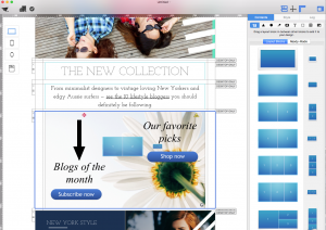
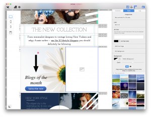
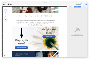
To get started, drag your image into the image area:

Create an image area for the first email link

Adding a button

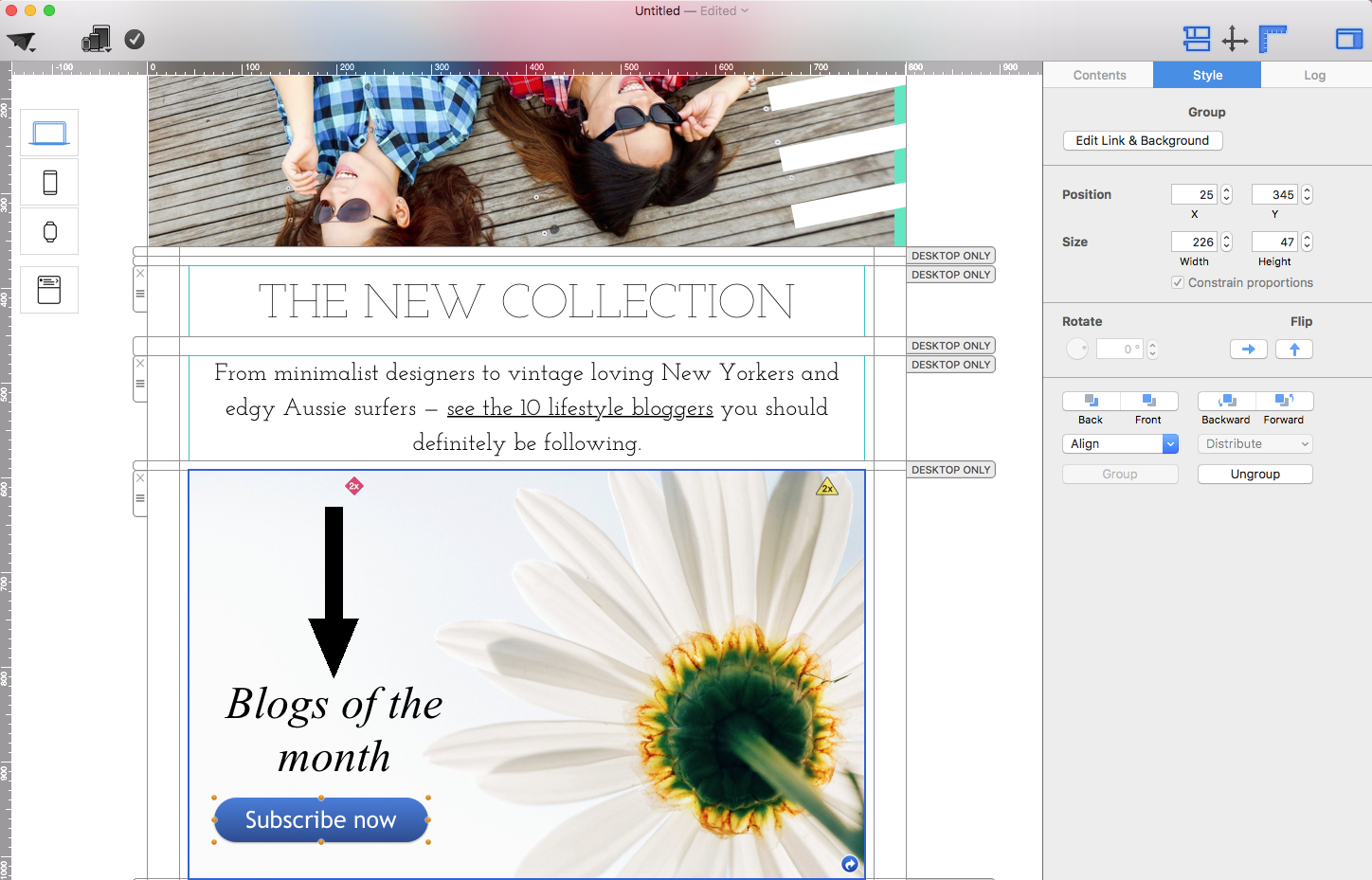
Now, we can create a “Shop Now” button by adding a shape and a text box into an image area. Or you can try dragging one of our pre-made buttons into an image area and customizing it.


Open the image area settings in Mail Designer 365

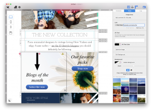
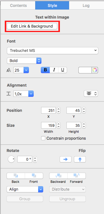
With this button, we want to add a link to our store. Click "Edit Link & Background:"

Choose an image for the linked background area

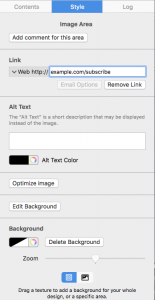
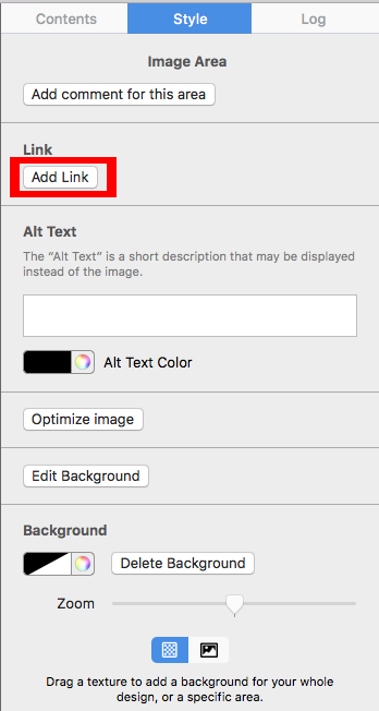
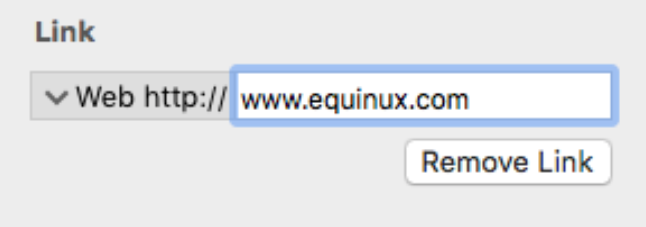
Click "Add Link." We are going to type: example.com/subscribe

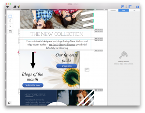
Position the first button over the background image


When recipients receive an email and clicks anywhere within the image area, it will take them to the landing page of the link.

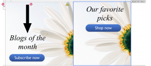
Creating a second button within the image background

Add a second image area for another hyperlink


Because the second button we added is still in the same image area, the link will still be example.com/mystore. We want to have the second button go to a different link.

Why is only allow one link per image area allowed?

Email clients do not support multiple links on a single image. Your entire image area becomes one single image, so one link.

Text areas are different: You can have multiple links within one text area. If you want, every word in a text area can have a different link.

How does Mail Designer 365 deal with this problem?

If you still want one background image with multiple buttons, the solution is simply to break the image up into multiple image areas.

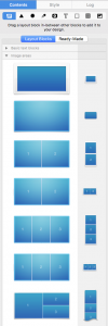
Go to the “Contents” section. Find a layout block with multiple image areas.

Align two linked image areas in the email design

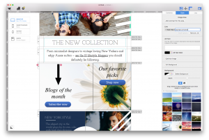
In this example, we want to use two buttons with two different links. So we will use a layout block with two image areas. Then we are going to drop the layout block above the original layout block that we want to replace.

Remember, do not drag the new layout block above or below the original layout block. You want this layout block with two image areas to replace the layout block with a single image area. It is important to make sure that you drag and drop the replacement above the old one.

Select the first image area to add its link


Once you drag and drop the layout block, Mail Designer 365 is not sure what size the images have to be.

Enter the first destination URL

You can adjust the height of an image area to your desired height by dragging down the image area's outline and if you resize the width, you can see that the second button and text are still there.


Select the second image area

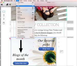
Select the two elements and cut them. To cut, choose "Edit" > "Cut." Or you can press Command-X on your keyboard.

Enter the second destination URL

Readjust the width of the first image area and adjust the height of the second image area to match the height of the first image area..

Preview multiple links over one background image

Once you adjust the height, paste the cut image onto the second image area. You can do this by choosing "Edit" > "Paste" or by pressing Command-V on your keyboard. Then, copy and paste the background image from the first image area into the second image area.

Fixing the pasted image

The image is now duplicated onto the second image area. Notice that the background image in the image area is in the front.

Review linked image areas in the desktop layout

Click on the image in the second image area. Once the image is selected, click "Back" to re-order the image to the back:

Check the linked image layout on mobile


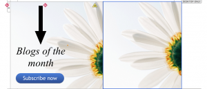
Drag the image of the second image area to the position that lines up with the image in the first image area. This will create an illusion of a single image.


Adjust image area dimensions before linking

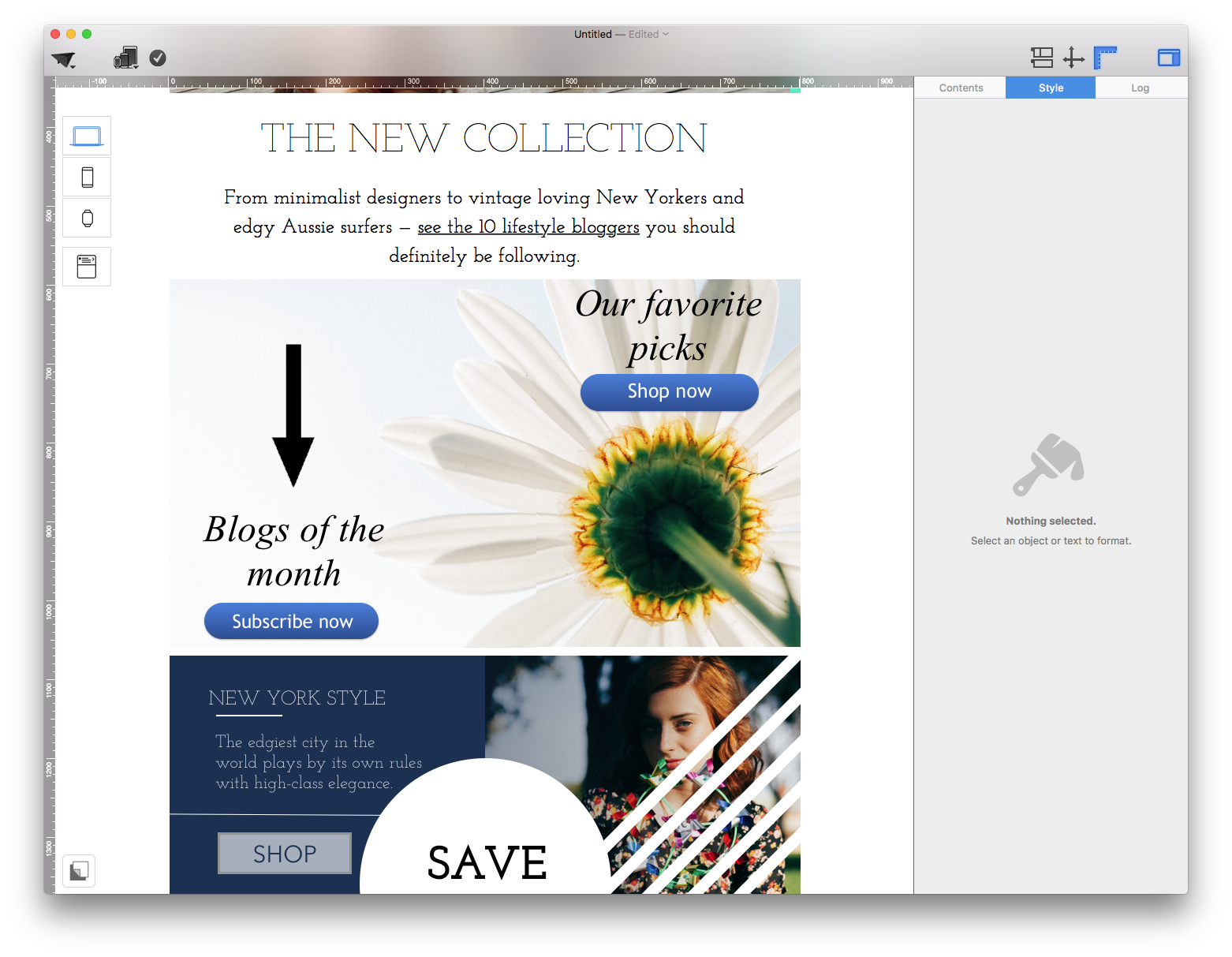
Once you have finished adjusting the position of the image, you will be able to see that the two images look like a single image. However, we actually have 2 image areas, which means that each image area can have their own, unique link.

If you turn off the layout mode, you can take a look at what the 2 image areas will look like.

Choose the subscribe button image area

How to add links to images:
Click on an image area or the elements within the image area. Then, click "Edit Link & Background." Then, click "Add Link." and type in your desired link. In this example, we are going to use example.com/subscribe for our subscribe button:
Enter the subscribe destination URL

Click on the other image area and add another link. Type in your desired link. For this example, to go with our shop now button, we are going to use the link: example.com/store.

Add the shop destination to the second image area

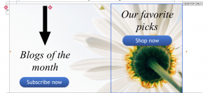
There you go! That's how you can add multiple links with a single image background.

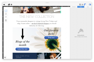
Completed email image with multiple links

Email Buttons with Different Links in Mail Designer 365

By Hans-Peter Links and Buttons

Email buttons with different links

Email buttons with different links let recipients choose the action that matches their intent—for example, opening separate product pages, social profiles, event registrations, or support resources. In Mail Designer 365, the important rule is that one image area can have one destination link. To create several independently clickable graphic buttons, place each button in its own image area.

This guide shows how to choose the correct layout block, assign a unique URL to every button, and test the finished email so each call to action opens the expected page.

Email buttons with different links require separate image areas

Remember, one image area only allows you to add one link. Even though you can have different graphic elements within one image area, the entire image area will only link to a single destination. When you send your email templates, an image area with different elements will be rendered as a single image. This is why  you can only add one link within one image area.

Multiple image areas

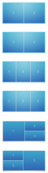
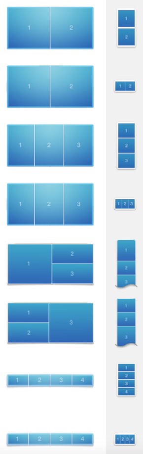
In order to add different buttons with different links, you need to use a layout blocks with multiple image areas. Within Mail Designer 365, you have multiple choices of different layout blocks with multiple image areas.

Layout block choices with multiple image areas

You can choose which layout you want. Within each image area, you can add a single link. Therefore, you have the freedom to add a button with a unique link within each image area. The different image areas will be rendered as their own individual images.

Adding buttons with different links

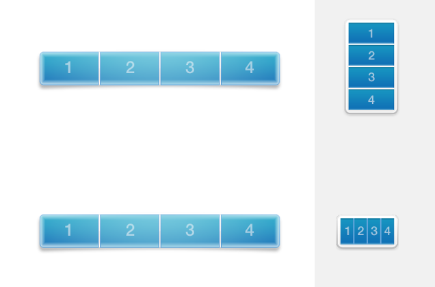
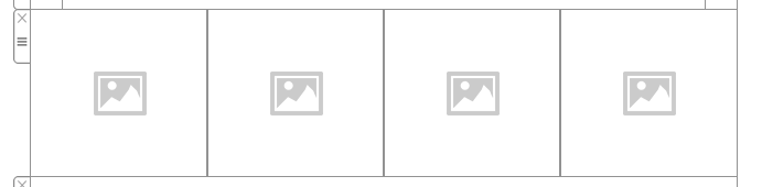
In this example, we are using a layout block with 4 image areas:

Four-area layout block for independent email buttons

Four separate image areas in Mail Designer 365

Then, we are adding a unique icon as buttons within each image area:

Unique button icons placed in separate image areas

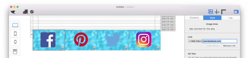
Afterwards, we are adding a different link within each image area. For the Facebook icon, we will add a link to the Facebook page:

Assigning the Facebook button destination link

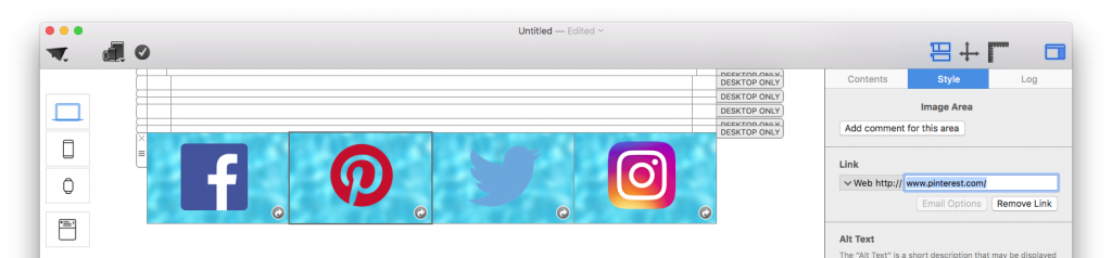
On the second image area, we will add a Pinterest icon. Then, we will add a link to the Pinterest page:

Assigning the Pinterest button destination link

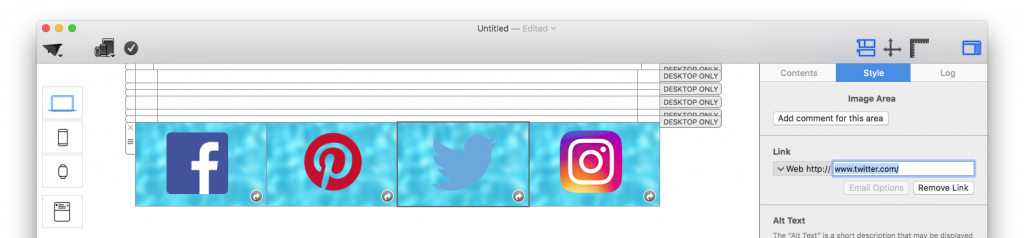
For the third image area, we will place a Twitter icon. Then, we will add a link to the Twitter page:

Assigning the Twitter button destination link

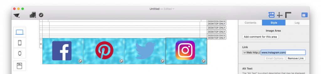
On the fourth image area, we will add the Instagram icon. Afterwards, we will add a link to the Instagram, page:

Assigning the Instagram button destination link


When the email template is rendered, the four different image areas will become four different images with their individual links.

Correct vs. Incorrect:

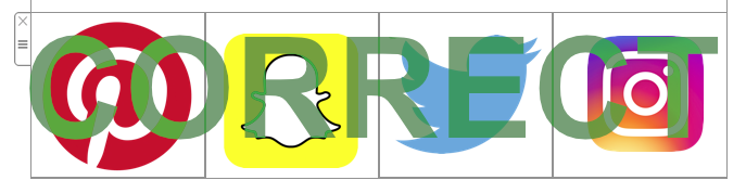
Correct setup with four linked image areas

Correct because: 4 different icons in 4 different image areas. You can add 1 link per 1 image area. Therefore, you can add 4 different links total.


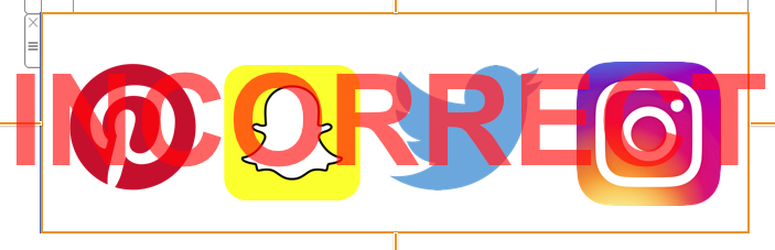
Incorrect setup with four icons in one image area

Incorrect because: 4 different icons in 1 image area. You can only add 1 link per 1 image area. Therefore, 4 icons will only lead to 1 landing page.


Plan and test multiple button destinations

Before building the row, list each button label and its final destination URL. Clear labels help recipients understand the result of a click, while distinct destinations make campaign reporting easier to interpret. Use a layout block with enough separate image areas for the number of graphic buttons you need. If the row contains four social icons, for example, choose a block with four individual areas rather than placing every icon inside one large image area.

After adding the graphics, select the first image area and assign its URL. Repeat the process for every remaining area. Check that secure HTTPS links are complete and that no destination was copied to the wrong button. When appropriate, use descriptive link titles and keep the visual treatment consistent across the set.

Accessibility and mobile checks

Add meaningful alt text to each button image so its purpose remains understandable if images are blocked. Avoid relying on the icon alone when the action may be ambiguous. In the mobile version, confirm that every button remains large enough to tap and that spacing prevents accidental clicks on the neighboring destination.

  • Preview the desktop and mobile layouts.
  • Click every button in preview or in a test email.
  • Confirm that each destination loads without an error or redirect surprise.
  • Check that button order matches the surrounding copy.
  • Send the test to at least one real inbox before the campaign launch.

If you need one graphic to contain several clickable regions, separate it into individual image areas instead. You can also review the guide to multiple links on an image background for related layout choices. This structure ensures that email buttons with different links remain independently clickable after the design is rendered for sending.

How Image Area Links Work in Email Newsletters

By Hans-Peter Links and Buttons

How image area links work in email newsletters

Image area links in email newsletters let you make an email image clickable and send readers to a landing page. In Mail Designer 365, you can add a background image or texture and combine multiple graphic elements within one image area. You can combine multiple shapes and texts and scatter them around within an image area.

Graphic elements combined in a Mail Designer 365 image area

However, you can only add one link per image area. You can add a link by double-clicking a graphic element or the background of the image area. Then, go to the style section and click "Edit Link & Background." You can add the link to your landing page.

Link and background settings for an email image area


Why is my link being applied to the entire image area instead of my button or shape?

When your email templates are rendered, an entire image area will become one image. This means that when you send your email designs, all of the graphic elements that you add within one image area will be combined and turned into one image. As a result, the link that you add will apply to the entire image area instead of a single element.

Email image area rendered as one clickable image


If you want to add multiple links or multiple buttons that lead to different landing pages, then use layout blocks with multiple image areas. This way, you can add a different link to each image area.

Multiple image areas for separate email links


HTML Email Button Design: Add and Link CTA Buttons

By Hans-Peter Links and Buttons

HTML Email Button Design in Mail Designer 365

A clear call-to-action helps readers understand what to do next. This guide explains HTML email button design with the ready-made graphical buttons in Mail Designer 365: how to add a button to an image area, customize its label and appearance, connect it to the correct landing page, and check it before sending.

This workflow is intended for the prebuilt buttons available in the Contents panel. If you want to create a flexible CTA from an editable text object instead, use the separate text button guide. Keeping those two methods separate prevents styling instructions from becoming confusing.

Add a Call-to-Action Button

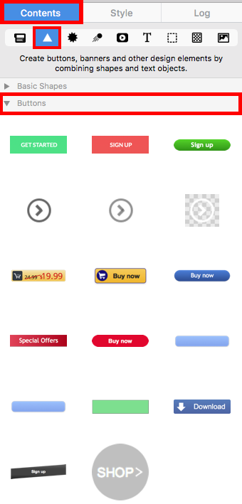
Open the Contents section on the right side of Mail Designer 365 and choose the triangle control to expand the available content elements. Scroll to the buttons section. Select a button whose shape suits the visual hierarchy of your email; the wording and styling can be adjusted after placement.

Open the button section for HTML email button design

Drag the chosen button into an image area in the email design. Place it close to the message it supports so readers can connect the offer or instruction with the action. Avoid adding several competing buttons to the same short section. A single clear primary action is usually easier to scan.

Drag a call-to-action button into an image area

Customize the Button Label and Style

Double-click the button text and replace it with a concise action label such as “View plans,” “Reserve a seat,” or “Read the guide.” The label should describe what happens after the click. Generic wording can work, but a specific action often gives the recipient more confidence about the destination.

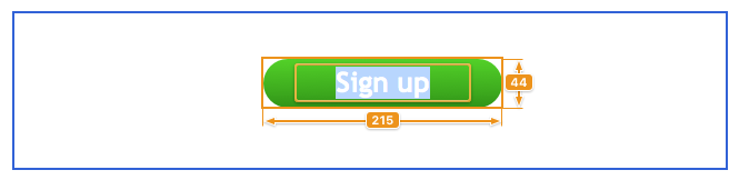
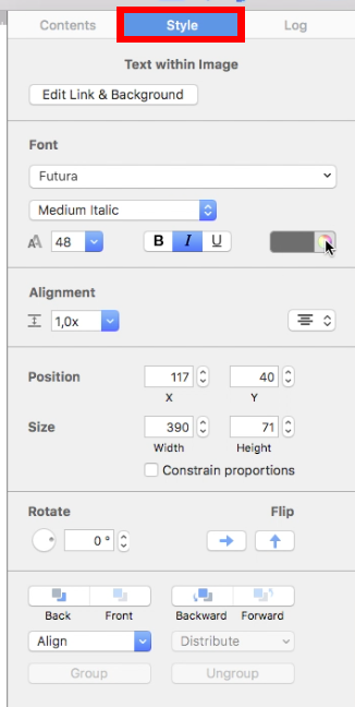
With the button selected, use the Style section on the right to adjust the font, font size, font style, and text color. Keep the label readable against the button background and make sure the button remains visually distinct from surrounding content. Review both desktop and mobile layouts after changing the size because longer labels may wrap or need more space.

Edit the button font size style and color

Add the Button Link

Select the button and click Edit Link & Background. This opens the controls used to assign the destination. Choose Add Link, then enter the full landing-page URL, including https://. Link directly to the page promised by the label rather than to a general homepage when a more relevant destination exists.

Open Edit Link and Background for the email button

Click Add Link to create the destination for the selected button.

Choose Add Link for the call-to-action button

Enter the desired landing-page address and confirm the change. Repeat the process for any other graphical buttons in the email, checking that each one has the correct destination.

Enter the button landing page URL

Check Your HTML Email Button Design

Before sending the campaign, preview the email at desktop and mobile widths. Confirm that the button is easy to identify, the label is not clipped, and the surrounding spacing makes it comfortable to select. Then send a test email and click the button from the received message. Verify that the destination loads successfully, uses HTTPS, and matches the action described by the button label.

Also review the email without relying only on color. The wording should still make the purpose of the CTA clear. If the campaign contains more than one button, keep their visual priority consistent: one primary action can be prominent, while secondary actions should not compete with it.

Common Button Problems

  • The button opens the wrong page: select it again and replace the saved URL.
  • The label wraps: shorten the wording or allow more room around the button.
  • The button is hard to see: increase the contrast between the button, its label, and the surrounding section.
  • The mobile layout feels crowded: review spacing and placement in the mobile version before sending another test.

A good HTML email button design combines a specific label, a readable style, an accurate destination, and a successful test from the delivered email.

Image Link in Newsletters – Tutorial for Mail Designer 365

By Team equinux Links and Buttons

Want to make your email campaigns more interactive and engaging? Creating an image link lets you turn any image in your email design into a clickable element that directs your recipients to a website, product page, or promotion. In this guide, we’ll show you step-by-step how to easily add an image link in Mail Designer 365, helping you boost clicks and conversions in your email marketing efforts.

What are Image Links?

You can create a link for an image area, so the image area will be clickable in your email. Remember that entire image areas will be displayed as a single image in your email. Also, you can only assign one link per image area.

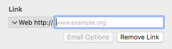
To create an image area link, choose an image area in your design. Then click the "Add Link" button from the Style section of the sidebar. Afterwards, enter your desired URL. The entire image area will be “hot.” Readers will be able to click it in your final message.

Input field for adding an image link in Mail Designer 365

A little link icon will show you for which image areas links has been embedded:

Link Icon next to an image area, showing that this image has an image link associated with it.

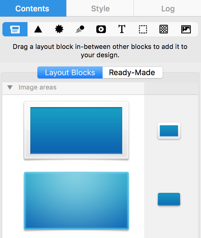
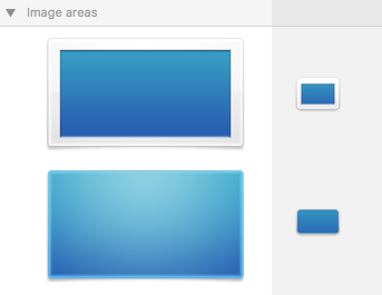
You can only link to one landing page per one image area. These layout blocks have a single image area:

Single Image area Layout blocks in Mail Designer 365

With these layout blocks, you can only link to one landing page. It does not matter whether you add multiple graphics within the same image area. The entire image area will be rendered as a single image.


Adding multiple image links

We’ve included several layout blocks that contain several image areas. Each image area can have its own links. If you want to link to 2 social media platforms, then use a layout block with 2 image areas. If you want to link to 3 different landing pages, then use a layout block with 3 image areas and so on...

Mulit Image Layout blocks in Mail Designer 365. For example you can place 4 images next to each other with a separate image link on each image.

You can use these blocks to create multiple image area links, e.g. in order to use multiple buttons with links to social media sites. With this layout block, you can potentially link up to 4 different landing pages/social media platforms:

This is what it will look like after you drag this layout block onto your template:

You can adjust the size of each individual image areas:

Here is an example of what it will look like when you add 4 different icons:


Remember, placing 4 icons within 1 image area will NOT allow you to link to 4 different landing pages/social media networks. This is an example of the INCORRECT way to do it:

Recap:


Further Reading

Also check out how to add different buttons with different links in Mail Designer 365.


Creating Text Links in Mail Designer 365

By Hans-Peter Links and Buttons

Text links let readers open a website, download a resource, or use another destination from words inside an email. In Mail Designer 365, link descriptive text instead of pasting a long raw URL whenever possible. A clear label helps readers understand where the link goes and makes the email easier to scan.

How to create text links in Mail Designer 365

  1. Open the email design and select the exact words that should become clickable.
  2. Choose Add Link in the sidebar.
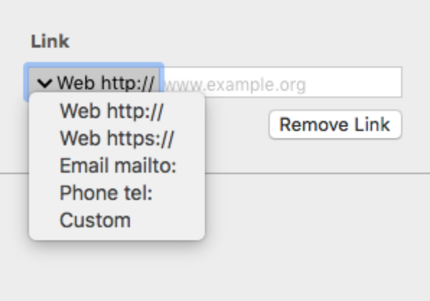
  3. Select the appropriate link type shown in the link panel.
  4. Enter or paste the complete destination requested by that link type.
  5. Confirm the link, then preview the design and verify that the linked words are clearly recognizable.

select text and choose Add Link in Mail Designer 365

Select only the meaningful words. For example, use “view the event schedule,” “download the guide,” or “contact our team” instead of linking an entire paragraph. Keep surrounding punctuation outside the link unless it is genuinely part of the label.

Choose the correct destination

The link panel presents the available destination types. Choose the one that matches the action you want the recipient to take, then complete the corresponding field carefully.

text link destination options in Mail Designer 365

For a web destination, use the full address and confirm that it opens the intended public page. Do not link to a private editing screen or a file that requires access the recipient will not have. If a destination contains campaign parameters, preserve them exactly and avoid adding a second conflicting set of tracking values.

Make linked text clear and accessible

Readers should be able to identify text links without guessing. Use descriptive wording, sufficient color contrast, and a consistent visual treatment. Do not rely on color alone when another cue, such as an underline, would make the interaction clearer. Avoid labels such as “click here” when the surrounding context does not explain the destination.

Keep links far enough apart to select comfortably on a phone. A short linked phrase usually works better than several adjacent one-word links. For guidance on changing shared or individual link appearance, see formatting styles for text links.

Test text links before sending

  • Open every important link from a delivered test email.
  • Confirm that the final destination, redirect, and tracking parameters are correct.
  • Check that website links use a secure public address where appropriate.
  • Review linked text on desktop and mobile and make sure it remains readable.
  • Verify that link styling is distinguishable in normal and dark viewing conditions.
  • Check that copied text did not introduce an unintended destination.

If a link does not work, select the linked words again and inspect the saved destination in the sidebar. Look for missing address prefixes, extra spaces, incomplete paths, or a link applied to the wrong text range. Correct the source design, send a new test, and click the link again rather than assuming the editor preview proves the delivered email.

Keep link intent consistent

Each text link should support the purpose of the email. Use a small number of meaningful destinations and reserve the strongest action for the primary call to action. When several links point to the same page, use consistent wording unless a different label genuinely clarifies a different section.

Common text-link mistakes

Avoid using the same vague label for destinations that perform different actions. Do not hide an unexpected file download behind wording that sounds like a normal web page, and do not leave sample or staging URLs in a production campaign. When copying content from another document, verify that the visible words and the underlying destination still belong together.

Also check whether a line break splits a linked phrase awkwardly on smaller screens. If it does, shorten the label or adjust the surrounding sentence. The goal is a link that remains understandable, visually distinct, and easy to activate without changing the meaning of the message.

Privacy Settings / Datenschutz-Einstellungen