
How to Create Rounded Corners in Email Design
Rounded corners web design techniques help you build friendly buttons, text boxes, and visual callouts in a newsletter. Follow these steps in Mail Designer 365 to create the effect and keep it consistent across desktop and mobile layouts.
Text boxes with rounded corners are often used to create customized buttons. They can also add dimension and visual structure to a newsletter.
Open Mail Designer 365 on your computer. If there isn't one already, drag an image area into your design. You will find image areas under "Contents." Then, click the layout blocks button (the first button under "Contents") and scroll down to the image areas.
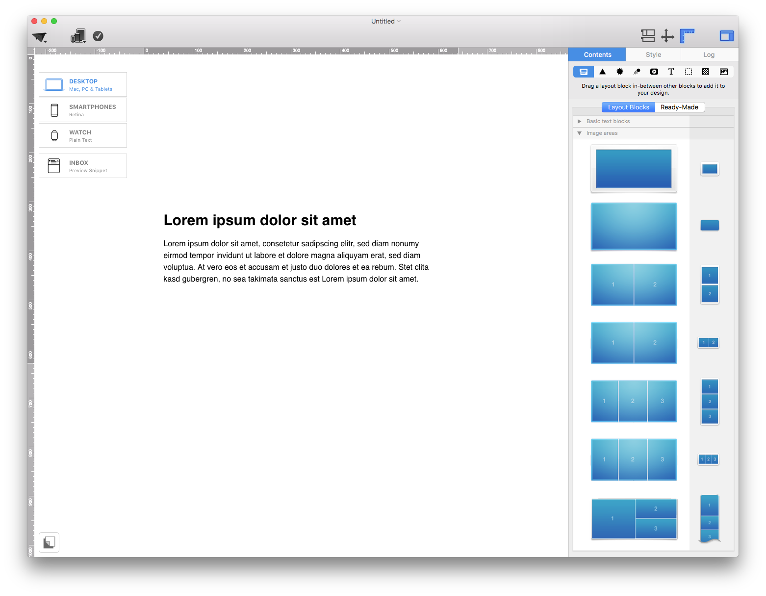
Once you have added an image area, go ahead and drag a square shape into your email design.
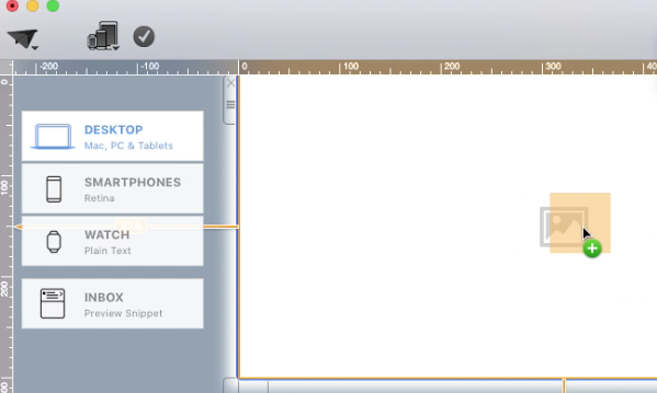
Adjust the size of your shape by dragging the size controls of the shape.
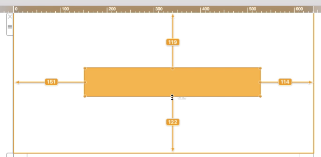
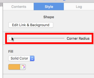
On the right side, you can round the corners of your shape by adjusting the corner radius.
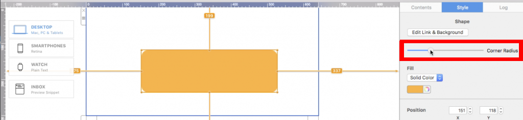
After you have decided how round you want the corners to be, adjust the shape again if needed.
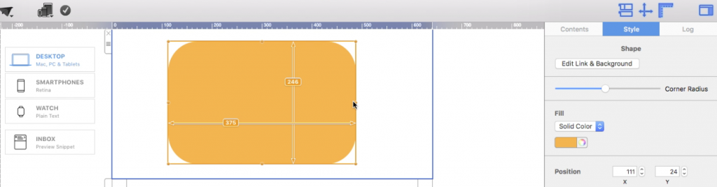
When you get the look that you want, click "Contents" on the right side.
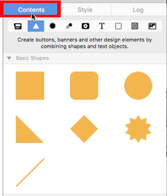
Then, click on the text object button.
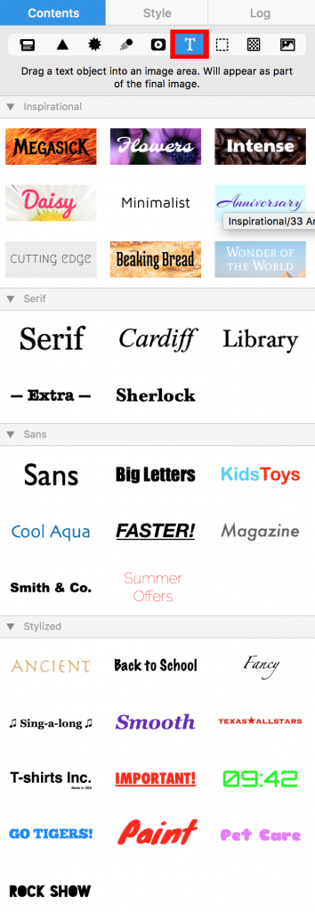
Choose your text object and drag it into the same image area as the shape.
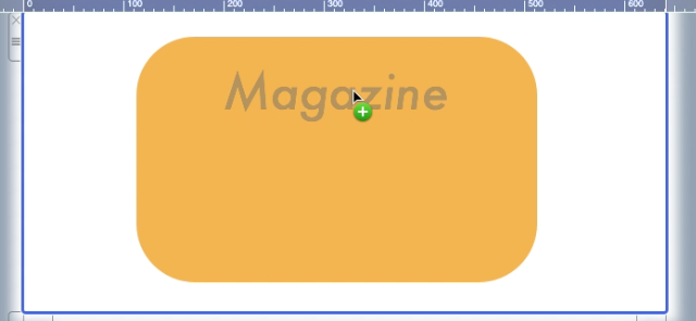
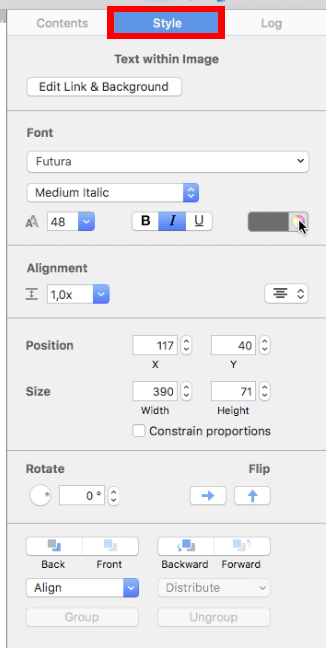
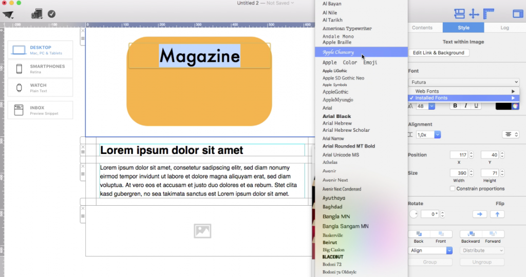
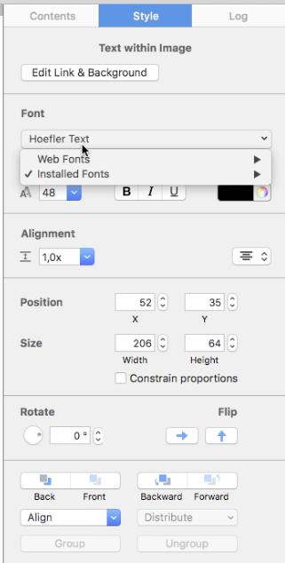
If you decide that you do not like the look of your text object, you can customize the font, color, style, size, and weight. You can do this by double-clicking on the text. Mail Designer 365 will automatically open the style tab on the right, where you can make all of your adjustments.
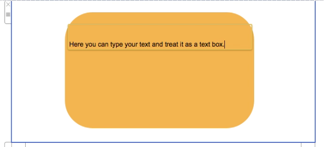
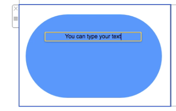
To edit your text, double-click the text and type your message.
Create Multiple Rounded Text Boxes
Choosing layout blocks with multiple image areas will make it easier for you to edit individual boxes. In this example, we are going to use two image areas. Drag a layout block with two image areas into your email template.
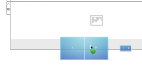
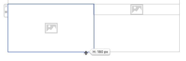
Then, adjust the size of the image areas. Just drag the outline of the image area.
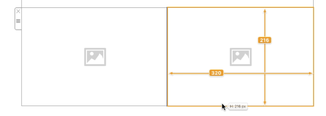
Afterwards, add a shape into an image area.
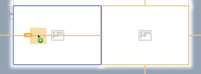
Feel free to adjust the size of the shape.
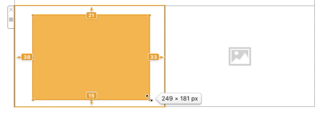
Adjust the corner radius of the shape by double-clicking on the shape and moving the corner radius slider on the right.
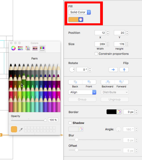
Change the color of the shape under the "Fill" section.
Repeat the same process for the second image area.
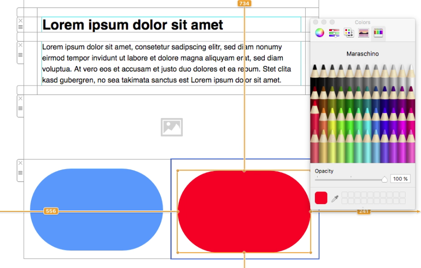
Click the "Contents" section and then choose the text object (T) icon.
Drag a text object into each image area.
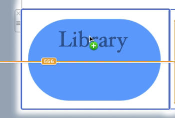
Here is what it looks like after dragging a text object into each image area:
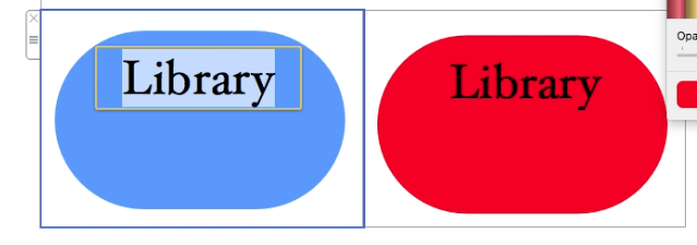
Feel free to adjust the font style, font size, font color, font weight, etc. to fit your needs. Each text area can be customized.
To edit your message, double-click on the text object and type your message.
Customize the Finished Rounded-Corner Design
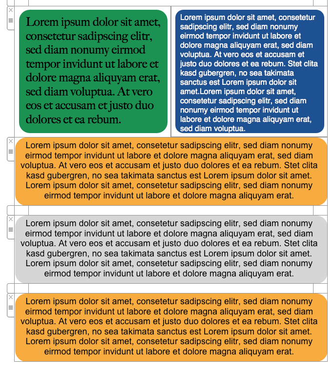
Here is an example where we added several examples of creating the effect of text boxes with rounded corners within one email template:
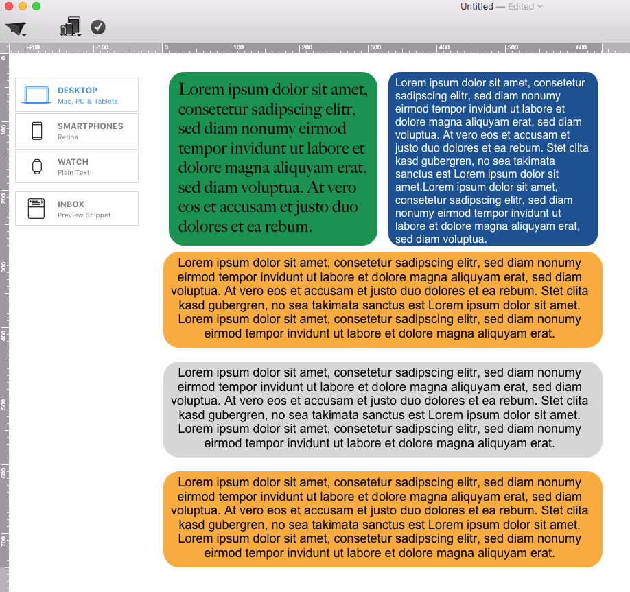
Why Rounded Corners Work in Email Design
Rounded corners web design can make buttons, labels, and content cards feel more approachable while preserving a clear visual hierarchy. In an email, use the effect selectively: one consistent corner radius for primary buttons and related callouts looks more intentional than several competing radii.
Choose a Consistent Corner Radius
Start with a modest radius and preview the result at the actual size used in your newsletter. A small radius creates a restrained card effect, while a larger value creates a pill-shaped button. Keep the shape, text, and surrounding spacing balanced. If several elements have the same role, apply the same radius so subscribers can recognize the pattern quickly.
Make Rounded Text Boxes Readable
Use strong contrast between the text and its background. Leave enough padding around every label, avoid squeezing long copy into a button, and keep important wording as live text whenever the design allows it. If text is placed inside an image area, include the essential message elsewhere as accessible text and add a useful image description.
Preview and Test Your Email
Check the desktop and mobile versions before sending. Confirm that the rounded shape does not crop the label, that line breaks remain intentional, and that buttons are easy to tap. Send a test message to the inboxes your audience uses most. Email clients render design details differently, so a real test is more reliable than relying on the canvas alone.
Rounded-Corner Checklist
- Use one radius consistently for elements with the same purpose.
- Keep text contrast and padding comfortable.
- Check the design in desktop and mobile layouts.
- Use clear link text and an adequately sized tap target.
- Send a test email before publishing the campaign.
How Can We Help?