Mobile only styles offer you a simpler way to edit your smartphone content without having to detach your mobile layout blocks from your main design.
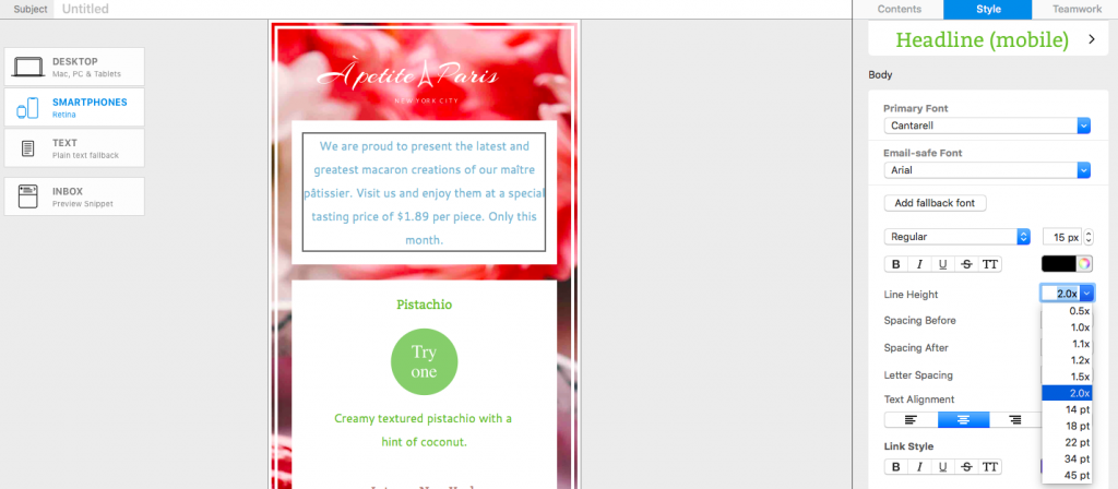
To get started, head to the Smartphone view and make an adjustment to any text block. In this example, we will reduce the line height to save space for mobile users:

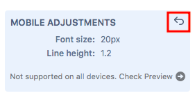
You will now see your mobile only change appear in a blue box in the Style menu:

Any further changes you make to this style for mobile will also appear in the blue box:

If you head back over to the main Desktop view, you will notice that the blue box is still in the Style menu to remind you, and anyone else collaborating on the design, of the changes you've made.

To reset the mobile only changes you can click the undo arrow in the top corner of the blue box. This will default your text style back to the desktop version across both designs.

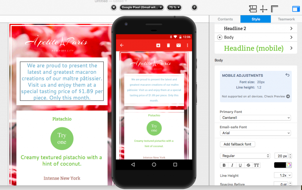
Important: Mobile Style Adjustments are not supported by non-Gmail addresses in the Gmail mobile app – check your design using the new Gmail (IMAP) preview. You can access this by clicking on "Check Preview", which opens a device preview of the Gmail app:

How Can We Help?
A Quick Tour of Mail Designer 365
Background
Layout Blocks
TextScout
Editing Text
Links and Buttons
Configuring Text Styles
Tables
Image Areas
Images
Using Retina Images with your Design
Graphics and Other Objects
Creative Tools
Advanced Design Techniques
Blend Modes
Optimizing your Template for Mobile
Plain Text
Preview your Design
Feedback and Sharing
Preparing your Design for Sending
Contacts and Audiences
Sending Emails
1:1 Emails
Email Analytics
HTML Export
Other Sharing Options
