
Adding space in between layout blocks gives an email design room to breathe and makes related sections easier to scan. In Mail Designer 365, you can create spacing with a dedicated spacer layout block or adjust the spacing around text inside a layout block.
Choose the right type of email layout spacing
Use a spacer layout block when you need a clear gap between two complete sections, such as between a hero area and a product block. Use Spacing Before or Spacing After when the space belongs to a selected text area and should remain part of that text layout.
Start by checking which element is actually too close. If two entire blocks feel cramped, add a spacer between them. If a heading or paragraph needs more room inside its existing block, adjust the text spacing instead.
Add a spacer between two layout blocks
When one layout block sits directly against the next, the design can look crowded and the visual hierarchy may be unclear. A spacer creates a controlled gap without adding empty text or repeated line breaks.
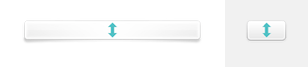
Open the Contents panel and locate the spacing layout block. Drag it between the two content layout blocks where you want the gap to appear. Watch the insertion position carefully so the spacer is placed between the intended sections rather than inside another block.
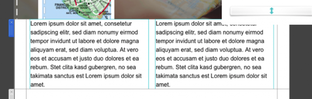
Fine-tune the spacer height
Select the inserted spacer and adjust its size by dragging the boundary line above or below it. A gap of around 30 pixels can be a useful starting point, but the right value depends on the surrounding content, typography, and overall rhythm of the design.
Compare the gap with other section breaks in the same email. Reusing a small set of consistent spacing values usually looks more polished than choosing a different distance for every block.

Use Spacing Before or Spacing After for text
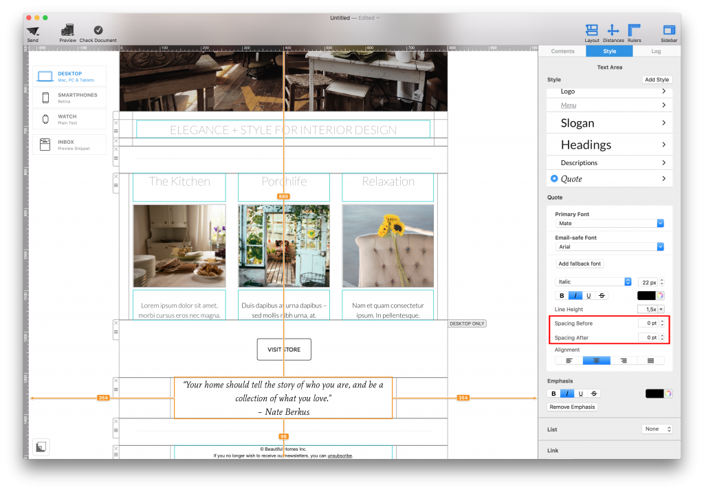
For space connected to a text area, select the text area first. In the panel on the right, open the Style tab and find Spacing Before and Spacing After below the line-height control. Increase or decrease the point value to adjust the space above or below the selected text area.
This method is useful when a headline needs separation from the paragraph that follows, or when a text group needs more room before the next element. Because the spacing belongs to the selected text area, it is easier to keep the text and its surrounding space together when the layout changes.
Check spacing on desktop and mobile
Preview the email at desktop and mobile widths after making changes. A wide desktop layout may need a generous section break, while the same gap can feel excessive when blocks stack on a narrow screen. Confirm that the reading order remains clear and that no important text or button appears separated from the content it belongs to.
Avoid using repeated blank lines, empty text boxes, or invisible characters to force distance. Dedicated spacing controls are easier to understand, adjust, and keep consistent.
Test the finished email design
- Review the full design at a comfortable zoom level and compare all major section gaps.
- Check that headings, paragraphs, images, and buttons remain grouped logically.
- Send a test email and inspect it in more than one email app.
- Confirm that links are still easy to tap and that spacing does not hide or separate a call to action.
For more Mail Designer 365 guidance, browse the Mail Designer 365 Knowledge Base.
How Can We Help?