
Change the color of your table in Mail Designer 365 to separate headings, highlight important values, and make rows easier to scan. The table Style controls let you apply a color to a complete area, alternate row colors, or emphasize one selected cell without rebuilding the layout.
Open the table color controls
Click the table in your email design, then open the Style menu. Expand the Colors section to see the available table areas and color controls.
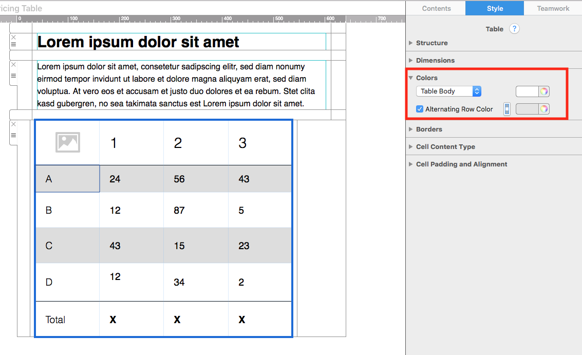
Before choosing a color, decide what the styling should communicate. A header color can identify labels, alternating rows can support scanning, and a highlighted cell can draw attention to one result or offer.
Select the table area to color
Use the dropdown menu in the Colors section to choose which part of the table you want to edit. Depending on the table setup, you can target a header, body rows, another defined table area, or the current cell.
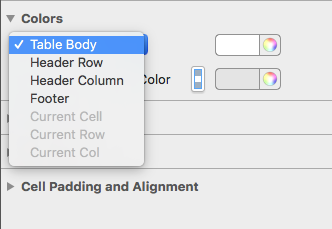
Confirm the selected area before changing the value. This prevents an accidental color change across the whole table when you intended to edit only one cell.
Choose a color from the color wheel
Open the color control and select a color from the wheel. Use a shade that fits the campaign palette and maintains clear contrast with the text inside the cells.
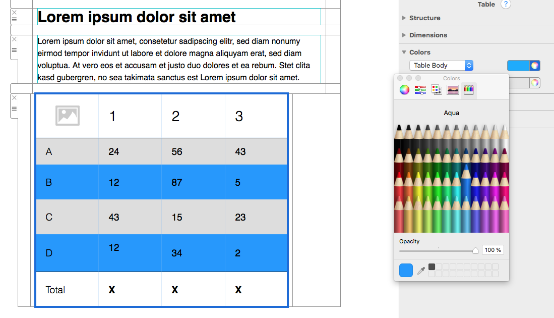
Avoid using color as the only way to communicate meaning. Labels, headings, and readable values should still explain the table when images are blocked or a reader has difficulty distinguishing colors.
Use alternating row colors
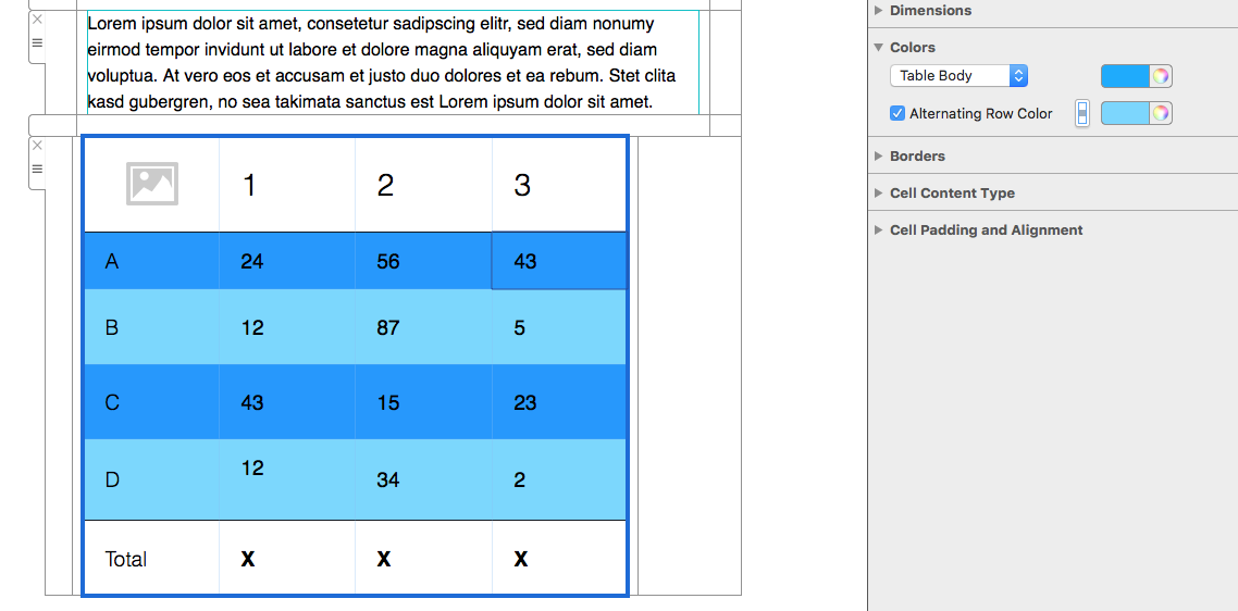
Enable Alternating Row Color when a table contains several rows that readers need to compare. A subtle second shade helps the eye follow one row across multiple columns.
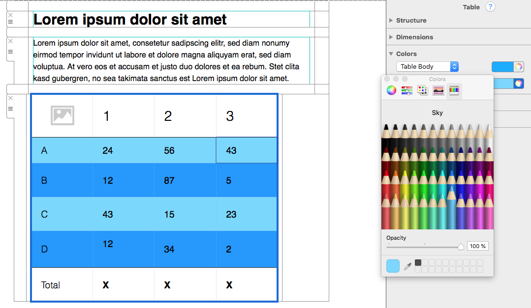
Choose two colors with enough difference to separate rows but not so much contrast that the table becomes distracting. Light variations of a brand color often work better than unrelated bright shades.
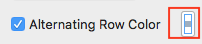
Use the switcher button to reverse which rows receive the alternate color. This is helpful when the first or last row needs to match another section of the design.
Change the color of one cell
Select the cell you want to emphasize, then choose Current Cell from the area dropdown. Apply the new color and check that the text remains readable.
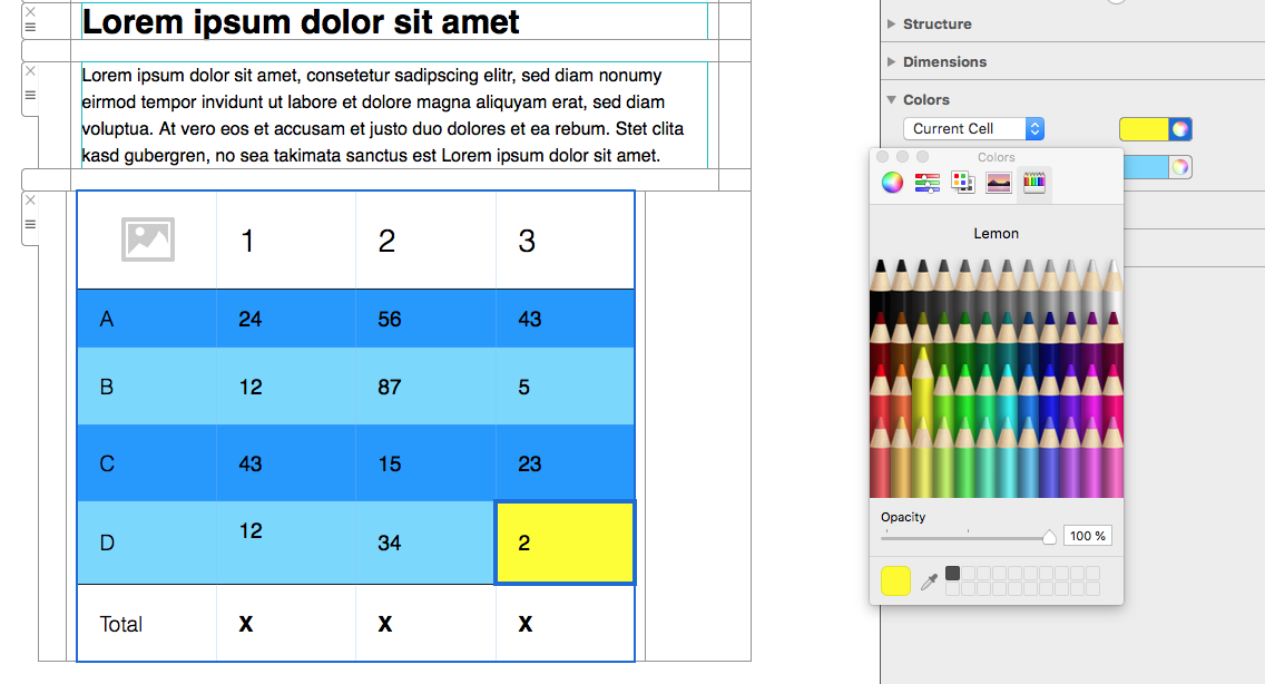
Use single-cell highlighting sparingly. It works well for a recommended plan, total, deadline, or other value that deserves attention. Too many highlighted cells can weaken the hierarchy and make the table harder to scan.
Check contrast and brand consistency
Compare every background with its text color. Dark text usually needs a light cell color, while white text requires a sufficiently dark background. Check links separately because their default color may not provide enough contrast on the new shade.
Reuse a small set of approved brand colors throughout the campaign. Consistent table colors connect the data section with headlines, buttons, and other design elements without overwhelming the content.
Preview desktop and mobile layouts
Open the desktop and mobile previews after changing the color of your table. Confirm that alternating rows remain visible, highlighted cells still make sense, and text wrapping does not create confusing color blocks on a narrow screen.
Send a test email and inspect the table in more than one email client when possible. Review background rendering, text contrast, spacing, link visibility, and dark-mode behavior. Some clients adjust colors, so important labels must remain understandable without relying on a precise shade.
Troubleshoot table color changes
If the wrong area changes, undo the step and select the intended table section or current cell again. If alternating colors are not visible, confirm that the option is enabled and that the two chosen shades differ enough.
When text becomes difficult to read, change either the background or text color rather than adding more decoration. After the color scheme is complete, use the guide to adding borders to your table to refine separation without using an outdated or broken link.
How Can We Help?