
The Mail Designer shadow tool adds depth and separation to text styles, shapes, and images placed in an image area. Use it carefully to clarify the visual hierarchy without making an email look heavy or reducing readability.
Apply a shadow to a design element
- Insert or select a text style, shape, or image inside an image area.
- Open the Style controls in the sidebar.
- Find the Shadow section for the selected element.
- Enable the shadow checkbox to apply the effect.
- Adjust offset, blur, color, and angle while previewing the complete email.
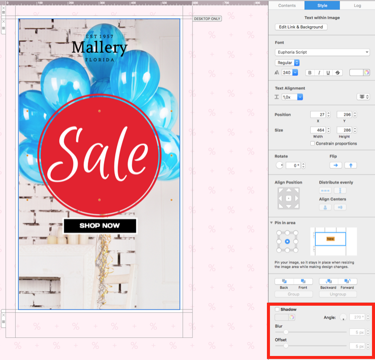
The shadow controls appear for supported content in an image area. If the option is not visible, confirm that the intended element—not the surrounding layout block—is selected.
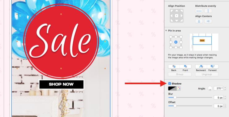
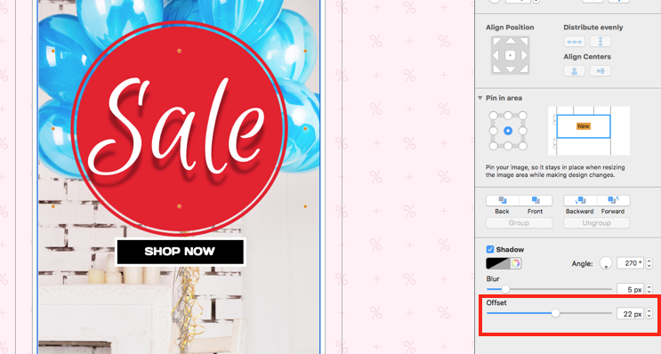
Adjust the shadow offset
Offset controls how far the shadow sits from the object. Move the slider to increase or reduce the distance. A small offset can separate an element from its background, while a large offset creates a more dramatic effect and may require extra space around the object.
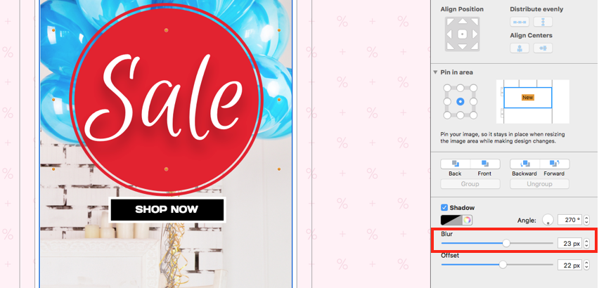
Control shadow blur
Blur softens the edge of the shadow. Increase it for a diffuse effect or reduce it for a sharper edge. Review the shadow at the size recipients will see rather than judging only a zoomed-in canvas. Very soft shadows can disappear on some displays, while very sharp shadows may resemble an outline.
Choose a suitable shadow color
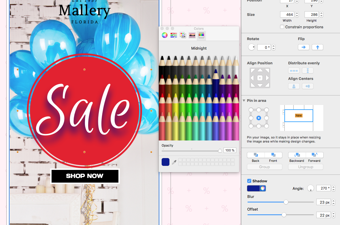
Open the color control and select a shade that fits the design. Dark gray often creates a softer result than pure black, but the correct choice depends on the background and brand palette. Check contrast in both light and dark surroundings and avoid a shadow color that makes text harder to read.
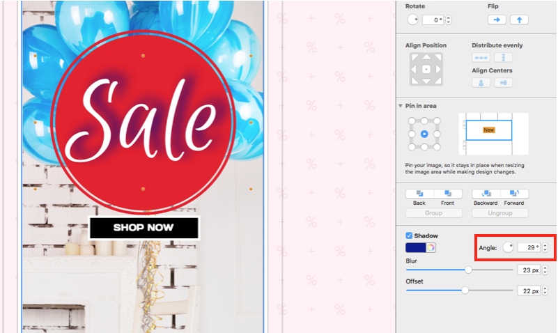
Set the shadow angle
Use the rotator or enter a value to control the direction in which the shadow falls. Apply a consistent angle to related objects so the design appears intentional. If several elements use conflicting shadow directions, the layout can look visually inconsistent.
Use shadows accessibly in email design
A shadow should be decorative support, not the only way to distinguish essential text or controls. Maintain sufficient contrast between the element and its background without the shadow. Keep important copy as live text where possible, and do not rely on a shadow to communicate whether an item is active, selected, or available.
Use restraint on small text. Strong blur or offset can reduce legibility, especially on mobile or lower-resolution displays. Shadows are usually most effective on a headline, product image, badge, or simple shape rather than every object in the email.
Test the finished shadow effect
- Preview the complete email at desktop and mobile widths.
- Check light and dark inbox themes where possible.
- Confirm that the object remains readable without depending on the shadow.
- Compare related elements for consistent offset, blur, color, and angle.
- Send a proof and review the effect at normal viewing size.
Keep shadow settings consistent across a campaign
When several campaign elements need depth, define a small set of approved shadow treatments instead of adjusting every object independently. Record the offset, blur, color, and angle used for headlines, images, or badges. Consistent settings make later edits faster and help new sections match the original design.
Recheck the effect whenever an object or background color changes. A shadow that works on a light section may become distracting or invisible on a darker one. Treat each shadow as part of the complete color and spacing system rather than an isolated decoration.
Troubleshooting the Mail Designer shadow tool
- The controls are missing: select a supported text style, shape, or image inside an image area.
- The shadow is clipped: reduce the offset or provide more space around the element.
- The effect looks too strong: reduce offset, increase blur, or choose a softer color.
- Text is difficult to read: improve the base text/background contrast and simplify the shadow.
- Shadows look inconsistent: reuse the same settings for related elements.
This article owns the Mail Designer shadow tool workflow. Illustrator effects, CSS box-shadow code, email privacy tools, shadow email addresses, and general graphic-design theory remain separate topics.
How Can We Help?