
Mobile-only text styles let you tailor typography for smartphone readers without changing the desktop version of your Mail Designer 365 email. This responsive email text styling workflow is useful when a headline wraps awkwardly, body copy feels too large, or spacing that looks balanced on a Mac takes up too much room on a phone.
When to use mobile only text styles
Start with a complete desktop design, then switch to Smartphone view and review each important text block. A mobile only adjustment is appropriate when the same wording should remain in both layouts but its font size, line height, alignment, or spacing needs to change for a narrower screen. Keep the message itself consistent so recipients see the same offer and information on every device.
Create a mobile only text style
Select a text block in Smartphone view and make a typography adjustment. In this example, reducing the line height saves vertical space while keeping the copy readable. Use small changes first and check that headings, paragraphs, and links still have enough separation.
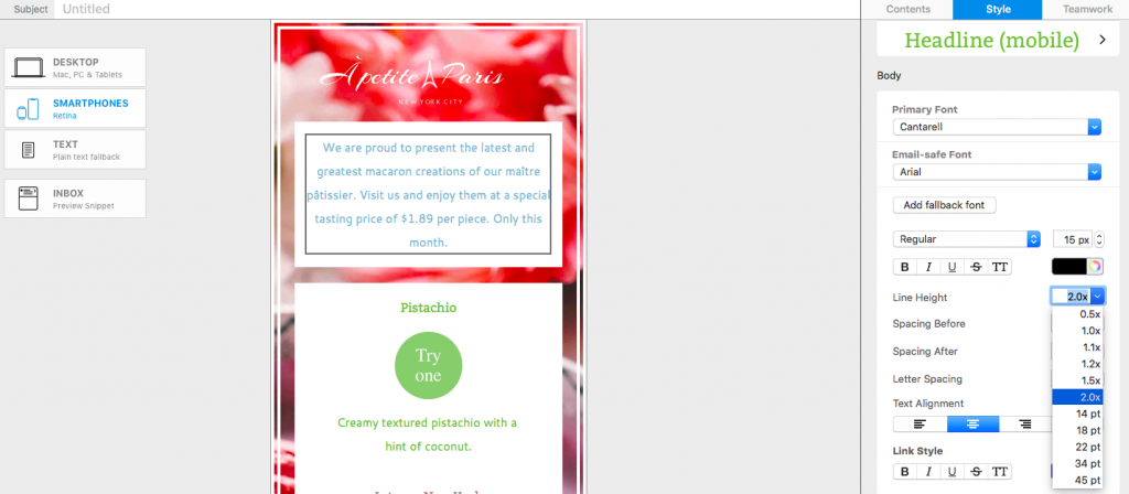
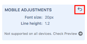
After the first mobile only change, Mail Designer 365 displays the adjustment in a blue box in the Style menu. This visual marker helps you distinguish smartphone-specific formatting from the shared desktop style.
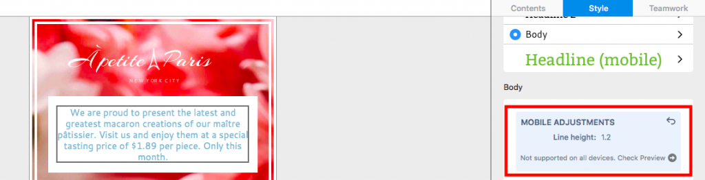
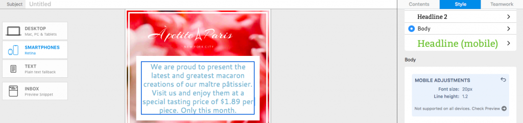
You can continue refining the same style for mobile. For example, adjust font size, line height, text alignment, or spacing only when it improves scanning on a narrow display. Avoid shrinking text so far that it becomes difficult to read.
Compare the mobile and desktop styles
Return to Desktop view after making your mobile only text styles. The blue box remains visible in the Style menu, reminding you and other collaborators that the selected text has smartphone-specific formatting. The desktop typography itself remains unchanged.
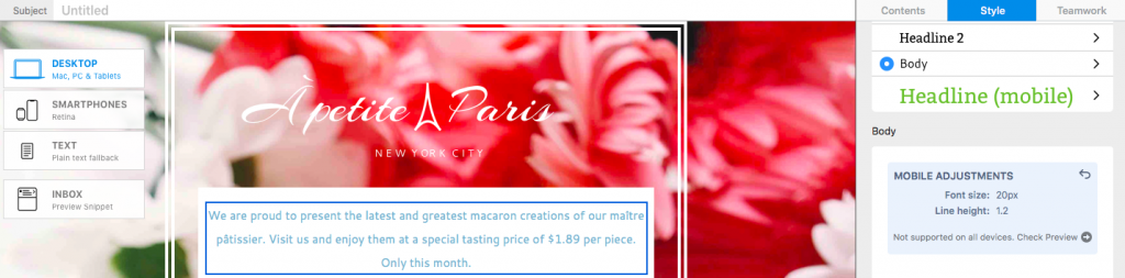
Review both layouts whenever you change shared copy. A longer headline or translated sentence may wrap differently even though the mobile style settings are still active. This comparison is an important part of responsive email text styling because it prevents a desktop edit from creating an unexpected mobile layout.
Reset a mobile only text adjustment
To remove the smartphone-specific formatting, click the undo arrow in the top corner of the blue style box. Mail Designer 365 then returns that text style to the desktop version across both layouts. Resetting is useful when the desktop settings already work well at both widths or when you want to rebuild the mobile treatment from a clean baseline.
Preview mobile typography before sending
Important: Mobile Style Adjustments are not supported by non-Gmail addresses in the Gmail mobile app. Check the design with the Gmail (IMAP) preview before sending. Choose Check Preview to open the device preview and confirm that font size, line height, wrapping, links, and spacing remain readable.
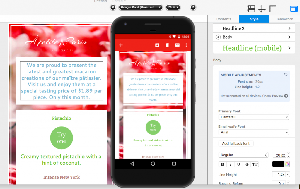
For a reliable final check, preview several representative text blocks, including the main headline, body copy, buttons, and legal information. Also send a test email when possible. If a line wraps poorly, return to Smartphone view and make the smallest useful adjustment rather than changing every text style.
You can also review the mobile layout block guide for related responsive design controls in Mail Designer 365.
Mobile text style checklist
Before you finish, compare the desktop and smartphone versions side by side. Confirm that the headline does not wrap into an isolated word, body text remains comfortably readable, and linked text is easy to tap. Check that line height provides breathing room without making the email unnecessarily long. Keep brand typography consistent unless a mobile adjustment is required for clarity.
Finally, use Check Preview for the inbox environments that matter to your audience and send a test message to a real device. These checks help you use mobile only text styles as a focused accessibility and layout improvement instead of a separate redesign. If the mobile version already reads well, retain the shared desktop style.
How Can We Help?