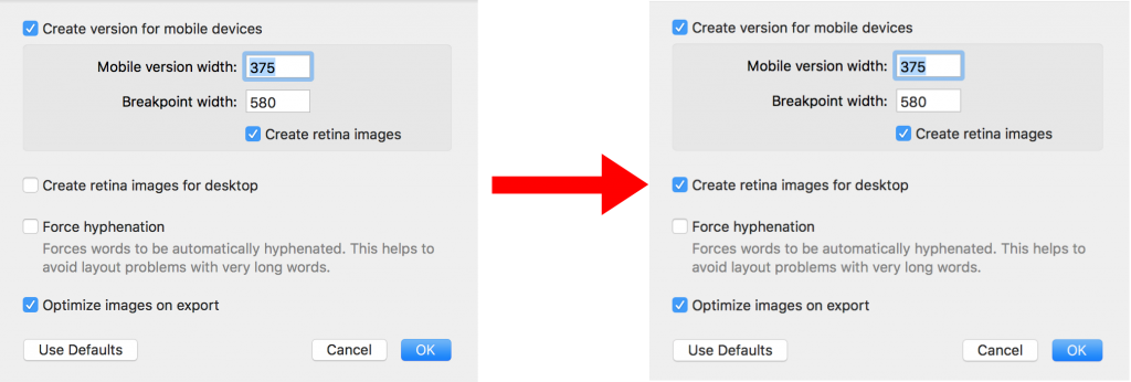
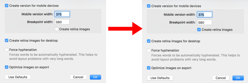
Retina images for your template: how to deactivate them

By Hans-Peter Using Retina Images with your Design

Retina images for your template: when to deactivate them

Retina images for your template usually make email graphics look sharper on high-density screens. Mail Designer 365 creates larger image assets so supported devices can display logos, photos, and other graphics with more detail. In some situations, however, you may prefer to disable this option—for example, when you need to reduce exported file size, meet a strict image-hosting limit, or troubleshoot an email platform that processes high-resolution assets unexpectedly.

This guide explains how to deactivate Retina image generation for mobile and desktop versions of a Mail Designer 365 design. The setting affects the assets created from image areas; it does not remove the original images from your document.

Before changing the Retina settings

Save a copy of the design before changing export-related options, especially if the design is already part of a campaign workflow. Check whether your email service provider has an upload or message-size limit and compare that requirement with the benefit of sharper graphics. Disabling Retina assets can reduce the amount of image data, but recipients using high-density displays may see less detail.

If only one image causes problems, first consider optimizing that image rather than changing the setting for the whole design. The guide to optimizing an image area can help you reduce unnecessary image data while retaining the overall Retina workflow.

Disable Retina images for the mobile version

  1. Open the design you want to update in Mail Designer 365.
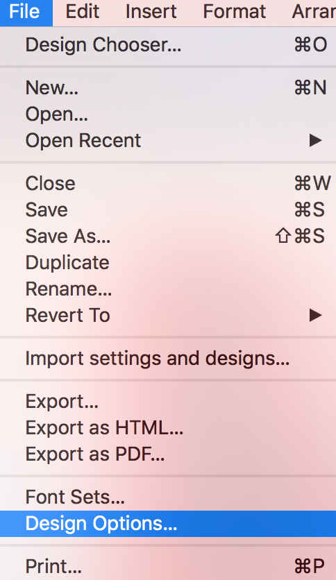
  2. Choose File > Design Options… from the macOS menu bar.
  3. Locate the Retina image settings in the Design Options window.
  4. Clear the option labeled Create retina images for the mobile version.
  5. Close the window and save the design.

Open Design Options to manage Retina images for your template

The exact wording can vary slightly between Mail Designer 365 versions, but the workflow begins in Design Options. If you do not see the setting immediately, review the image and export options in that window.
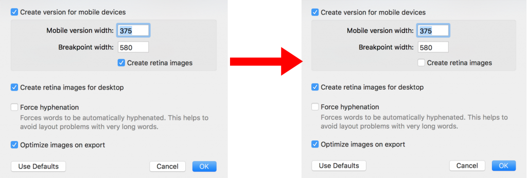
Deactivate Create retina images for the mobile email version

Disable Retina images for the desktop version

Mail Designer 365 lets you control the desktop asset setting separately. In the same Design Options window, clear Create retina images for desktop. This is useful when both layout versions must use standard-resolution assets, but it also means desktop recipients with high-density screens will not receive the additional Retina detail.
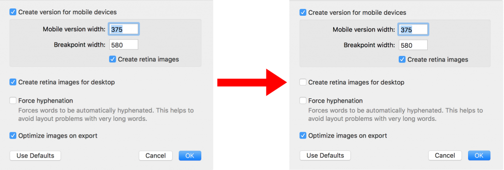
Turn off Retina image generation for the desktop email version

You can leave one version enabled and the other disabled. For example, you might retain Retina graphics for the desktop design while reducing mobile asset size, or do the reverse when the mobile design contains fewer images.

Check the result before sending

After changing the settings, preview both the mobile and desktop versions. Pay particular attention to small text inside graphics, detailed logos, thin lines, and screenshots, because those elements reveal resolution changes most clearly. Send a test email to at least one high-density device and one standard display if image sharpness is important to your campaign.

When exporting or uploading the design, compare the resulting file or message size with your previous version. If the reduction is small and the visual difference is noticeable, re-enable Retina assets. If the design is now accepted by your sending platform and still looks good, keep the adjusted setting for that document.

Re-enable Retina images later

The change is reversible. Return to File > Design Options… and select the relevant Retina options again. Save the design, regenerate the export or upload, and repeat your test send. Using a deliberate preview-and-test process helps you balance image quality, compatibility, and email size instead of applying one setting to every campaign.

Email Marketing Retina Image Size in Mail Designer 365

By Hans-Peter Using Retina Images with your Design

Choosing the right email marketing retina image size helps graphics look sharp on high-density desktop and mobile displays. Mail Designer 365 can create Retina-optimized images for your design and warns you when an image does not have enough resolution for its displayed size.

Retina optimization works best when the source image contains enough pixels for the area where it will appear. If the source is too small, either replace it with a higher-resolution version or reduce its displayed dimensions in the email design.

Understand Retina images for email

A high-density display uses more physical pixels to render the same visual area. A Retina image therefore needs more source detail than an image intended only for a standard-density display. Mail Designer 365 uses the design size and available image resolution to help create a sharper result.

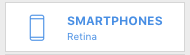
The desktop and mobile switch indicates when Retina support is active. When the option is enabled, Mail Designer 365 automatically prepares Retina-optimized images for the corresponding version of the template.

Desktop and mobile switch showing Retina image support

Watch for the low-resolution icon

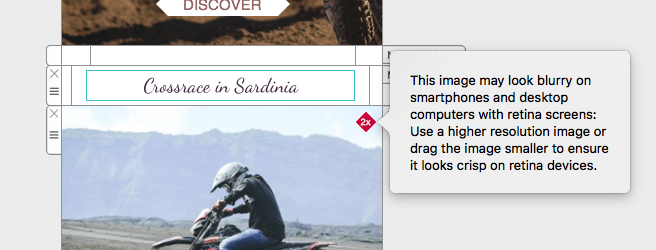
Mail Designer 365 checks images added to the mobile version. When an image has insufficient resolution for its current displayed size, a warning icon appears.

Low-resolution warning icon for a Retina email image

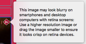
Select the affected image and read the warning. It identifies a potential quality problem before you send the email.

Mail Designer 365 warning for an image with insufficient resolution

Fix an image that is too small

You have two practical options. Replace the source with a higher-resolution image that uses the same composition, or make the existing image smaller inside its image area. Reducing the displayed size means the available pixels cover a smaller area and can produce a sharper result.

Resizing an image to resolve a Retina resolution warning

Do not enlarge a low-resolution source merely to fill more space. Scaling it up does not create real detail and may make softness or compression artifacts more visible. When replacing an image, preserve the intended crop and check that any important product or brand details remain accurate.

Enable Retina images in Design Options

Choose File > Design Options to review the Retina settings for the current design.

Design Options command in the Mail Designer 365 File menu

For the desktop version, make sure Create retina images for desktop is selected when you want high-density desktop graphics.

Create Retina images setting for the desktop email version

For mobile, enable Create retina images for the mobile version. Review both settings because a campaign may use different image sizes or crops in its desktop and smartphone layouts.

Create Retina images setting for the mobile email version

Balance image quality and email size

Use the resolution required for a clear result, but avoid unnecessarily large source files. Oversized images can increase the amount of image data used by the message without improving the visible result. Crop unused areas before adding an image and choose sensible displayed dimensions for the design.

Keep important text as live text rather than placing all copy inside images. This improves readability when images are blocked and avoids depending on image resolution for essential information.

Test Retina images before sending

  • Review every warning icon in both desktop and mobile versions.
  • Check the design at normal size rather than judging only while zoomed in.
  • Send a test email and inspect key images on standard- and high-density displays where available.
  • Confirm that images remain sharp without covering text, buttons, or links.
  • Verify that alternative text communicates the purpose of meaningful images.

For more image and layout guidance, browse the Mail Designer 365 Knowledge Base.

Privacy Settings / Datenschutz-Einstellungen