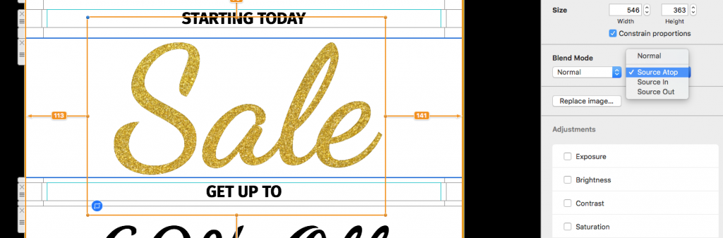
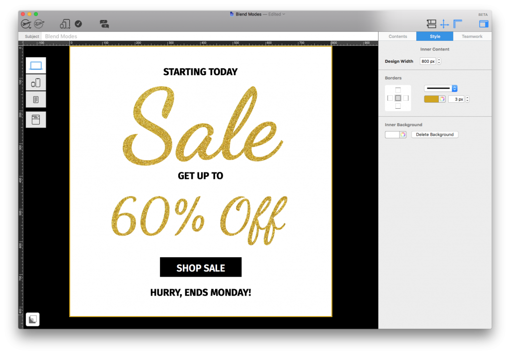
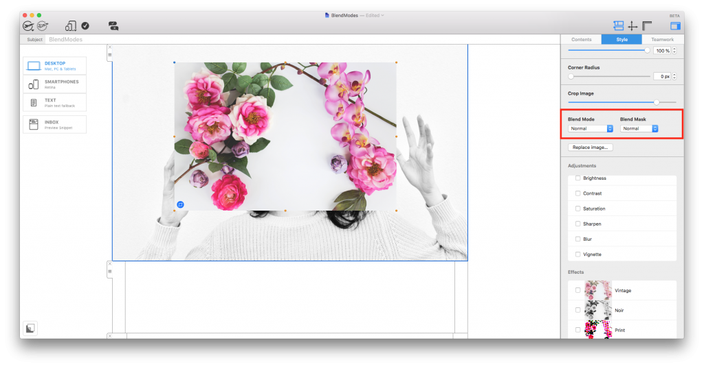
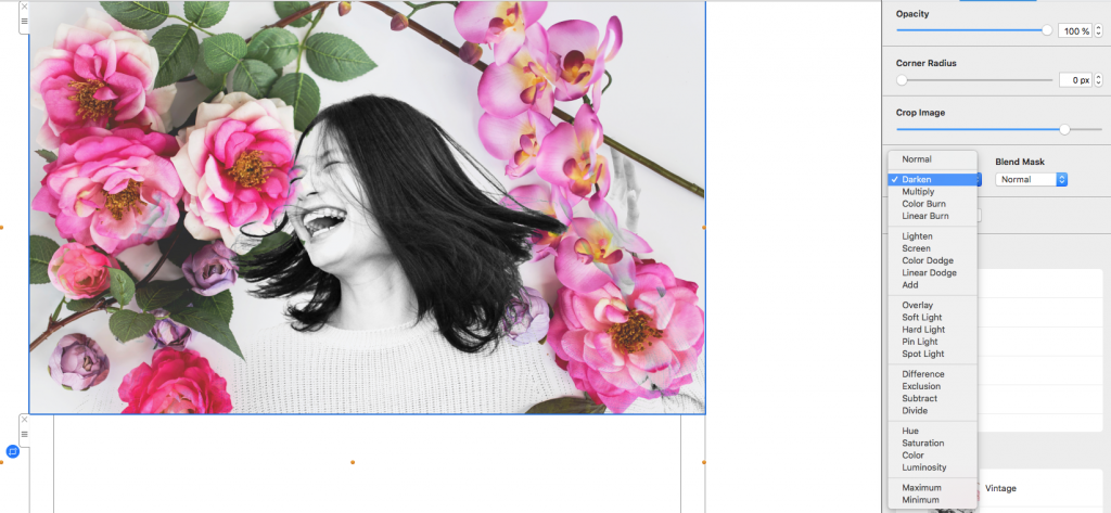
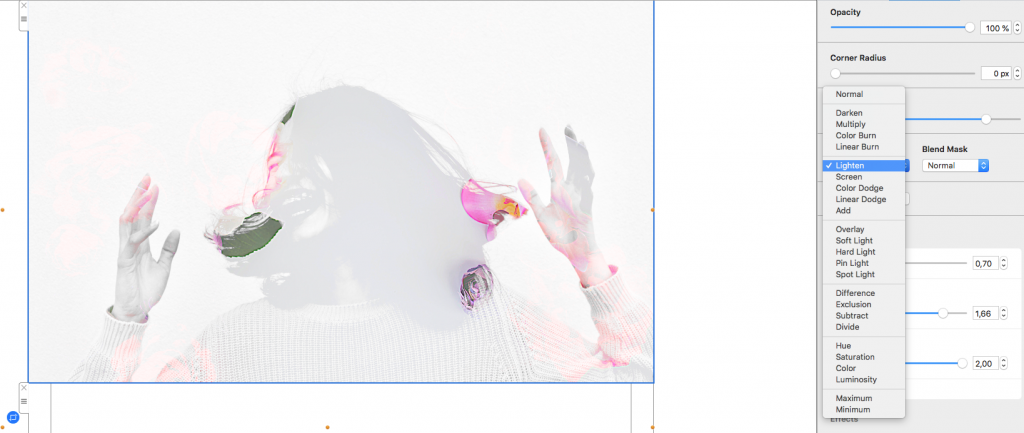
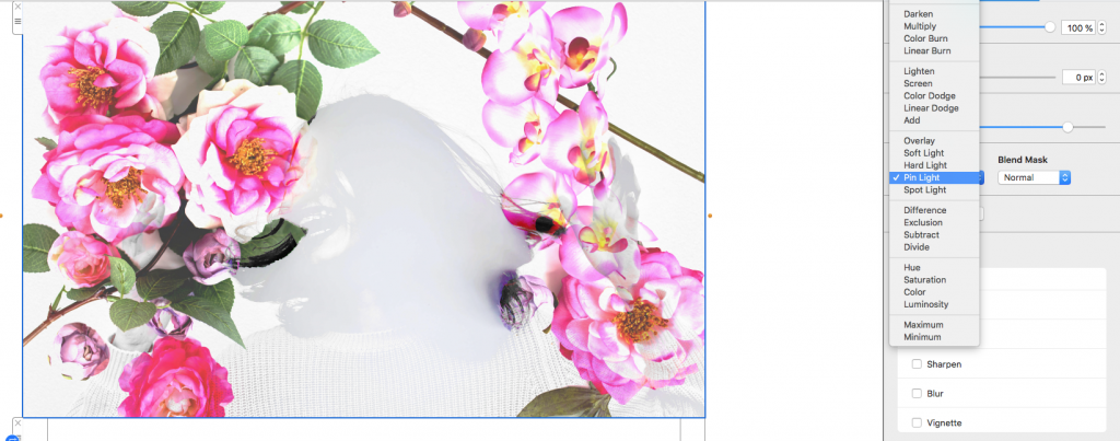
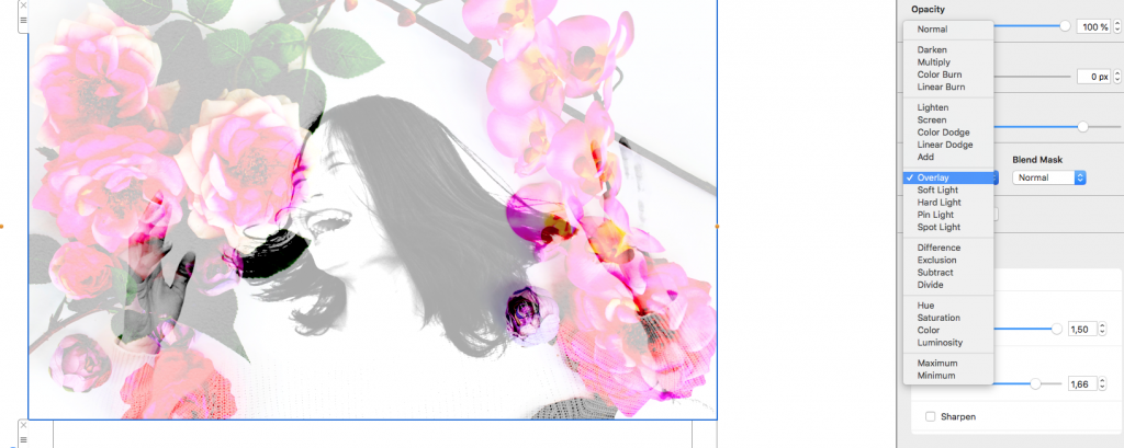
Email blending lets you combine photos, colors, textures, and graphic elements in a single Mail Designer 365 composition. Blend Modes change how the colors in one selected image interact with the layer behind it, giving you a quick way to create depth and visual effects without rebuilding the artwork in another app.
The tutorial on this page introduces three practical ways to use Blend Modes in an email design. Use the examples as starting points, then adjust the mode, image position, and contrast to fit your own campaign.
What email blending changes
A Blend Mode does not simply change an image's transparency. It compares the colors of the selected element with the colors behind it. The result depends on both layers, so the same mode can look very different when you swap a photo, change a background color, or move the image.
Before experimenting, keep a copy of the original design or duplicate the relevant element. This makes it easy to compare the blended result with the unedited version and return to a clean starting point.
1. Blend a texture into a background
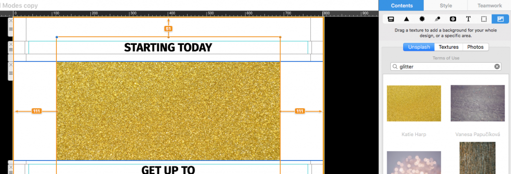
A texture can add depth to a flat color area without covering the entire composition. Place a suitable texture image over the background, select it, and try different Blend Modes. Reposition or crop the image so the texture supports the message instead of competing with it.
Check quiet areas as well as detailed areas. A subtle effect around the headline can help the text stand out, while a strong texture immediately behind small copy may reduce readability.
2. Combine a photo with a color layer
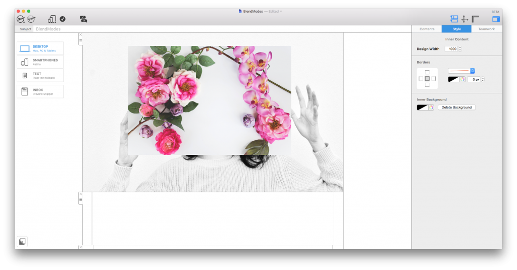
Email blending can help a photo feel more connected to the campaign palette. Place the photo and color element in the intended order, select the top element, and compare the available Blend Modes. The underlying colors determine the result, so test the effect with the actual background used in the email.
Keep skin tones, product colors, and logos accurate. If blending changes an important brand or product detail, reduce the visual effect or leave that element unblended. Decorative impact should never make the content misleading.
3. Create layered graphic effects
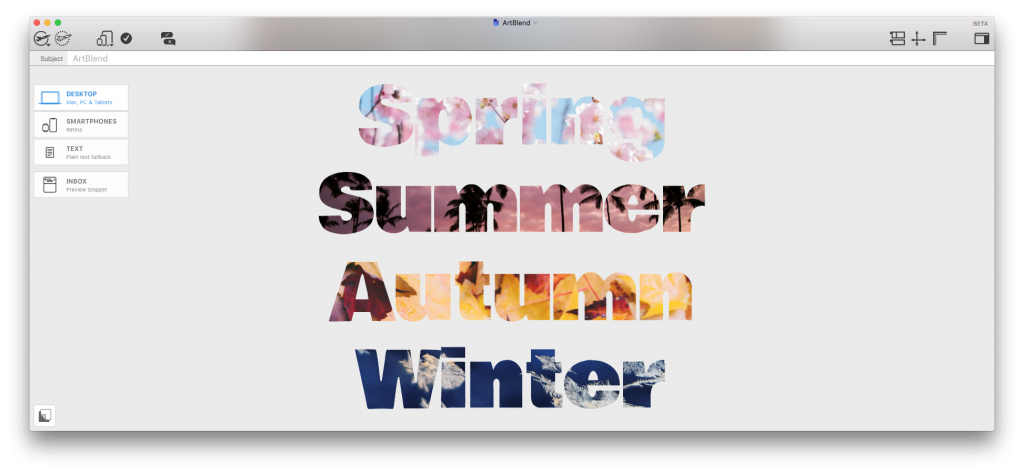
Blend Modes can also bring separate shapes, lettering, or illustrations together. Overlap the elements intentionally and choose a mode that produces a clear boundary or interesting color interaction. This is useful for feature graphics, event announcements, and hero sections where a layered composition supports the message.
Use the effect consistently. One strong blended area usually creates a clearer visual hierarchy than several competing effects across every content block.
Watch the Blend Modes tutorial
The video demonstrates three Blend Mode ideas you can try in Mail Designer 365:
Check readability and fallback appearance
After applying an email blend mode, zoom out and review the whole design. Confirm that headings, body text, buttons, and important details still have enough contrast. Then preview the message at desktop and mobile widths, because cropping and stacking can change which layers overlap.
Also consider recipients who view messages with images disabled. Keep essential information as live text rather than embedding it only in a blended graphic. Add concise alternative text to meaningful images so the message still makes sense when an image cannot be displayed.
Test before sending
- Send a test email to addresses you can check in several common email apps.
- Confirm that the blended artwork renders as expected and does not obscure text or links.
- Click every important link and review the message in light and dark viewing conditions where available.
- Check that the design still communicates the campaign purpose without the decorative effect.
For more examples, explore the Mail Designer 365 video tutorials.
How Can We Help?