Email Preview Text: Inbox Preview Guide

By Team equinux Plain Text, Preview your Design

Email Preview Text in Mail Designer 365

Email preview text is the short snippet many inboxes display beside or below the subject line. It gives recipients extra context before they open the message. In Mail Designer 365, the Inbox Preview lets you edit the subject and preview text together and compare their appearance on different device previews.

Use the preview text to add useful information rather than repeat the subject line. Keep every promise accurate and consistent with the email content.
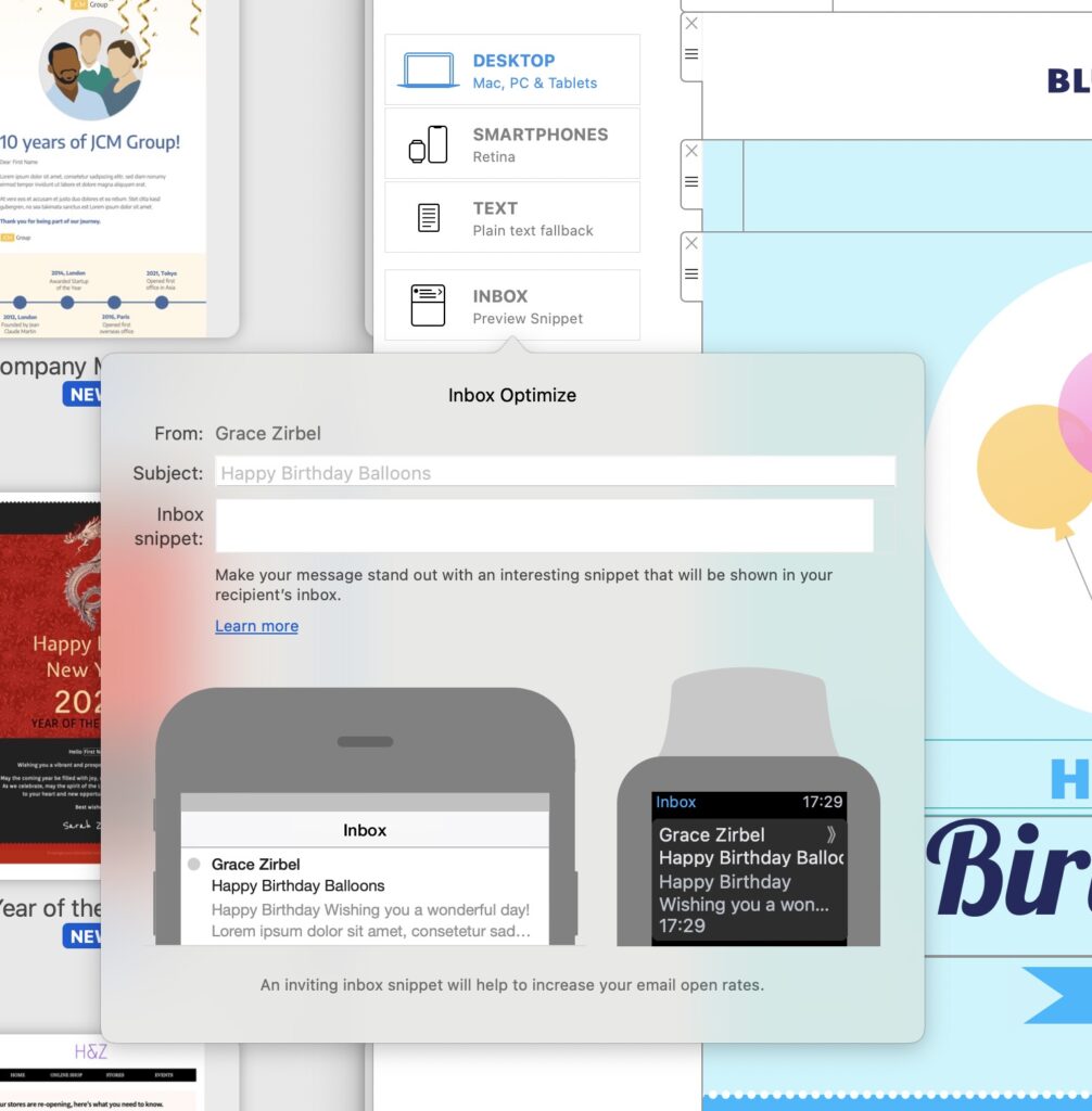
Edit email preview text in the Mail Designer 365 inbox preview

Open the Inbox Preview

  1. Finish the main newsletter content and check its links and images.
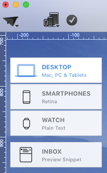
  2. Click the Inbox Preview icon on the left side.
  3. Use the window that opens to edit the subject line and preview text.
  4. Review the phone and smartwatch previews.
  5. Adjust the wording when important information is cut off or repeated.

Coordinate Preview Text and Subject Line

Read the subject and preview text as one combined inbox message. The subject should communicate the main reason to open the email. The preview text can add a supporting detail, deadline, audience cue, or next step.

Avoid copying the subject verbatim. Repetition uses limited inbox space without giving the recipient more information. Also avoid placing unrelated promotional language in the preview text when the email serves a support, confirmation, or account purpose.

Write Useful Email Preview Text

  • Lead with the detail that matters most after the subject.
  • Use natural language that matches the sender and campaign.
  • Keep names, dates, prices, and availability accurate.
  • Avoid unnecessary capitalization and excessive punctuation.
  • Do not rely on a fixed visible length across every inbox.

Different inboxes and screen sizes can display different amounts of text. Put essential wording near the beginning, then use the device previews to identify obvious truncation problems.

Use the Phone and Smartwatch Previews

Compare the available previews after entering the final subject and snippet. A phrase that looks complete on a wider inbox can be shortened on a smaller display. Check whether the visible opening still makes sense when the remaining words are hidden.

The preview is a planning aid, not a guarantee that every recipient will see identical spacing or length. Send a real test message to representative inboxes before the campaign.

Avoid Unwanted Preview Content

When an email has no deliberate preview text, an inbox may use other early message content. This can expose navigation wording, image alternative text, or utility copy instead of the intended campaign context. Add a purposeful snippet and inspect a received test to confirm the result.

Test the Inbox Preview Before Sending

  1. Review the subject and preview text for accuracy.
  2. Check phone and smartwatch views in Mail Designer 365.
  3. Send the message to test inboxes.
  4. Inspect the inbox list before opening the email.
  5. Confirm that the subject, sender, and snippet work together.

Repeat the test after changing either the subject or preview text. A strong pair should set the correct expectation without hiding the email's actual purpose.

Troubleshoot Email Preview Text

The Preview Text Is Cut Off

Move the most important detail earlier and remove repeated words. Do not try to force every inbox to display the same number of characters.

The Inbox Shows Different Copy

Confirm that the intended preview text was saved, then send a fresh test. Check the beginning of the email for other text that an inbox might choose as a snippet.

The Subject and Preview Repeat Each Other

Keep the stronger phrase in the subject and use the preview text for a supporting detail. Review both fields together in the Inbox Preview.

Email Preview Text Checklist

  • The subject states the main message.
  • The preview text adds new, accurate context.
  • Important wording appears near the beginning.
  • Phone and smartwatch previews were checked.
  • A received test displays an appropriate inbox snippet.

For related campaign instructions, browse the Mail Designer 365 Knowledge Base.
Change the Size of the Preview Window

By Hans-Peter Preview your Design

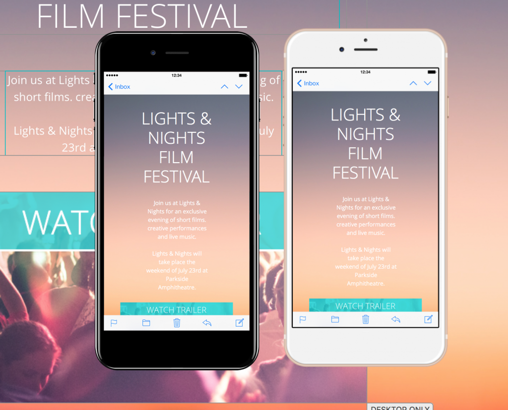
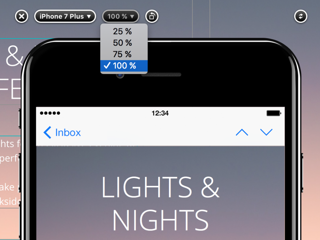
Changing the size of the preview window in Mail Designer 365 helps you compare how an email design appears on different devices. A smaller device preview zoom can fit several preview windows on one display, while a larger view makes typography, spacing, images, and buttons easier to inspect in detail.

Open the device preview

Use Check Preview to open the device preview for your design. The preview lets you review the rendered email without changing the layout itself. Before adjusting the zoom, choose the device or inbox views that are most relevant to the recipients you want to check.

Device preview window with zoom controls in Mail Designer 365

The zoom setting changes only the size of the preview window on your Mac. It does not resize the email content sent to recipients and does not change the actual width of the desktop or smartphone design.

Change the size of the preview window

Select a zoom factor that gives you the level of detail you need. A smaller percentage reduces the on-screen preview size and leaves more room for additional windows. A larger percentage is useful when you want to inspect fine details, such as line wrapping, image edges, button labels, or the space between layout blocks.

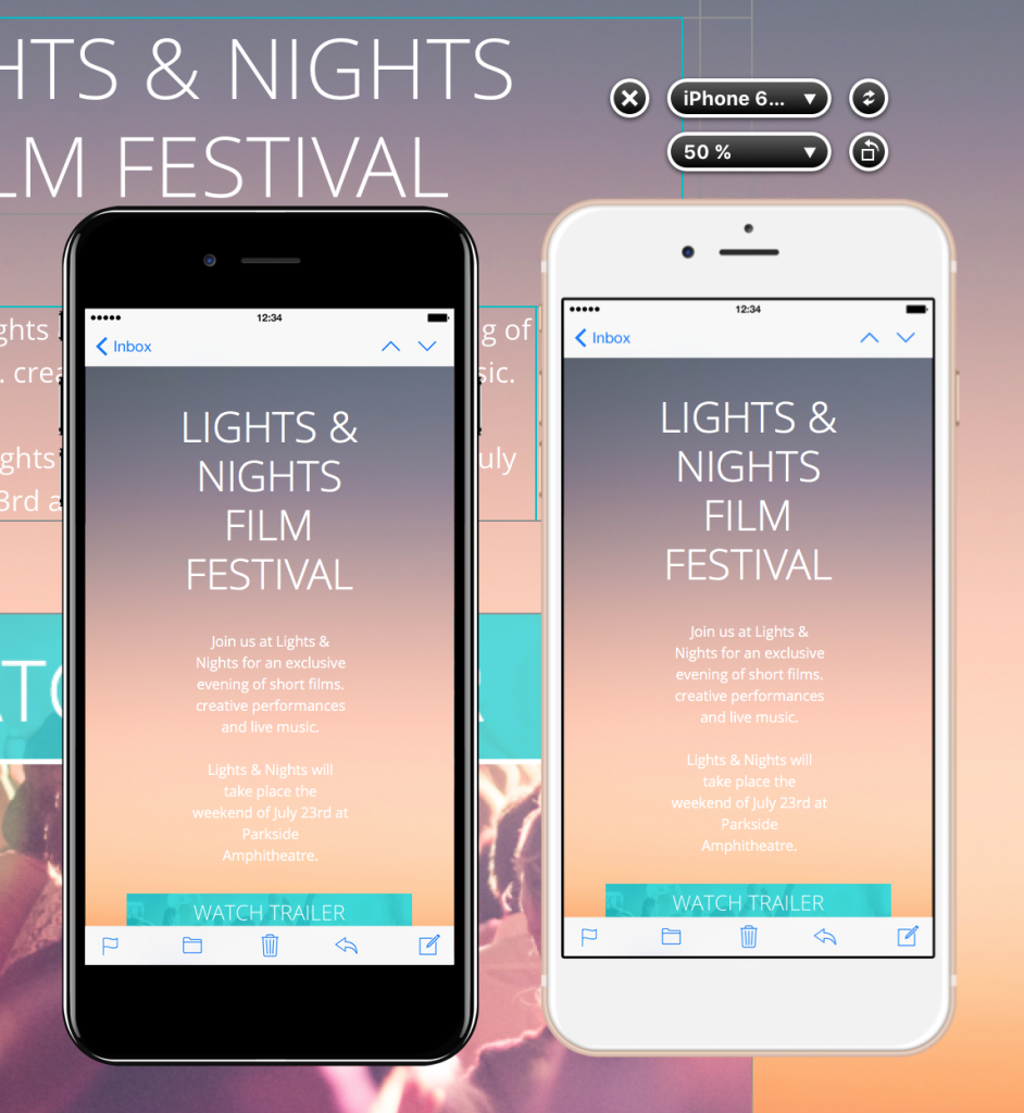
For example, setting the device preview to 50% can make it practical to position multiple device preview windows side by side. This supports a quick visual comparison between different devices or inbox environments at one glance.

Setting the device preview zoom to compare multiple windows

Compare several device previews

Arrange the preview windows so the same part of the email is visible in each one. Compare the headline, important images, calls to action, and the transition between layout blocks. If one view wraps text differently or creates an unexpected gap, return to the design and make the smallest appropriate adjustment.

A reduced device preview zoom is best for overview comparisons. After spotting a possible issue, increase the preview size or inspect that view individually before changing the design. This avoids making decisions from a preview that is too small to show fine details reliably.

Multiple Mail Designer 365 preview windows arranged for comparison

What to check at each preview size

At a smaller zoom, focus on the overall reading order, block spacing, image balance, and whether the main call to action remains prominent. At a larger zoom, check text clarity, line breaks, link labels, image quality, borders, and small alignment differences.

Remember that changing the size of the preview window is a workspace aid. It does not replace testing the delivered email. Preview results can help you identify likely issues, but a real inbox may apply its own rendering behavior.

Test the email before sending

After comparing the preview windows, send a test email to representative desktop and mobile inboxes. Click important links, check that images load, and confirm that text remains readable. If you modify the design after testing, reopen the preview and repeat the relevant checks.

For smartphone-specific layout work, see how to modify a layout block for the mobile version. Combining device preview zoom with a focused mobile review makes it easier to catch problems without changing unrelated parts of the email.

Refreshing the preview window

By Preview your Design

Hit the refresh button

If you change an image or layout block in your template, then you can click the refresh button to update the view in the preview window.

First, choose the device you want to use to preview your design.

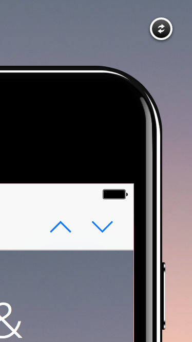
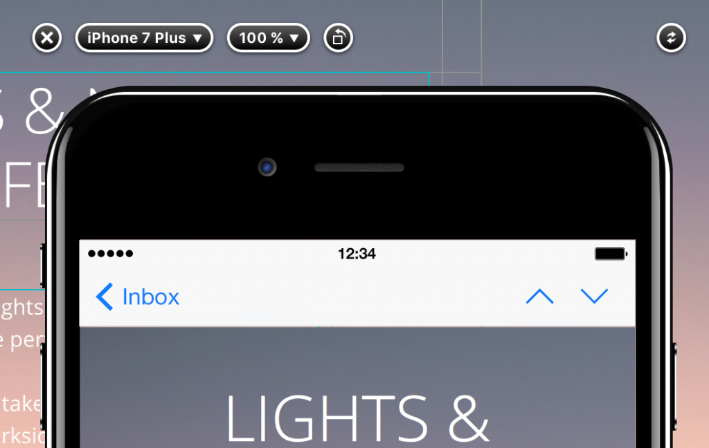
Then, you can always find the refresh button on the top right of the device. It doesn't matter if your device is in the vertical position:


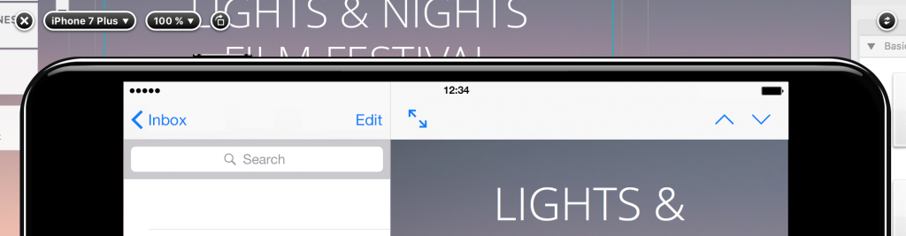
Or the horizontal position:


Setting up a custom preview device

By Preview your Design

Custom preview device

You can also define your own preview device, if you want to preview your template on a display with a certain resolution. 

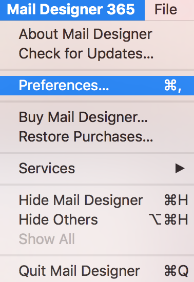
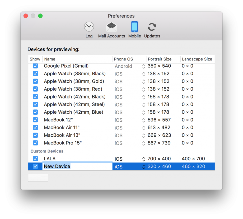
Open you email template. Click "Mail Designer 365." From the drop down menu, choose "Preferences:"

Click on the smartphone icon:


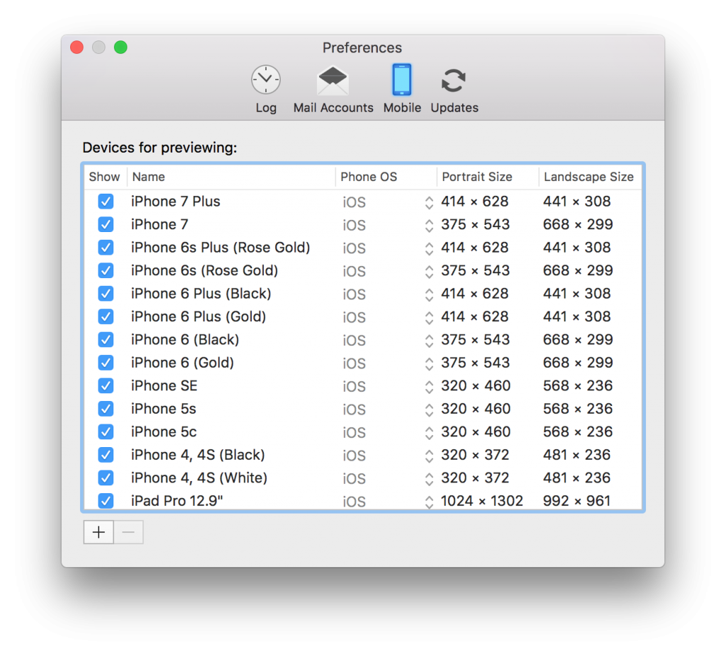
You will see a list of all the devices available for preview at the moment. Click the "+" in order to add a new display resolution to this list:

Change the name and choose the resolution you want to use.

Unchecking the checkbox in front of each entry lets you determine which devices will be available in the drop down menu.


Open the preview window

By Preview your Design

Preview your design

After you optimize your design for mobile devices, it's time to check the preview. We can now preview the result for multiple devices right within Mail Designer 365. This handy feature removes the need of sending preview emails to your own devices.

Open the preview window

Clicking one of the mobile preview buttons in the toolbar will open an additional window where you can see the mobile version of your design as it would appear on an iPhone or an Apple Watch.

Click this icon:

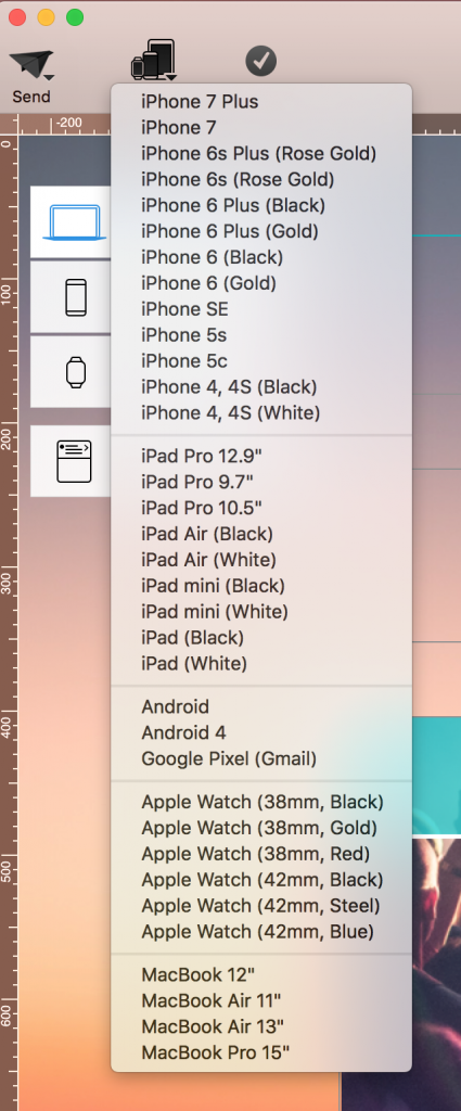
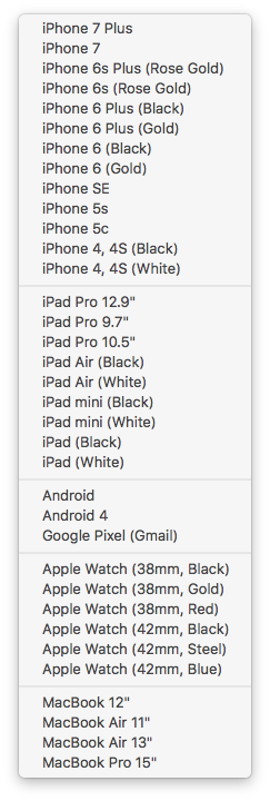
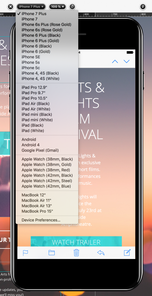
You will see a drop-down menu. As you can see, you have many preview options:


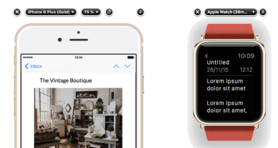
From the top of the preview window, you can choose from a variety of preview devices:

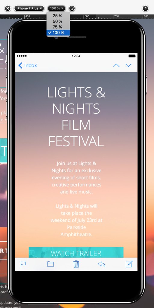
You can also change the zoom factor for the preview window:

Move your cursor on the iPhone’s display in order to scroll through your message.

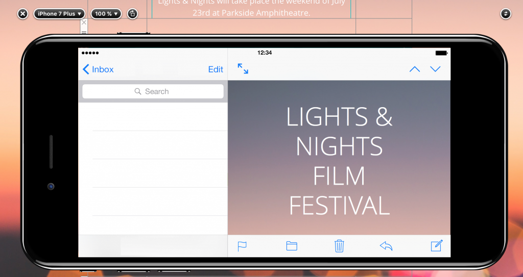
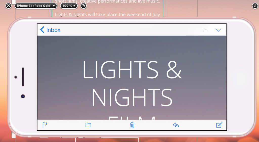
For rotation, click the little rotate icon:

As you can see, it will rotate the iPhone into landscape mode.


Privacy Settings / Datenschutz-Einstellungen