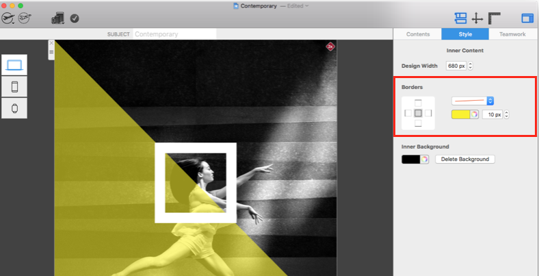
Finished email border design in Mail Designer 365

Email Border Design: Create a Border for Your Newsletter

By Hans-Peter Creative Tools

Create an Email Border Design in Mail Designer 365

An email border design can frame the entire newsletter, separate the message from the surrounding inbox background, and reinforce a consistent visual style. Mail Designer 365 lets you apply a border to the design background, then choose its line style, thickness, color, and individual edges.

This article covers the border around the overall email design. To add an outline to an individual image or shape, use the separate Mail Designer 365 border tool guide. Keeping those two workflows distinct prevents changes from being applied to the wrong element.

1. Select the design background

Click the background of the email design rather than an image, shape, or text area. The controls for the overall design border will appear. If you see settings for a selected content element, click an empty part of the background and check the selection again.
Selecting the background before creating an email border design

2. Choose a border style

Open the style menu and choose the line treatment that fits the campaign. A solid border is usually the most versatile option for newsletters, product updates, and invitations. More decorative styles can work for a themed message, but use them carefully so the frame does not compete with the content.
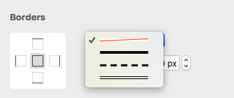
Choosing a line style for the email design border

3. Set the border thickness

Use the arrow control to increase the thickness or enter the desired pixel value manually and confirm it. Start with a subtle value, then preview the email at its actual reading width. A border that looks balanced on a large design canvas can become visually heavy on a narrow mobile screen.
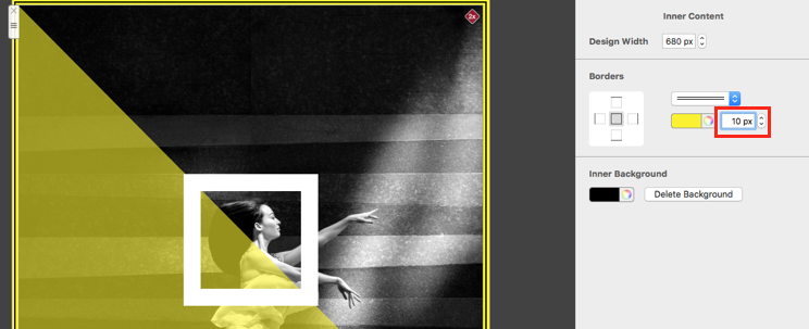
Adjusting the thickness of an email border design

4. Choose the border color

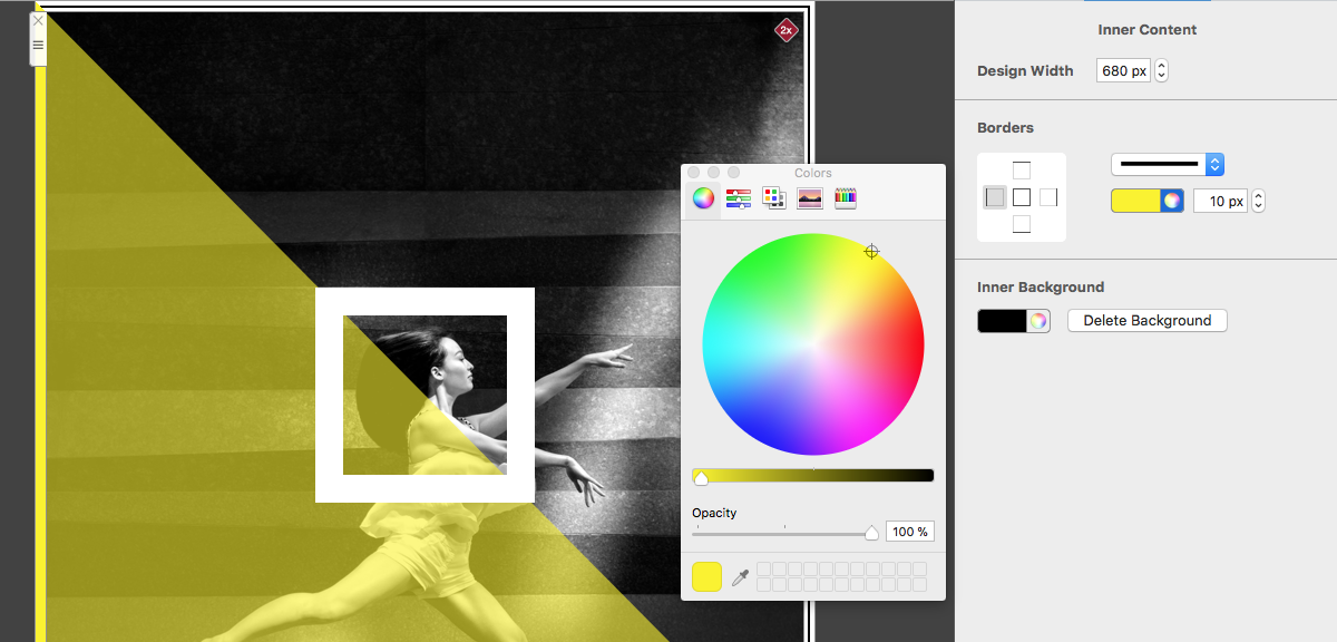
Use the color control to select a border color. A neutral shade can define the email gently, while a brand color can connect the frame to headings, buttons, or other campaign accents. Check the border against both the email background and the surrounding page or inbox background, and maintain sufficient contrast without letting the frame dominate the message.
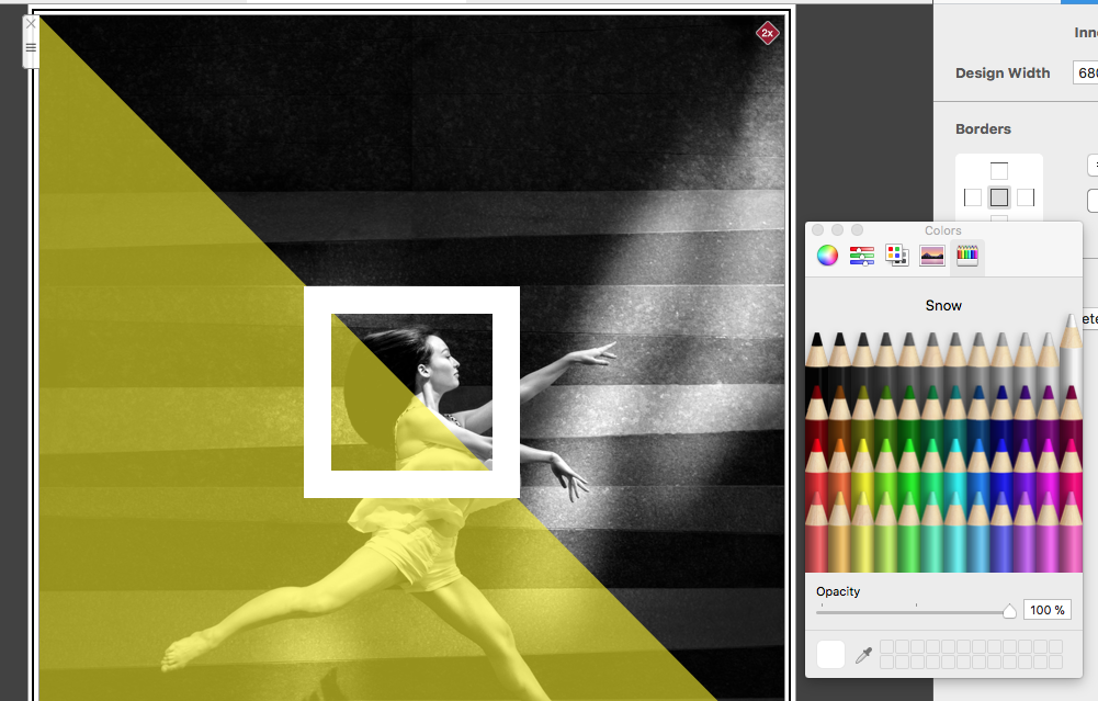
Selecting a color for the overall email design border

5. Edit border edges separately

Mail Designer 365 can apply different settings to individual edges. Use the edge-selection display to choose the top, right, bottom, or left side, then adjust only that part of the border. This is useful for creating a top accent, a divider-like bottom edge, or an asymmetric frame without changing all four sides.
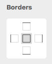
Selecting an individual edge of the email border
Email design with separately edited border edges

Troubleshoot the design border

If the controls do not appear, click away from the current element and select the design background again. When only one edge changes, inspect the edge-selection display and enable the sides that should share the setting. If the frame looks uneven, compare the pixel values for each side and check whether an intentional asymmetric configuration is active.

For a border that seems too wide on mobile, reduce the thickness instead of changing unrelated layout widths. If the color appears different than expected, compare it with the surrounding background and verify the selected color value. After each correction, preview the complete message so the border can be judged in context rather than as an isolated control.

Check the border before sending

  • Preview the design at desktop and mobile widths.
  • Confirm that the border frames the overall email rather than an individual image or shape.
  • Check line thickness and color against light and dark surrounding backgrounds.
  • Verify that separately edited edges are intentional and consistent.
  • Send a test email to the clients your audience uses most.

If the border is missing or appears on the wrong element, return to the editor and confirm what is selected. For a design-wide frame, select the background. For an image or shape outline, use the element-specific border controls described in the linked guide.

A successful email border design should support the hierarchy of the message. Use the frame to define the design area or add a restrained accent, while keeping the headline, content, and call to action visually dominant. For a broader feature overview and visual examples, see design borders in Mail Designer 365.

Alignment and distribution tools in Mail Designer 365

Alignment & Distribution Tools in Mail Designer 365

By Hans-Peter Creative Tools

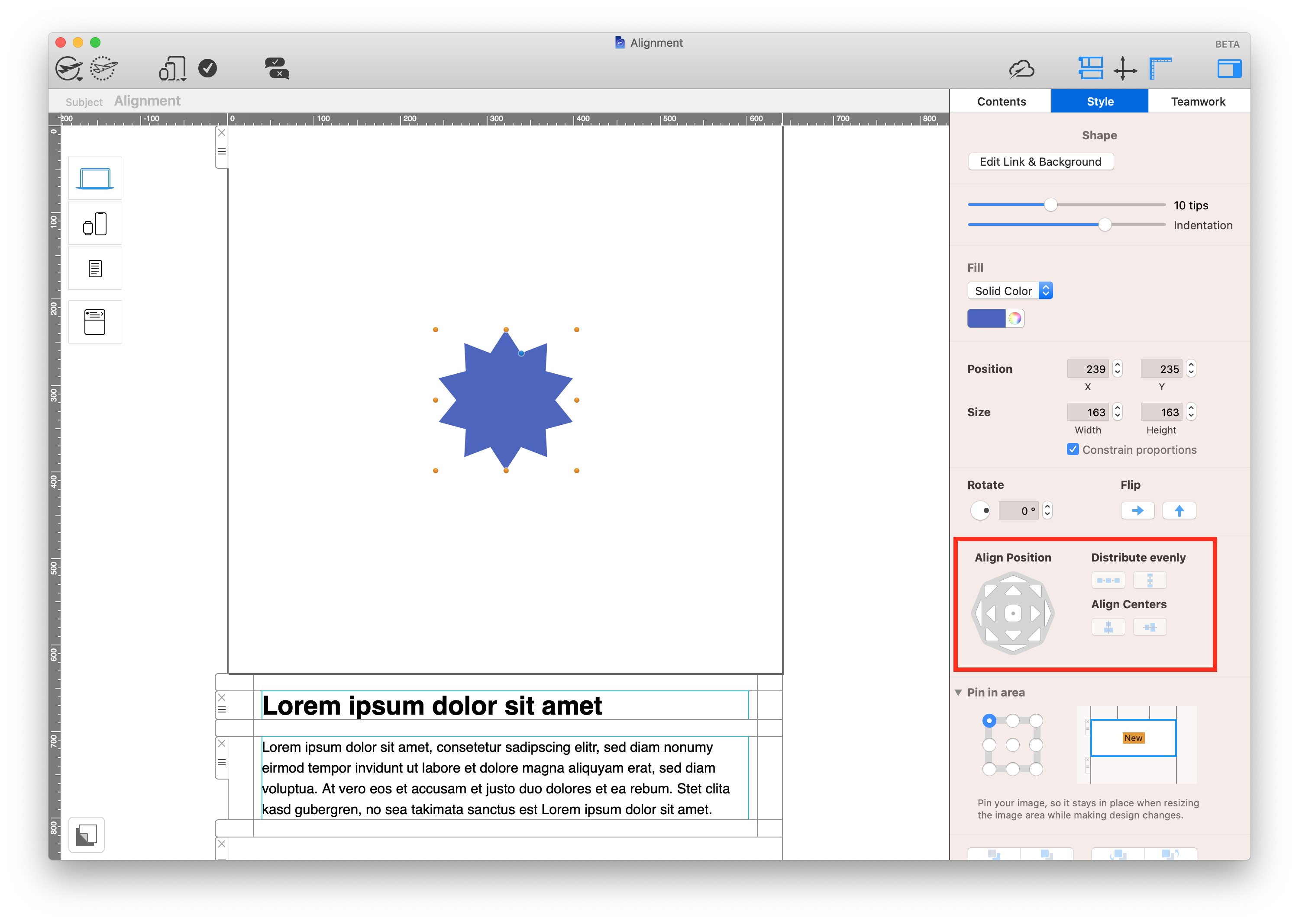
Alignment & distribution tools help you place graphics, text styles, shapes, and other design elements precisely inside an image area. Mail Designer 365 provides separate controls for aligning one object to its container, aligning several selected objects to one another, and distributing three or more elements with equal spacing.

Find the alignment controls

Select a design element such as a shape, image, or text style. The alignment controls appear in the Style section of the app sidebar. If you do not see them, confirm that an individual object inside an image area is selected rather than the complete layout block.

Alignment controls in Mail Designer 365

Alignment tools shown in the Mail Designer 365 Style sidebar

Understand inner and outer alignment

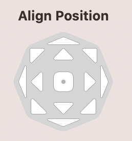
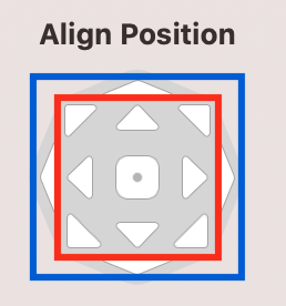
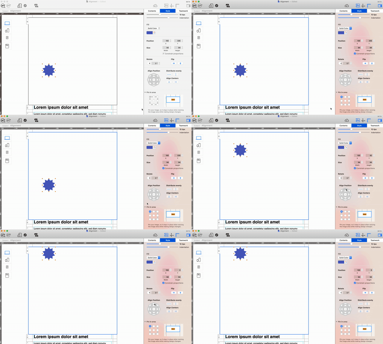
The control panel contains an inner set of buttons and an outer set. The inner controls center the selected element on the corresponding axis. The outer controls move it to the top, bottom, left, or right edge of the image area without automatically changing the second axis.

Inner and outer alignment controls for email design objects

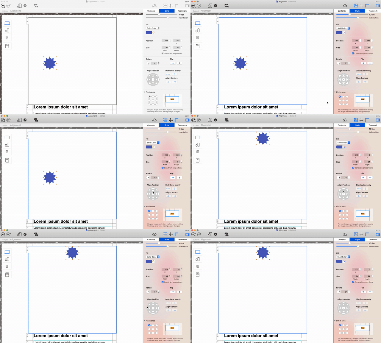
For example, use an inner control to center an object horizontally, then an outer control to move it to the top edge. This keeps the horizontal center while changing its vertical position.

Align a shape to the top center of an image area

The outer controls are also useful when a logo, badge, or decorative shape must sit flush with one side of the container.

Move a shape to the top edge of an email image area

Align multiple design elements

Hold the Command key and select the objects you want to align. Once several elements are selected, choose an alignment direction. Mail Designer 365 uses the selection as the reference, so the objects form a clean shared edge or center line.

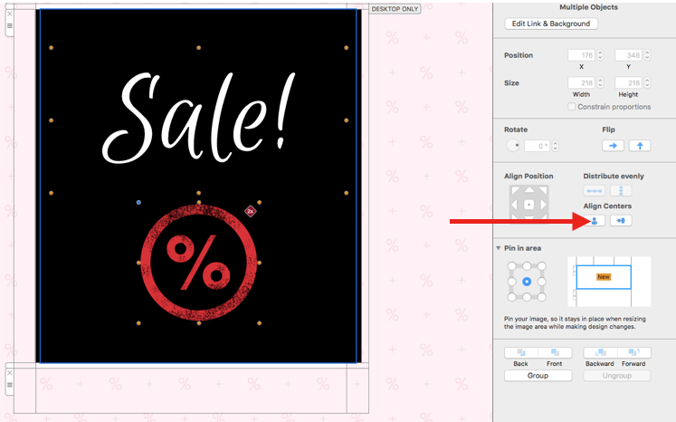
Use vertical alignment when elements should share a left edge, right edge, or horizontal center. This is useful for logos, icons, and labels stacked within the same image area.

Select multiple email design elements for vertical alignment

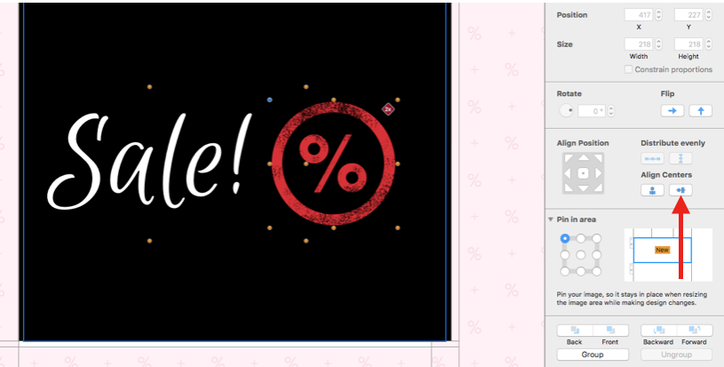
Use horizontal alignment when objects should share a top edge, bottom edge, or vertical center.

Align multiple objects horizontally in an email image area

Distribute three or more objects evenly

Distribution creates equal spacing between at least three selected elements. It works well for social icons, repeated badges, product markers, or text styles used as a short list. First place the outer objects where the group should begin and end, then select the complete group and apply distribution.

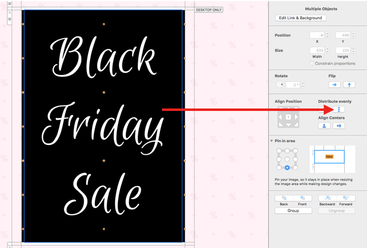
For a vertical group, distribute the selected objects from top to bottom:

Select three objects for even vertical distribution

Objects evenly distributed vertically in an image area

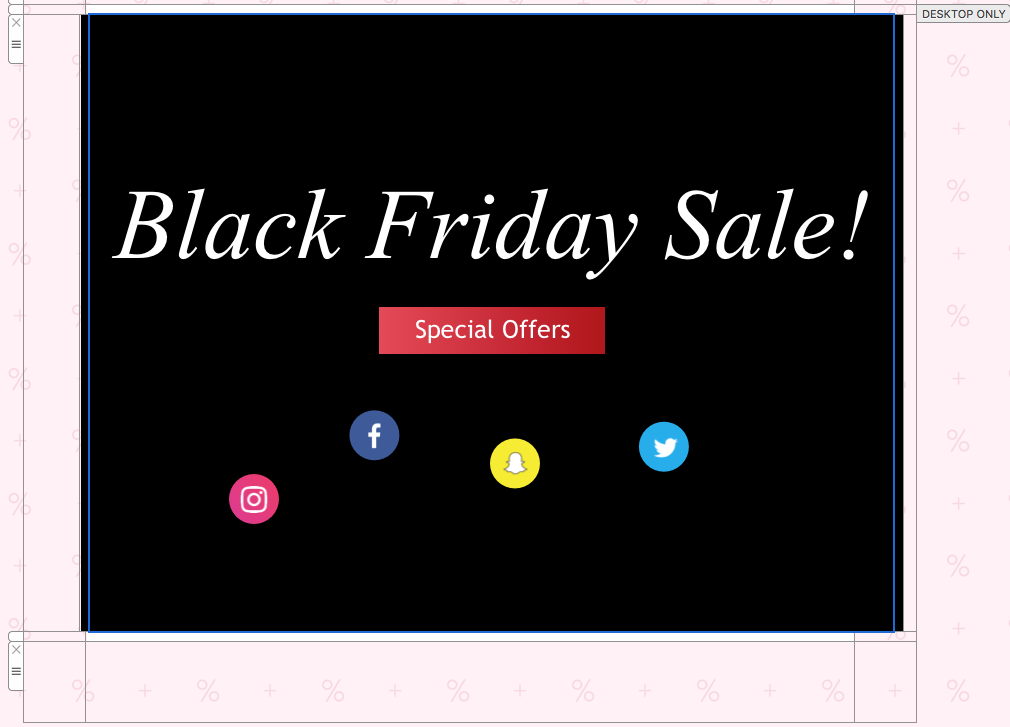
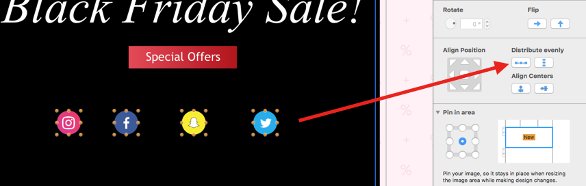
For a horizontal group, distribute the objects from left to right:

Select icons for even horizontal distribution

Icons evenly distributed horizontally in an email design

Choose alignment before distribution

Align the selected elements on the relevant axis before distributing them. For a horizontal row of icons, first align their vertical centers, then distribute them horizontally. For a vertical list, align the left edges or horizontal centers before applying vertical distribution.

If objects overlap, arrange their layer order first. The guide to moving objects to the front or back explains how to correct stacking without changing alignment.

Check desktop and mobile layouts

Preview both layouts after using the alignment & distribution tools. Equal spacing on a wide desktop image area may feel too loose on a phone. Confirm that icons remain large enough to understand, labels do not overlap, and the group stays inside the available area.

Send a test email and review the arrangement in desktop and mobile email clients. Check visual spacing, image scaling, and any links attached to the aligned objects.

Troubleshoot alignment problems

If a control moves an object in an unexpected direction, undo the change and confirm whether you selected an inner or outer button. If several objects do not align together, hold Command and verify that every intended element is visibly selected.

Distribution requires at least three elements. If the spacing still looks uneven, confirm that the first and last objects define the desired range and that hidden or overlapping elements are not included. For repeated elements, the guide to adding and duplicating graphics and shapes can help you build the group before aligning it.

Use these alignment & distribution tools as the final precision step after objects have the correct size, content, and layer order. That sequence keeps the layout predictable and makes later edits easier to verify.

How to Use the Mail Designer Pinning Tool

By Hans-Peter Creative Tools

How to Use the Mail Designer Pinning Tool

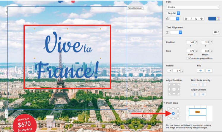
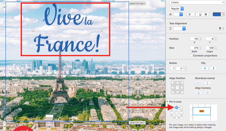
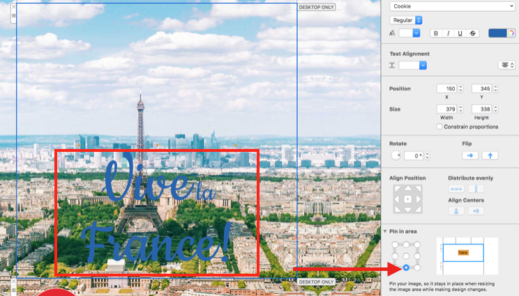
The Mail Designer pinning tool keeps design elements anchored inside an image area while you edit or resize an email layout. Use it when a headline, logo, badge, or button must stay aligned to the top, center, or bottom of its layout block across different newsletter sizes.

Find the pinning controls

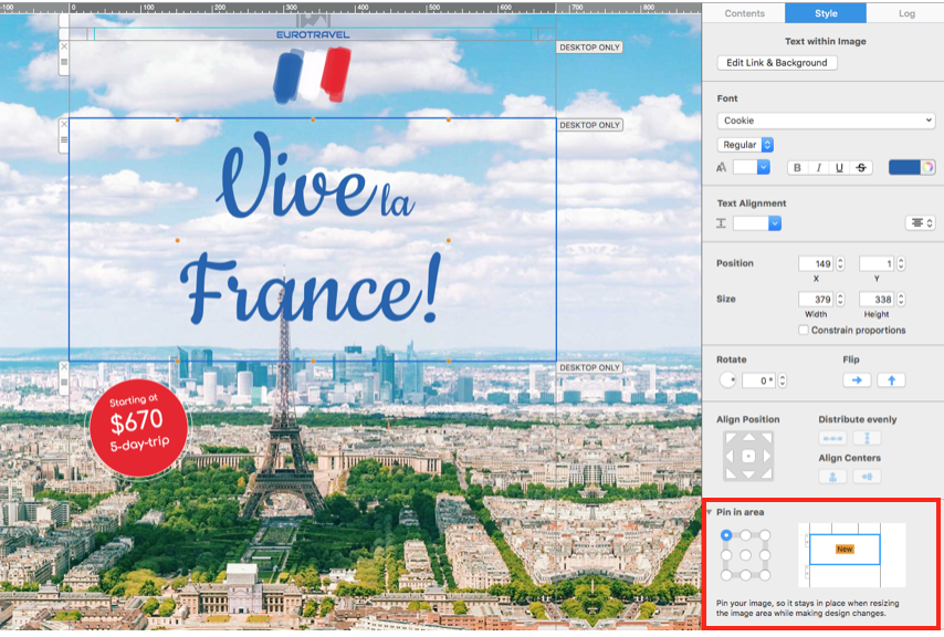
Select the design element you want to position. In the app sidebar, open the Style options and find the pin control. The visual selector shows the available anchor points and makes it clear where the element will remain fixed inside the image area.

Mail Designer pinning tool anchor selector

Pinning controls in the Mail Designer Style sidebar

Choose the right anchor position

Choose the center anchor when an element should remain centered as the image area changes size. This works well for centered logos, product badges, and short calls to action.

Design element pinned to the center of an image area

Choose the top anchor for titles, headings, or labels that must keep a consistent distance from the upper edge. The element stays at the top even when you resize the surrounding layout block.

Headline pinned to the top of a Mail Designer layout block

Choose the bottom anchor for captions, price labels, or buttons that should remain close to the lower edge of an image area.

Design element pinned to the bottom of an image area

Check the result before sending

After pinning an element, resize the image area and confirm that its position remains correct. Preview both desktop and mobile versions of the email, especially when text wraps differently or an image area becomes narrower. If the element moves unexpectedly, select it again and verify that the intended anchor point is active.

The Mail Designer pinning tool controls placement inside the selected image area; it does not lock an entire layout block on the page. Test the finished design in the Mail Designer preview and send a test email before publishing your campaign.

Use the Mail Designer Shadow Tool

By Hans-Peter Creative Tools

The Mail Designer shadow tool adds depth and separation to text styles, shapes, and images placed in an image area. Use it carefully to clarify the visual hierarchy without making an email look heavy or reducing readability.

Apply a shadow to a design element

  1. Insert or select a text style, shape, or image inside an image area.
  2. Open the Style controls in the sidebar.
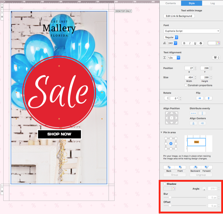
  3. Find the Shadow section for the selected element.
  4. Enable the shadow checkbox to apply the effect.
  5. Adjust offset, blur, color, and angle while previewing the complete email.

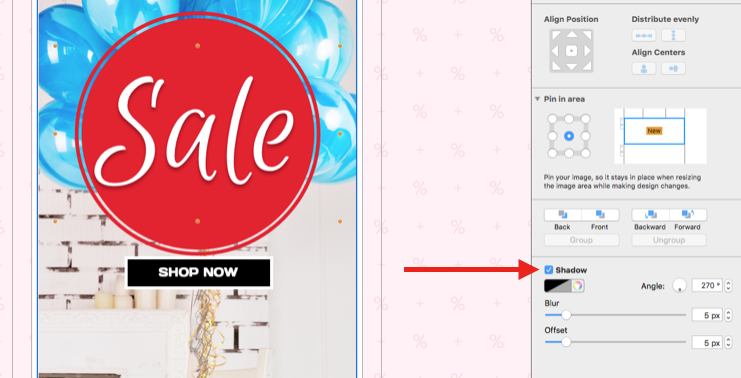
Shadow controls in the Mail Designer 365 Style sidebar

The shadow controls appear for supported content in an image area. If the option is not visible, confirm that the intended element—not the surrounding layout block—is selected.

Enable the shadow effect for a selected design element

Adjust the shadow offset

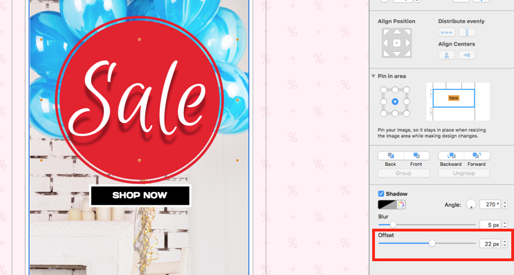
Offset controls how far the shadow sits from the object. Move the slider to increase or reduce the distance. A small offset can separate an element from its background, while a large offset creates a more dramatic effect and may require extra space around the object.

Adjust the shadow offset with the Style sidebar slider

Control shadow blur

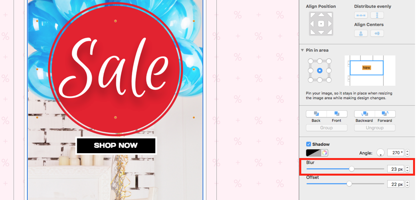
Blur softens the edge of the shadow. Increase it for a diffuse effect or reduce it for a sharper edge. Review the shadow at the size recipients will see rather than judging only a zoomed-in canvas. Very soft shadows can disappear on some displays, while very sharp shadows may resemble an outline.

Change the shadow blur amount in Mail Designer 365

Choose a suitable shadow color

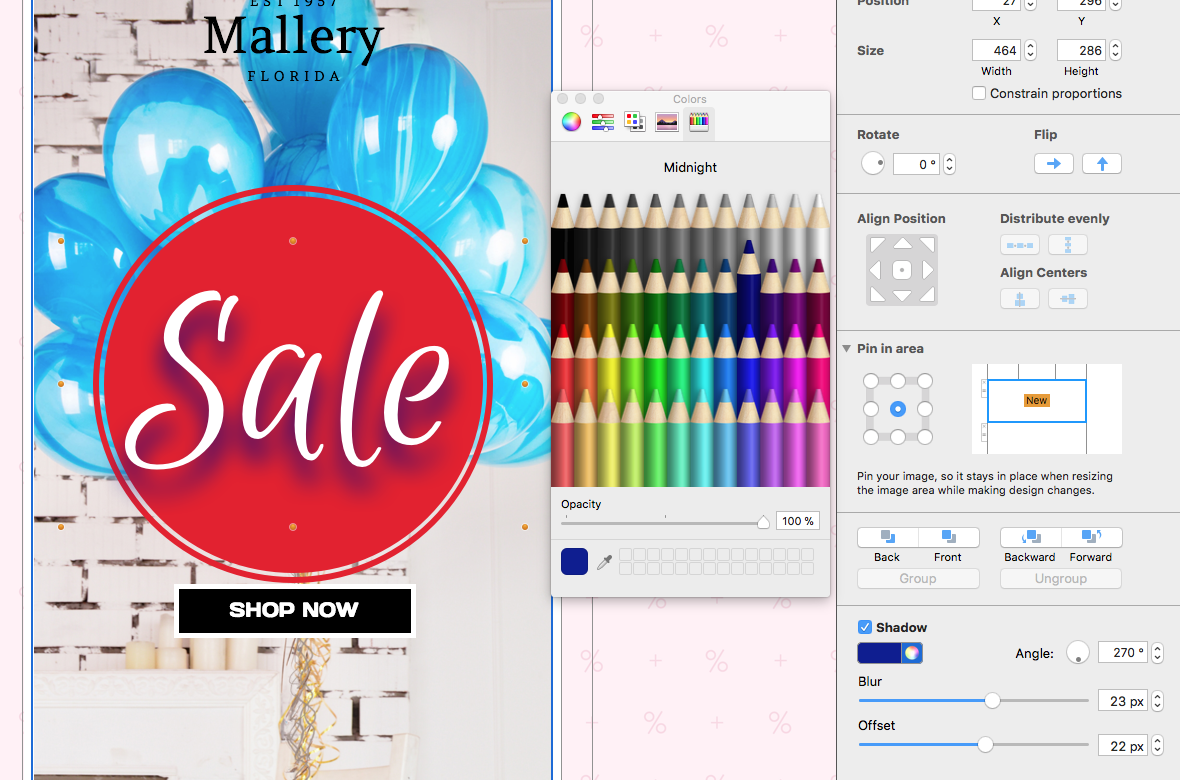
Open the color control and select a shade that fits the design. Dark gray often creates a softer result than pure black, but the correct choice depends on the background and brand palette. Check contrast in both light and dark surroundings and avoid a shadow color that makes text harder to read.

Choose a shadow color with the Mail Designer color picker

Set the shadow angle

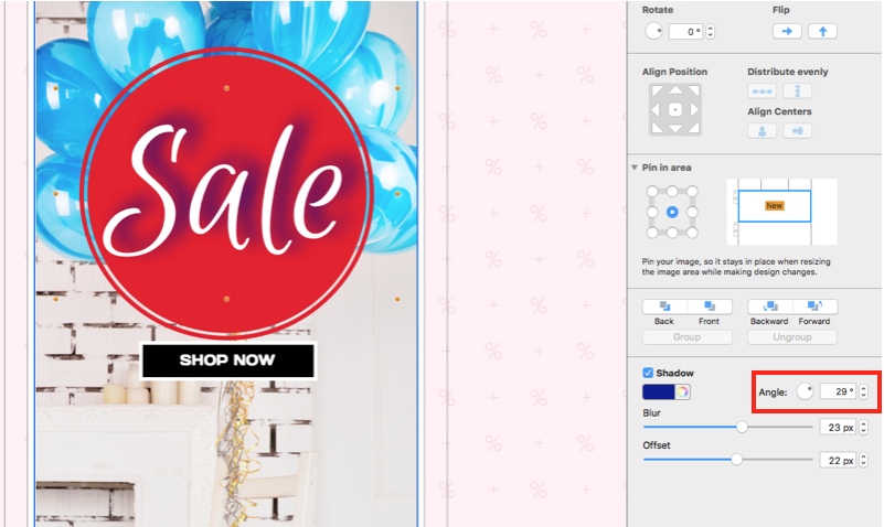
Use the rotator or enter a value to control the direction in which the shadow falls. Apply a consistent angle to related objects so the design appears intentional. If several elements use conflicting shadow directions, the layout can look visually inconsistent.

Set the shadow angle with the rotator or a numeric value

Use shadows accessibly in email design

A shadow should be decorative support, not the only way to distinguish essential text or controls. Maintain sufficient contrast between the element and its background without the shadow. Keep important copy as live text where possible, and do not rely on a shadow to communicate whether an item is active, selected, or available.

Use restraint on small text. Strong blur or offset can reduce legibility, especially on mobile or lower-resolution displays. Shadows are usually most effective on a headline, product image, badge, or simple shape rather than every object in the email.

Test the finished shadow effect

  • Preview the complete email at desktop and mobile widths.
  • Check light and dark inbox themes where possible.
  • Confirm that the object remains readable without depending on the shadow.
  • Compare related elements for consistent offset, blur, color, and angle.
  • Send a proof and review the effect at normal viewing size.

Keep shadow settings consistent across a campaign

When several campaign elements need depth, define a small set of approved shadow treatments instead of adjusting every object independently. Record the offset, blur, color, and angle used for headlines, images, or badges. Consistent settings make later edits faster and help new sections match the original design.

Recheck the effect whenever an object or background color changes. A shadow that works on a light section may become distracting or invisible on a darker one. Treat each shadow as part of the complete color and spacing system rather than an isolated decoration.

Troubleshooting the Mail Designer shadow tool

  • The controls are missing: select a supported text style, shape, or image inside an image area.
  • The shadow is clipped: reduce the offset or provide more space around the element.
  • The effect looks too strong: reduce offset, increase blur, or choose a softer color.
  • Text is difficult to read: improve the base text/background contrast and simplify the shadow.
  • Shadows look inconsistent: reuse the same settings for related elements.

Use this workflow for visual shadows created inside Mail Designer 365. For Illustrator effects, CSS box-shadow, or email privacy and alias features, follow the documentation for those separate tools.

Border controls in Mail Designer 365

Email Border: Using the Mail Designer 365 Border Tool

By Hans-Peter Creative Tools

How to Add an Email Border in Mail Designer 365

An email border created with the Mail Designer 365 border tool adds a clear outline to images and shapes without editing the original artwork in another app. Borders can separate a photo from a similarly colored background, create a framed-card effect, or add a consistent visual detail across several design elements. The steps below explain where to find the controls and how to choose an appropriate width, color, and style.

1. Select an image or shape

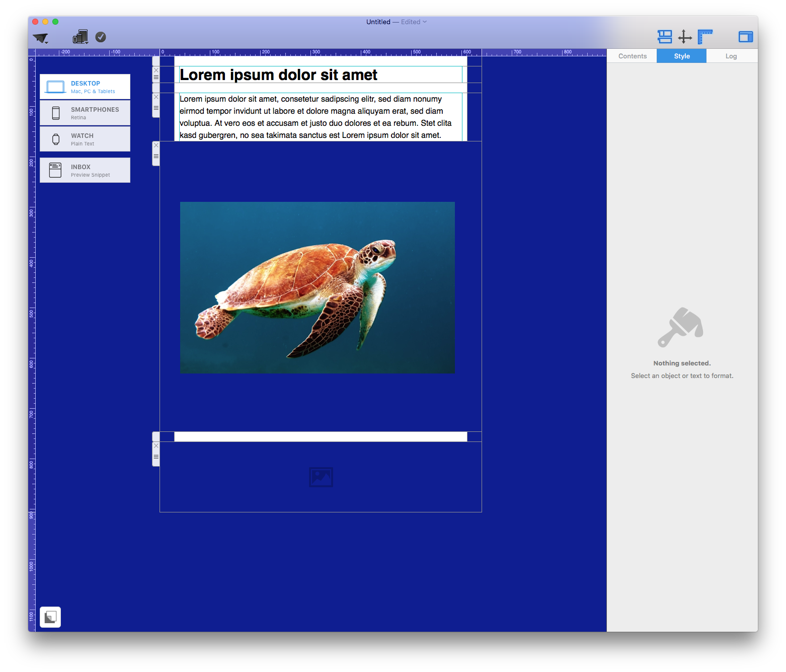
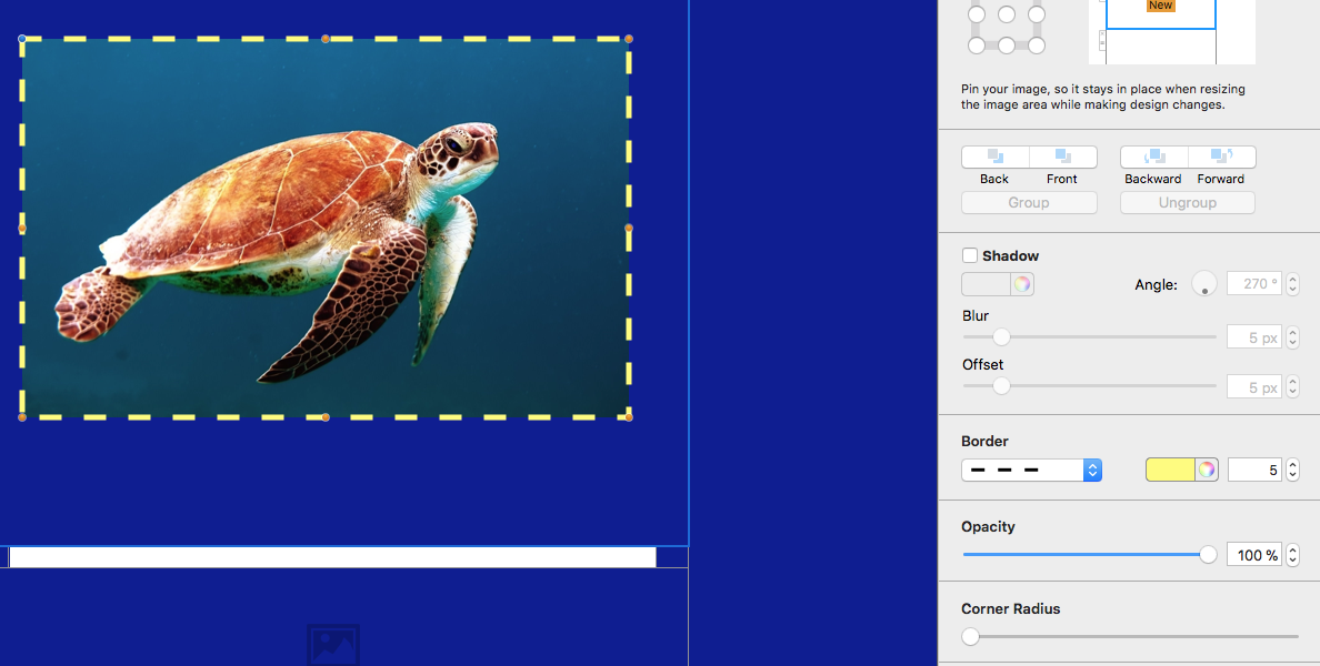
Insert an image or shape into an image area, then select that design element. In this example, the selected photo comes from Unsplash. Work on one element at a time so that the border settings are applied only where you intend them to appear.

Image selected before opening the Mail Designer 365 border tool

2. Open the border controls

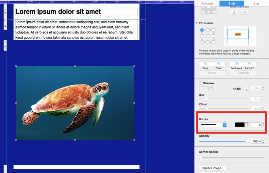
With the image or shape selected, open the Style menu and locate the border controls. If the controls are not visible, confirm that the correct design element is selected. Text areas and layout blocks use different settings, so selecting the image or shape itself is important.

Border controls in the Style menu in Mail Designer 365

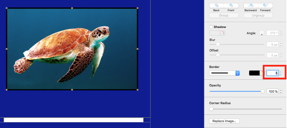
3. Set the border width

Use the arrows to increase or decrease the width, or enter a value manually and press Return. Start with a subtle width and preview the result at the size recipients will actually see. A border that looks balanced on a large desktop canvas can feel heavy on a smaller email layout. When several elements belong to the same group, reuse the same width to create a consistent visual system.

Adjusting border width with the Mail Designer 365 border tool

4. Choose a border color

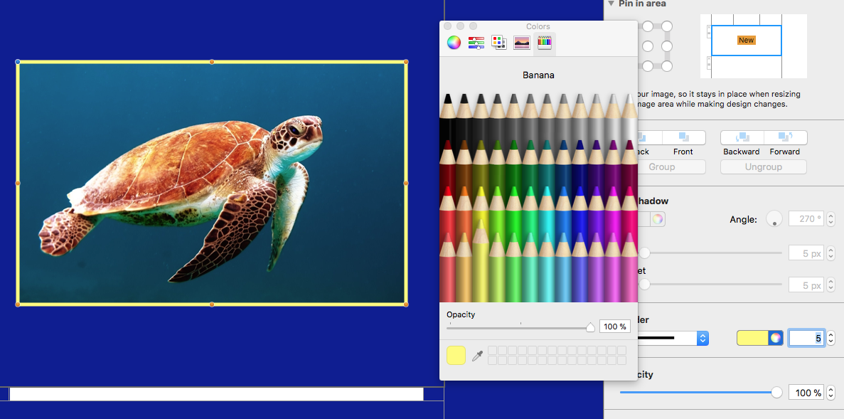
Open the color picker and select a color that supports the design rather than competing with it. A neutral shade can define an image gently, while a brand color can connect the element to buttons, headings, or other campaign accents. Check the result against the surrounding background and keep sufficient contrast so that the edge remains visible.

Choosing a border color in Mail Designer 365

5. Select a border style

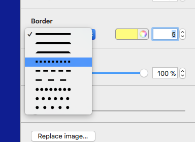
Choose a border style from the menu to complete the effect. Solid borders are usually the most versatile option for product images, cards, and callouts. Alternative styles can work for invitations or decorative campaigns, but use them consistently and avoid mixing too many treatments in one email.

Selecting a border style for an image or shape

Border style examples

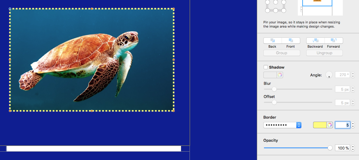
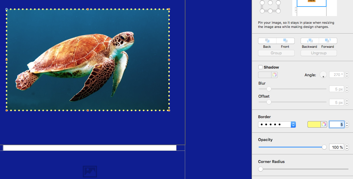
The examples below show how different widths, colors, and styles change the same type of element. Use them as a reference, then adjust the settings to fit your own campaign. A restrained border can improve separation, while a stronger frame can turn an image into a deliberate focal point.

Example of a border style applied to a design element
Second example of an image border in Mail Designer 365
Third border treatment created with the border tool

Troubleshooting the border controls

If a border does not appear, select the image or shape again and verify that the width is greater than zero. If the border looks uneven, confirm that you are editing the intended element and that the image area has not been replaced or covered by another object. When a border seems too strong on mobile, reduce the width rather than changing several unrelated layout settings.

For a color that appears different than expected, compare the border against both the canvas background and the image itself. Very similar colors may disappear, while highly saturated colors may dominate the content. If you are reproducing a brand style, note the chosen color, width, and line style so the same settings can be used on other elements. After making changes, send a fresh test email instead of relying only on the editor preview.

Practical checks before sending

  • Preview the design at desktop and mobile widths.
  • Confirm that repeated elements use the same border settings.
  • Check that the border remains visible against the surrounding background.
  • Send a test email and review the result in the email clients your audience uses most.
  • Keep decorative borders secondary to the message and call to action.

The Mail Designer 365 border tool is most effective when it supports a clear hierarchy. Use borders to separate, group, or emphasize content, and keep the treatment consistent throughout the campaign.

Using Mail Designer 365's image effects

By Creative Tools

Mail Designer 365 comes with a selection of built-in effects which you can easily apply to your images. Here's how you can make the most of them...

How to access image effects in Mail Designer 365

Drag an image into an image area:


Use the re-size tools to adjust your image to fit the image area:

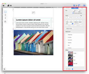
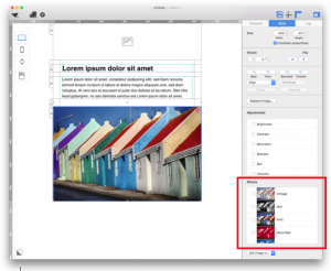
Click on your image - notice how this will bring up the 'Style' tab on the menu to the right of your page. In this tab you will be able to see the full list of image adjustment effects and filters:


Applying filters

Click on your image and the 'Style' tab will open. Under 'Effects' you will find multiple filters:

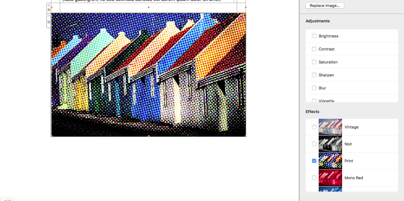
To apply a filter, simply check the box next to your chosen filter:

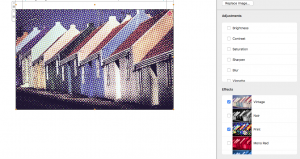
You can also apply more than one filter at once. To do this, just check multiple boxes to create mixed filter effects:


Using the image adjustment tools

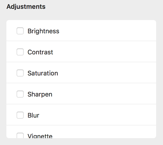
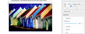
To adjust your image, click on the image and once again you will see the 'Style' tab. Under 'Adjustments' you can find multiple effects:

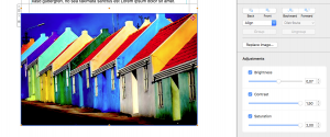
To change an element of your image's appearance, check the box next to the effect and use the toggle bar to increase or decrease the desired effect:

You can edit as many elements of your image as you like:


Privacy Settings / Datenschutz-Einstellungen