Eye Catcher Design: 3 Ideas for Email Campaigns

By Hans-Peter Advanced Design Techniques

An eye catcher is a small visual element that draws attention to an offer, product feature, deadline, or other important detail in an email design. Used carefully, it helps readers understand the main message before they read the supporting copy.

This guide explains three practical eye catcher design ideas and shows how to build them in Mail Designer 365 without overwhelming the rest of your campaign.

What Is an Eye Catcher in Email Design?

An eye catcher is usually a badge, label, shape, or short line of text placed near the content you want readers to notice first. Common examples include “New,” “20% Off,” “Limited Time,” “Free Shipping,” or a date for an upcoming event.

The most effective designs create contrast while remaining consistent with the brand. They support the email hierarchy instead of competing with the headline, product image, price, and call-to-action button.

Three Eye Catcher Design Ideas

1. Promotional badge

Place a circular or angled badge over the corner of a product image to highlight a discount, new arrival, or special bundle. Keep the wording short and choose a color that is easy to distinguish from the image behind it.

2. Product highlight label

Use a simple rectangular label to identify features such as bestseller, organic, handmade, or back in stock. This works well in product grids because readers can compare several items quickly without adding long paragraphs.

3. Urgency or event marker

A date label, countdown message, or limited-time banner can make a deadline easier to spot. State the actual deadline clearly and avoid false urgency. Readers should be able to understand when the offer ends without searching through the email.

How to Create an Eye Catcher in Mail Designer 365

Start with a shape from the design tools, adjust its fill and border, then add a short text element. Position the finished graphic close to the relevant image or offer. Check that the text remains readable at mobile size and that the shape does not hide important product details.

The video below demonstrates three creative styles and the steps for building them in Mail Designer 365:

Eye Catcher Best Practices

  • Use one main eye catcher per content section.
  • Keep the message specific and easy to scan.
  • Maintain strong color contrast and readable type.
  • Do not place essential information only inside an image.
  • Preview the email on desktop and mobile before sending.

For more design demonstrations, explore our Mail Designer 365 video tutorials.


Email Blending: 3 Ways to Use Blend Modes

By Hans-Peter Advanced Design Techniques, Blend Modes

Email blending lets you combine photos, colors, textures, and graphic elements in a single Mail Designer 365 composition. Blend Modes change how the colors in one selected image interact with the layer behind it, giving you a quick way to create depth and visual effects without rebuilding the artwork in another app.

The tutorial on this page introduces three practical ways to use Blend Modes in an email design. Use the examples as starting points, then adjust the mode, image position, and contrast to fit your own campaign.

What email blending changes

A Blend Mode does not simply change an image's transparency. It compares the colors of the selected element with the colors behind it. The result depends on both layers, so the same mode can look very different when you swap a photo, change a background color, or move the image.

Before experimenting, keep a copy of the original design or duplicate the relevant element. This makes it easy to compare the blended result with the unedited version and return to a clean starting point.

1. Blend a texture into a background

A texture can add depth to a flat color area without covering the entire composition. Place a suitable texture image over the background, select it, and try different Blend Modes. Reposition or crop the image so the texture supports the message instead of competing with it.

Check quiet areas as well as detailed areas. A subtle effect around the headline can help the text stand out, while a strong texture immediately behind small copy may reduce readability.

2. Combine a photo with a color layer

Email blending can help a photo feel more connected to the campaign palette. Place the photo and color element in the intended order, select the top element, and compare the available Blend Modes. The underlying colors determine the result, so test the effect with the actual background used in the email.

Keep skin tones, product colors, and logos accurate. If blending changes an important brand or product detail, reduce the visual effect or leave that element unblended. Decorative impact should never make the content misleading.

3. Create layered graphic effects

Blend Modes can also bring separate shapes, lettering, or illustrations together. Overlap the elements intentionally and choose a mode that produces a clear boundary or interesting color interaction. This is useful for feature graphics, event announcements, and hero sections where a layered composition supports the message.

Use the effect consistently. One strong blended area usually creates a clearer visual hierarchy than several competing effects across every content block.

Watch the Blend Modes tutorial

The video demonstrates three Blend Mode ideas you can try in Mail Designer 365:

Check readability and fallback appearance

After applying an email blend mode, zoom out and review the whole design. Confirm that headings, body text, buttons, and important details still have enough contrast. Then preview the message at desktop and mobile widths, because cropping and stacking can change which layers overlap.

Also consider recipients who view messages with images disabled. Keep essential information as live text rather than embedding it only in a blended graphic. Add concise alternative text to meaningful images so the message still makes sense when an image cannot be displayed.

Test before sending

  • Send a test email to addresses you can check in several common email apps.
  • Confirm that the blended artwork renders as expected and does not obscure text or links.
  • Click every important link and review the message in light and dark viewing conditions where available.
  • Check that the design still communicates the campaign purpose without the decorative effect.

For more examples, explore the Mail Designer 365 video tutorials.

Creating a Sketched Headline Effect

By Advanced Design Techniques

An eye-catching header is all you need to grab readers' attention from the get go. This video tutorial shows you how to create a unique sketched headline effect to use in your email newsletters...

You can find even more video tutorials on this page.

Creating Call to Action Buttons

By Advanced Design Techniques

The CTA (call to action) button is an essential part of any marketing email. In order for your button to be effective and get readers on to your website, it needs to stand out from the rest of your design.

This video shows you 3 amazing button styles you can try out in your next email design...

You can find even more video tutorials on this page.

Use Hex Color Values in Mail Designer 365

By Hans-Peter Advanced Design Techniques

Hex color values let you apply consistent brand colors to shapes, backgrounds, text, buttons, and other supported elements in Mail Designer 365. A hex value records an RGB color in a compact format such as #3D4DBB, making it easier to reuse the same approved color across several email designs.

How to use hex color values in Mail Designer 365

  1. Select the object you want to color, such as a shape or supported design element.
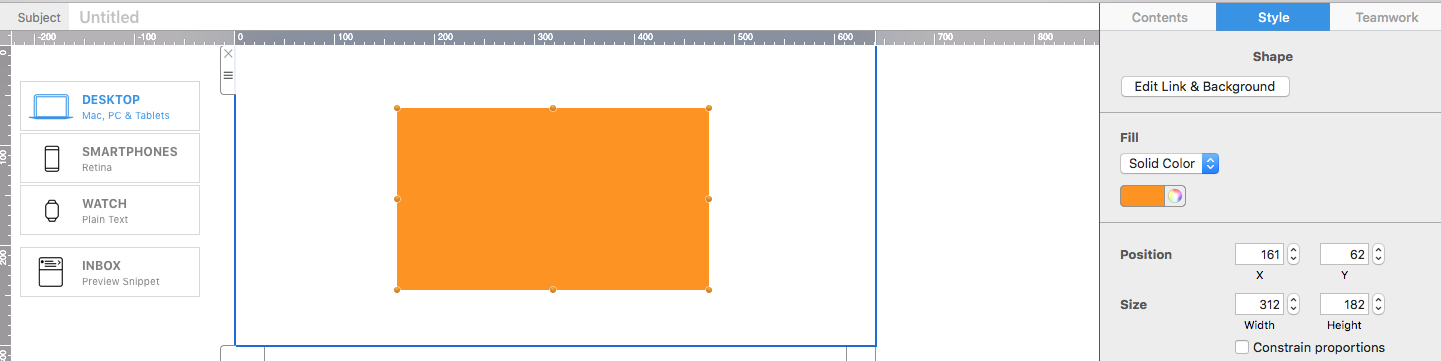
  2. Open the relevant color control under the Style area.
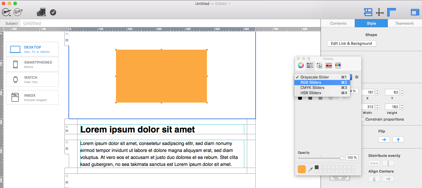
  3. In the macOS color panel, switch to the Color Sliders view.
  4. Select RGB Sliders from the available color models.
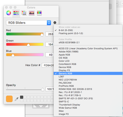
  5. Open the settings menu, choose 8-Bit (0–255), and select the appropriate RGB profile. Generic RGB is a practical choice for many email-design workflows.
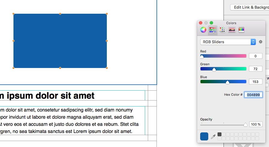
  6. Enter the approved hex code in the hexadecimal color field and confirm the result in the design.

Mail Designer 365 Style color control for a selected design object

The exact labels and appearance of the macOS color panel can vary by system version, but the workflow is the same: open the sliders, choose RGB, and enter the hexadecimal value.

Color Sliders panel with RGB Sliders selected

Choose the RGB value format and profile

Use the settings control in the color panel to choose the 8-Bit (0–255) value format. This matches the common way RGB colors are described with three channel values between 0 and 255. Select the profile used by your design workflow; Generic RGB is a useful default when no different approved profile has been specified.

RGB color settings with 8-Bit values and Generic RGB profile

Enter the hex value exactly as supplied by your brand guide. Hex codes use six characters representing red, green, and blue. For example, the pairs in #3D4DBB correspond to those three channels. Uppercase and lowercase letters describe the same value, but a consistent style makes shared documentation easier to review.

Hexadecimal color value field in the macOS RGB color panel

Build a reusable email color system

Keep a short list of approved hex color values for primary text, secondary text, backgrounds, accents, links, and buttons. Record the intended use beside each value instead of keeping an unlabeled collection of codes. This reduces accidental substitutions and helps different team members produce consistent campaigns.

Use a limited palette. A primary brand color, one accent, neutral backgrounds, and readable text colors are usually more effective than many competing shades. Reserve the strongest accent for important actions so recipients can understand the visual hierarchy quickly.

Check color contrast and accessibility

A correct brand hex code is not automatically suitable for every background. Check the contrast between text and its background, including buttons and linked text. Do not communicate meaning through color alone; pair warning, status, or availability colors with clear words or icons that have appropriate text alternatives.

Preview the design in light and dark inbox themes where possible. Some inboxes can alter surrounding colors, so verify that text, borders, and buttons remain distinguishable. Also check the email with images disabled because essential labels and calls to action should remain readable as live content.

Test hex colors before sending

  • Compare the entered value with the approved brand specification.
  • Check every object that should use the same color.
  • Preview desktop and mobile layouts at realistic brightness.
  • Test text and button contrast against each background.
  • Send proofs to common inboxes and review dark mode.

Troubleshooting custom colors

  • The hex field is not visible: switch the macOS color panel to Color Sliders and select RGB Sliders.
  • The result looks different: verify the six-character code, 8-Bit format, and selected RGB profile.
  • The wrong object changes: select the intended shape, text, background, or button before opening its color control.
  • The color is hard to read: choose an approved higher-contrast pairing rather than forcing the same value onto every background.
  • Team designs are inconsistent: maintain one documented palette with names, values, and permitted uses.

Use this workflow when you need to apply an approved brand color inside Mail Designer 365. For HTML/CSS color coding or creating a complete brand guide, follow the documentation for those separate workflows.

Polygram shape in Mail Designer 365

Polygram Shape: Create Polygons and Polygrams

By Hans-Peter Advanced Design Techniques

Creating a Polygram Shape and Polygon

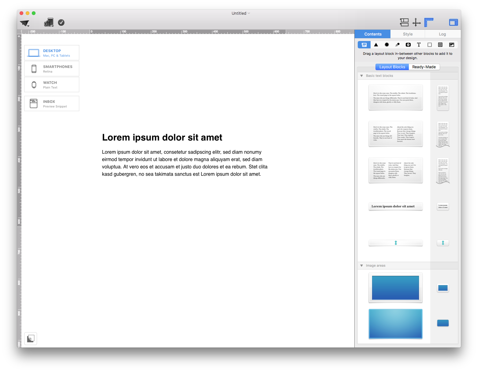
A polygram shape gives you a customizable star-like graphic, while a polygon creates a closed shape with straight sides. Mail Designer 365 lets you build both from its shape tools, then adjust the size, fill, color, number of sides or tips, and indentation. Start by adding an image area to your email design and opening the Contents section.

Contents panel for adding an image area in Mail Designer 365

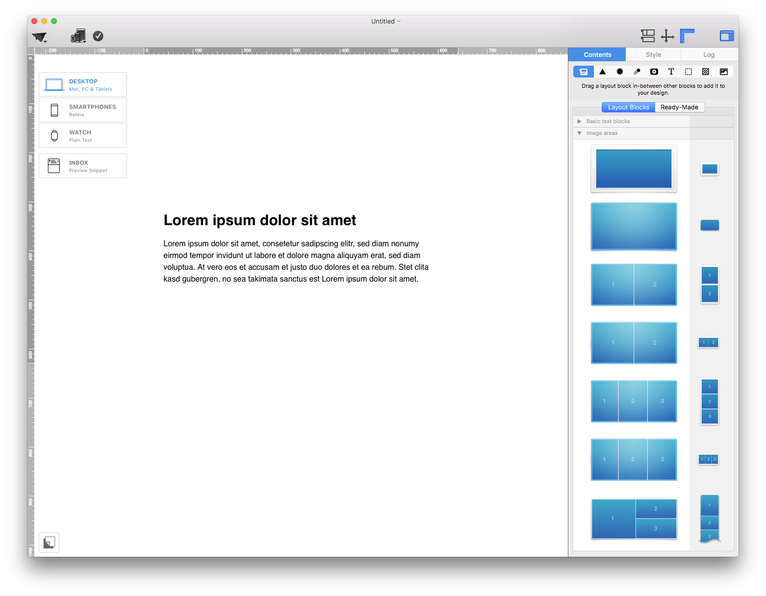
Then, in the layout tab, scroll down to "Image areas:"

Image area layout options in Mail Designer 365

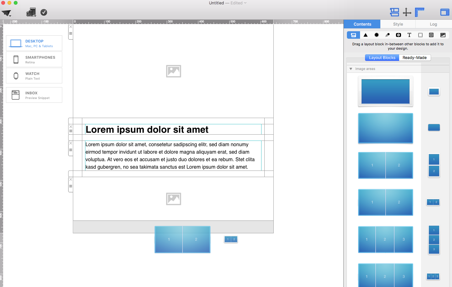
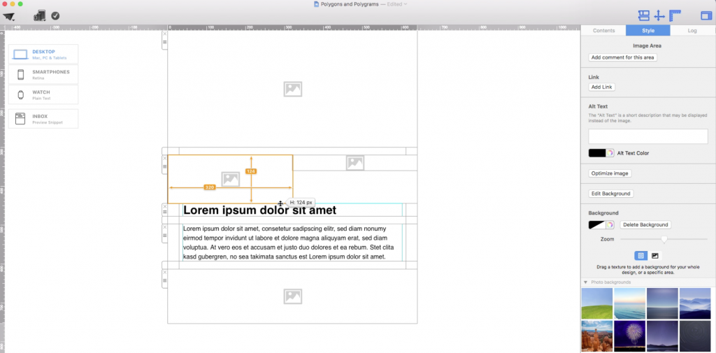
Drag a layout block with an image area into your template. It is up to you how many image areas you want. In this example, we will use a layout block with 2 image areas:

Layout block with two image areas

Feel free to adjust the size of your image areas according to your needs. Just drag the resize controls to the appropriate direction (up, down, right, left):

Resizing image areas before adding shapes


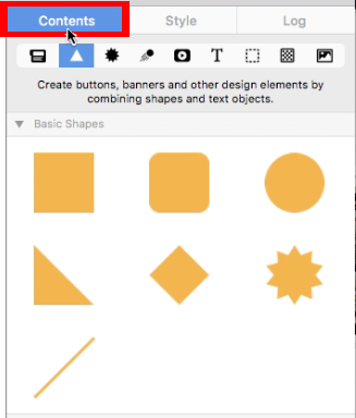
Once you finished adjusting the size of your image areas, go to the "Contents" section again:

Contents section in Mail Designer 365

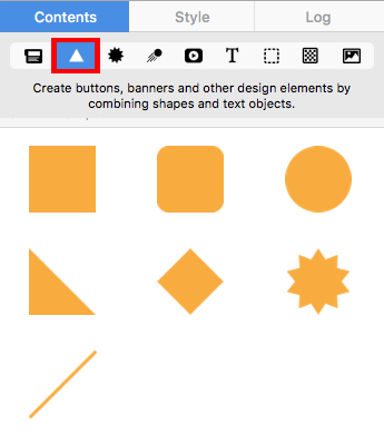
Then, click on the "Shape" button:

Shape button in the Contents section

Polygons

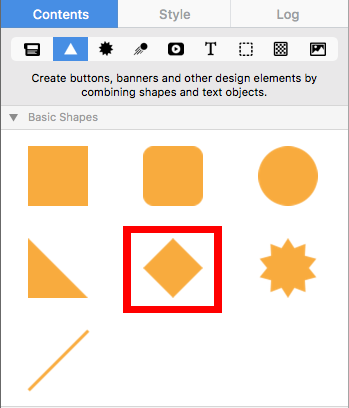
For polygons, we recommend choosing the rhombus/diamond shape under the "Basic Shapes:"

Rhombus basic shape used to create a polygon

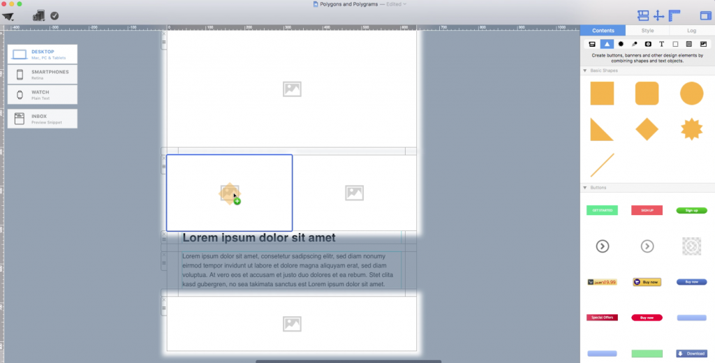
Drag the rhombus shape into an image area:

Rhombus shape placed in an image area


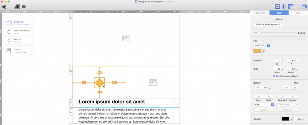
You can adjust the size of the shape by dragging the resize controls towards the direction you want the shape to expand to:

Resizing a polygon shape


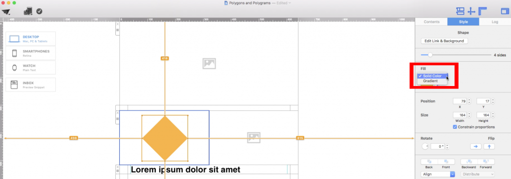
You can choose to change the fill style of your shape, whether you want a solid color or a gradient:

Choosing a solid or gradient polygon fill

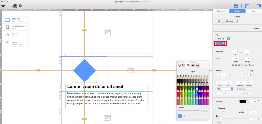
Don't forget to choose the color that you want:

Selecting a color for the polygon

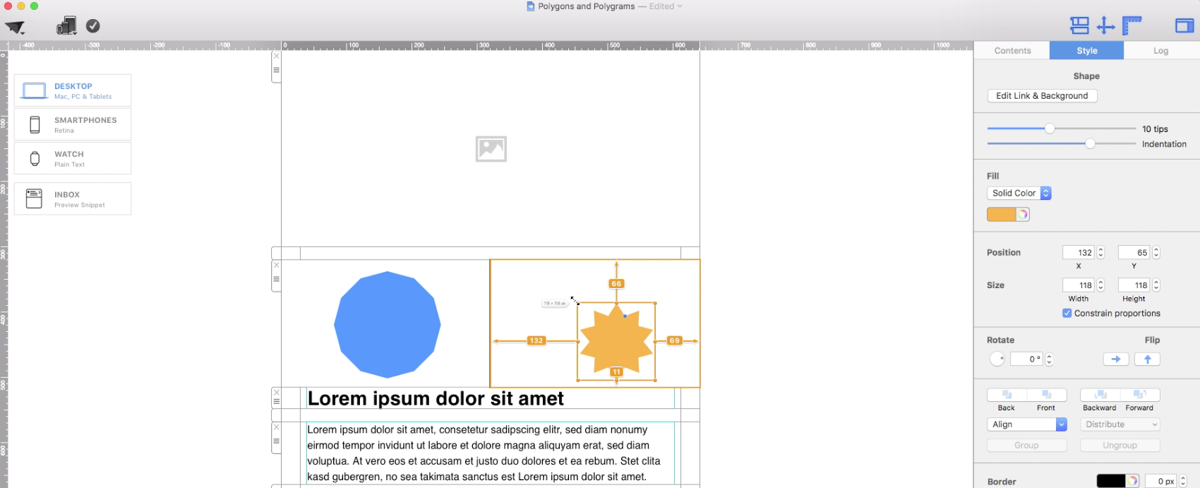
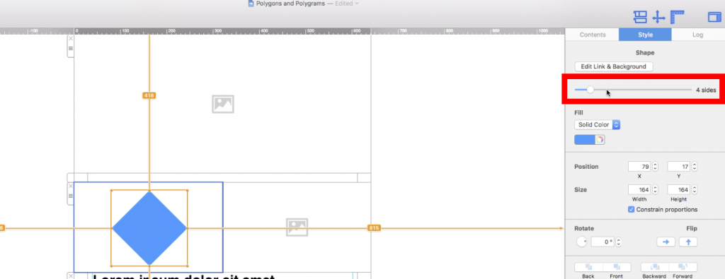
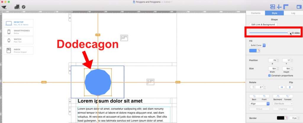
On the right side, under the "Style" section, you will notice a slide bar for the number of sides:

Number of sides slider for polygon shapes

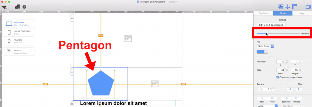
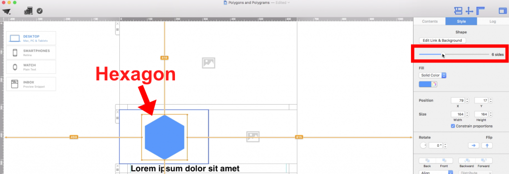
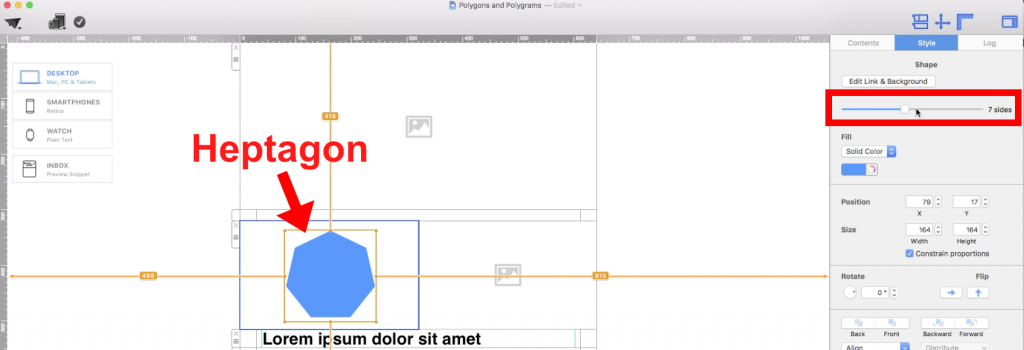
You can slide this bar to the number of sides that you want. The maximum number of sides is 12, so you can turn the shape all the way into a dodecagon.

Here is a pentagon:

Five-sided pentagon example


Hexagon:

Six-sided hexagon example


Heptagon:

Seven-sided heptagon example

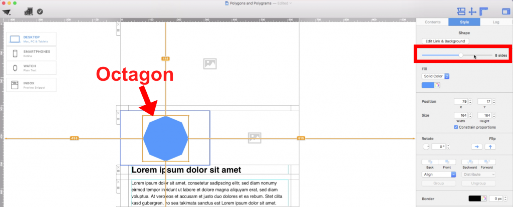
Octagon:

Eight-sided octagon example

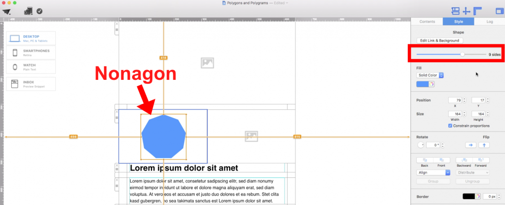
Nonagon:

Nine-sided nonagon example

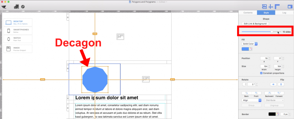
Decagon:

Ten-sided decagon example

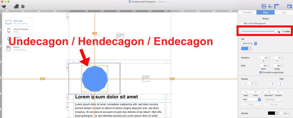
Undecagon/Hendecagon/Endecagon:

Eleven-sided undecagon example

Dodecagon:

Twelve-sided dodecagon example


Polygrams

If you want to use a polygram, go to the "Contents" section.

Contents section used to add a polygram shape

Then, click on the "Shape" button:

Shape button used for a polygram

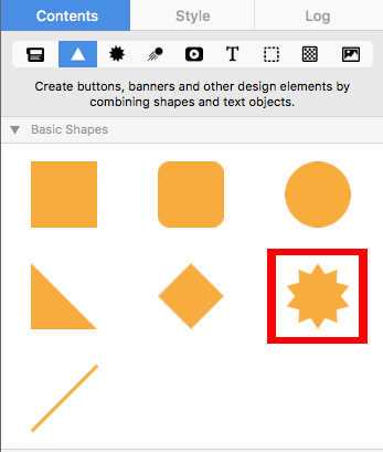
Choose the star-shaped shape:

Star shape used to create a polygram shape


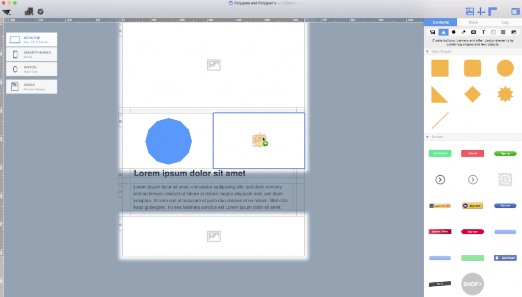
Drag the shape into an image area:

Polygram shape placed in an image area

Adjust the size of your shape by dragging the resize controls towards the direction you want the shape to expand to:

Resizing a polygram shape

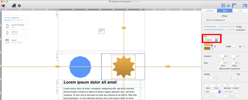
You can also change the fill of the shape. In this example, we are going to change it to gradient:

Applying a gradient fill to a polygram shape

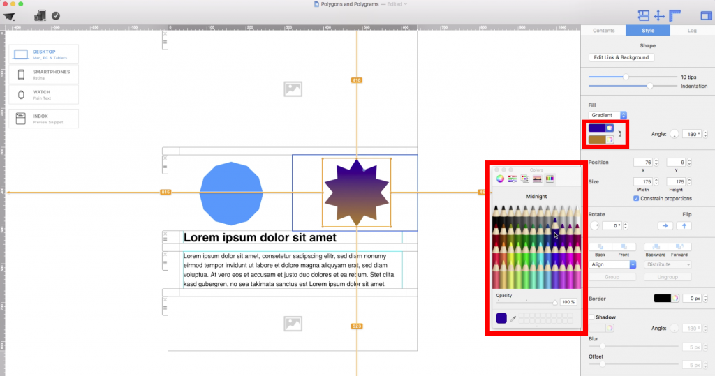
You can also change the color of the shape:

Changing the color of a polygram shape

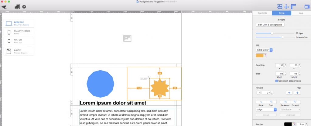
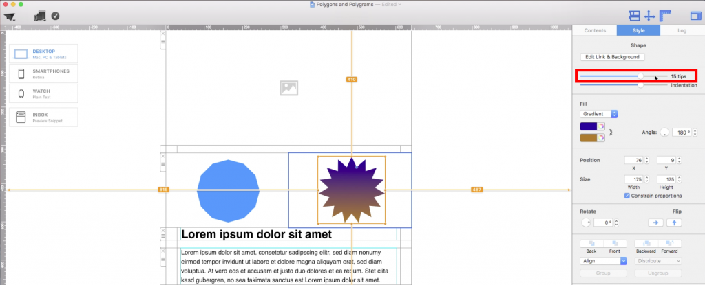
On the right, you will notice a slide bar for the number of tips. Here, you can slide it to change the number of tips your polygram will have. In this example, we turned the polygram into a pentadecagram (15 tips):

Number of tips slider set to a 15-tip polygram


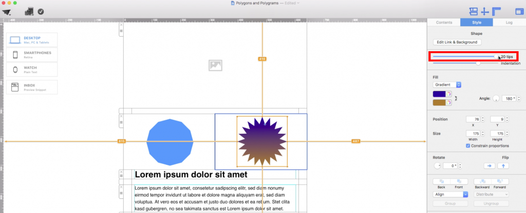
The maximum you can have is 20 tips (icosagram):

Twenty-tip polygram shape example

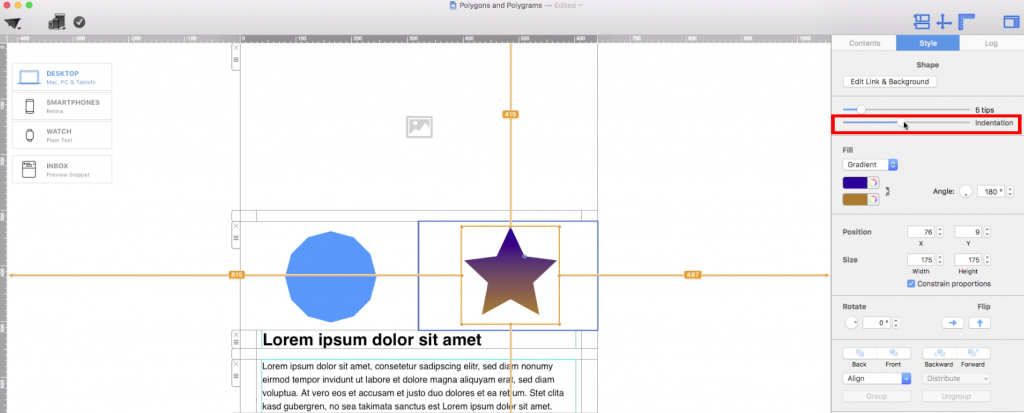
You can also adjust the indentation with the indentation slider:

Indentation slider for a polygram shape


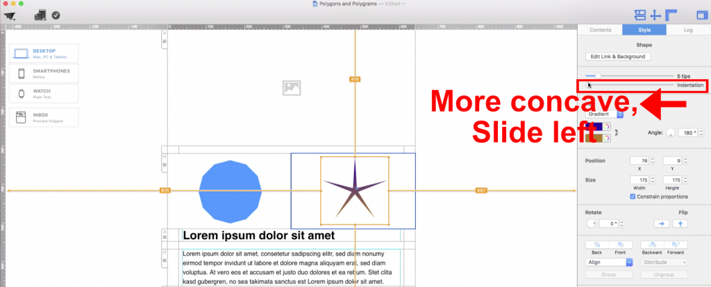
To make the shape more concave, slide the indentation slider to the left.

Creating a concave polygram shape

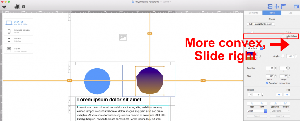
To make the shape more convex, slide the indentation slider to the right.

Creating a convex polygram shape

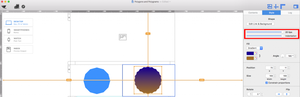
If you were to choose 20 tips and slide the indentation slider all the way to the right, you will get a polygon with 40 sides (Tetracontagon). With Mail Designer 365, you definitely have a lot of room to create the polygon and/or polygram that you want:

Forty-sided polygon created from a 20-tip polygram


Practical tips for polygon and polygram shapes

Choose the shape based on the role it plays in the email. A polygon can frame a label, price, or short callout, while a polygram shape works well as a decorative badge or emphasis element. Keep important text readable and avoid placing long copy inside a small or highly indented shape. When several shapes appear in one design, reuse the same fill colors and related dimensions so the result looks intentional.

If a shape is difficult to select or resize, confirm that you are working inside the correct image area. Adjust the image area first, then refine the shape. For a polygram, change the number of tips before fine-tuning indentation, because the two controls affect the silhouette together. Preview the design at desktop and mobile widths and send a test email to confirm that the shape, color contrast, and surrounding content remain clear.

Use decorative graphics to support the message rather than replace it. Essential offer details and calls to action should also be available as live text and links.


Grouping design elements

By Hans-Peter Advanced Design Techniques

Why group design elements together?

Grouping elements together makes it easier to simultaneously move the objects that belong together within your email.

To group elements together

Drag across two or more elements to select them together and then click “Group” from the bottom of the sidebar.

Or hold the command key and click on the objects you want to group. After you select all of your desired objects, then click "Group."

Grouping example

Here we’ve selected 3 elements: the “Sale” text, the description, and price and the strikethrough line:

You can now move the elements around together. All of the elements will be treated as a single element, making it much easier to move them:

Ungroup the included text objects

Several of the text objects that we include are images and text objects grouped together. You can ungroup these for greater control over the look of a certain element – just click “Ungroup” from the sidebar:


Moving objects to the front or back

By Hans-Peter Advanced Design Techniques

When graphics, shapes, images, or styled text overlap in an image area, you can move objects to the front or back to control which element is visible. Mail Designer 365 provides commands for moving an object all the way to the front or back and for shifting it one step forward or backward.

Use these controls to build layered artwork while keeping important text, product details, and calls to action readable. Before changing the order, select the exact object you want to move and identify which other elements it should appear above or below.

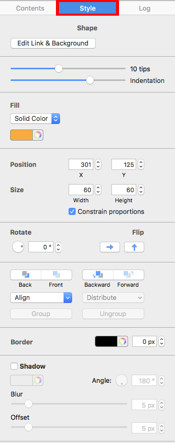
Select the object and open the Style tab

Click the graphic element you want to arrange. Mail Designer 365 opens the Style tab on the right, where the layer-order controls are available.

Selected graphic object with the Style tab open

If a different object moves, undo the action and click the intended element again. Selection handles help confirm which item is active, especially when several objects overlap.

Understand Front, Back, Forward, and Backward

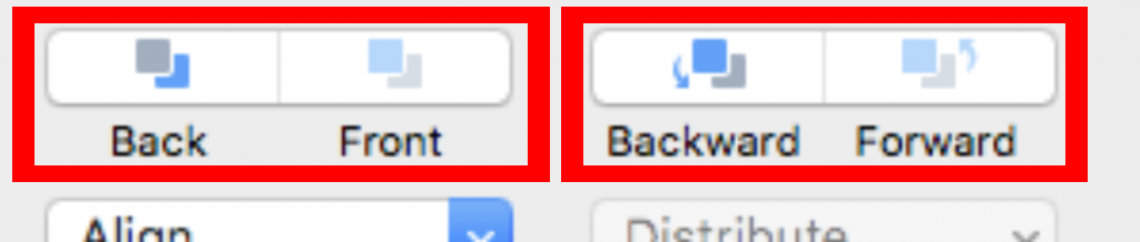
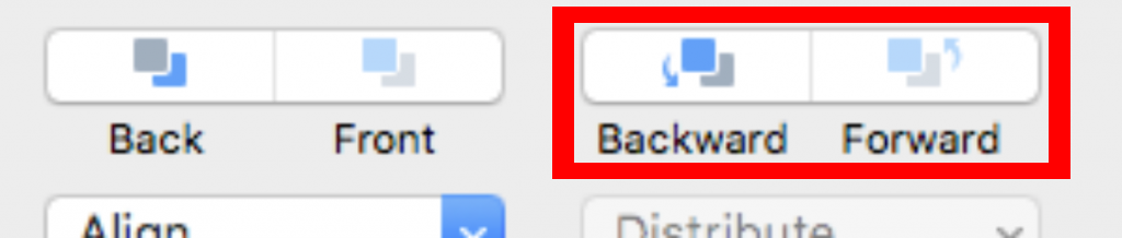
The Style tab includes four commands:

  • Front moves the selected object above all other objects in the same image area.
  • Back moves it behind all other objects in that area.
  • Forward moves it one step closer to the front.
  • Backward moves it one step closer to the back.

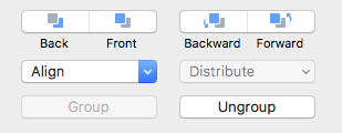
Front Back Forward and Backward layer controls in the Style tab

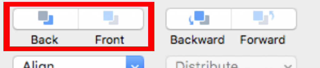
Move an object directly to the front or back

Choose Front when the selected element should sit above every other object, such as a short text label that must remain visible over a decorative image. Choose Back when an object should become the background of the composition.

Front and Back buttons for changing an object's layer position

After moving an object to an extreme position, inspect the entire image area. A background shape should not cover the area unexpectedly, and a front object should not hide another item that recipients need to see.

Move an object one layer at a time

Use Forward or Backward for more precise control. Each click changes the position by one step in the stack. This is useful when an object should sit above one element but remain below another.

Forward and Backward buttons for one-step layer changes

Click once, review the result, and repeat only if necessary. Moving several steps without checking can make it harder to understand where the selected object is in relation to the others.

Use the context menu to arrange layers

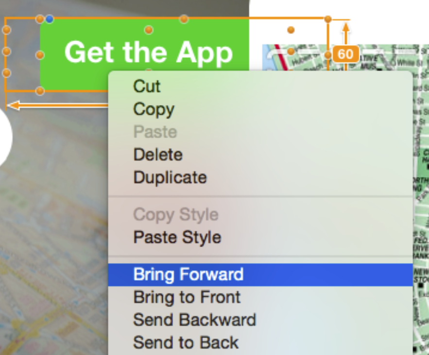
You can also right-click a selected object and choose the appropriate layer command. In this example, the “Get the App” text object needs to appear in front of the image. Choose Bring Forward, or use Forward in the Style tab.

Context menu used to bring a text object forward

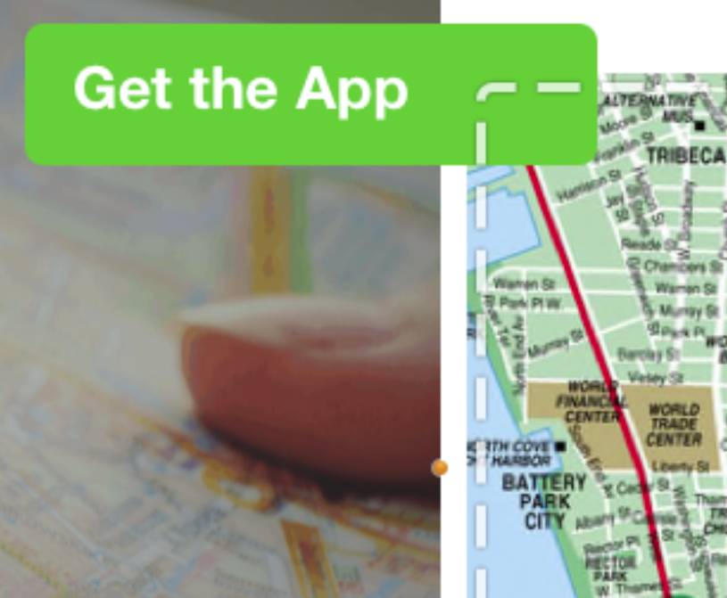
The adjusted layer order places the text in front of the image so it remains visible.

Text object displayed in front of an image after reordering layers

Arrange layers without reducing readability

Layering can add depth, but the design still needs a clear reading order. Keep sufficient contrast between text and the artwork behind it. Do not place decorative objects over buttons, links, prices, dates, or required information.

When several elements form one visual composition, align and space them consistently. If an item is difficult to select because another object covers it, move the covering object temporarily or use a one-step layer command until the intended item becomes accessible.

Troubleshoot object order

  • The wrong object moves: Undo, select the correct object, and confirm its handles before trying again.
  • An object disappears: It may be behind a larger shape or image; move it forward one step at a time.
  • Text becomes unreadable: Adjust the layer order, background, or text color instead of relying on overlap alone.
  • The composition changes on mobile: Preview the smartphone layout and check the overlap at the narrower width.

Test the layered email design

Preview the email at desktop and mobile widths, then send a test message. Confirm that the final image composition is sharp, important text remains readable, and links or buttons are not obscured. For more design guidance, browse the Mail Designer 365 Knowledge Base.

Combining design elements

By Hans-Peter Advanced Design Techniques

You can create interesting effects by combining multiple design elements. With Mail Designer 365, you are able to arrange objects in layers. This means that you can stack objects on top of each other for eye-catching designs.

Easily create graphic combinations

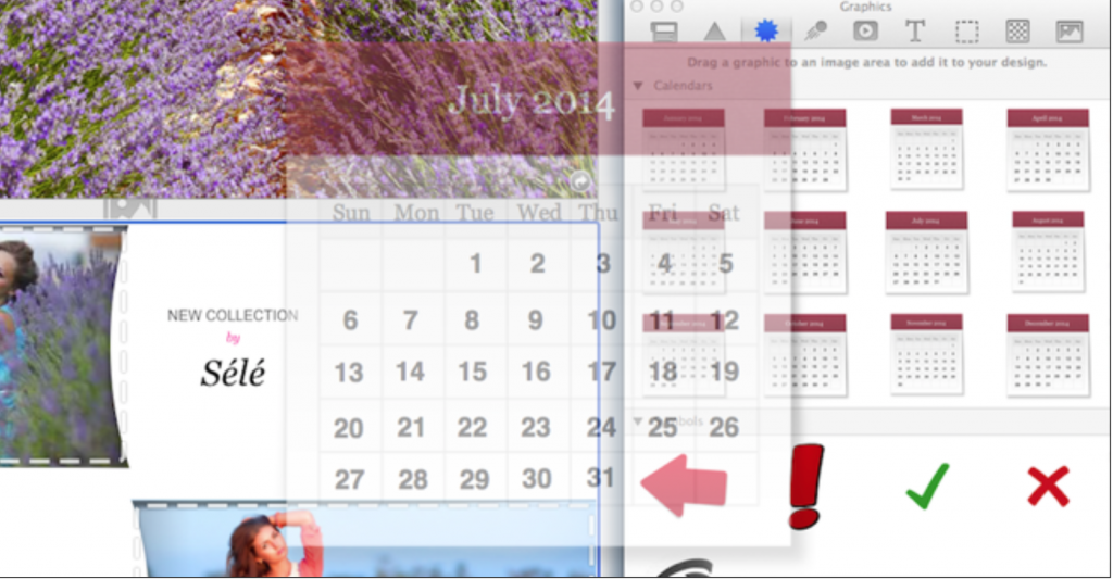
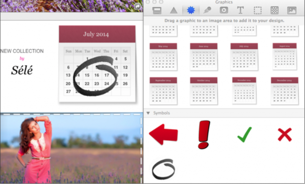
Let’s say we have a big sales event on July 16th that we want to announce. We can highlight that date visually by combining the calendar text element with a graphic element. Mail Designer 365 makes highlighting specific dates easy!

Drag in the July Calendar text object in an image area:

Now go to the graphics. Drag the black marker circle onto the calendar:

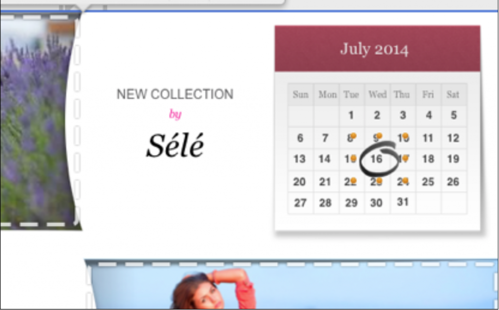
Finally, grab the black circle by the orange adjustment handles, resize it, and then click and drag it into position over July 16th.

Perfect! A great visual reminder to let customers know to check out the event on July 16th!Have fun with combining different graphic elements.

Regardless of what combinations you want to create, remember to drag in the elements in an image area!


Email Image Editor: Edit Images in Third-Party Apps

By Hans-Peter Advanced Design Techniques

Use an Email Image Editor with Mail Designer 365

An email image editor can help you crop, retouch, or adjust a picture used in a Mail Designer 365 design. Instead of exporting the complete email, you can select an eligible image area and open its image in a compatible third-party application from the Mail Designer 365 sidebar.

Use this workflow for changes that belong to the image itself, such as retouching, detailed color correction, or other edits offered by the selected application. For layout size, placement, links, alternative text, and mobile behavior, return to Mail Designer 365 and use its email-design controls.

Prepare the Image Before Editing

  • Save the Mail Designer 365 design before starting.
  • Select the exact image area you want to change.
  • Confirm that the image is the intended version and not a temporary placeholder.
  • Note the visible crop and proportions so you can review them after editing.
  • Keep an unchanged source copy when the original may be needed later.

Consider the final email dimensions before making detailed edits. Very small source images can look soft after resizing, while unnecessarily large files can increase message weight. Preserve an appropriate aspect ratio unless the design intentionally uses a different crop.

Open the Image in a Third-Party App

  1. Click the image area in the open Mail Designer 365 design.
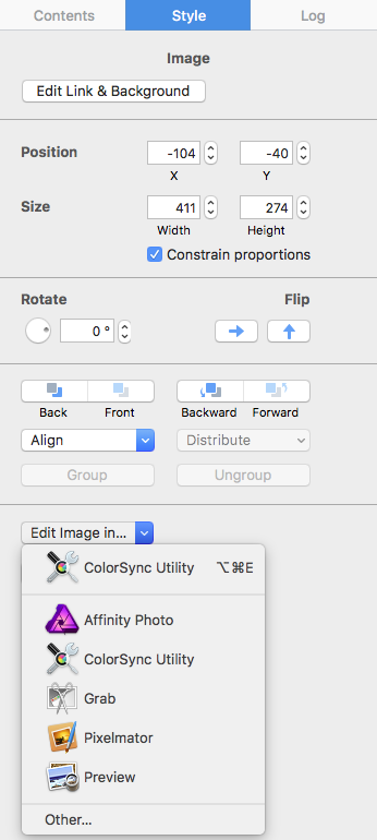
  2. Locate the image controls in the sidebar.
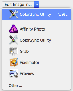
  3. Choose Edit Image in….
  4. Select the application you want to use from the available choices.
  5. Wait for the image to open in that application.

Open an image in an email image editor from the Mail Designer 365 sidebar

The applications shown depend on the software available on the Mac and the image handoff supported by the system. Choose a tool suited to the edit you need rather than changing the email layout in an image application.

Choose a third-party application for editing an email image

Edit and Save the Email Image

Make the required adjustment in the third-party application. Avoid adding essential campaign copy directly into the image when live text would be more accessible and easier to update. If text must be part of the graphic, keep it legible and repeat important information elsewhere in the email.

Save the image in the editing application, then return to Mail Designer 365. Confirm that the changed image is reflected in the intended image area. If the external application offers several save or export formats, retain a format suitable for the source image and the email workflow.

Review the Updated Image in the Design

Inspect the image at desktop and mobile widths. A successful handoff does not guarantee that the crop, focal point, or file size is ideal in the finished email. Review the complete layout and check how nearby text, buttons, and spacing interact with the revised visual.

  • Confirm that the correct image was updated.
  • Check crop, sharpness, color, and proportions.
  • Add or update concise alternative text in Mail Designer 365.
  • Verify any link attached to the image area.
  • Preview the mobile version and adjust its crop when necessary.

Troubleshoot Third-Party Image Editing

The Intended Application Is Not Listed

Confirm that the application is installed and can open the image format. Reopen the selection menu after the application is available. If it still does not appear, use an available compatible editor or edit a protected source copy separately and replace the image through Mail Designer 365.

The Saved Change Does Not Appear

Confirm that the edit was saved rather than exported to a different file. Return to Mail Designer 365 and check the selected image area. If necessary, replace the image with the revised file and review its crop again.

The Image Looks Blurry or Incorrectly Cropped

Review the source dimensions and the image area's proportions. Use a sufficiently detailed source image and select the focal point deliberately. Test at the actual display size instead of judging only from a zoomed editing window.

Email Image Editing Checklist

  • The correct image area and source version were selected.
  • The third-party edit changed only the intended image.
  • The saved result appears in Mail Designer 365.
  • Crop, quality, alternative text, and image link were reviewed.
  • Desktop and mobile previews remain usable.
  • A received test email displays the revised image correctly.

Use the email image editor handoff only for changes to the selected visual; keep layout and accessibility settings in Mail Designer 365.

After editing, send a test message and inspect the image with images enabled and blocked. This confirms that the visual, alternative text, and surrounding live content work together for recipients.

For more product workflows, browse the Mail Designer 365 Knowledge Base.

Privacy Settings / Datenschutz-Einstellungen