
Changing the size of the preview window in Mail Designer 365 helps you compare how an email design appears on different devices. A smaller device preview zoom can fit several preview windows on one display, while a larger view makes typography, spacing, images, and buttons easier to inspect in detail.
Open the device preview
Use Check Preview to open the device preview for your design. The preview lets you review the rendered email without changing the layout itself. Before adjusting the zoom, choose the device or inbox views that are most relevant to the recipients you want to check.
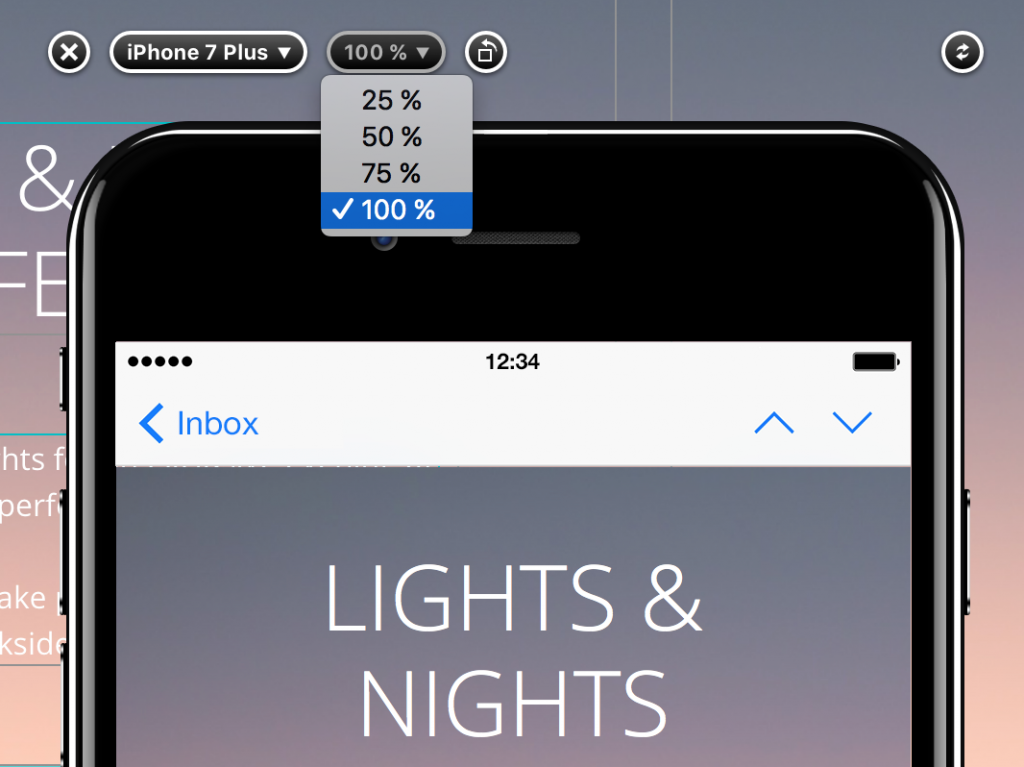
The zoom setting changes only the size of the preview window on your Mac. It does not resize the email content sent to recipients and does not change the actual width of the desktop or smartphone design.
Change the size of the preview window
Select a zoom factor that gives you the level of detail you need. A smaller percentage reduces the on-screen preview size and leaves more room for additional windows. A larger percentage is useful when you want to inspect fine details, such as line wrapping, image edges, button labels, or the space between layout blocks.
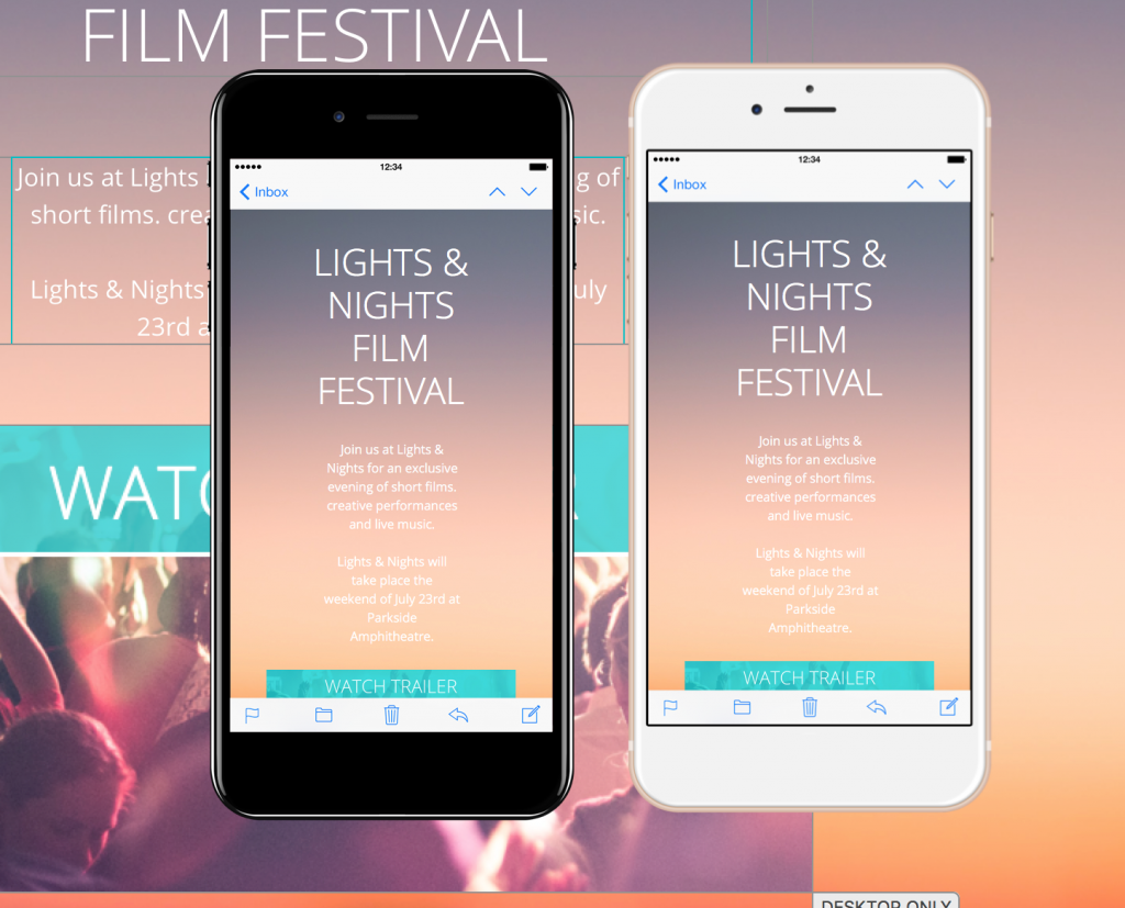
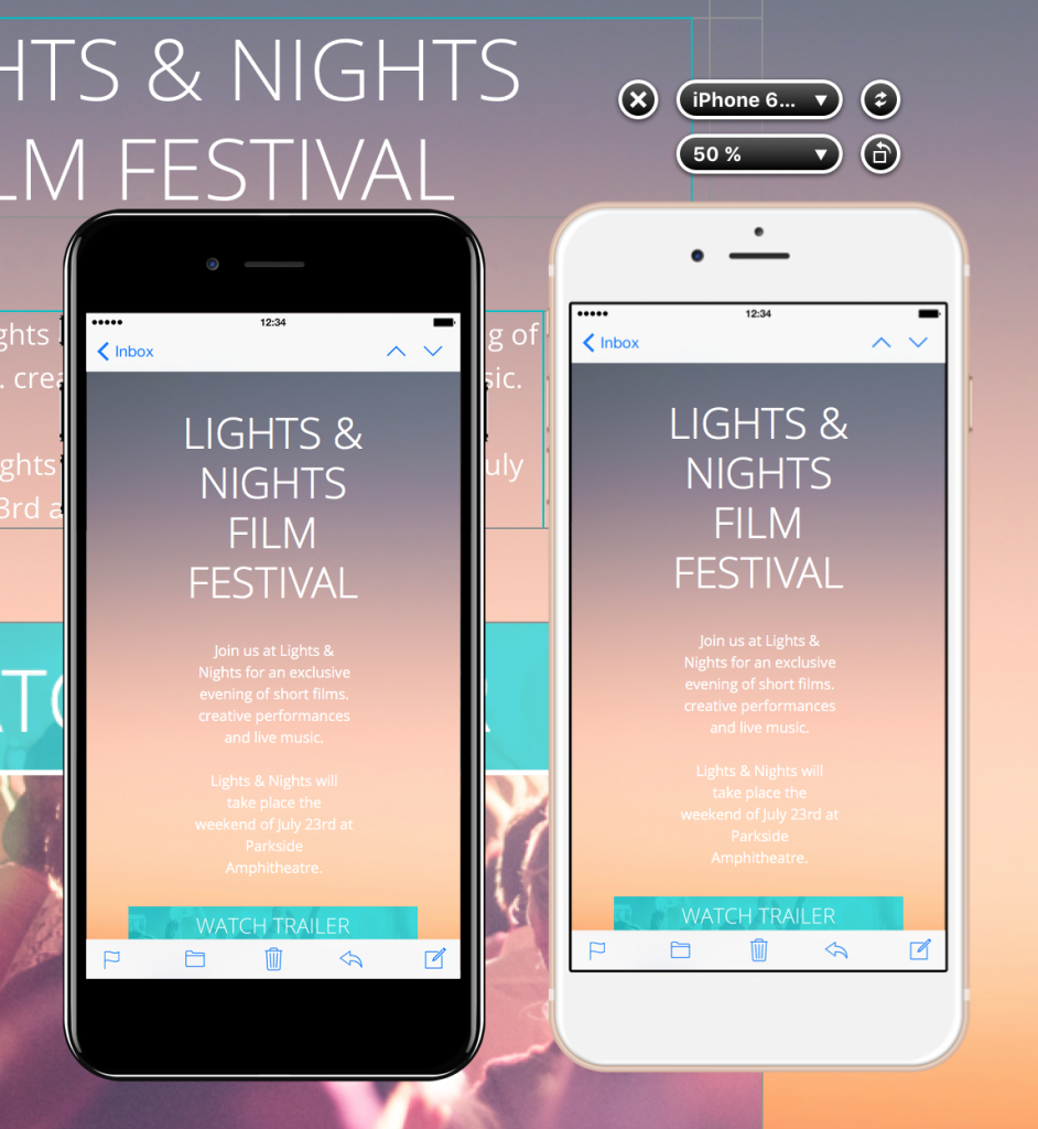
For example, setting the device preview to 50% can make it practical to position multiple device preview windows side by side. This supports a quick visual comparison between different devices or inbox environments at one glance.
Compare several device previews
Arrange the preview windows so the same part of the email is visible in each one. Compare the headline, important images, calls to action, and the transition between layout blocks. If one view wraps text differently or creates an unexpected gap, return to the design and make the smallest appropriate adjustment.
A reduced device preview zoom is best for overview comparisons. After spotting a possible issue, increase the preview size or inspect that view individually before changing the design. This avoids making decisions from a preview that is too small to show fine details reliably.
What to check at each preview size
At a smaller zoom, focus on the overall reading order, block spacing, image balance, and whether the main call to action remains prominent. At a larger zoom, check text clarity, line breaks, link labels, image quality, borders, and small alignment differences.
Remember that changing the size of the preview window is a workspace aid. It does not replace testing the delivered email. Preview results can help you identify likely issues, but a real inbox may apply its own rendering behavior.
Test the email before sending
After comparing the preview windows, send a test email to representative desktop and mobile inboxes. Click important links, check that images load, and confirm that text remains readable. If you modify the design after testing, reopen the preview and repeat the relevant checks.
For smartphone-specific layout work, see how to modify a layout block for the mobile version. Combining device preview zoom with a focused mobile review makes it easier to catch problems without changing unrelated parts of the email.
How Can We Help?