Creating Nested Lists

By Hans-Peter Editing Text

Nested Lists

With Mail Designer 365, you can apply different list styles within your email design to create more defined lists.

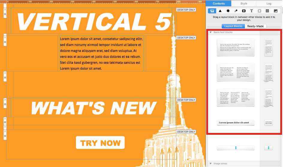
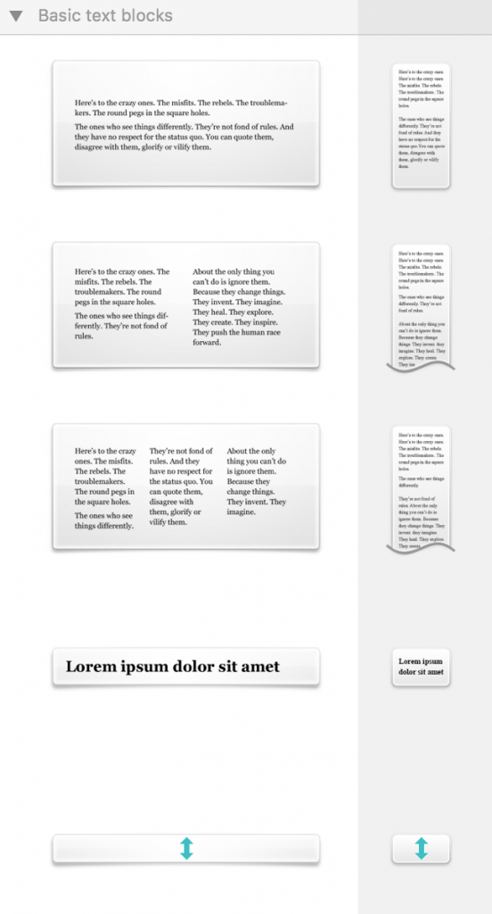
To get started, insert a text layout block into your design by dragging and dropping from the content menu in the sidebar.

Insert a text block for nested lists in Mail Designer 365

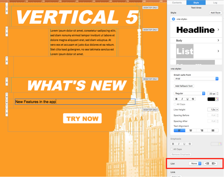
Type the first line of your list into the layout block. You should notice the list tool appear in the "Style" menu in the sidebar:

Choose a list style in the Mail Designer 365 sidebar

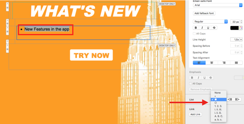
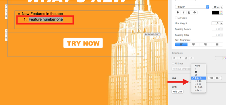
Highlight the text and choose a list style from the drop-down menu and click to apply it to the first line of your list.

Apply a list style to the first list item

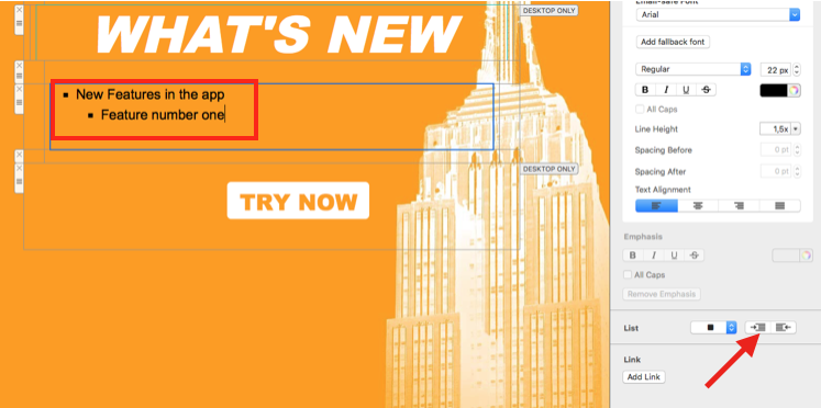
To create an indentation, press Return to start a new line, and then press the Tab key. Alternatively, you can use the indent buttons in the "List" tool to indent left or right.

Indent a list item to create a nested list

You can then highlight this line and choose a new list style to distinguish the nested item from the first level.

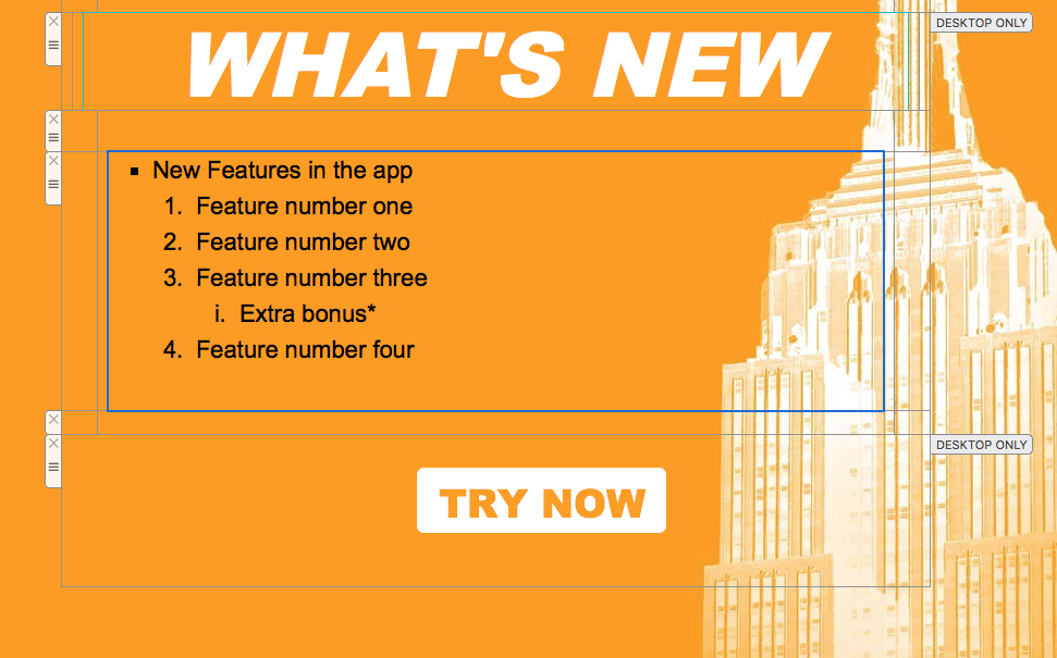
Nested list with multiple indentation levels

To include multiple list styles, continue to repeat the previous two steps:

Nested list formatting in an email design

Nested list formatting tips

  • Use one consistent list style for each indentation level so readers can scan the hierarchy quickly.
  • For a nested bullet list in email design, keep sub-items concise and avoid adding more levels than the message needs.
  • Check spacing and line breaks in both desktop and mobile previews before sending.
  • If an item is indented incorrectly, select it and use the left or right indent button in the List tool.

How to Use All Caps in Mail Designer 365

By Hans-Peter Editing Text

How to use All Caps in Mail Designer 365

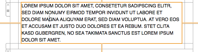
If you have written a body of text that you suddenly want to be in all capital letters, you no longer have to manually retype the text using caps lock. Instead, you can easily capitalize the letters of the text by adding a checkmark next to "All Caps" in the "Style" section.

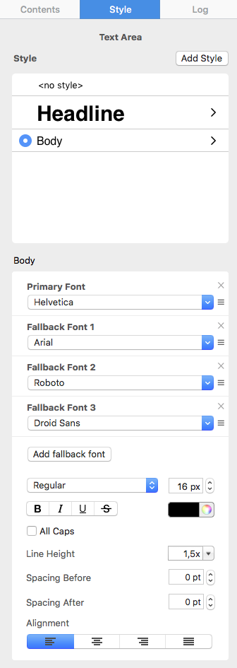
First, select a text area. Then in the Style section, find the "All Caps" option.

All Caps option in the Mail Designer 365 Style section

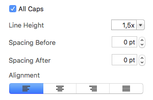
Add a checkmark inside the box next to "All Caps."

All Caps checkbox enabled for a selected text area

This will automatically convert the text in all capital letters.

Selected email text displayed in all capital letters

If you change your mind and want to revert your text to regular capitalization, just simply remove the check next to "All Caps."

All Caps checkbox cleared to restore regular capitalization


Adding different types of text links

By Hans-Peter Editing Text

How to add different types of text links

With Mail Designer 365, you can add different types of text links. You can specify whether you want http, https, email link, telephone link, or custom.

First, select the text that you want to add a link to.

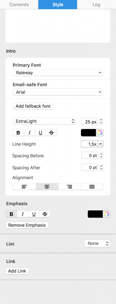
Second, scroll to the bottom of the "Style" tab until you see the link section.

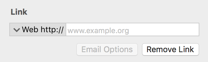
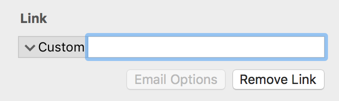
Next, click "Add Link." You will see a form where you can type your link.

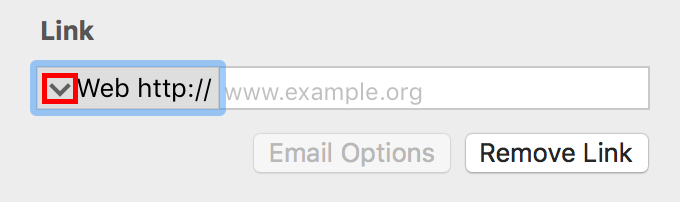
Click on the down arrow that you see before the word "Web."

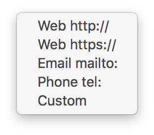
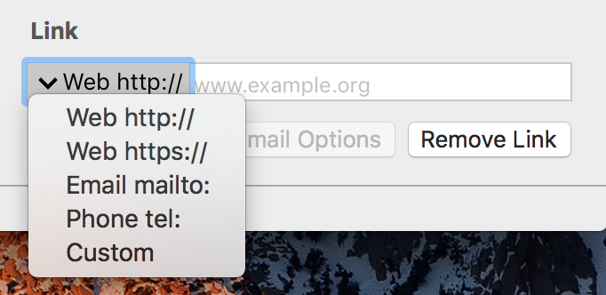
You will see a drop-down menu, where you can choose the type of link that you want to set for your selected text.


You can choose the "Custom" option for ftp links, app links, download links, other links that do not necessarily start with http or https.

One you have finished entering the link to the landing page, notice that text that you selected is now blue and underlined.


Automatic hyphenation in Mail Designer 365

Automatic hyphenation

By Hans-Peter Editing Text

Automatic hyphenation helps prevent awkward line breaks and layout problems in your email design. You can enable or disable it for the entire design:

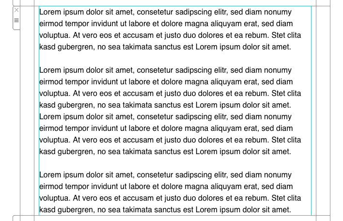
Automatic hyphenation applied to text in an email design

Email text layout with automatic hyphenation enabled

Of course, you can also turn off this feature.

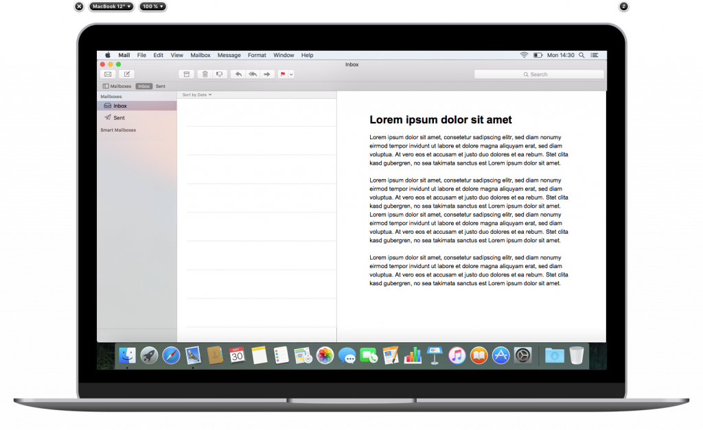
Email text displayed without forced hyphenation

Email design preview with hyphenation disabled

To access this feature, try the following:

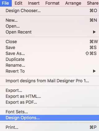
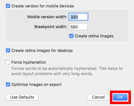
Choose "File" > "Design Options..." from the top menu bar.

Opening Design Options from the Mail Designer 365 File menu

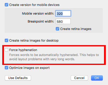
Then, check or uncheck the box next to "Force hyphenation."

Force hyphenation checkbox in Mail Designer 365 Design Options

Click "Ok" when you are done.

Confirming automatic hyphenation settings with OK

Special characters and emoji for email in Mail Designer 365

Special Characters in Email: Symbols, Emoji, and Bullets

By Hans-Peter Editing Text

How to Use Special Characters in Email

Special characters in email can help structure short text, show currencies, add arrows, or provide a compact visual cue. Mail Designer 365 uses the macOS Emoji & Symbols viewer, so you can insert a character directly into a text object without converting it to an image.

Use symbols selectively. They should support the meaning of the message rather than replace important instructions. Because inboxes, operating systems, and fonts can display some Unicode characters differently, always send a test email before publishing a campaign.

Open Emoji & Symbols on Your Mac

  1. Click inside a text object in your Mail Designer 365 design.
  2. Place the insertion point where the symbol should appear.
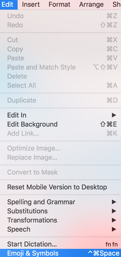
  3. From the macOS menu bar, choose Edit > Emoji & Symbols.
  4. Browse or search for the character you need.
  5. Select the character and click Insert, or double-click it in the viewer.

Open Emoji and Symbols on macOS for an email design

The character becomes part of the editable text. You can reposition it, remove it, or apply suitable text formatting. If the chosen font does not include that character, macOS may display it with a fallback font, which can look slightly different from the surrounding copy.

Choose the Right Type of Character

Emoji

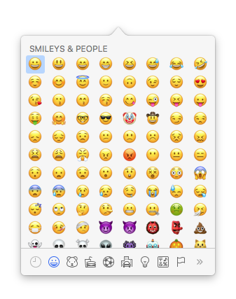
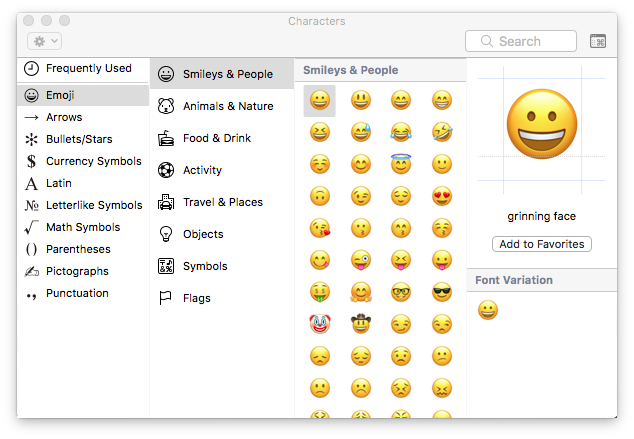
Emoji can add tone to a short announcement or seasonal message. Keep the surrounding wording clear, since the artwork and meaning of an emoji may vary between platforms.

Browse emoji special characters for emailInsert an emoji into Mail Designer 365 text

Arrows

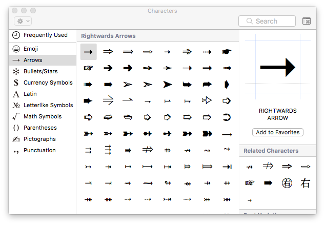
Arrows can point toward a nearby instruction or create a compact directional cue. Do not rely on an arrow alone for navigation; pair it with descriptive link or button text.

Browse arrow special characters

Bullets and Stars

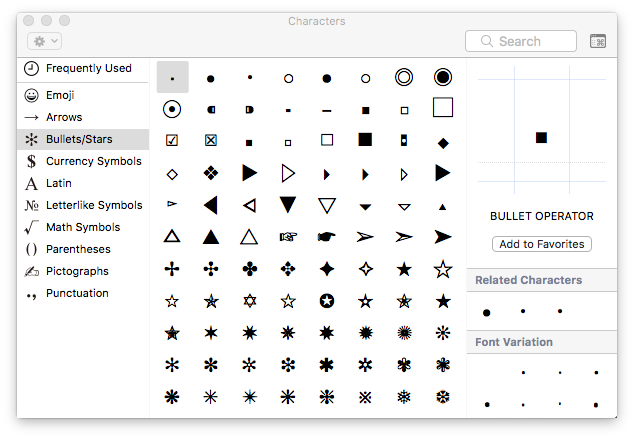
Bullet and star characters can separate short benefits or highlight a brief note. For longer lists, use the editor’s list formatting so spacing and structure remain consistent.

Browse bullet and star symbols

Currency Symbols

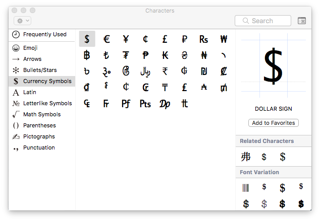
Currency symbols are useful next to prices, but the currency should remain unambiguous for the recipient. Include an ISO currency code such as USD or EUR when the audience could otherwise misinterpret the amount.

Browse currency symbols

Letters and Letterlike Symbols

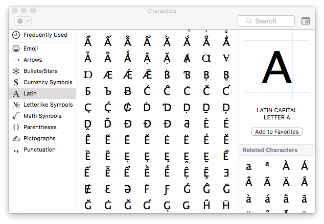
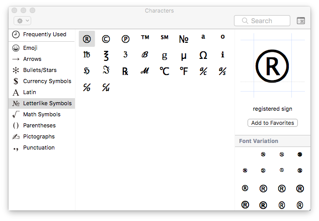
The Latin and letterlike categories include accented letters and specialist characters. Insert the actual character needed for the language or notation, then confirm that it remains legible in the selected font.

Browse Latin alphabet charactersBrowse letterlike symbols

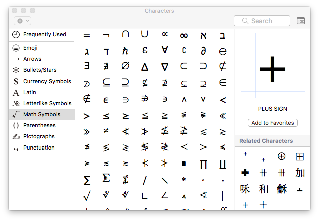
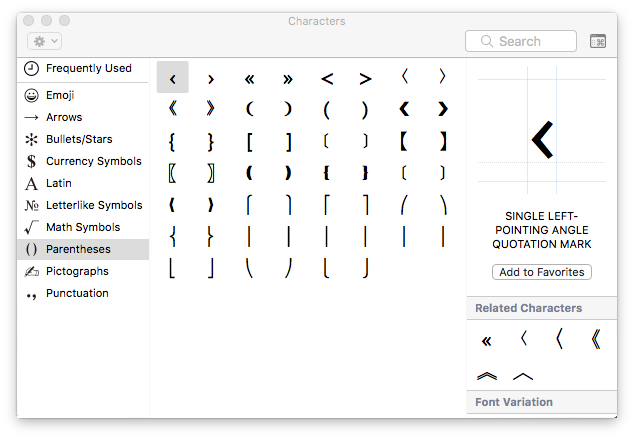
Mathematical Symbols and Parentheses

Use mathematical symbols only when they accurately express the relationship in the text. Parentheses and related marks can support compact labels, but ordinary punctuation is often clearer for general campaign copy.

Browse mathematical symbolsBrowse parentheses characters

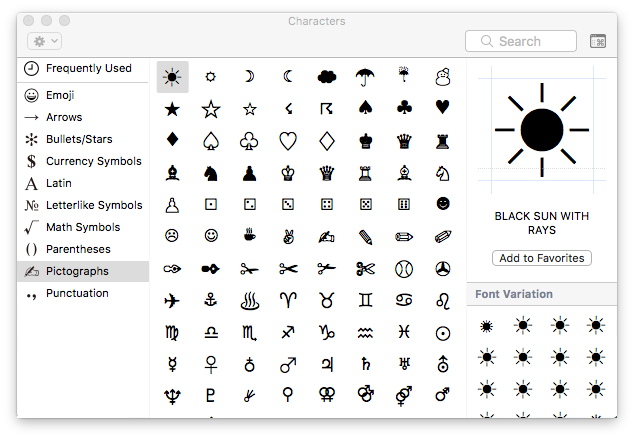
Pictographs and Punctuation

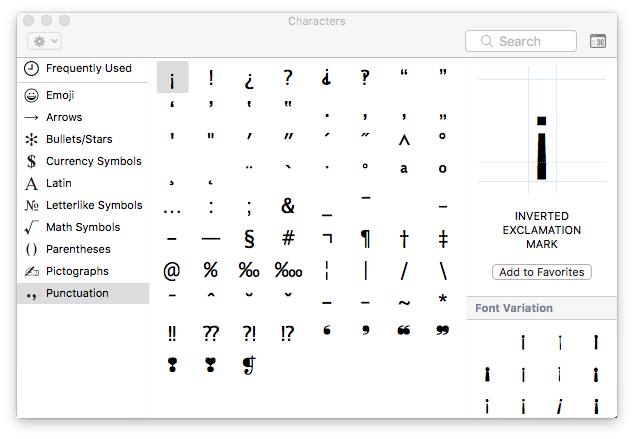
Pictographs provide simple visual cues, while the punctuation category includes marks that may not appear on the standard keyboard. Prefer familiar characters when the meaning needs to be understood immediately.

Browse pictograph symbolsBrowse punctuation characters

Use Symbols in Call-to-Action Buttons

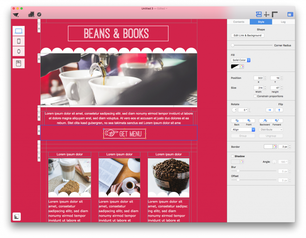
A short symbol can accompany a button label—for example, an arrow beside “View details.” Keep the written label intact so recipients do not have to interpret an icon to understand the action. Check that the symbol is vertically aligned and does not crowd the text at mobile width.

Use a symbol inside an email call-to-action button

Test Special Characters Before Sending

  • Preview the desktop and mobile versions of the email.
  • Send a test to more than one inbox when the character is important.
  • Check that the symbol is visible, correctly positioned, and not replaced by an empty square.
  • Confirm that surrounding links, buttons, prices, and instructions still make sense without the symbol.
  • Replace an uncommon character with plain text when rendering is inconsistent.

Well-chosen special characters in email can improve scanning and add personality, but readable wording and a successful test should always take priority.

How to Edit Text in an Image Area for Email

By Team equinux Editing Text

Edit a Mail Designer Text Object

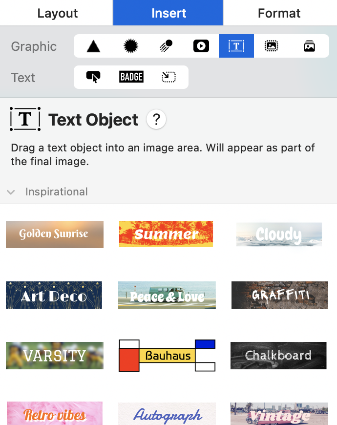
If you want to know how to edit text in an image without flattening your entire email design, use a Text Object inside a Mail Designer 365 image area. Text Objects let you create decorative headlines, labels, badges, prices, or short calls to action while keeping each element movable and editable.

Use image-area text for visual accents rather than essential newsletter copy. Normal text areas remain the best choice for paragraphs, legal information, and important calls to action because recipients can select the text, screen readers can interpret it, and email clients can resize it more reliably.

1. Add a Text Object to the Image Area

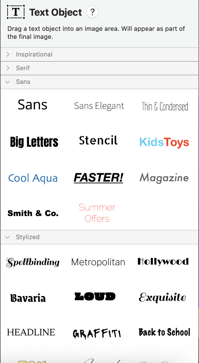
Open Insert in the Mail Designer 365 sidebar and choose Text Objects. Browse the available styles, then drag a suitable Text Object into the image area in your email design. Place it over the background photo, color block, shape, or other visual element where the text should appear.

Choosing a Text Object to add editable text to an image area

2. Edit the text in the image area

Double-click the Text Object to activate its text-editing mode. Select the placeholder wording and type your own message. Keep the copy short enough to remain readable on smaller screens. A brief headline or label is usually more effective than a full paragraph inside an image area.

If double-clicking selects the image area instead of the text, click the Text Object once and then double-click directly on its characters. You can also zoom in temporarily when several design elements overlap.

Editing stylized text positioned over an email image area

3. Format and position the edited text

With the Text Object selected, adjust its font, size, color, alignment, and other available style settings. Choose enough contrast between the text and the background image. If the photo is visually busy, add a solid or translucent shape behind the text so the message remains legible.

Drag the Text Object to reposition it and use Mail Designer 365 alignment tools when you need precise placement. Leave comfortable space between the text and the edges of the image area. Preview the desktop and mobile versions separately because an attractive desktop arrangement may become crowded on a narrow screen.

4. Keep important email copy accessible

Text placed in an image area becomes part of the rendered graphic. Recipients may not see it when images are blocked, and assistive technology cannot read it like normal HTML text. Do not use image text as the only place for a discount code, deadline, price, event time, or essential instruction.

Repeat critical information in a normal text area and provide meaningful alternative text for the finished image. Describe the purpose of the visual rather than every decorative detail. For more guidance, see using alt text in Mail Designer 365.

5. Test the edited image text before sending

  • Preview both desktop and mobile layouts.
  • Confirm the text is not cropped or hidden by another object.
  • Check contrast at the actual display size.
  • Send a test email and view it with images enabled and disabled.
  • Verify that important information also appears as real text.

Troubleshooting text in an image area

The text cannot be edited: Make sure you inserted a Mail Designer 365 Text Object. Text that is already embedded in an imported JPG or PNG cannot be changed as a separate object; edit the source image or cover it with a new design element.

The text looks blurry: Avoid enlarging a small rendered object, check the image-area dimensions, and preview at 100 percent. Keep body copy in a normal text area for consistently sharp rendering.

The text moves on mobile: Open the mobile layout and reposition or resize the Text Object there. Test again after every substantial change to the image area.

Web Fonts in Email: Mail Designer 365 Guide

By Hans-Peter Editing Text

Use Web Fonts in Email Designs

Web fonts in email give you more typographic choices in Mail Designer 365, but they should be used with a reliable fallback plan. A recipient's email app may load the selected web font from the internet, use an installed version, or display a fallback font when web-font loading is unavailable.

Choose typography for readability first. Use web fonts to support the brand and visual hierarchy, then preview how headings, body copy, buttons, and narrow columns behave when a fallback font has different proportions.

Download Web Fonts in Mail Designer 365

  1. Open the font menu in Mail Designer 365.
  2. Choose Web Fonts.
  3. Select Download additional fonts….
  4. Review the available fonts in the preview window.
  5. Click Start Download and wait for the download to finish.
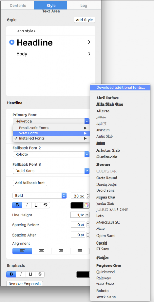
Open the menu to download web fonts in email designs

The preview window lists the fonts available through this Mail Designer 365 workflow. Compare letterforms at a useful size and check whether the family includes the weights required for headings, body text, and emphasis.
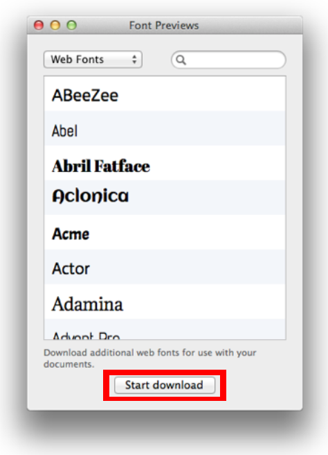
Preview additional web fonts available in Mail Designer 365

When the download begins, a progress window shows its status. Let the process finish before applying a newly downloaded family to the email design.
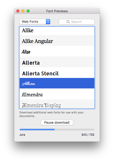
Web font download progress in Mail Designer 365

Apply a Web Font to Email Text

After the download, select a text object or text style and choose the new font from the font menu. Using shared text styles helps keep typography consistent across repeated headings, paragraphs, and buttons.
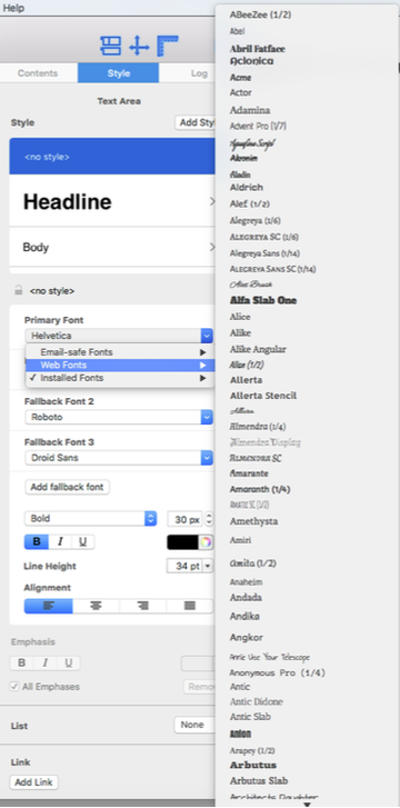
Choose a downloaded web font for email text

Check line breaks and text height after changing fonts. A wider or taller family can change button labels, narrow columns, and the overall length of a layout block. Adjust the text style or available space instead of reducing important text to an unreadable size.

Understand Email-Safe and Web Fonts

The Email-safe fonts category contains common fonts that are widely available on recipient devices. These are useful when predictable fallback behavior matters most. Web fonts offer more visual variety but depend on the recipient environment and its ability to load or display the selected font.
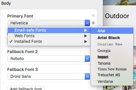
Email-safe font choices in Mail Designer 365

Mail Designer 365 provides additional fonts from a directory of open-source web fonts. Availability in the editor does not mean every recipient will see exactly the same typeface. Design the email so that its message, hierarchy, and calls to action remain clear when a fallback font is used.

Text Areas and Image Areas Behave Differently

Text in a regular text area remains live email text. Its appearance depends on the fonts supported or available in the recipient's environment. Live text is searchable, selectable, adaptable, and generally more accessible, so use it for essential content whenever possible.

Text placed in an image area becomes part of the image. This can preserve a decorative appearance, but recipients cannot resize or select it as live text, and images may be blocked. Do not put essential instructions, prices, dates, or calls to action only inside an image. Add descriptive alternative text and repeat critical information as live text.

Test Web Fonts in Email Clients

Preview the design at desktop and mobile widths, then send test messages to representative inboxes. Review both the intended web font and the fallback result.

  • Check headings, paragraphs, buttons, and narrow columns.
  • Confirm that fallback text does not overlap or become clipped.
  • Review line breaks, line spacing, and layout-block height.
  • Test with images enabled and blocked.
  • Confirm that live text remains readable at mobile size.

Troubleshoot Web Font Problems

The Font Does Not Appear in the Menu

Repeat the additional-font download and confirm that it completes. Reopen the font menu after the download and select the correct text object or text style before choosing the family.

The Recipient Sees a Different Font

The receiving app may not load the web font. Review the fallback appearance and choose an email-safe alternative that preserves readability and hierarchy. Avoid layouts that depend on an exact line break or letter width.

Text Wraps Differently on Mobile

Check the mobile text style, available width, and the fallback font. Shorten overly long headings or button labels when needed and leave sufficient space for natural variation between fonts.

Web Font Checklist

  • Required font families and weights are downloaded.
  • Shared text styles are used consistently.
  • A readable email-safe fallback is acceptable.
  • Essential information remains live text.
  • Desktop, mobile, and received test messages were reviewed.
  • Fallback line breaks do not damage the layout.
For related formatting workflows, browse the Mail Designer 365 Knowledge Base.

Working with font sets

By Editing Text

Font Sets

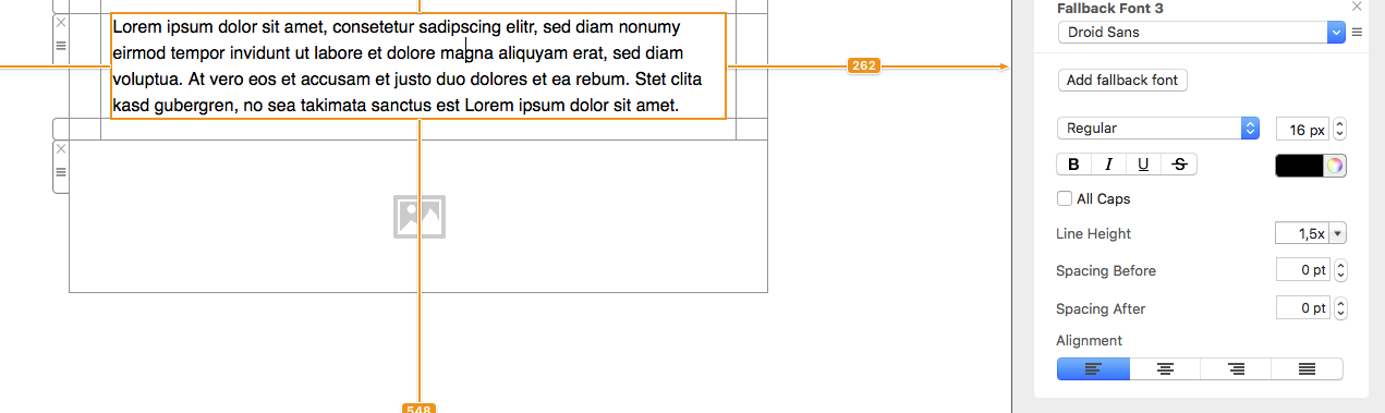
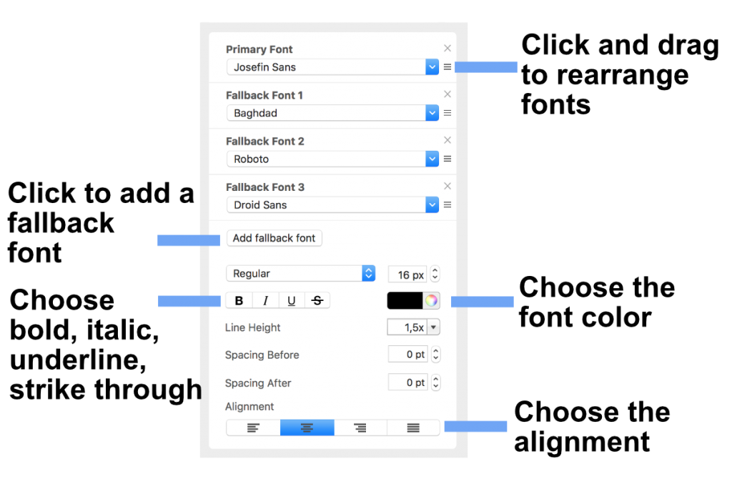
In Mail Designer 365, you can define a different set of fonts, font size, line spacing and text color for every style.  In addition, you can designate what font will be chosen if another font is unavailable. This is helpful if you have multiple fonts for one style. In our case, we picked "Josefin Sans" as our Primary Font. If this font is not available on the recipients computer, then "Baghdad" will be chosen. If "Baghdad" is not available, then "Roboto" will be chosen and so on.

Click and drag a font at its handle to rearrange the chosen fonts. Afterwards, click "Add fallback font" to add an "Email-safe font".


Editing a text area

By Hans-Peter Editing Text

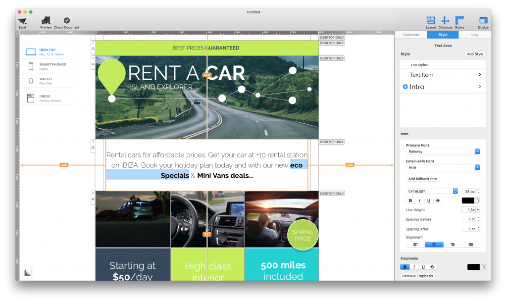
Editing a text area in Mail Designer 365

Editing a text area is the quickest way to update headlines, paragraphs, labels, and other written content in an email design. Click inside the area and start typing, then select the text you want to format. Mail Designer 365 displays the relevant text controls so you can adjust typography and reading flow without leaving the design.

This guide explains what text areas can contain, how they differ from image areas, and how to format and check email copy before sending.

Text areas and image areas

Layout blocks can contain text areas and image areas. A text area is intended for editable text only. An image area can hold an image and may also support text placed as part of its visual composition. Use a text area for content that should remain selectable, accessible, and adaptable across screen sizes.

Whenever possible, keep important messages, links, and calls to action as live text rather than embedding them in an image. Live text is easier to read when images are blocked and usually adapts more reliably in responsive email layouts.

Editing a text area with Mail Designer 365 formatting controls

Enter and replace text

  1. Click inside the text area you want to edit.
  2. Place the insertion point where new text should appear.
  3. Type the new copy, or select existing text and replace it.
  4. Click outside the area when you are finished.

Use short paragraphs and descriptive headings to make the message easy to scan. If you paste text from another application, review the result carefully because copied formatting may not match the styles already used in the design.

Select and format text

Drag across a word, sentence, or paragraph to select it. Use the formatting popover to adjust the font, size, weight, color, alignment, and other available text options. Apply formatting consistently so recipients can understand the hierarchy of the message at a glance.

For repeated elements such as headings or body copy, use consistent text styles instead of formatting every section differently. A restrained combination of font sizes and weights generally produces a clearer email than many competing styles.

Add or update a text link

Select the words that should become a link and use the link control to enter the destination. Link meaningful text such as “View pricing” or “Read the setup guide” instead of generic phrases when possible. After entering the URL, confirm that the complete address is correct.

If you need more detail on link behavior and formatting, see different types of text links.

Improve readability

  • Keep body text large enough to read comfortably.
  • Use sufficient contrast between text and its background.
  • Break long passages into short paragraphs.
  • Use headings to introduce new sections.
  • Leave enough spacing around buttons and linked text.

Read the copy once in the desktop layout and again in the smartphone layout. Line breaks, paragraph height, and alignment can change when the available width becomes smaller.

Edit text for the mobile version

Switch to Smartphone view and check whether the text still fits the design. You may need to adjust spacing, line length, or the surrounding layout block. Avoid reducing text to an uncomfortable size simply to make a paragraph fit; concise copy and a clear structure are usually better solutions.

When a message needs separate content for mobile readers, consider a mobile-only layout block rather than forcing one text area to serve two very different purposes.

Preview and test the finished copy

Use the preview to check the complete email and look for truncated lines, accidental font changes, inconsistent alignment, or links that are difficult to identify. Then send a test email and open it in the email clients and devices that matter to your audience.

Click every text link in the test message. Confirm that the destination opens correctly, the visible wording matches the destination, and no placeholder text remains. Save the design after the text and formatting have been verified.

Privacy Settings / Datenschutz-Einstellungen