
Hide Layout Blocks on Mobile in Mail Designer 365
You can hide layout blocks on mobile when a section is useful in the desktop email but would make the smartphone version too long, repetitive, or difficult to scan. Mail Designer 365 keeps the layout block available in the desktop design while marking it as hidden in the smartphone view.
Use this feature selectively. Important information, legal details, essential links, and the main call to action should remain available to mobile recipients. Hide only content that is genuinely optional or has an equivalent mobile-friendly replacement.
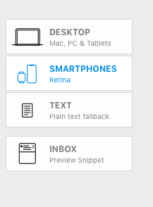
1. Open the Smartphone view
Switch from the desktop design to the Smartphone view. Review the complete mobile layout before hiding anything so you can see which sections repeat information, create unnecessary scrolling, or do not adapt well to the narrower format.
2. Hide a layout block
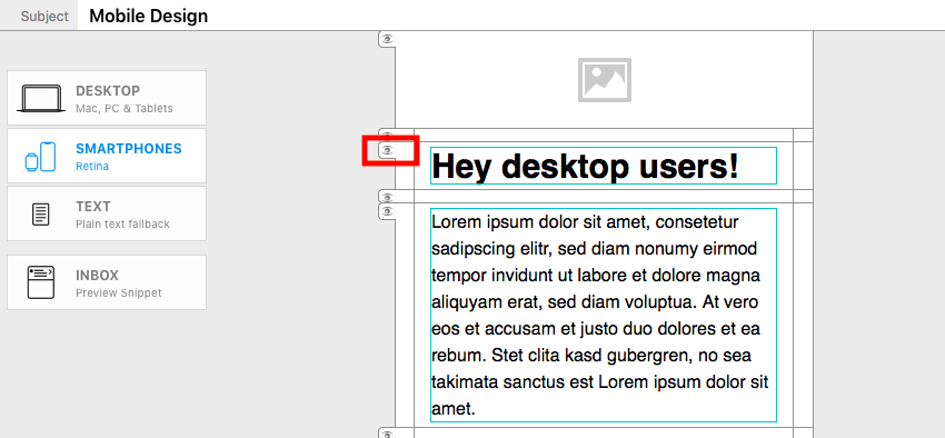
Select the layout block you want to remove from the mobile version. Click the eye icon on the left edge of the block. The block is hidden from the smartphone layout but remains part of the desktop version.
3. Read the hidden-block indicator
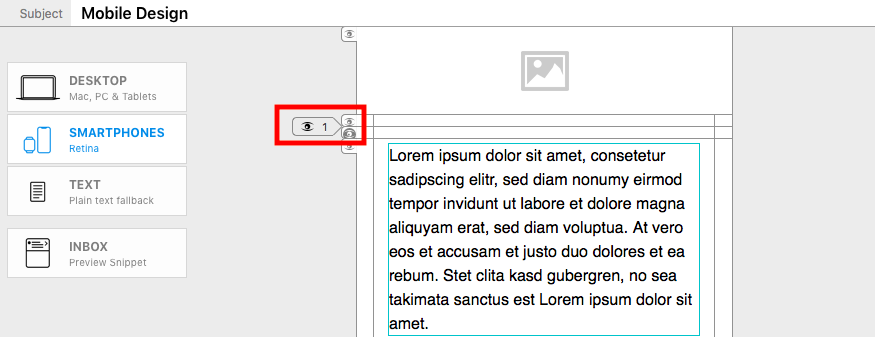
After the block disappears, Mail Designer 365 displays a small flag with an eye symbol in its place. The number beside the symbol shows how many layout blocks are hidden at that position in the smartphone version. This indicator helps you keep track of content that is still present in the design but not shown on mobile.
4. Hide consecutive blocks
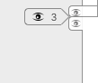
If you hide several adjacent layout blocks, the number in the indicator increases. Use the count to confirm that the intended number of sections is hidden. When several blocks disappear together, review the content before and after the indicator to make sure the mobile reading order still makes sense.
5. Confirm the Desktop Only state
Switch back to the Desktop view. Layout blocks hidden from the smartphone version display a DESKTOP ONLY flag. This confirms that the content remains available to desktop recipients and has not been deleted from the email design.
When hiding a mobile block makes sense
- A decorative desktop section repeats information already presented as live text.
- A wide visual treatment has a separate mobile-friendly replacement.
- A secondary promotion makes the smartphone message unnecessarily long.
- A desktop navigation or supporting section is not required for the mobile action.
Do not hide a block simply because it needs design work. If the section contains essential content, adapt the layout, shorten the copy, resize the imagery, or create a dedicated mobile block instead. The separate mobile-layout workflow is more appropriate when recipients need the information in a different format.
Troubleshoot hidden mobile content
If the eye control is not available, confirm that you are in the Smartphone view and that a complete layout block is selected. If the hidden count is higher than expected, inspect the adjacent indicators and review which consecutive blocks were hidden. Switching to the Desktop view can help identify the affected blocks through their DESKTOP ONLY flags.
When restoring content, check the order again instead of assuming the original position is still ideal for mobile. A block may need shorter copy, a different image crop, or a dedicated smartphone layout before it is made visible to mobile recipients.
Review and test the mobile email
After hiding layout blocks on mobile, preview the full smartphone version from top to bottom. Confirm that headings, paragraphs, images, and buttons still follow a logical sequence. Check that removing a block did not leave an unexplained gap or separate a heading from the content it introduces.
Send a test email and review it on a real phone as well as in the email clients your audience uses most. Verify that the primary call to action, contact information, unsubscribe link, and required legal details remain accessible. Return to the Smartphone view if you need to restore a hidden section or replace it with a more suitable mobile layout.
How Can We Help?