
Layout blocks for the mobile version
Layout blocks for the mobile version let you add content that appears only when recipients read the newsletter on a smartphone or other mobile device. This is useful when the mobile design needs a shorter introduction, a compact call to action, a different image, or instructions tailored to people using a smaller screen.
Mail Designer 365 keeps the desktop and smartphone versions connected while allowing selected blocks to be mobile-only. The following steps explain how to switch views, add the block, recognize its visibility setting, and verify the final result.
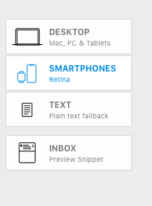
Switch to the Smartphone view
- Open the email design in Mail Designer 365.
- Select the Smartphone view in the design toolbar.
- Review the existing mobile layout before adding another section.
Working in Smartphone view is important because a block inserted there can be designated specifically for the mobile version. Before making structural changes, note how the current desktop content is arranged and which parts already adapt automatically.
Choose a layout block
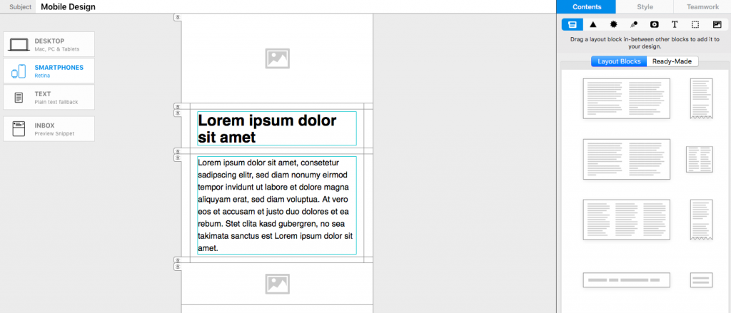
Open Contents > Layout Blocks. The available structures work in the same way as they do in Desktop view. Choose a layout that suits the mobile content: a single-column block is often easiest to read on a narrow screen, while a compact image-and-text block can work well for a featured offer.
Drag the selected layout block into the smartphone design. Watch the placement indicator and release the block when it appears at the intended position. Existing sections move aside to show where the new block will be inserted.
Confirm the MOBILE ONLY label
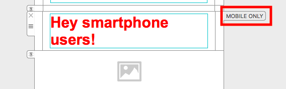
After insertion, the new section is labeled MOBILE ONLY. This label confirms that the block will be displayed in the smartphone version but not in the desktop version. It is a design-editor indicator and does not appear as visible text in the email received by your audience.
If the label is missing, check which view was active when you inserted the block. Undo the change if necessary, return to Smartphone view, and add the block again.
Add content for mobile readers
Fill the block with the text, image, button, or other elements needed for the mobile experience. Keep copy concise and make buttons large enough to tap comfortably. Avoid placing essential information only in a mobile-only block unless desktop recipients receive the same information elsewhere.
Common uses include a shorter call to action, a mobile app link, a compact event reminder, or an image cropped specifically for portrait screens. A mobile-only block can also replace a desktop section that is too detailed for a small display.
Check the desktop version
Switch back to Desktop view and confirm that the new block is not shown there. Also verify that the surrounding desktop sections have not changed unexpectedly. The mobile-only block should supplement the responsive design, not disrupt the content that already works on larger screens.
If you need to adjust an existing block rather than create a separate mobile section, see modifying a layout block for the mobile version.
Preview and test both versions
- Preview the smartphone layout and confirm the MOBILE ONLY block is in the correct position.
- Check text size, line length, image cropping, and button spacing.
- Preview the desktop layout and confirm the mobile-only section is absent.
- Send a test email and open it on both a phone and a desktop email client.
- Check that links and calls to action lead to the intended destinations.
Testing both versions is essential because content visibility changes affect the reading experience differently on each device. Once the mobile block and surrounding sections work as intended, save the design before exporting or sending the campaign.
How Can We Help?