
Email text blend modes in Mail Designer 365
Email text blend modes combine typography with an image, texture, or color to create distinctive headline effects. Instead of using a flat text color, you can let a photograph or pattern show through the letter shapes. This type of email blending works well for short headlines, seasonal graphics, and visual accents inside an image area.
Because the result is rendered as part of an image area, use the effect selectively and keep important information available as live text elsewhere in the email. This guide explains how to build the effect, choose the correct Blend Mask, and check readability before sending.
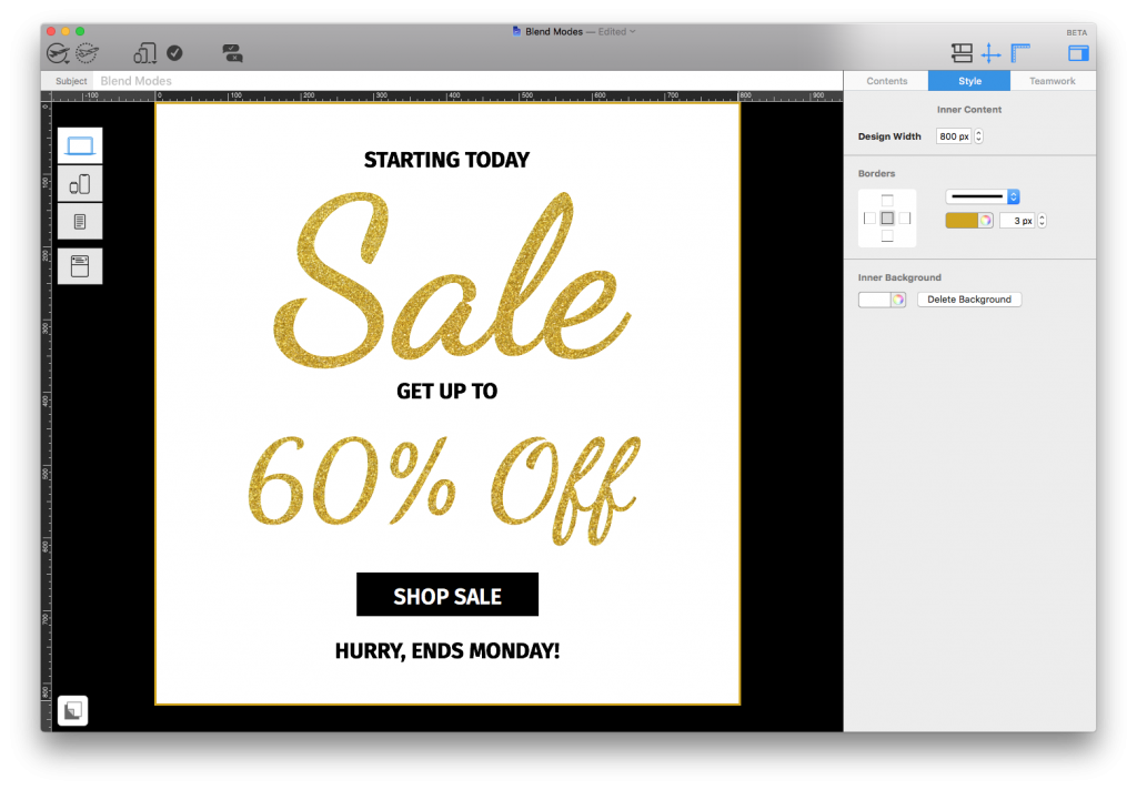
You can use the Blend Modes feature to make unique text effects for your email designs. These kind of effects are great for bold headlines or creating text-based eye-catchers like this:
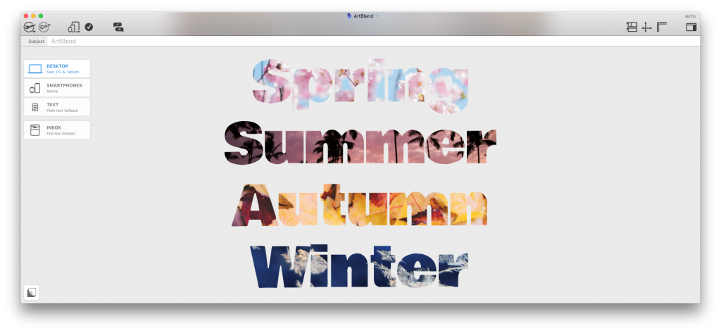
Here's how it works...
Using Blend Modes for text effects
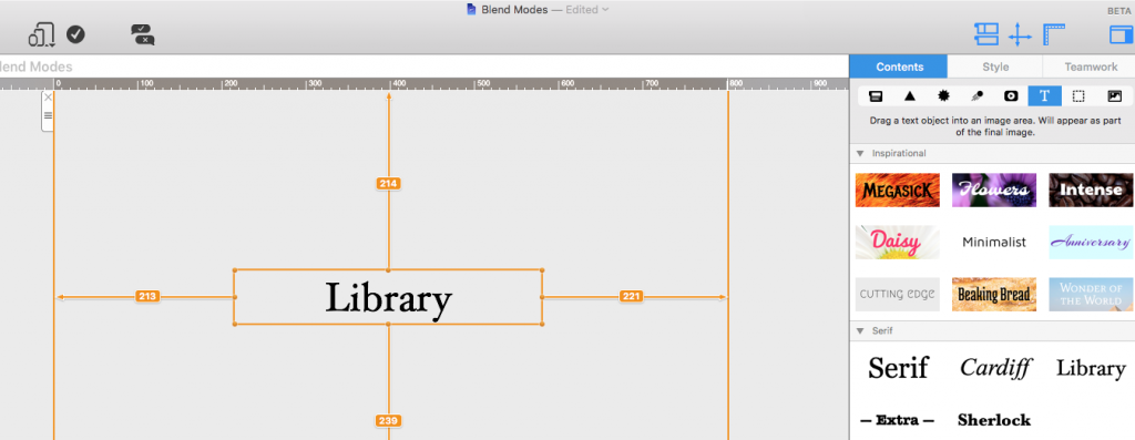
To get started, go to the "Contents" menu and add a Text Object to an image area:
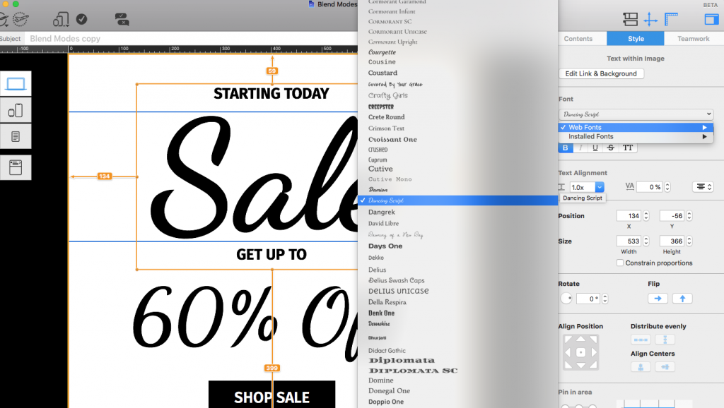
Edit the text: Adjust the font, size, text etc. to make it fit your design:
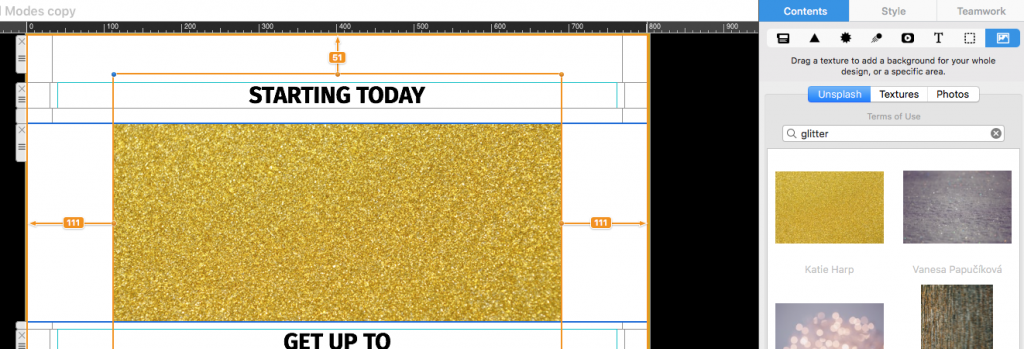
To make your text look extra special, choose a vibrant image you would like to use to fill in your text. Use your own image or one from the Unsplash library. This could be a pattern, a textured image, or anything else you think may suit your design.
Drag your chosen image into the image area and position it over the text; making sure all text is covered:
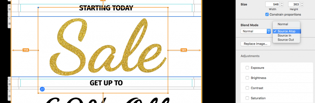
Select the image, go to the "Style" menu and to "Blend Mask." From the drop down menu, apply the "Source Atop" Blend Mask. The lighter-colored text will now be filled in by the image you have chosen:
You can now carry on and repeat this effect throughout your design to create cool patterned text effects:
Choose images and text that blend clearly
Start with a bold, readable typeface and a short phrase. Thin fonts, very small letters, or long paragraphs leave too little visible area for the image texture. A high-contrast source image usually produces a clearer result than a photo with many similar colors. Patterns, gradients, foliage, water, and colorful abstract images can all work well.
Place the image so its most useful details cover the text object. The surrounding parts of the image will not be visible after the Source Atop mask is applied, so concentrate on the area directly above the letters. Reposition or resize the image if the first result looks flat or uneven.
Keep blended text accessible
Decorative image-filled text should not carry the only copy of an essential message. Some recipients initially block images, and image-based text cannot adapt like live HTML text. Repeat important information in a live heading or body paragraph and add concise alt text that describes the graphic purpose.
- Use the effect for short decorative headlines rather than body copy.
- Maintain strong contrast against the background behind the text.
- Check that every letter remains recognizable at normal viewing size.
- Preview desktop and mobile versions separately.
- Send a test email and inspect the result in a real inbox.
Troubleshoot email blending effects
If the image does not appear inside the letters, confirm that the image sits above the text object and that Source Atop is selected in the Blend Mask menu. If only part of a word is filled, enlarge or reposition the image until it covers the full text object. If the result is difficult to read, try a heavier font, a simpler source image, or a quieter background.
For more examples of combining elements, see the Mail Designer 365 blend modes guide. A careful preview ensures that email text blend modes add visual interest without weakening the message.
How Can We Help?