Modify a layout block for mobile in Mail Designer 365

Modifying a Layout Block for the Mobile Version

By Hans-Peter Optimizing your Template for Mobile

Modifying a layout block for the mobile version lets you refine a Mail Designer 365 email for smartphone readers without changing the main desktop layout. This is useful when a block needs different spacing, sizing, or positioning at a narrow width. The workflow keeps the same message while giving you more control over responsive email layout blocks.

Review the design in Smartphone view

Start with the desktop design in a stable state, then switch to Smartphone view. Review the full email before separating any block. A small typography adjustment may be possible with a mobile-only text style, while a structural change such as resizing or rearranging a layout block requires the mobile layout workflow described here.
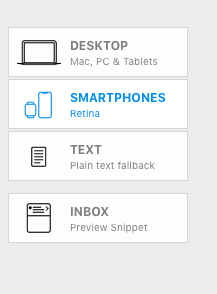
Opening Smartphone view before modifying a mobile layout block

Check the headline, body copy, images, buttons, and spacing at the smartphone width. Identify the specific block that needs attention so you can keep the change focused and avoid creating unnecessary differences between desktop and mobile.

Separate the mobile layout from the desktop version

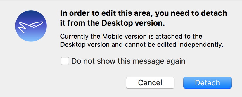
When you first make a structural change in Smartphone view, such as resizing a layout block, Mail Designer 365 displays a confirmation window. This step prevents an accidental mobile-only change and makes the relationship between the two layouts clear.
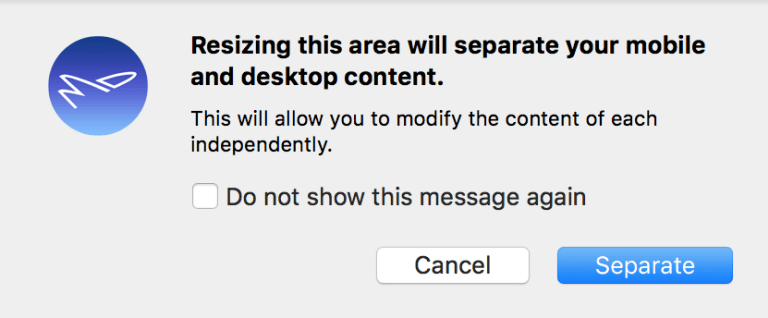
Separate mobile layout confirmation in Mail Designer 365

Choose Separate when you intend to modify the smartphone layout independently. After separation, changes to that mobile version no longer alter the corresponding desktop layout. Keep the content and destination links consistent unless the campaign itself requires different information.

Modify the layout block for mobile

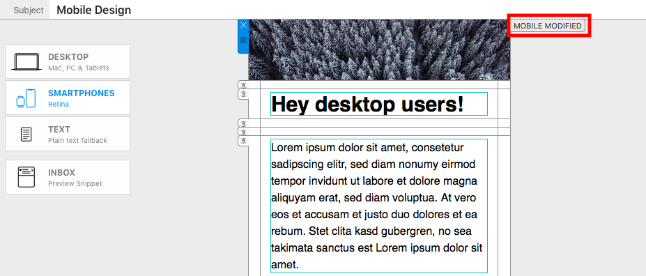
After separating the design, resize, reposition, or adjust the layout block for the available smartphone width. Mail Designer 365 marks changed blocks with the Mobile Modified label. This indicator helps you and other collaborators see that the block has mobile-specific settings.

Mobile Modified label on a separated responsive email layout block

When modifying a layout block for the mobile version, make the smallest change that solves the problem. For example, reduce excessive vertical space, give a button enough room to remain tappable, or reposition an image so the reading order stays clear. Preview surrounding blocks as well, because changing one block can affect the rhythm of the complete email.

Compare mobile and desktop versions

Switch between Smartphone and Desktop views after each meaningful adjustment. Confirm that the desktop version remains unchanged and that the mobile version still communicates the same information. Pay particular attention to text wrapping, image crops, button labels, linked destinations, and legal information.

Responsive email layout blocks should support a clear reading order. Avoid using a mobile-only arrangement that changes the meaning of the message or hides essential information. If a block contains text, also check whether a mobile-only text style would be a more appropriate and more limited adjustment.

Reset the mobile design to the desktop version

If you no longer want the separated mobile layout, choose Edit > Reset design to desktop version. This removes the mobile-specific structural changes and restores the desktop arrangement for the smartphone layout. Because the reset undoes the changes made in the separated mobile version, review the design before confirming it.
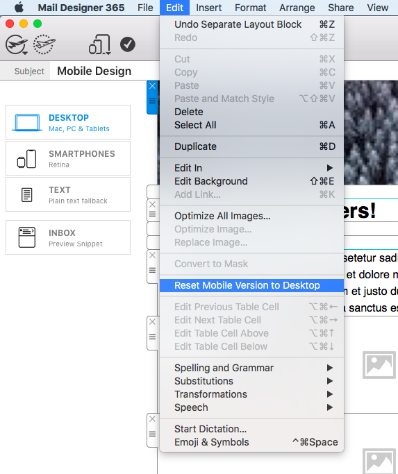
Resetting a modified mobile design to the desktop version

Test the mobile layout before sending

Use Check Preview to inspect the result in the inbox environments that matter to your audience, then send a test email to a real phone when possible. Confirm that each button and linked image opens the correct destination and that no content overlaps, clips, or becomes too small to read.

For text-specific changes that do not require separating a complete block, see the guide to mobile only text styles. Choosing the narrowest suitable tool keeps desktop and mobile versions easier to maintain.

Mobile Only Text Styles for Responsive Email Design

By Hans-Peter Configuring Text Styles, Optimizing your Template for Mobile

Mobile-only text styles let you tailor typography for smartphone readers without changing the desktop version of your Mail Designer 365 email. This responsive email text styling workflow is useful when a headline wraps awkwardly, body copy feels too large, or spacing that looks balanced on a Mac takes up too much room on a phone.

When to use mobile only text styles

Start with a complete desktop design, then switch to Smartphone view and review each important text block. A mobile only adjustment is appropriate when the same wording should remain in both layouts but its font size, line height, alignment, or spacing needs to change for a narrower screen. Keep the message itself consistent so recipients see the same offer and information on every device.

Create a mobile only text style

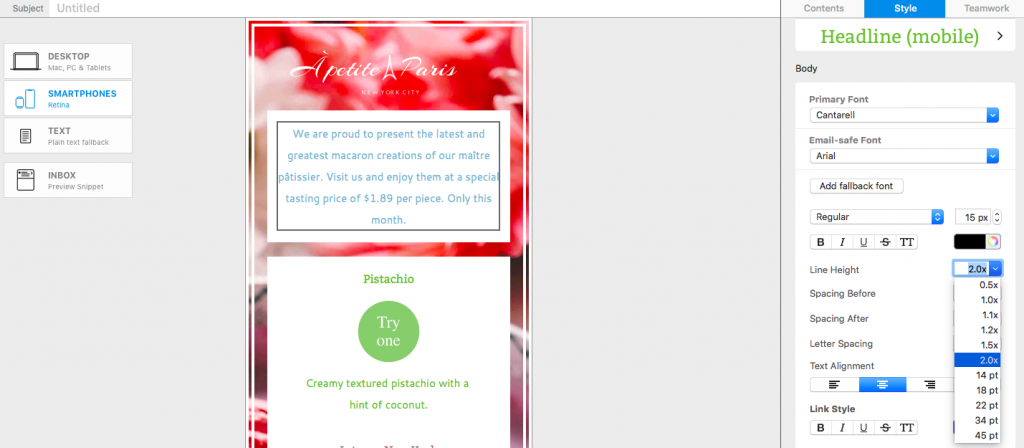
Select a text block in Smartphone view and make a typography adjustment. In this example, reducing the line height saves vertical space while keeping the copy readable. Use small changes first and check that headings, paragraphs, and links still have enough separation.

Adjusting line height for a mobile only text style in Mail Designer 365

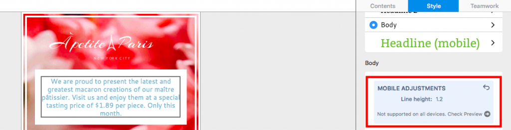
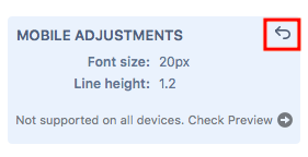
After the first mobile only change, Mail Designer 365 displays the adjustment in a blue box in the Style menu. This visual marker helps you distinguish smartphone-specific formatting from the shared desktop style.

Blue mobile only style indicator in the Mail Designer 365 Style menu

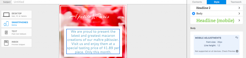
You can continue refining the same style for mobile. For example, adjust font size, line height, text alignment, or spacing only when it improves scanning on a narrow display. Avoid shrinking text so far that it becomes difficult to read.

Additional mobile only text style settings for responsive email design

Compare the mobile and desktop styles

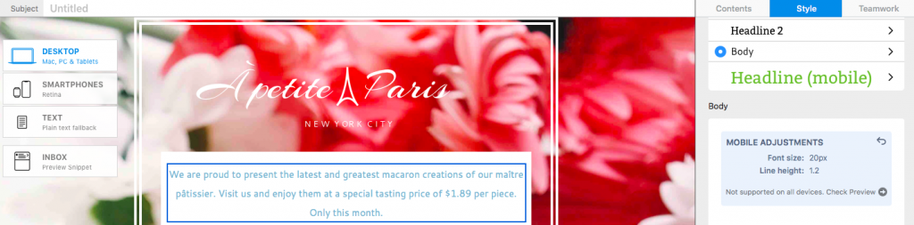
Return to Desktop view after making your mobile only text styles. The blue box remains visible in the Style menu, reminding you and other collaborators that the selected text has smartphone-specific formatting. The desktop typography itself remains unchanged.

Desktop view showing the mobile only style reminder

Review both layouts whenever you change shared copy. A longer headline or translated sentence may wrap differently even though the mobile style settings are still active. This comparison is an important part of responsive email text styling because it prevents a desktop edit from creating an unexpected mobile layout.

Reset a mobile only text adjustment

To remove the smartphone-specific formatting, click the undo arrow in the top corner of the blue style box. Mail Designer 365 then returns that text style to the desktop version across both layouts. Resetting is useful when the desktop settings already work well at both widths or when you want to rebuild the mobile treatment from a clean baseline.

Resetting a mobile only text adjustment to the desktop style

Preview mobile typography before sending

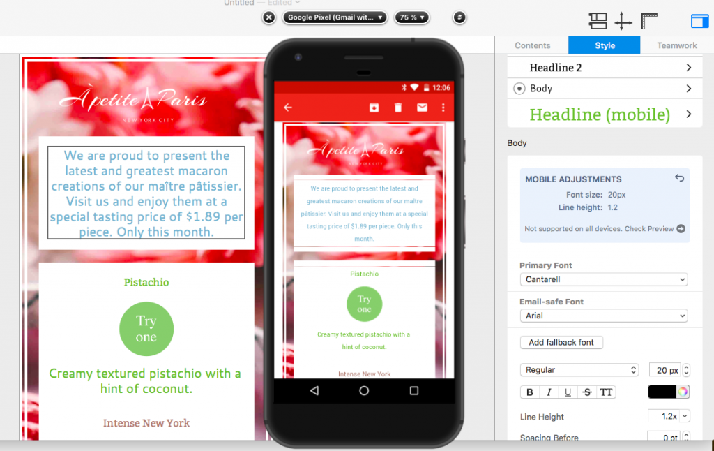
Important: Mobile Style Adjustments are not supported by non-Gmail addresses in the Gmail mobile app. Check the design with the Gmail (IMAP) preview before sending. Choose Check Preview to open the device preview and confirm that font size, line height, wrapping, links, and spacing remain readable.

Gmail IMAP preview for checking mobile only text styles

For a reliable final check, preview several representative text blocks, including the main headline, body copy, buttons, and legal information. Also send a test email when possible. If a line wraps poorly, return to Smartphone view and make the smallest useful adjustment rather than changing every text style.

You can also review the mobile layout block guide for related responsive design controls in Mail Designer 365.

Mobile text style checklist

Before you finish, compare the desktop and smartphone versions side by side. Confirm that the headline does not wrap into an isolated word, body text remains comfortably readable, and linked text is easy to tap. Check that line height provides breathing room without making the email unnecessarily long. Keep brand typography consistent unless a mobile adjustment is required for clarity.

Finally, use Check Preview for the inbox environments that matter to your audience and send a test message to a real device. These checks help you use mobile only text styles as a focused accessibility and layout improvement instead of a separate redesign. If the mobile version already reads well, retain the shared desktop style.

Working with text and links

By Optimizing your Template for Mobile

How will the device version affect my text and links?

Working with text and links is the same in the desktop and mobile editing mode. If a layout block in the mobile version is not detached from the desktop version, then all changes you make will apply to both. If you make changes in the desktop version, it will also apply to the mobile version and vice versa. However, making independent changes is easy! Just detach the two versions and then edit your text and links.


Hide layout blocks on mobile in Mail Designer 365

Hide Layout Blocks on Mobile in Mail Designer 365

By Hans-Peter Optimizing your Template for Mobile

Hide Layout Blocks on Mobile in Mail Designer 365

You can hide layout blocks on mobile when a section is useful in the desktop email but would make the smartphone version too long, repetitive, or difficult to scan. Mail Designer 365 keeps the layout block available in the desktop design while marking it as hidden in the smartphone view.

Use this feature selectively. Important information, legal details, essential links, and the main call to action should remain available to mobile recipients. Hide only content that is genuinely optional or has an equivalent mobile-friendly replacement.

1. Open the Smartphone view

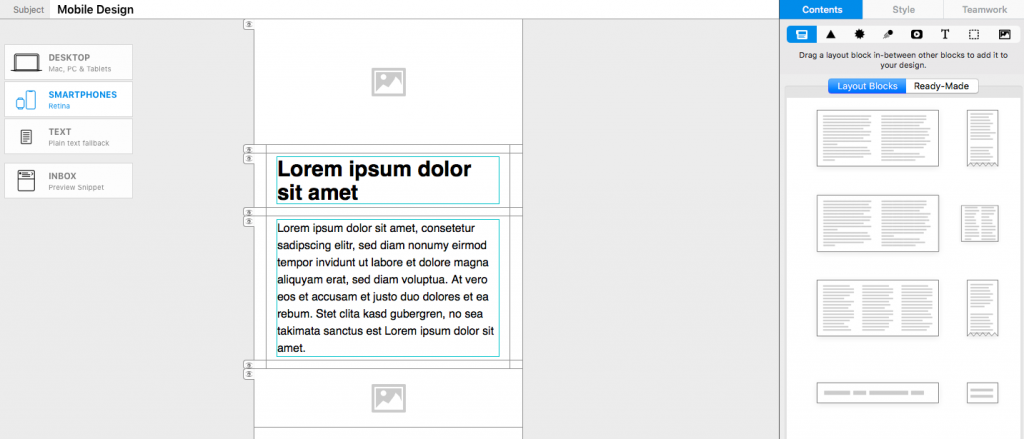
Switch from the desktop design to the Smartphone view. Review the complete mobile layout before hiding anything so you can see which sections repeat information, create unnecessary scrolling, or do not adapt well to the narrower format.

Opening the Smartphone view to hide layout blocks on mobile

2. Hide a layout block

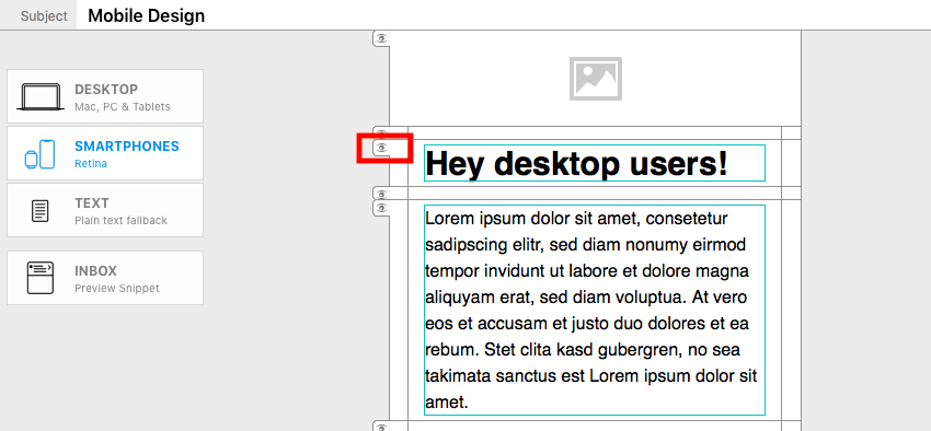
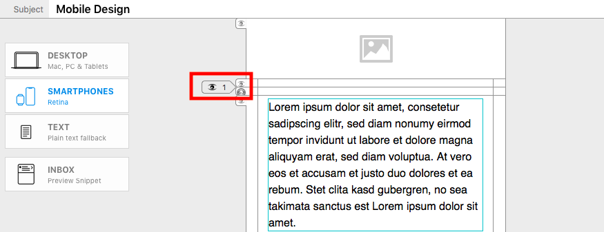
Select the layout block you want to remove from the mobile version. Click the eye icon on the left edge of the block. The block is hidden from the smartphone layout but remains part of the desktop version.

Eye icon used to hide a layout block in the Smartphone view

3. Read the hidden-block indicator

After the block disappears, Mail Designer 365 displays a small flag with an eye symbol in its place. The number beside the symbol shows how many layout blocks are hidden at that position in the smartphone version. This indicator helps you keep track of content that is still present in the design but not shown on mobile.

Hidden layout block indicator with an eye symbol and count

4. Hide consecutive blocks

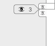
If you hide several adjacent layout blocks, the number in the indicator increases. Use the count to confirm that the intended number of sections is hidden. When several blocks disappear together, review the content before and after the indicator to make sure the mobile reading order still makes sense.

Indicator showing multiple layout blocks hidden on mobile

5. Confirm the Desktop Only state

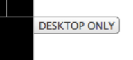
Switch back to the Desktop view. Layout blocks hidden from the smartphone version display a DESKTOP ONLY flag. This confirms that the content remains available to desktop recipients and has not been deleted from the email design.

Desktop Only flag on a layout block hidden from mobile

When hiding a mobile block makes sense

  • A decorative desktop section repeats information already presented as live text.
  • A wide visual treatment has a separate mobile-friendly replacement.
  • A secondary promotion makes the smartphone message unnecessarily long.
  • A desktop navigation or supporting section is not required for the mobile action.

Do not hide a block simply because it needs design work. If the section contains essential content, adapt the layout, shorten the copy, resize the imagery, or create a dedicated mobile block instead. The separate mobile-layout workflow is more appropriate when recipients need the information in a different format.

Troubleshoot hidden mobile content

If the eye control is not available, confirm that you are in the Smartphone view and that a complete layout block is selected. If the hidden count is higher than expected, inspect the adjacent indicators and review which consecutive blocks were hidden. Switching to the Desktop view can help identify the affected blocks through their DESKTOP ONLY flags.

When restoring content, check the order again instead of assuming the original position is still ideal for mobile. A block may need shorter copy, a different image crop, or a dedicated smartphone layout before it is made visible to mobile recipients.

Review and test the mobile email

After hiding layout blocks on mobile, preview the full smartphone version from top to bottom. Confirm that headings, paragraphs, images, and buttons still follow a logical sequence. Check that removing a block did not leave an unexplained gap or separate a heading from the content it introduces.

Send a test email and review it on a real phone as well as in the email clients your audience uses most. Verify that the primary call to action, contact information, unsubscribe link, and required legal details remain accessible. Return to the Smartphone view if you need to restore a hidden section or replace it with a more suitable mobile layout.

Adding layout blocks for the mobile version

By Hans-Peter Optimizing your Template for Mobile

Layout blocks for the mobile version

Layout blocks for the mobile version let you add content that appears only when recipients read the newsletter on a smartphone or other mobile device. This is useful when the mobile design needs a shorter introduction, a compact call to action, a different image, or instructions tailored to people using a smaller screen.

Mail Designer 365 keeps the desktop and smartphone versions connected while allowing selected blocks to be mobile-only. The following steps explain how to switch views, add the block, recognize its visibility setting, and verify the final result.

Switch to the Smartphone view

  1. Open the email design in Mail Designer 365.
  2. Select the Smartphone view in the design toolbar.
  3. Review the existing mobile layout before adding another section.

Working in Smartphone view is important because a block inserted there can be designated specifically for the mobile version. Before making structural changes, note how the current desktop content is arranged and which parts already adapt automatically.

Switch to Smartphone view before adding mobile layout blocks

Choose a layout block

Open Contents > Layout Blocks. The available structures work in the same way as they do in Desktop view. Choose a layout that suits the mobile content: a single-column block is often easiest to read on a narrow screen, while a compact image-and-text block can work well for a featured offer.

Drag the selected layout block into the smartphone design. Watch the placement indicator and release the block when it appears at the intended position. Existing sections move aside to show where the new block will be inserted.

Choose and drag a layout block into the mobile email version

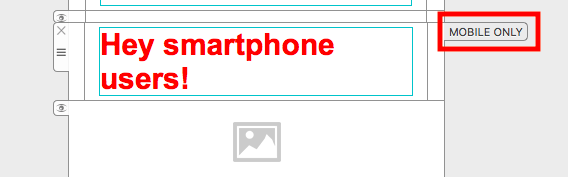
Confirm the MOBILE ONLY label

After insertion, the new section is labeled MOBILE ONLY. This label confirms that the block will be displayed in the smartphone version but not in the desktop version. It is a design-editor indicator and does not appear as visible text in the email received by your audience.

If the label is missing, check which view was active when you inserted the block. Undo the change if necessary, return to Smartphone view, and add the block again.

MOBILE ONLY label on a smartphone-specific layout block

Add content for mobile readers

Fill the block with the text, image, button, or other elements needed for the mobile experience. Keep copy concise and make buttons large enough to tap comfortably. Avoid placing essential information only in a mobile-only block unless desktop recipients receive the same information elsewhere.

Common uses include a shorter call to action, a mobile app link, a compact event reminder, or an image cropped specifically for portrait screens. A mobile-only block can also replace a desktop section that is too detailed for a small display.

Check the desktop version

Switch back to Desktop view and confirm that the new block is not shown there. Also verify that the surrounding desktop sections have not changed unexpectedly. The mobile-only block should supplement the responsive design, not disrupt the content that already works on larger screens.

If you need to adjust an existing block rather than create a separate mobile section, see modifying a layout block for the mobile version.

Preview and test both versions

  • Preview the smartphone layout and confirm the MOBILE ONLY block is in the correct position.
  • Check text size, line length, image cropping, and button spacing.
  • Preview the desktop layout and confirm the mobile-only section is absent.
  • Send a test email and open it on both a phone and a desktop email client.
  • Check that links and calls to action lead to the intended destinations.

Testing both versions is essential because content visibility changes affect the reading experience differently on each device. Once the mobile block and surrounding sections work as intended, save the design before exporting or sending the campaign.

Privacy Settings / Datenschutz-Einstellungen