
Resize email layout blocks in Mail Designer 365
When you resize email layout blocks, you control how text, images, and columns are arranged before your campaign reaches an inbox. Mail Designer 365 makes these adjustments directly on the design canvas, so you can refine a section without rebuilding the whole email. This guide explains how to change the height and width of layout blocks, resize the areas inside them, and keep the desktop and mobile versions of your design easy to read.
How to change the width of a layout area
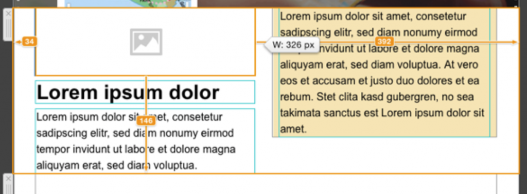
Select the layout block that contains the area you want to adjust. Move the pointer over the divider between two areas until the resize control appears, then drag the divider left or right. One area becomes wider while the neighboring area becomes narrower, and the overall email width remains unchanged. This is useful when an image needs more room, when a text column has too many short line breaks, or when a button should sit beside supporting copy.
Make small adjustments and check the result as you drag. A very narrow text area can create awkward wrapping, while an oversized image area may leave too little space for the message. If a block has several columns, review every column after moving a divider because the available space is shared across the row.
How to adjust the height of text and image areas
Text areas grow automatically as you add lines of text and become shorter when you remove them. If a text area appears taller than expected, check for blank paragraphs or extra line breaks at the end of the copy. Editing the text is usually the cleanest way to control its height because the area adapts to the content.
For an image area, drag its horizontal divider to increase or reduce the visible height. The image placement and crop determine which part remains visible, so check the focal point after resizing. If an important subject is cut off, reposition the image or choose a crop that fits the new proportions.
Check the mobile version after resizing
Desktop and mobile layouts have different space constraints. After you resize email layout blocks for the desktop design, switch to the mobile preview and confirm that the reading order still makes sense. Pay particular attention to narrow columns, headings, buttons, and images with text embedded in them. A balanced desktop row can become crowded on a smaller screen.
If the mobile layout needs a different arrangement, use the available mobile editing controls instead of forcing the desktop block into an unsuitable shape. Keep tap targets large enough, avoid very small type, and make sure the most important message appears early in the design.
Practical layout resizing tips
- Start with the content hierarchy: give the main message more room than supporting details.
- Keep related text and images together so recipients understand the connection immediately.
- Use consistent proportions across repeated product or feature blocks.
- Preview the design at several widths before sending a campaign.
- Send a test email to confirm how the resized layout renders in real inboxes.
Troubleshooting common resizing problems
If a divider does not move, first make sure you selected an editable area inside the layout block rather than the outer email canvas. If content jumps after a resize, look for long unbroken links, oversized images, or text formatting that prevents natural wrapping. When a row becomes too complex, consider using a simpler layout block with fewer areas.
For more guidance on building flexible sections, see the Mail Designer 365 layout blocks guide. Once the proportions look balanced, use the preview tools and send a test campaign. These checks help ensure that your layout works as intended across desktop and mobile inboxes.
How Can We Help?