Building up your email list is a great start to any email marketing strategy, but the important work does not stop there. Email list segmentation is also a critical factor for your email marketing success.
Segmenting your list helps you to create the best email content for your subscribers, and has also been proven to work wonders on your open rates. However, getting the information you need can be challenging.
Here are some useful techniques you can implement in your next campaign to improve your email list segmentation and get better results.
5 Useful Techniques for Email List Segmentation
1. Optimize your opt in process
The moment a customer chooses to opt in to receiving your newsletter is an important one.
Seize the moment while they are consciously making the effort to engage with your business to find out more about the new subscriber.
Instead of simply asking for their email address, think of a few key details you would like to know to help segment your list.
This could be:
- Name - For better personalisation
- Age - To optimize your content for the target group
- Interests (e.g. kids' fashion, rock music, political news, etc.) - To send relevant deals/content
- Location - For language choice or relevant cultural events
Getting this information straight away will allow you to hit the ground running in terms of producing relevant content and will save you time in the future.
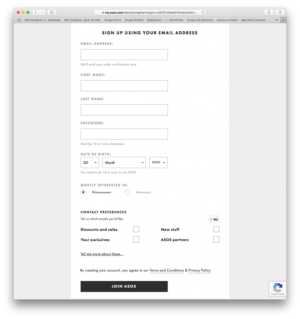
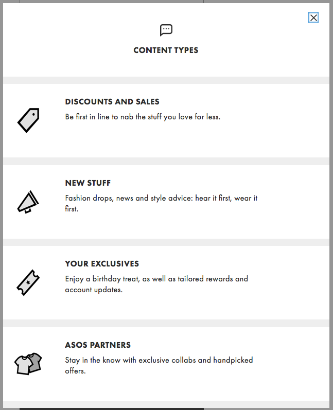
This opt in form by ASOS allows new customers to provide important information about themselves before signing up for their newsletter.
2. Get to know customers through your welcome email
First impressions are everything, and your welcome email is no exception.
Start as you mean to go on and make sure your welcome email presents customers with the opportunity to tell you more about themselves.
Including a link to a basic questionnaire, such as this example by Britannica, is a nice way to let the customer quickly outline their preferences.
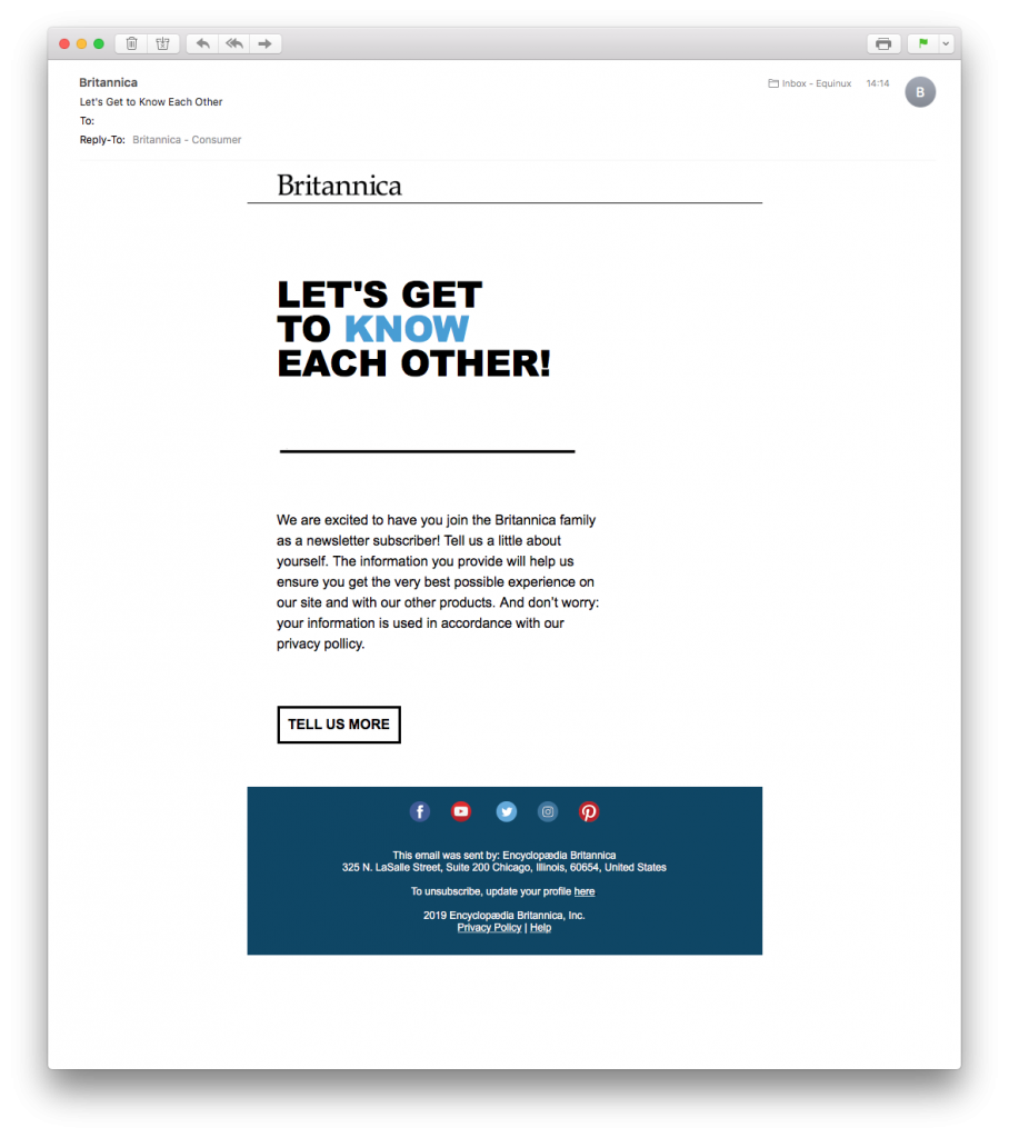
Britannica sent out this great welcome mail for better email list segmentation
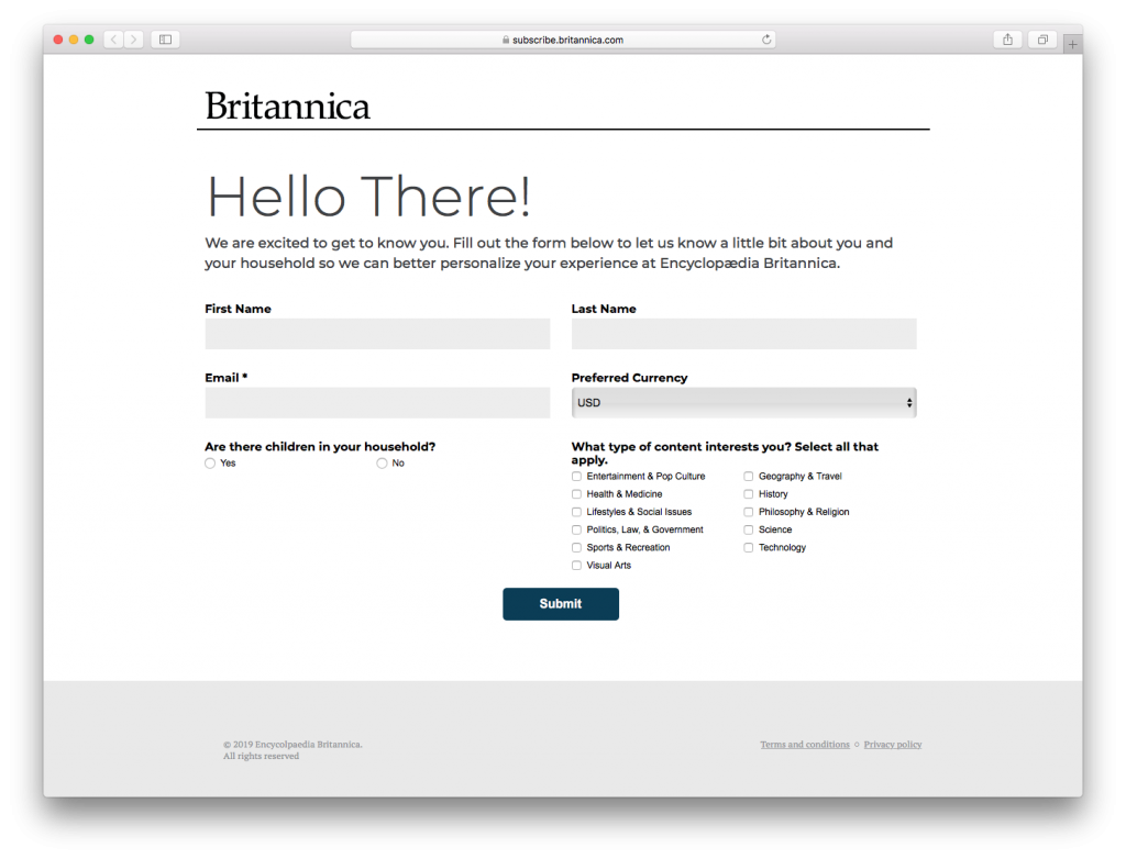
A simple questionnaire helps the new subscriber to easily indicate their preferences.
The customer will also feel confident that they will only be receiving emails relevant to the interests they've outlined.
3. Refer to customer shopping habits
The way your customer shops also tells you a lot about them that can help you with your email list segmentation.
If customers are required to sign in before completing a purchase, you will have all of the purchase information associated with their account.
Recommendation emails
This information can help you to produce better newsletter content. For example, you will have an insight into which kinds of products your customer is interested in (e.g. gadgets, outdoor clothing, sports equipment, etc.) This will allow you to send them more relevant recommendations.
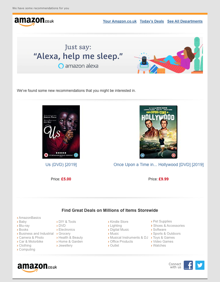
Tracking customer purchase information helps Amazon send more relevant product recommendation emails.
Service and subscription models
If you offer a subscription service, it is also useful to track customer activity to send them more effective emails.
This could range from onboarding emails, re-engagement campaigns, or sales-based up-sell emails. Knowing more about your customers helps you target them with a suitable call-to-action.
For example, sending an email with an upgrade call-to-action to a customer who hasn't used your service in some time is far less effective than targeting them with a re-engagement campaign.
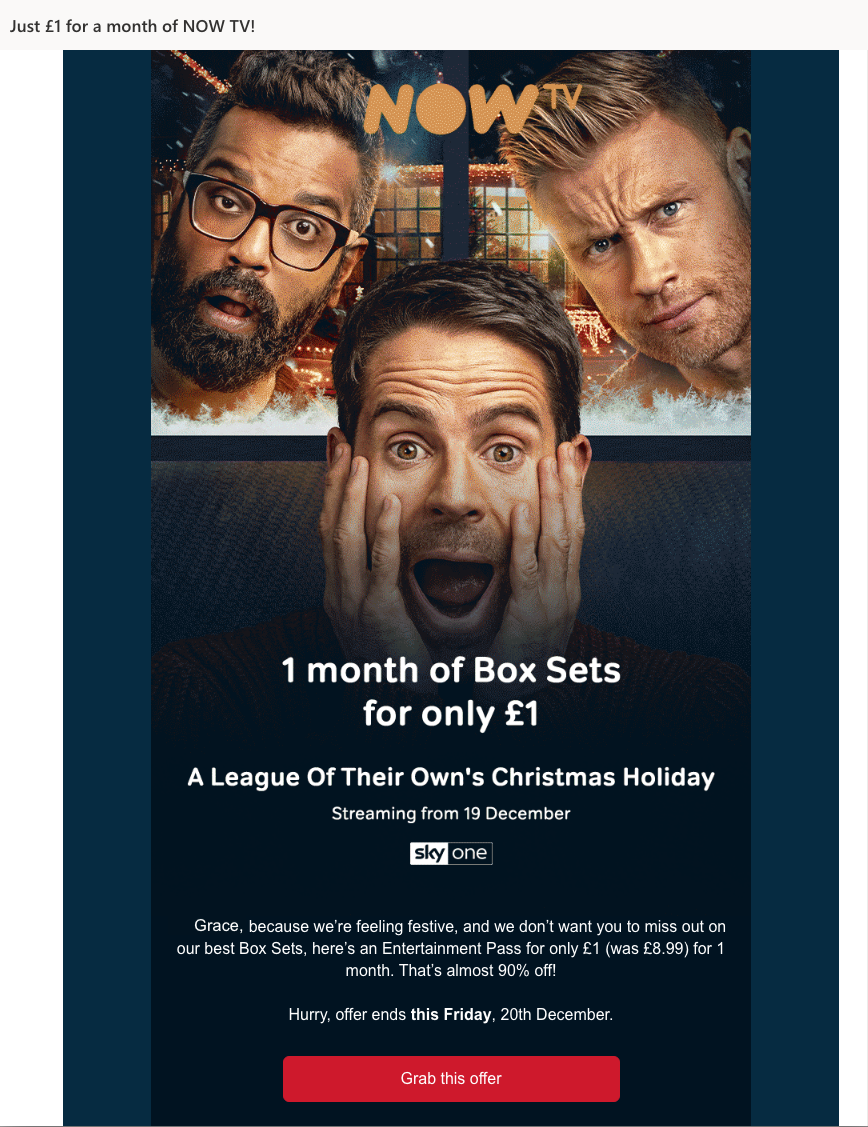
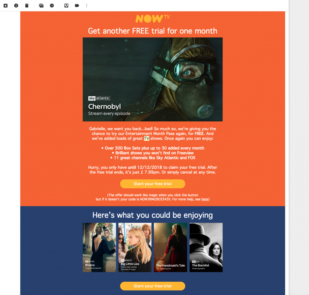
Knowing more about customer behaviour allows NOW TV to reengage lapsed subscribers with new offers.
Segmentation by abandonment rate
Behaviour tracking also helps you segment your list based on abandonment rate.
If a customer did not complete the checkout process, you can use this chance to send them an abandoned cart email. This is a great tool for reengagement and could be the key to you increasing sales which would have otherwise been lost.
This technique can also be applied for an abandoned onboarding process as a form of re-engagement.
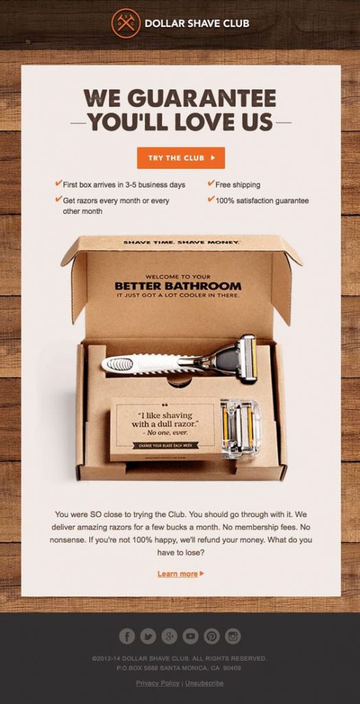
The Dollar Shave Club reacts to an abandoned onboarding process by sending out this smart re-engagement style email.
4. Run a birthday campaign
Everyone loves a birthday! A birthday email is a great opportunity to send customers a personalised offer.
To do this, you first need to find out when their birthday is. If you haven's found this out during the opt in process, putting together a quick email campaign helps fill in this missing information later on.
Once you have the customer's birthday on record, the world is your oyster. You can segment your list by birthday, birthday month, age, star sign, etc and create unique birthday related content to engage your subscribers.
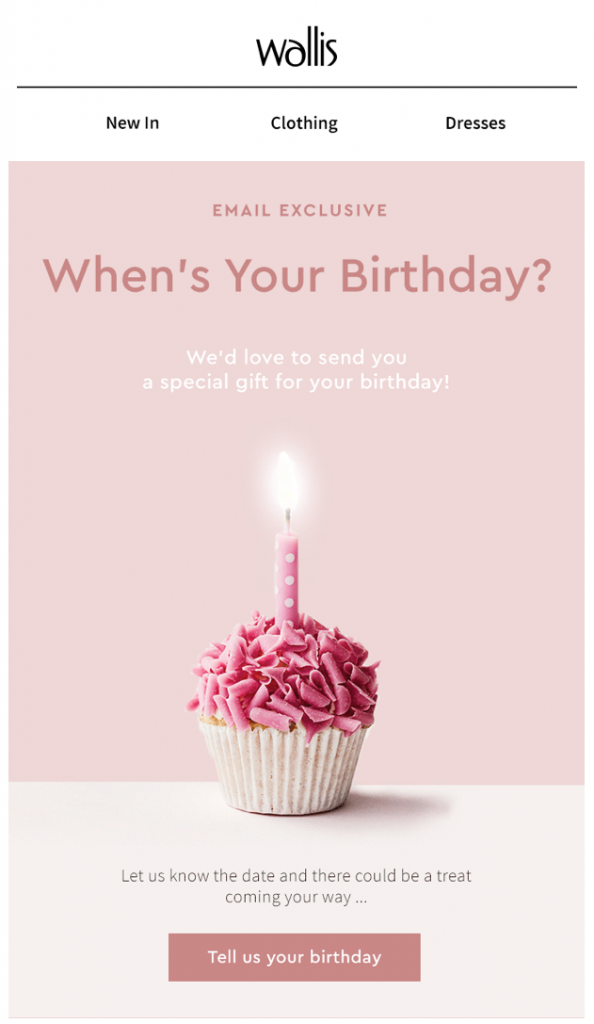
Wallis used this campaign to find out more about subscribers' birthdays and send them unique, personalised content later on.
5. Give subscribers an incentive to tell you more
Getting information from your subscribers to help with your email list segmentation can be tough. Providing an incentive is often a good way to boost engagement.
Offering a discount voucher in exchange for information is one potential way to gather more useful data to use for your email campaigns.
Alternatively, you could offer subscribers a useful guide or resource as a way to get them to tell you more about themselves.
In this example by Neil Patel, new users are encouraged to take a quiz to then receive relevant marketing advice. This is elaborate for a newsletter sign up process, but ultimately is a win-win situation. The user provides all the information to help categorise them correctly and is rewarded with a useful guide at the end.
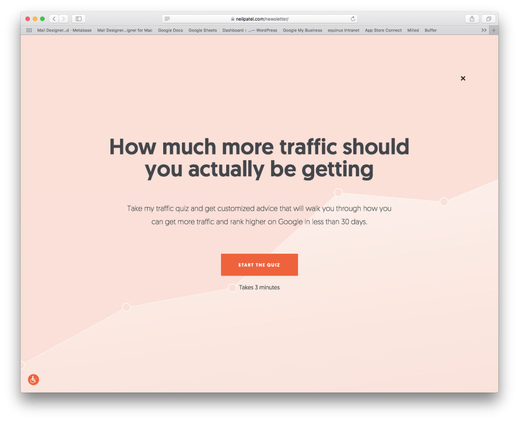
Neil Patel's quiz is an innovative way to segment his email list based on key subscriber characteristics.
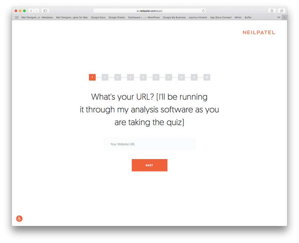
Neil can understand more about new subscribers after using his quiz to ask critical questions.
Try out these email list segmentation techniques
Many of the techniques listed above require a trigger-based transactional email.
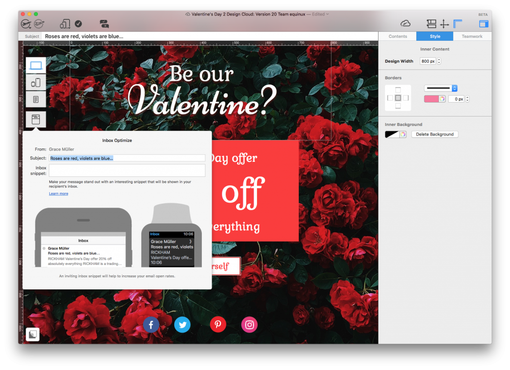
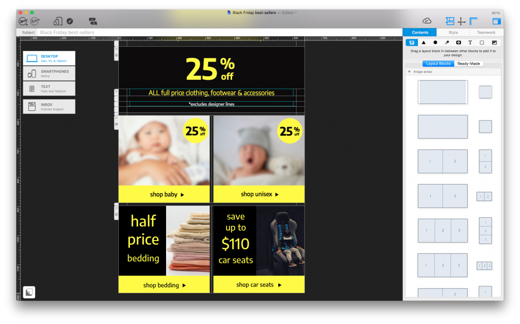
Try out the tools and resource provided by Mail Designer 365 today to create a HTML email template to use with your campaign.
Use great email design to convince your subscribers to respond to your campaigns and gather more information to help you with your email list segmentation.
Start your free trial today to see what you can achieve.
Until next time,
Your Mail Designer 365 Team


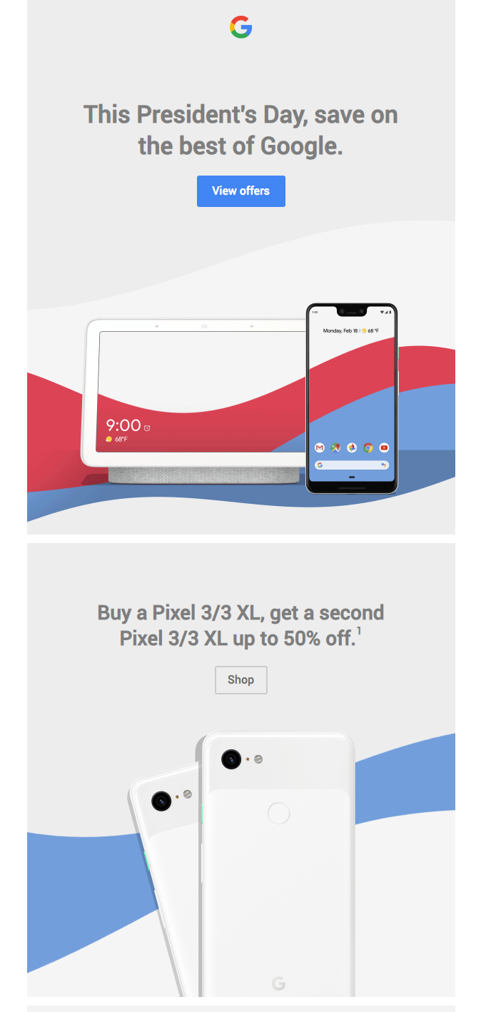
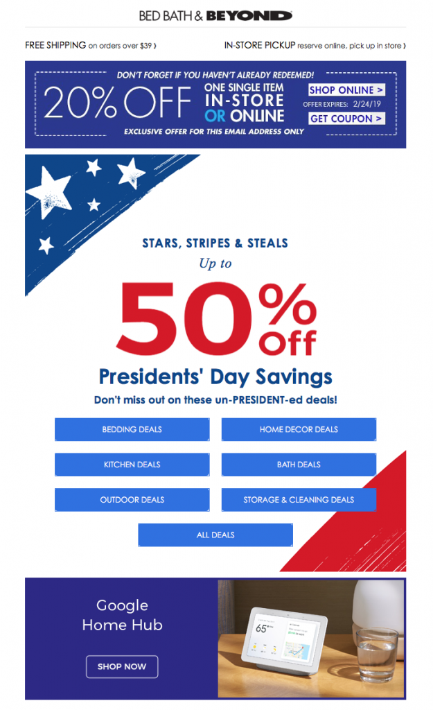
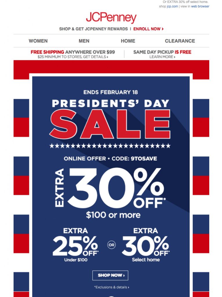
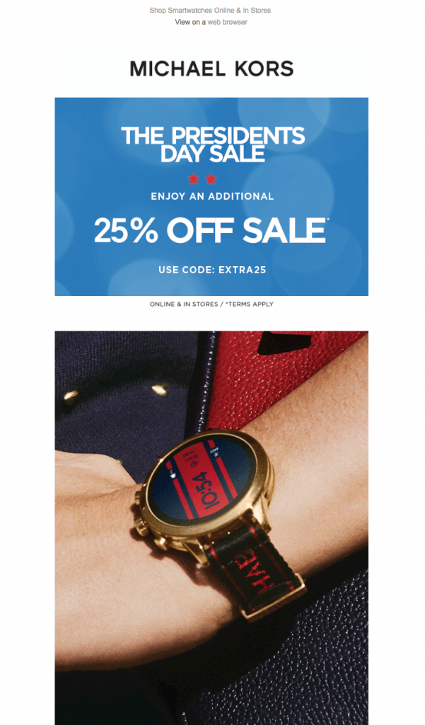
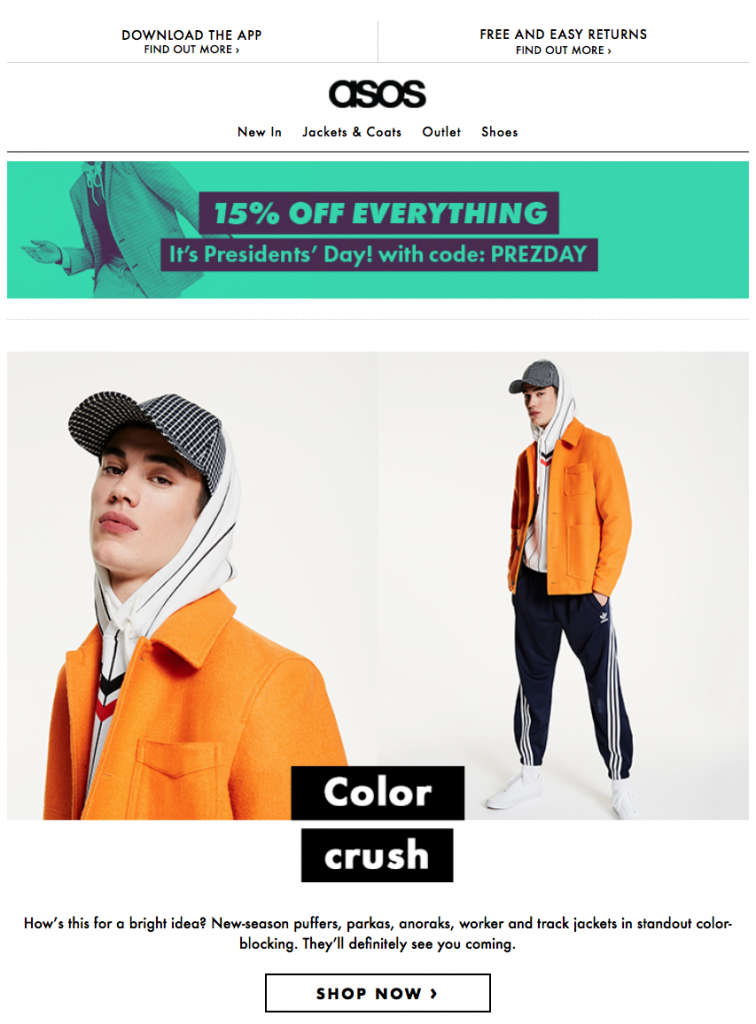
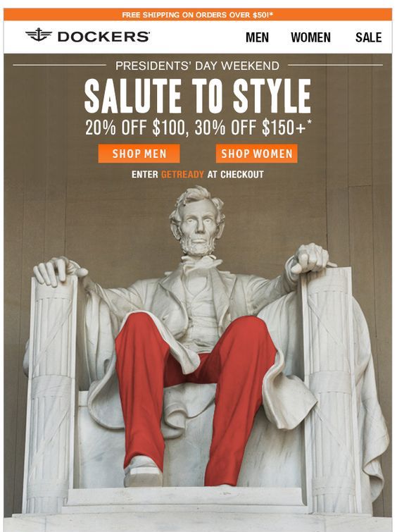
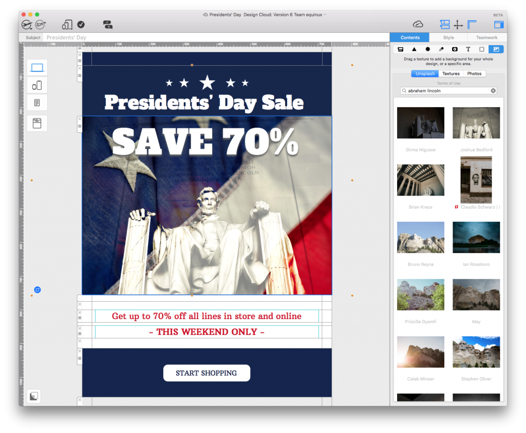
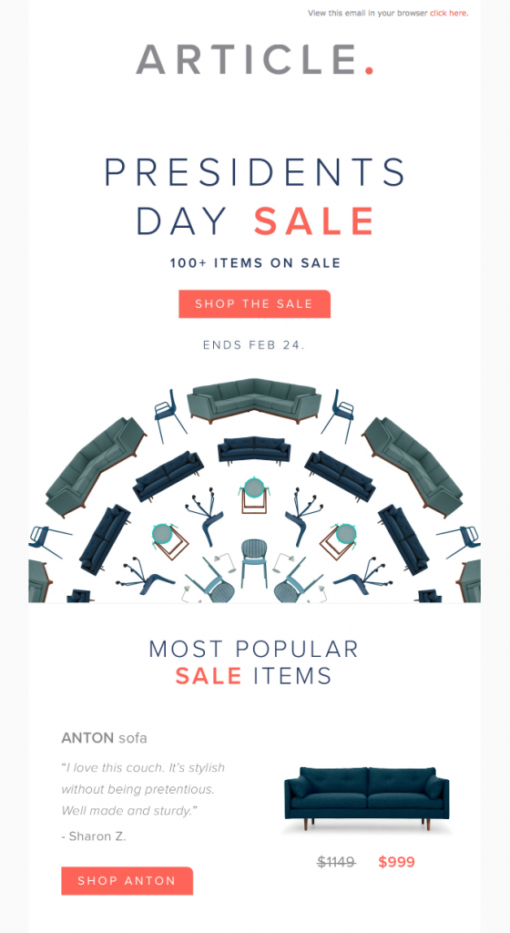 This Presidents' Day email design by Article also shows you don't have to go wild with the stars and stripes to get involved in the action. Big, easy to read headlines paired with bold CTAs and a clear shopping layout make up the perfect recipe for any sale or promotion.





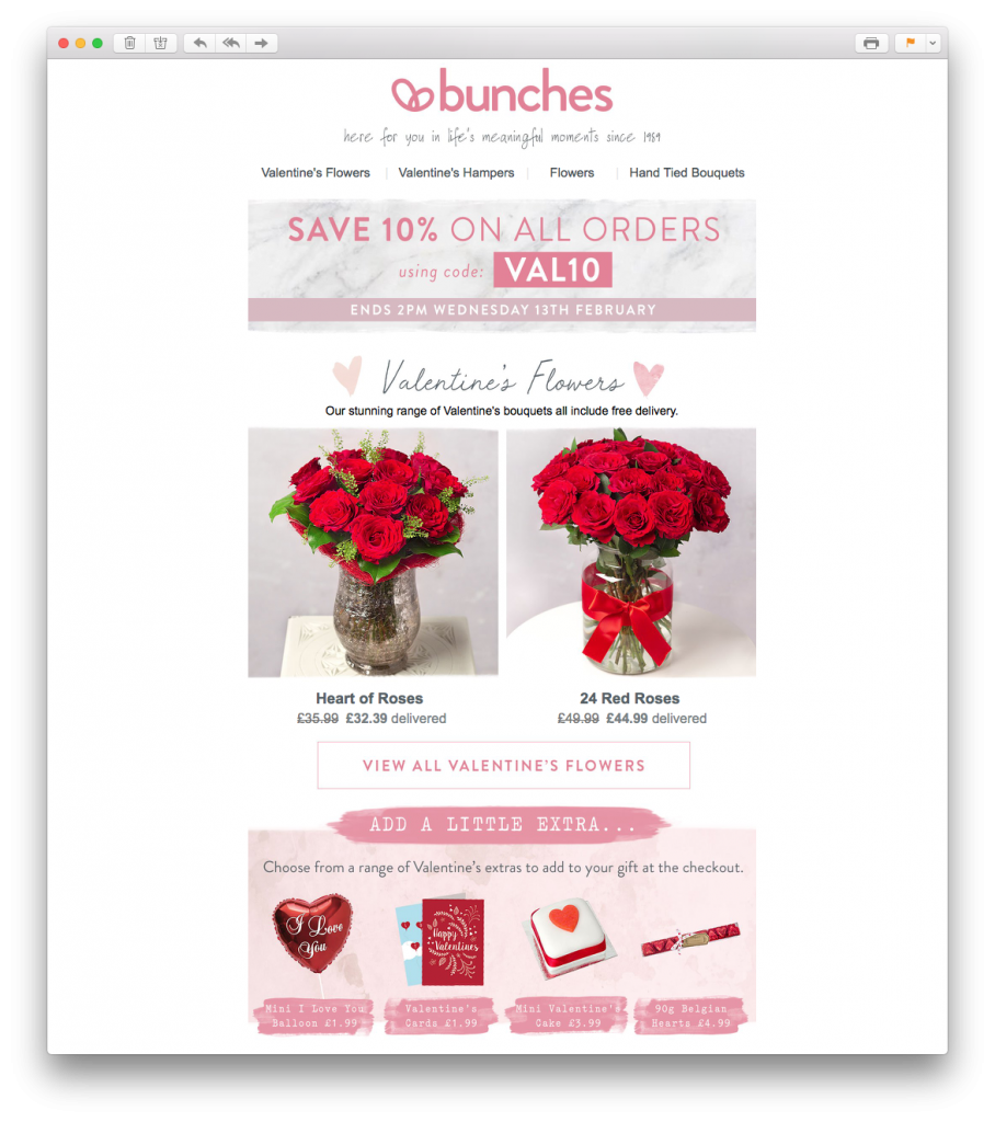 What we love: The offer is made super prominent in the header of the email design. This paired with bright product photos and useful pricing information makes it really effective for shoppers looking for the best deal.
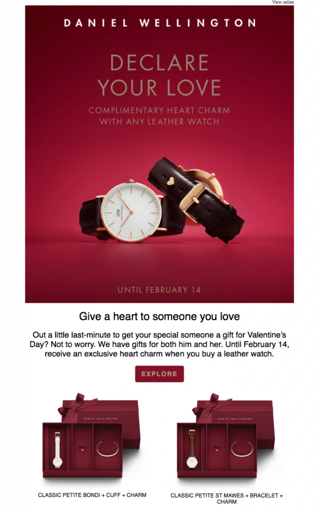 What we love: The deep red theme of this email design is perfect for the romantic occasion. The bold headline also takes centre stage and speaks directly to the reader.
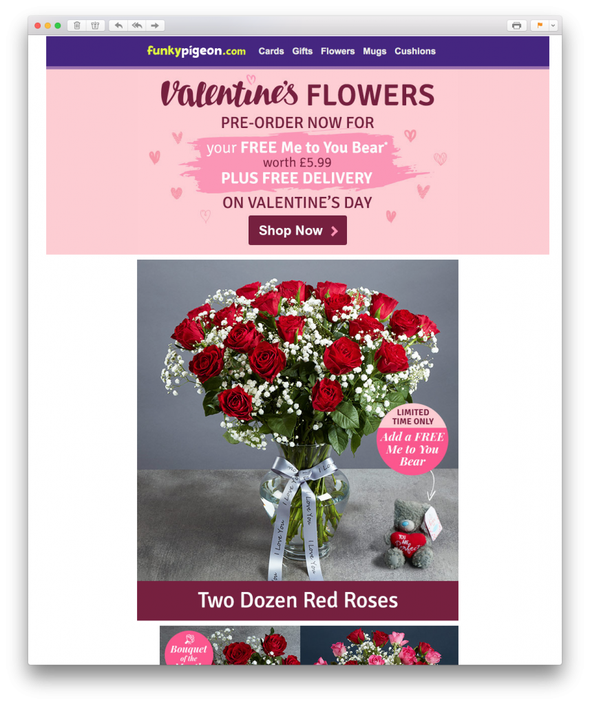 What we love: Using a classic brush font in the header is a great way to illustrate the Valentine's theme. The use of bright pink eye-catchers to draw attention to special offers and promotions is also very effective.
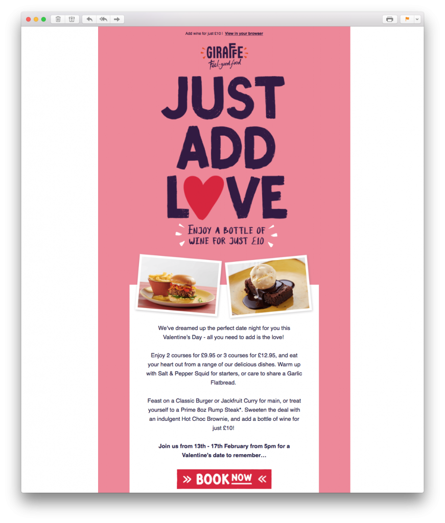 What we love: The giant headline does a great job of capturing the customer's attention. In addition, the red CTA (call-to-action) button contrasts well against the plain white background; making it super clickable.
 What we love: Think pink! Even if you don't do much in the build up to the big day, a simple Valentine's Day themed sale can be all you need to celebrate with your customers. The huge love heart is a great eye-catcher and the contrasting CTA buttons work really well.
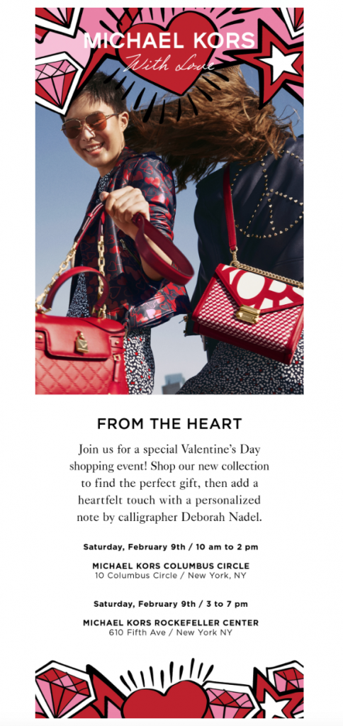 What we love: This Valentine's Day email campaign stands out thanks to the fun illustrations of hearts and stars. Red and pink accents throughout the design also play well to the Valentine's Day theme and perfectly advertise their seasonal collection.
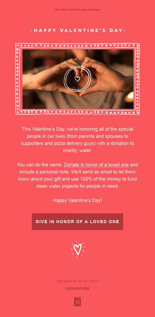
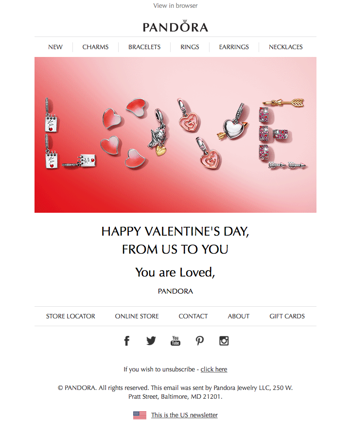 What we love: The message may be simple, but the design is so sweet. Taking a time out from all the sales-emails sent around a big holiday is a great way to show customers your appreciation. The "Love" headline made up of their charms is also super creative.
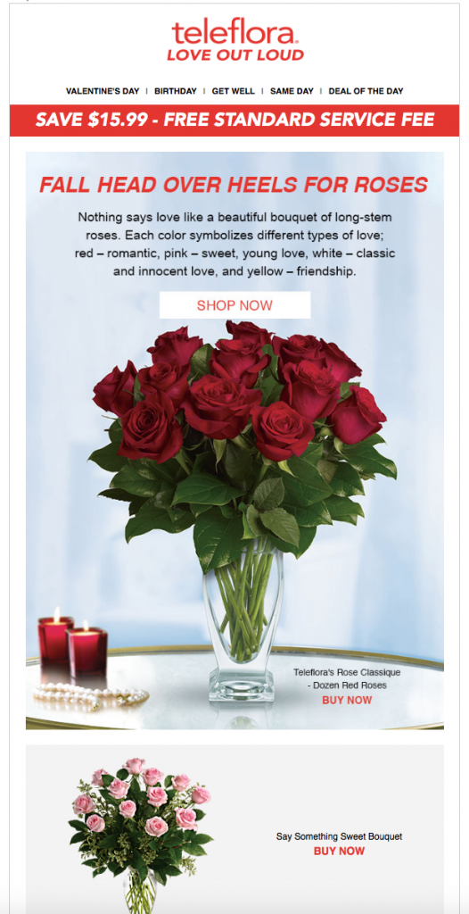 What we love: Red roses are a time old symbol of love and romance; making them the perfect feature image for this campaign. The use of red in the headline and call-to-actions also works great in the design.
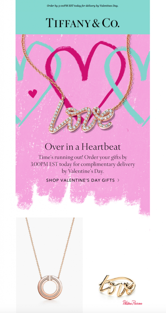 What we love: This Valentine's Day email campaign by one of the biggest names in the industry definitely turns heads thanks to its bright pink background and love heart design. Including a
 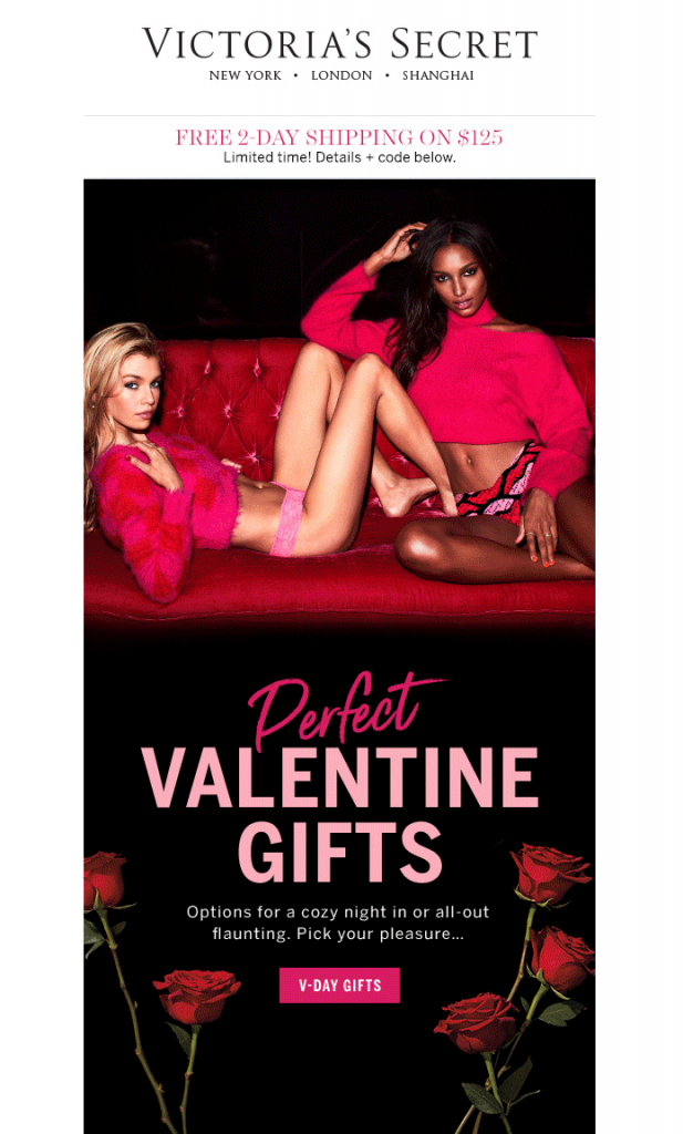 What we love: The black background in this design makes the red and pink accents even more prominent and helps turn up the heat. Again, the use of red roses is perfect for Valentine's Day and providing gift ideas is a great way to help shoppers who may be struggling to choose!
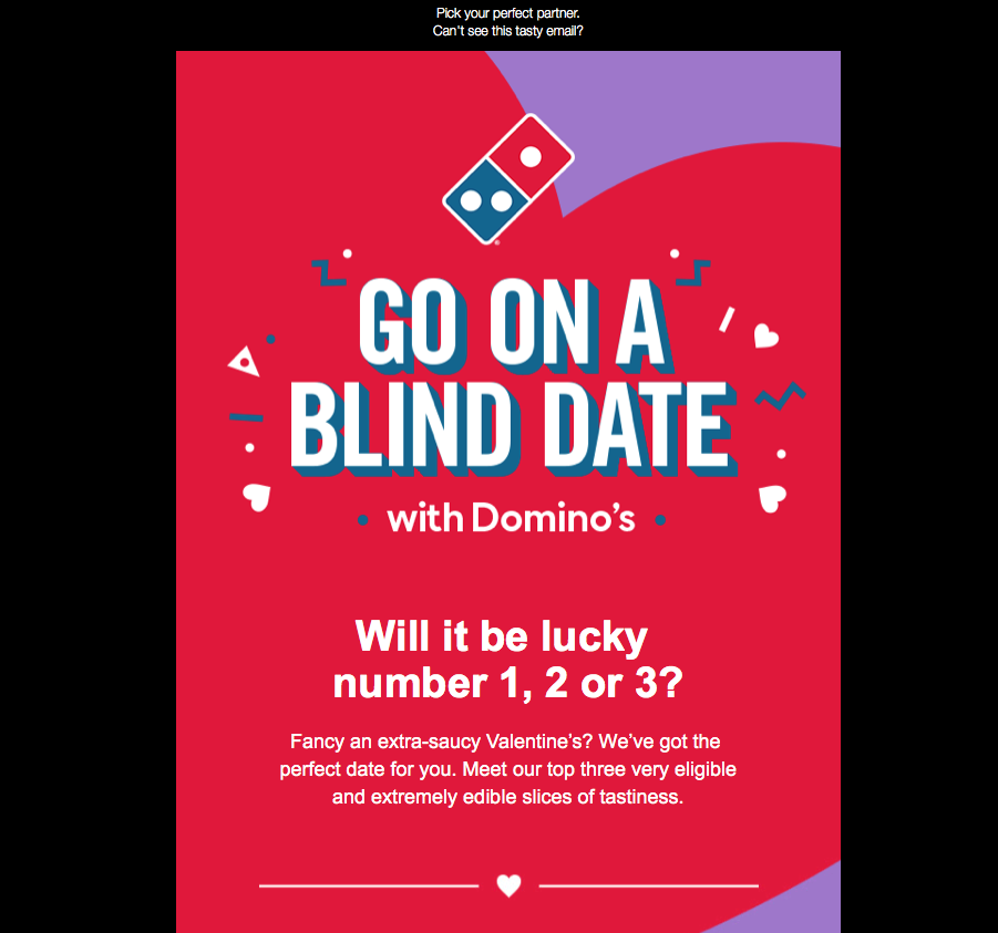
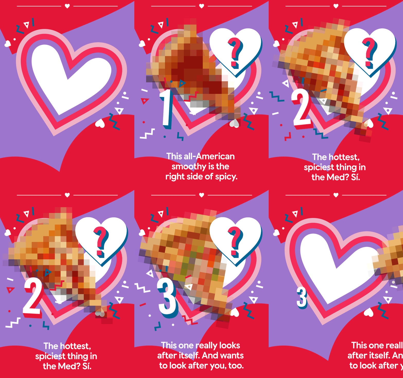
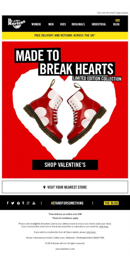
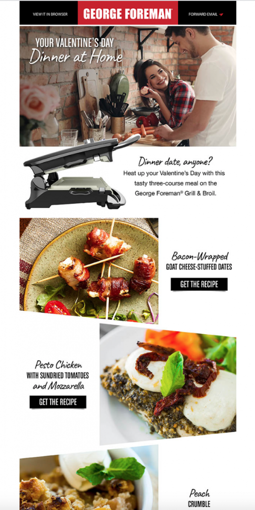
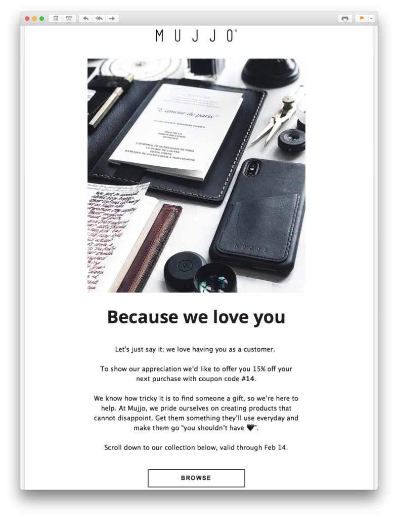
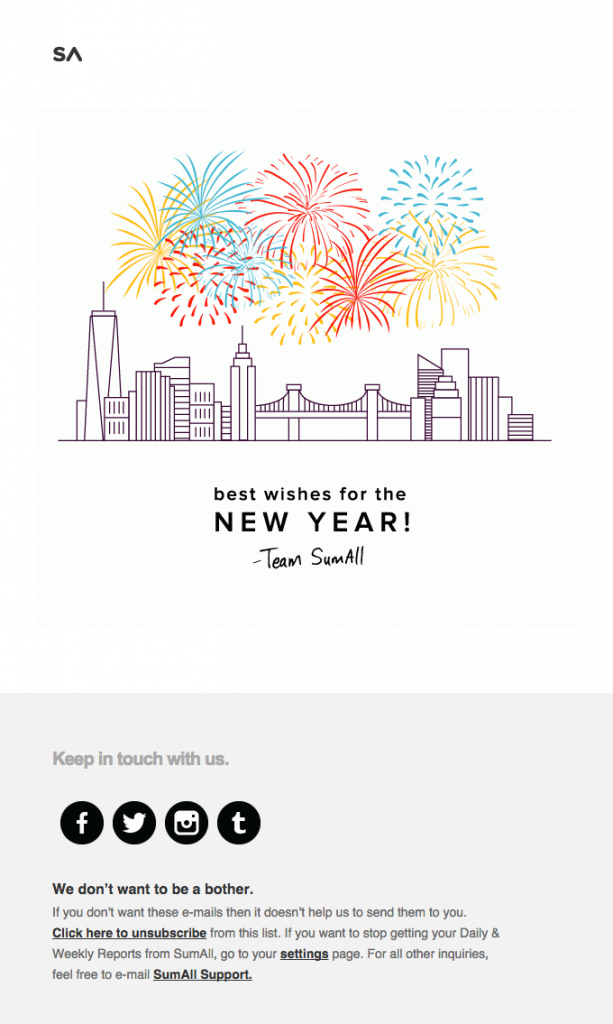
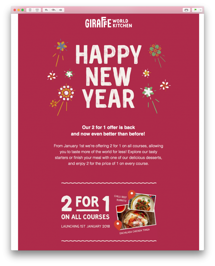
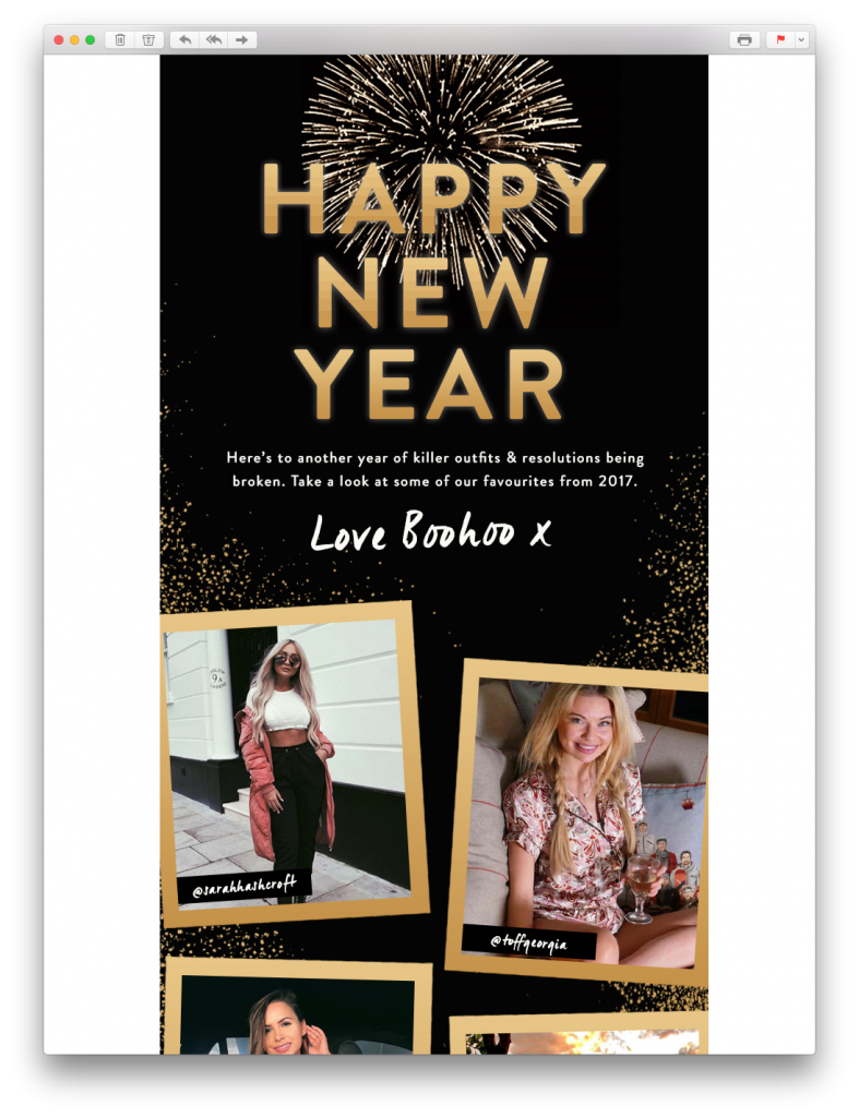
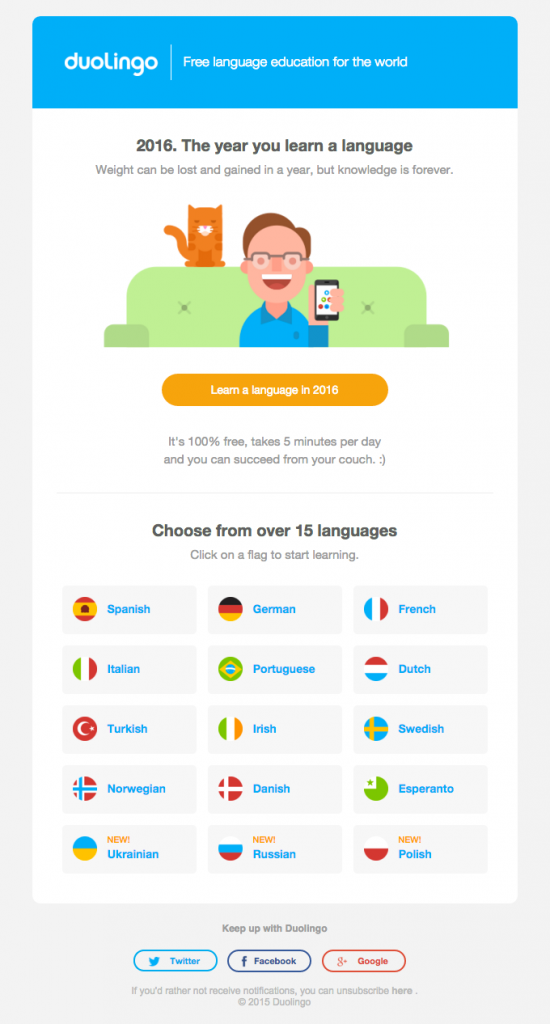
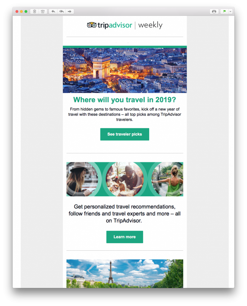
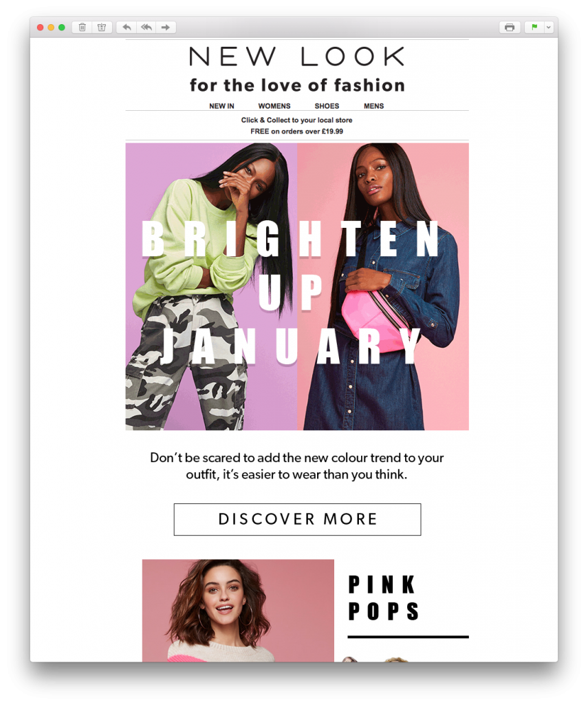
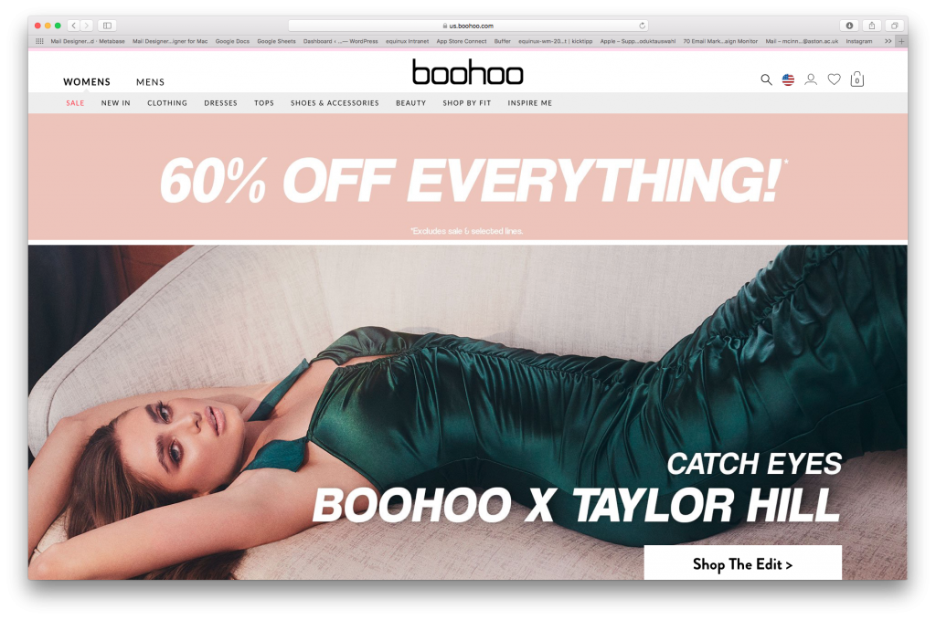
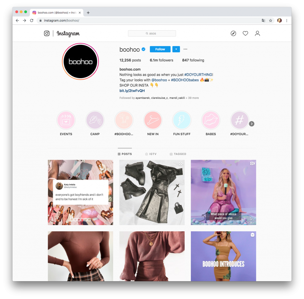
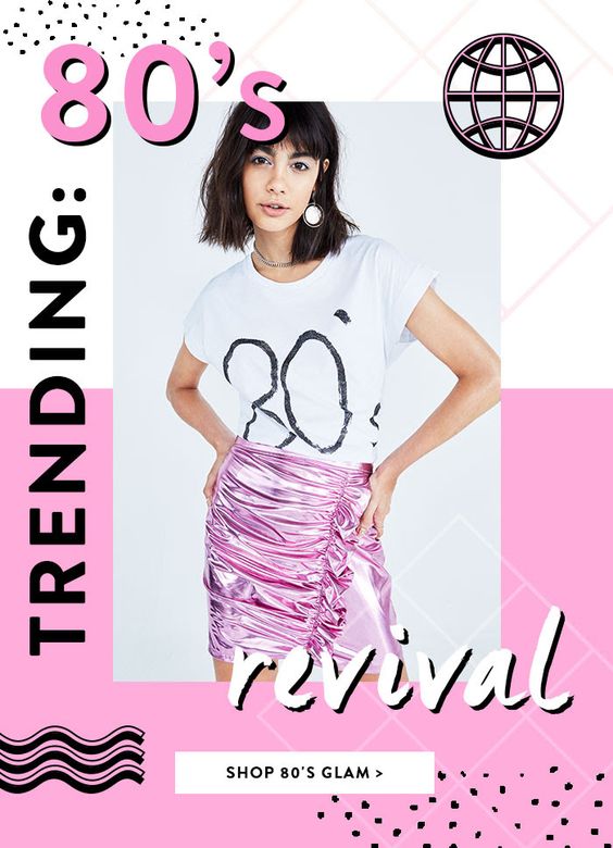
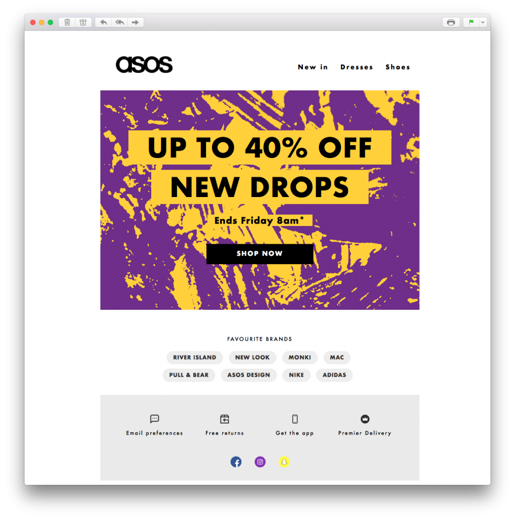
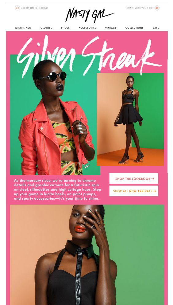
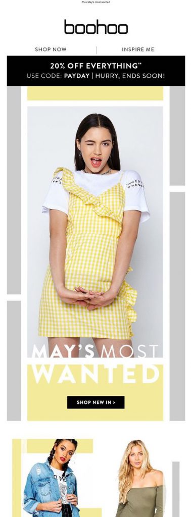
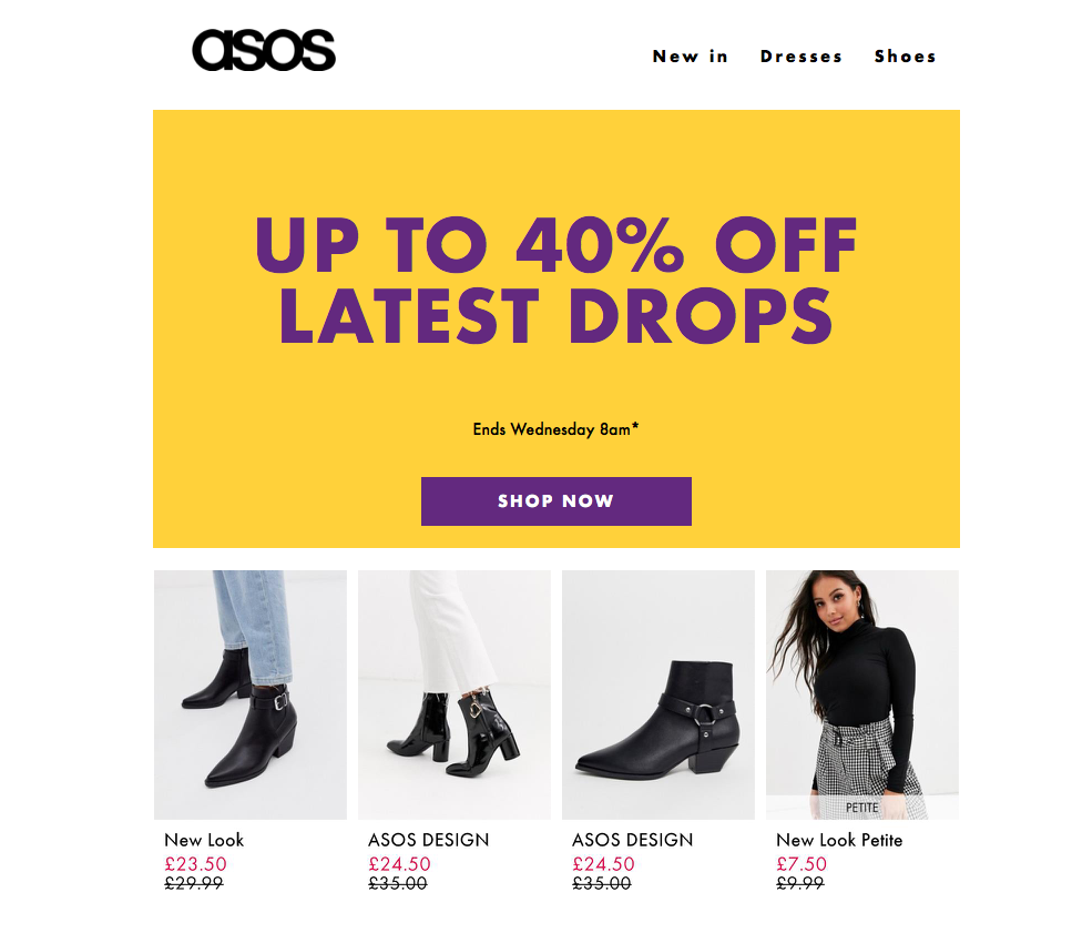
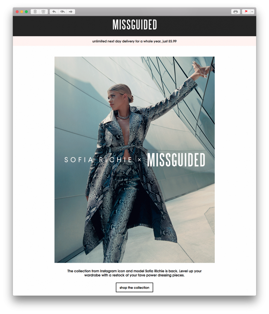
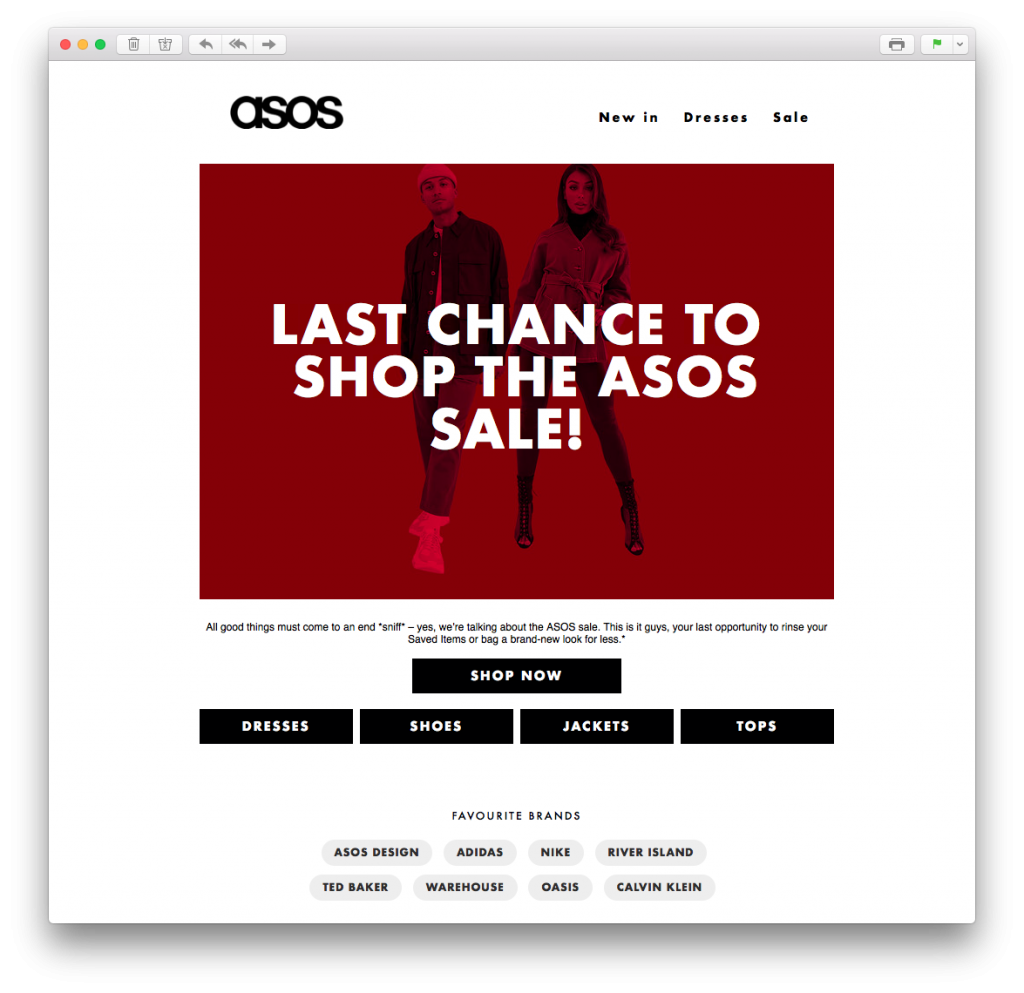
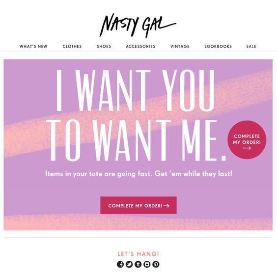
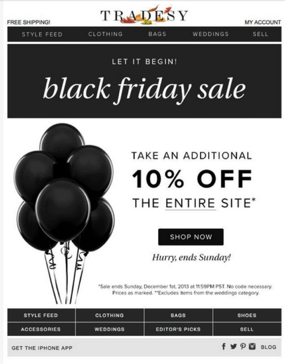
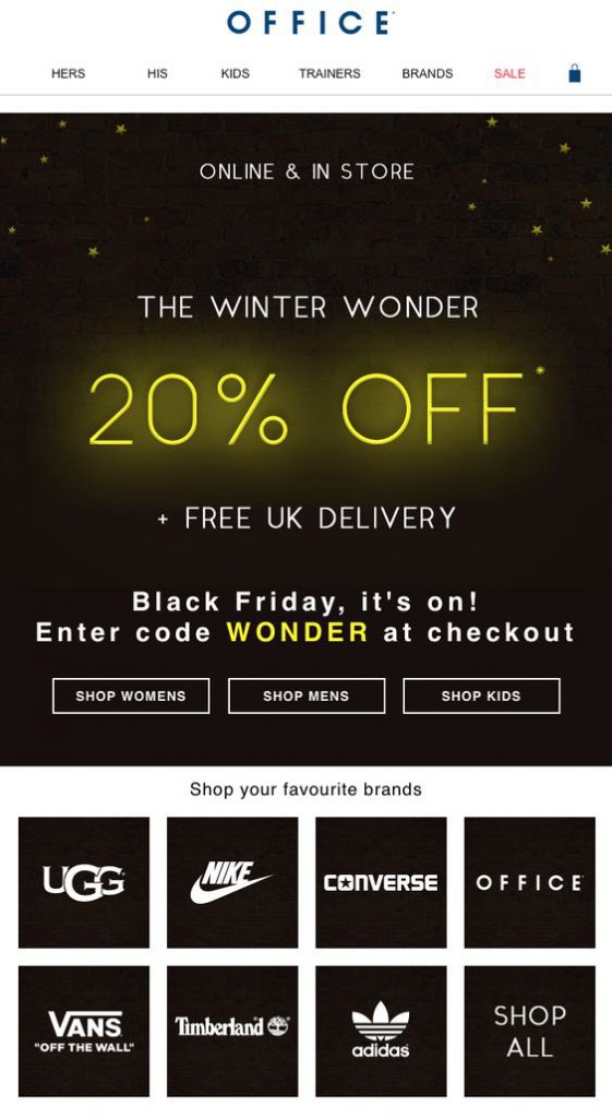
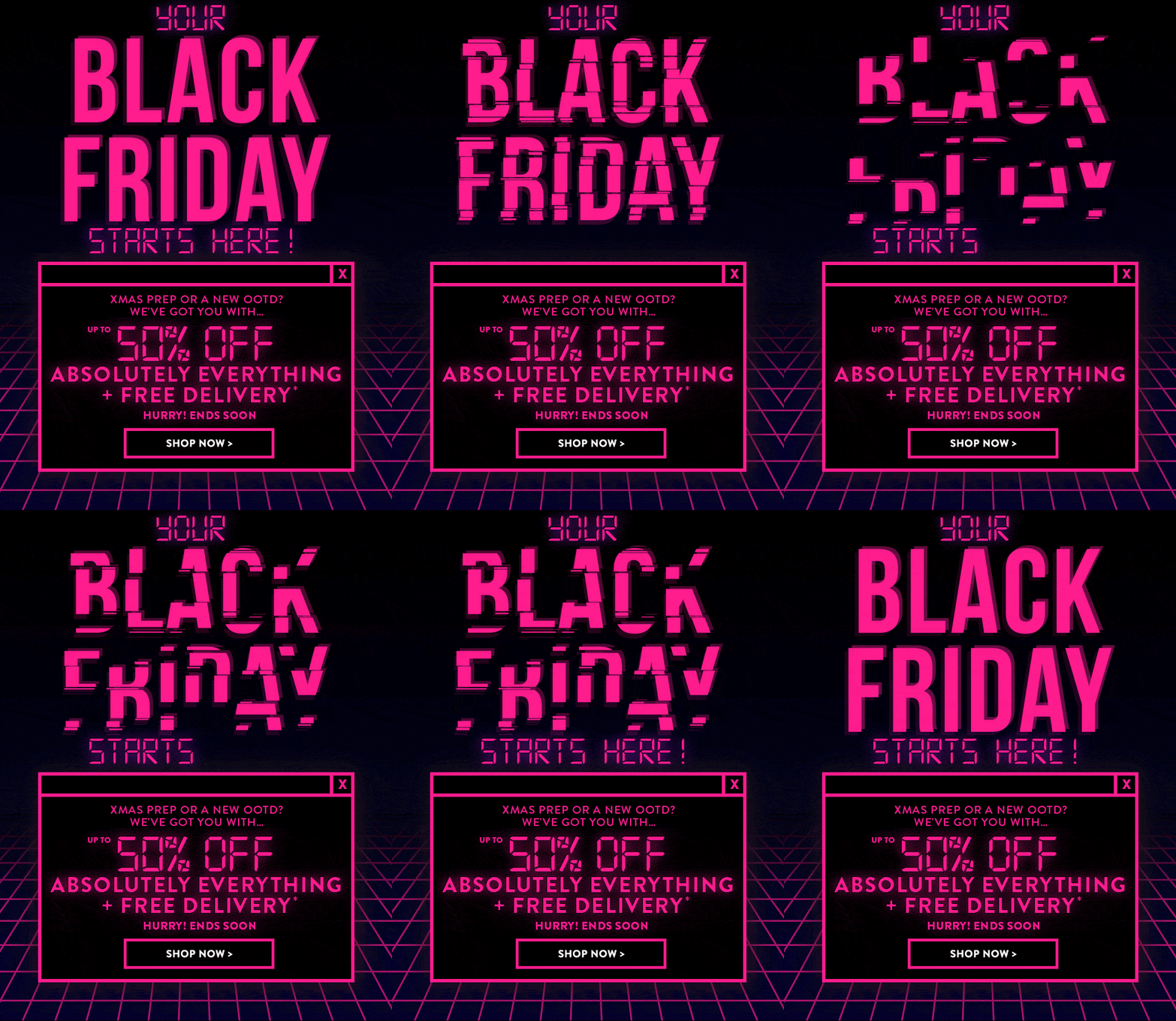 This fun design by Boohoo also adopts a clear cyber theme. The bright pink GIF is great at drawing attention the the message of the campaign and the design as a whole is certainly unique enough to win over customers.
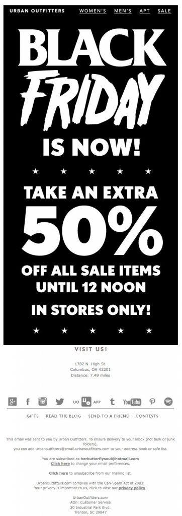 This monochrome design is basically all text but gets straight to the point. Urban Outfitters do a good job here of using contrasting fonts to give their simple design more character.
 6. Chicago Tribune
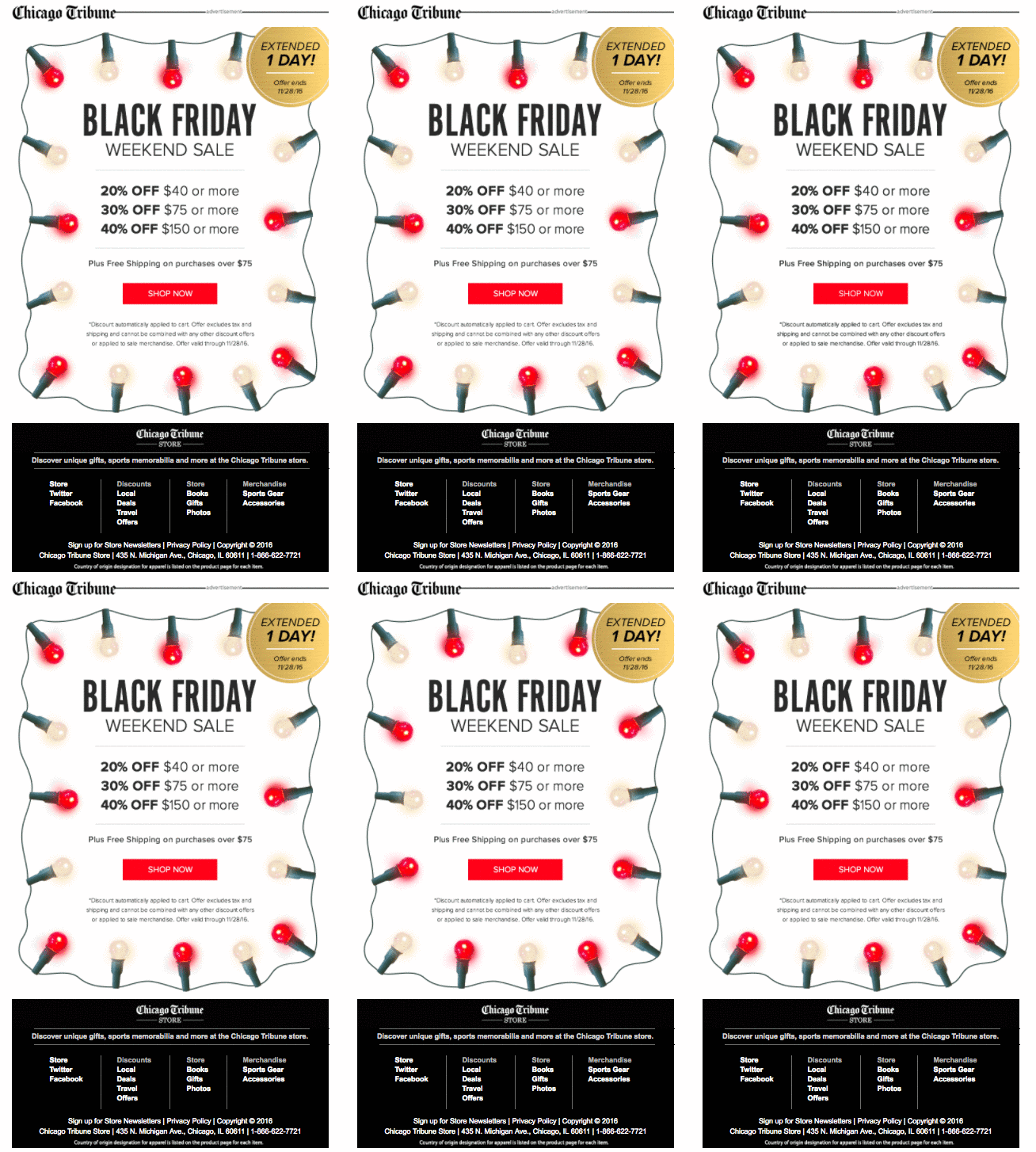 The Chicago Tribune gets super festive with this colorful email design. The fairy lights GIF is a good way to attract attention while also getting readers in the holiday shopping mood.
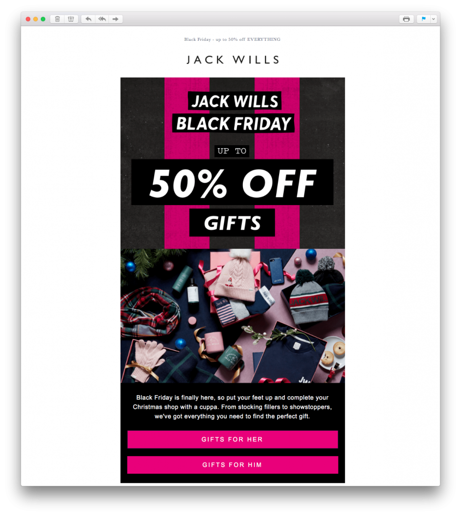 This email by Jack Wills definitely gets us in the holiday mood. The festive feature image is really effective in recreating the ultimate Christmas morning feeling. The pink striped background also creates a gift wrap effect and fits perfectly with the theme of holiday gift shopping.
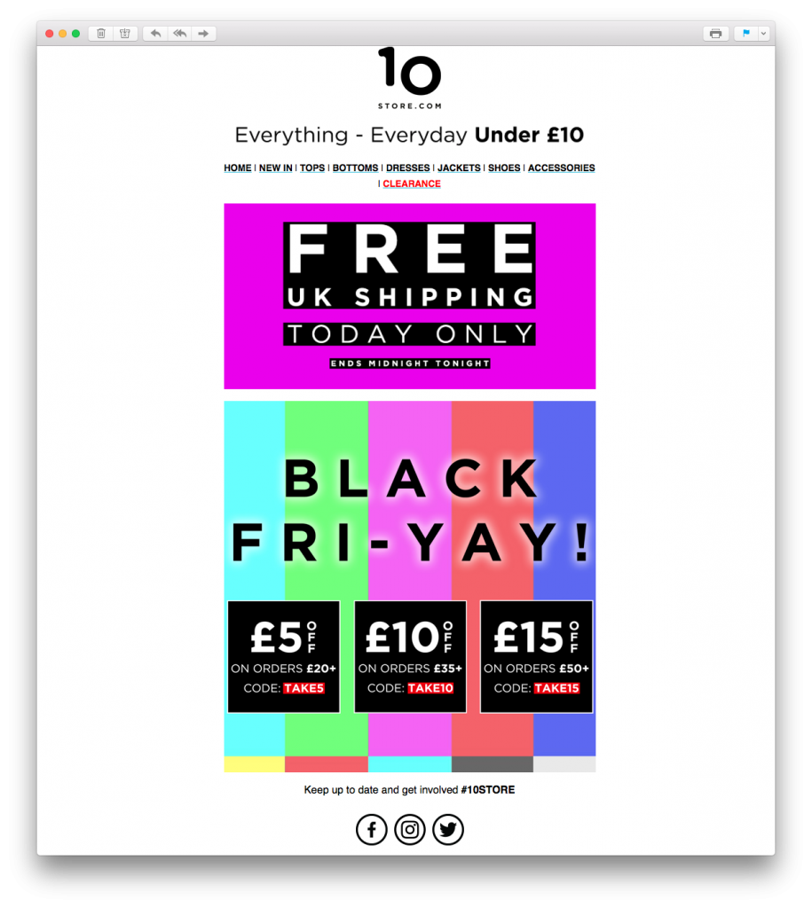 Here's a risk that paid off. Although perhaps a little adventurous for some, there's no denying that this loud, colorful email design by 10 Store grabs your attention straight away.
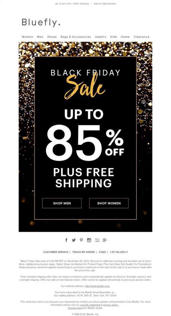 The gold, glittery vibe of this email campaign by Bluefly is super festive and exciting. The combination of black, gold and white works great for a big sales event and the text is big and bold enough to instantly make the message clear.
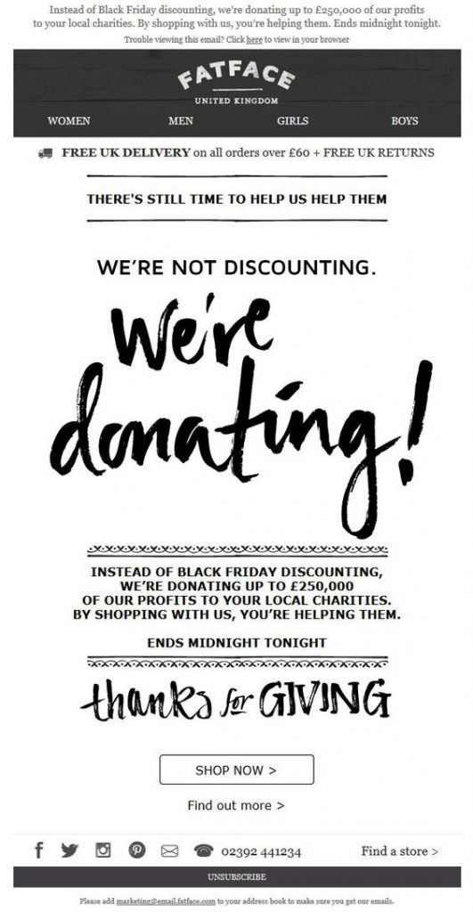 This campaign by FatFace has a really nice sentiment and makes a change from standard sales emails. Giving back campaigns such as this one are very effective around the holidays. Customers are encouraged to shop in order to put their money towards worthwhile causes.
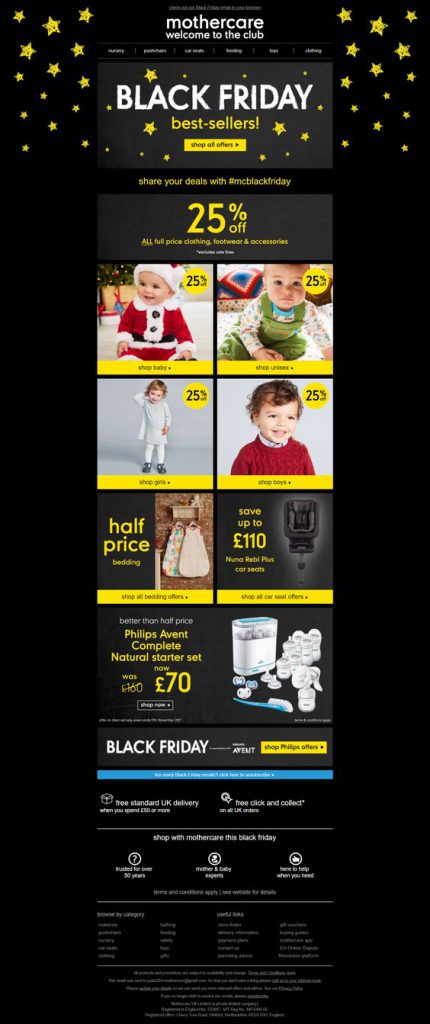 Mothercare show off their star offers in this stellar email design. The contrast between black and yellow tones make the CTAs (call-to-actions) and eye-catchers really pop in this email. The catalogue layout also makes accessing the deals much easier; which is great on this busy shopping occasion.
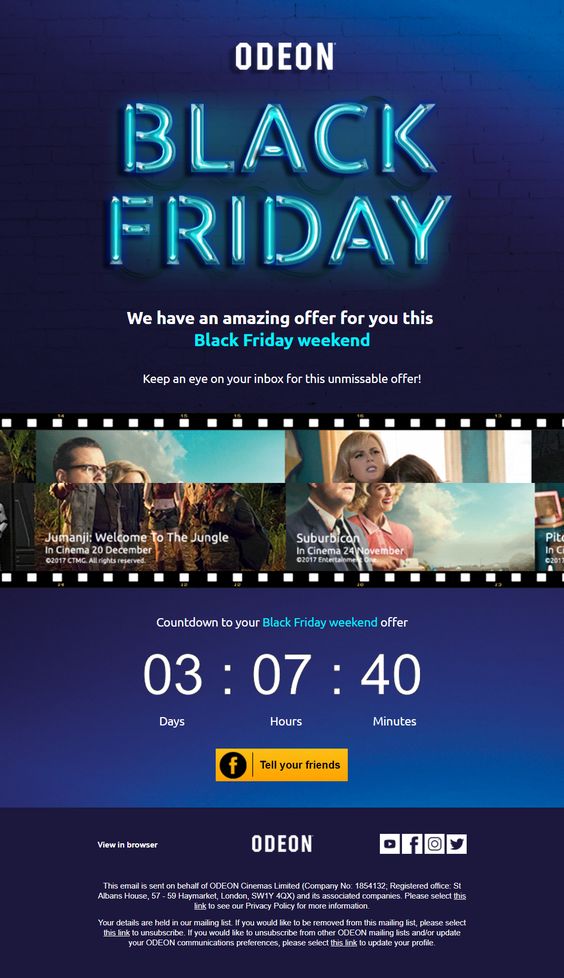 As shown here by Odeon, a bold feature font is a nice way of grabbing your readers' attention. The countdown is also a great touch to get customers geared up for your special promotion.
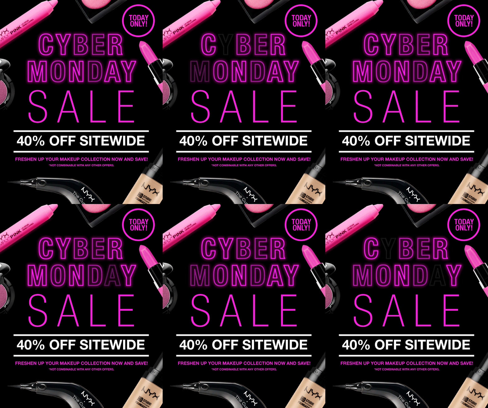 NYX really promote their products with this inventive layout. Hot pink accents make the message hard to miss and the LED effect GIF is both cool and creative. The "today only" tag is also a clever way to generate a sense of urgency.
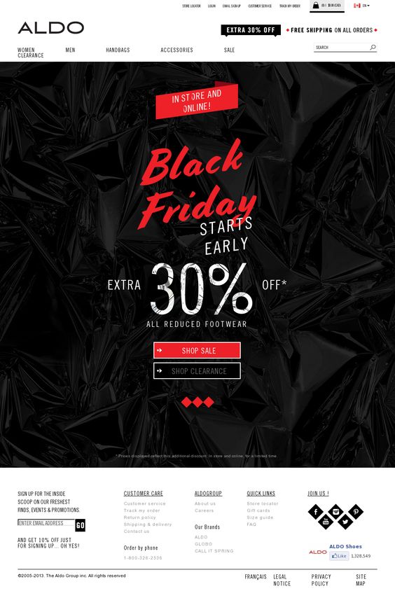 Aldo keep things pretty simple in this design, but the festive red combined with the cool, textured black background creates a noticeable contrast. Again, they've gone for a mix of font styles to liven up the design even more.
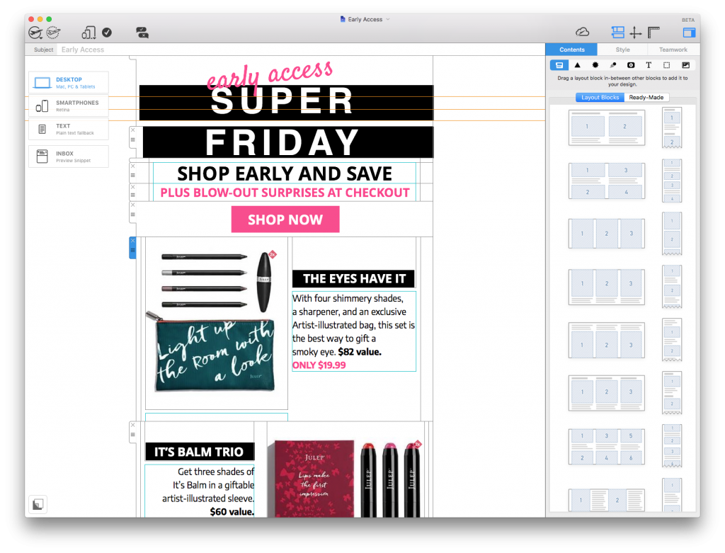
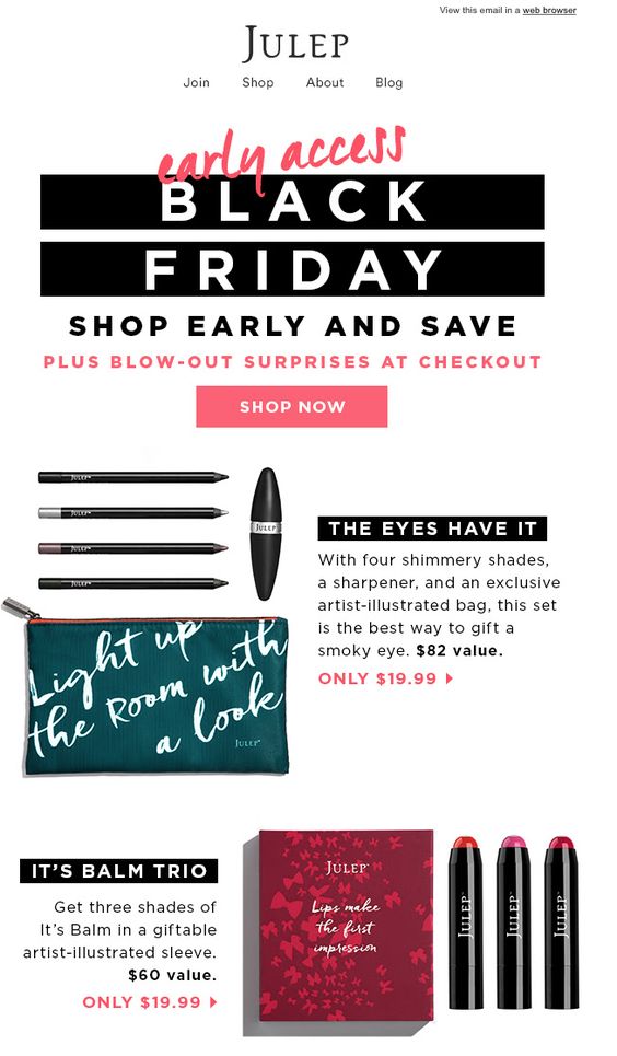 In this campaign, Julep have gone for a slightly different approach. The "early access" sale gets customers shopping before the big day and alluding to surprises at the checkout will certainly boost those click-through rates. We also like the design's balance between images and text to keep things visually interesting yet still informative.
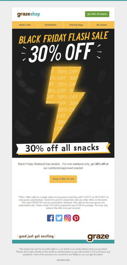 Graze have taken us by storm with this lightning bolt design. This is a great way to stand out from competitors and the color combination also hits the spot.
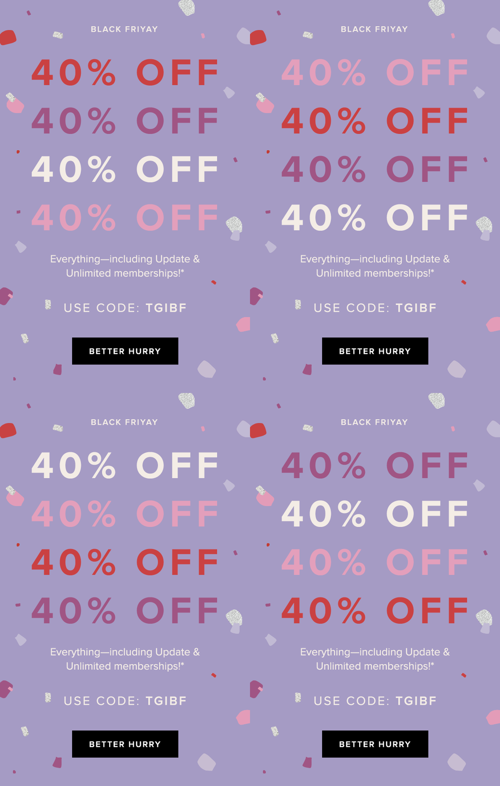 As shown here by Rent the Runway, sometimes simple does the trick. The bold GIF clearly highlights their 40% off promotion whilst also bringing some fun to the design. The "better hurry" CTA button is also inventive and adds a sense of urgency to the campaign.
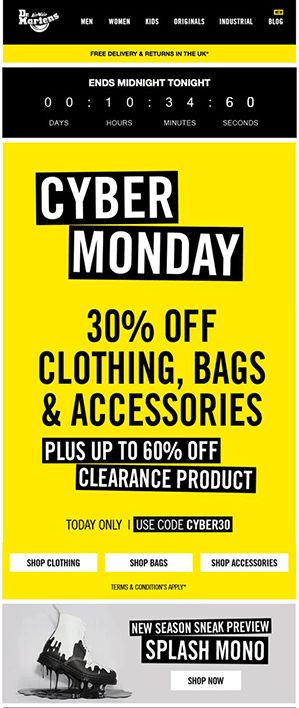 Dr. Martens demonstrate yet another drastic color scheme with this vibrant design. The countdown at the top again creates a sense of urgency and big, bold lettering communicates their offer well. It's also smart how they think ahead and include a product preview at the bottom of the email.
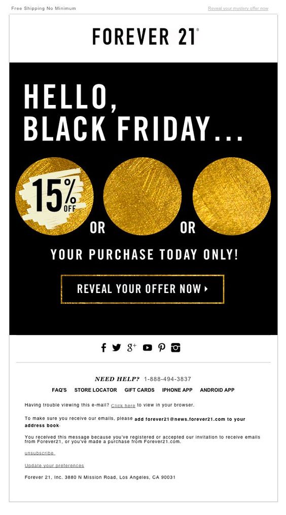 Forever 21 sneak an element of mystery into this "Black Friday" themed design. The temptation to click and reveal their discount is too much for many customers to resist. The gold accents also add a festive tone to the design and get customers in the money-spending mood.
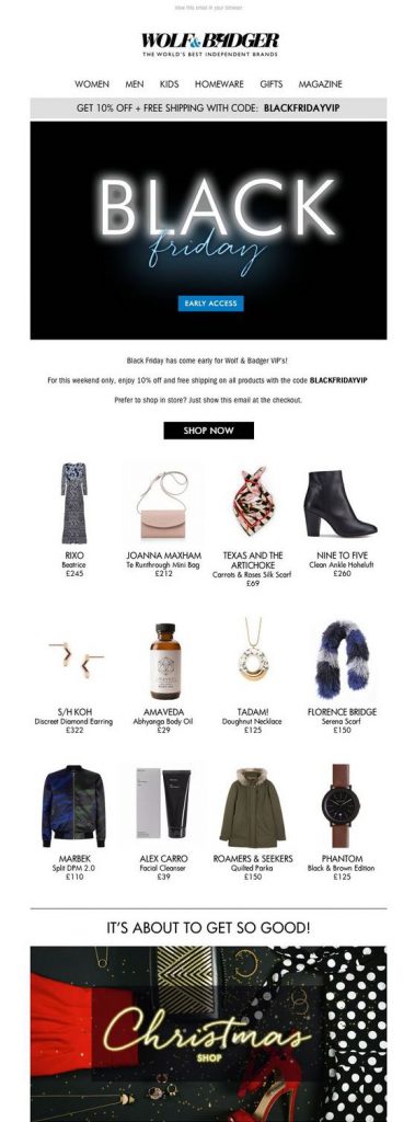 In this email, Wolf & Badger proudly showcase their best products to celebrate with their customers. As well as the eye-catching feature graphic, the clear layout also makes the promotion more effective and the deals easier to shop. The Christmas Shop graphic in the bottom of the email also does a good job of getting readers ready for holiday shopping.
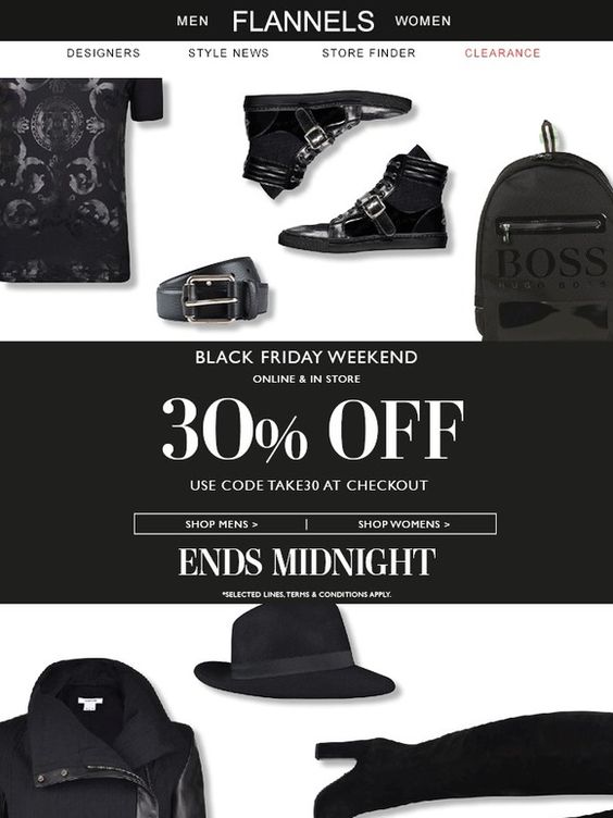 This monochrome design by Flannels is super cool. Using only black products in the background of the email is a clever take on the "Black Friday" theme. The font choices are also bold and stylish, and the "Ends Midnight" tagline incorporates that all-important sense of urgency to the campaign.
