Your subject line is often the thing which entices readers to open your email in the first place. For this reason, it has to be good. After all, what's the point of designing a standout email newsletter if you can't even get your customers to open it?
We've collected some of our favourite subject lines from all types of emails to help provide you with some inspiration for your next campaign...
News Updates
You want your customers to read about your company's latest news and announcements. Make sure you are emphasising your exciting news to customers by mentioning it in the email subject. This example from Amazon is simple, but lets their brand new release take centre stage in their subject line:

Amazon shows that when it comes to news, sometimes simple is most effective.
If you are confident in your list segmentation, you can also go one step further in sending out more personalised news emails such as this example from Spotify. I got sent this email because of my frequent streaming of Fleetwood Mac, so it was a no-brainer that after reading this subject line, I'd be interested in the content of this email.

Spark your reader's curiosity by using segmentation to identify their interests.
Sales Emails
Sales emails are an integral part of most email marketing strategies, but that doesn't mean they have to be boring. In fact, making your subject line stand out is a great way to make readers choose your email in an over-crowded inbox.
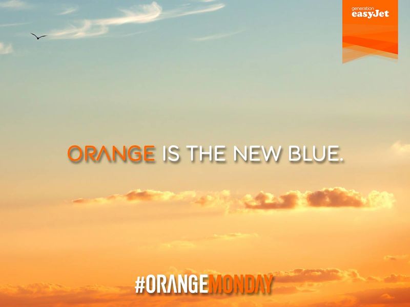
In this example, easyJet play on our love for a good bargain and some sun. This alongside their use of personalisation in the subject line had just the right amount of temptation to make me click on the email!

Use personalisation to attract your reader's eye to your email.
If you aren't able to personalise your emails for whatever reason, using personal pronouns is just as effective. This email from Selfridges would have been sent to thousands, but the use of the word "You" made it feel so much more personal.
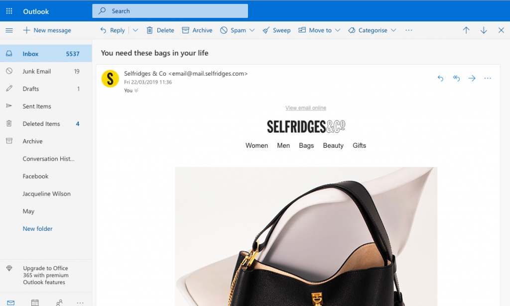
Using personal pronouns is a simple, yet effective way to make your subject line more direct.
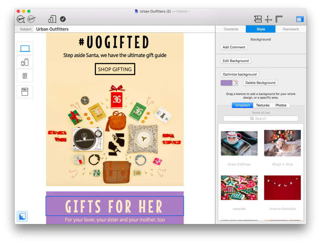
Promotional Emails
If you're running a promotion or you have a sale going on, of course you don't want your customers to miss out. Similarly to the sales email, you need to make your email subject shine in their inbox. In this instance, it's really a case of go hard or go home!
This subject line from New Look leaves the reader asking questions but in all the right ways. Building up a sense of intrigue is a great way to get your recipients clicking on your email and on your site in no time:

Get your reader asking questions which can only be answered within your email.
Another effective trick is the use of emojis. In this Easter email promotion from YO! Sushi, they are clever in using a cute and eye-catching chick emoji to help readers immediately identify the theme. This, alongside the capitalisation of "FREE" creates a statement in the inbox.

Emojis are a great way to brighten up your subject line and make it stand out.
*Tip: Caps are super effective, but can also land you in the spam folder if you over-use them. For more advice, check out our guide to avoiding the spam folder.*
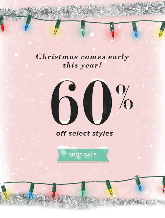
Sense of Urgency
Many sales and promotions will also require readers to feel a sense of urgency - especially when it gets closer to the end. The best way to incorporate this into your subject line is by using lots of time-sensitive phrases to get readers to realise that time is running out.
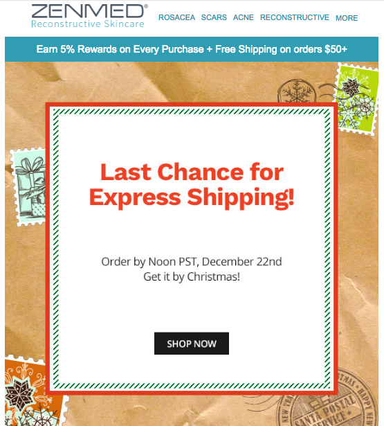
In this email by Boots, they have made it perfectly clear what readers will be missing out on if they don't get shopping. Phrases like "last chance" naturally spike our interest and help get customers browsing through the site to find any last-minute deals.
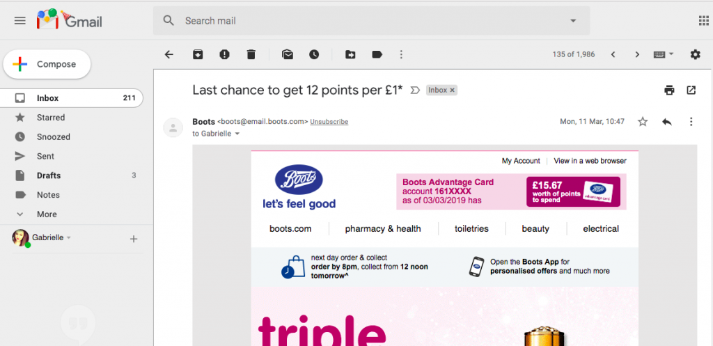
The use of time sensitive language such as "last chance" creates an intense sense of urgency.
It may also be useful to create a sense of urgency surrounding a certain event or occasion. This subject line from Funky Pigeon does a good job of reminding customers that Mother's Day is coming up, while also highlighting that time is running out.
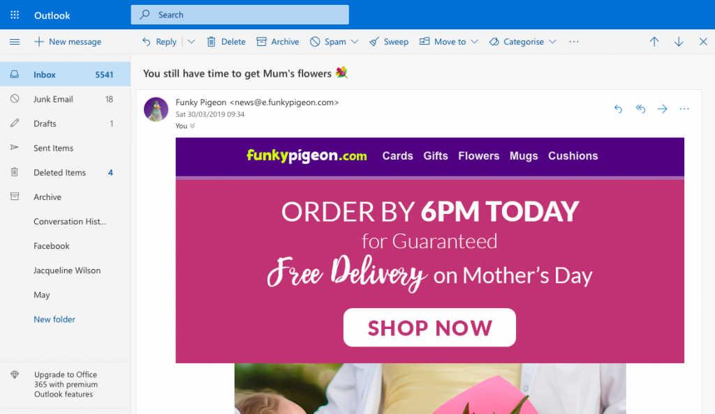
Focusing your subject line on an upcoming event also creates a sense of urgency.
Drip Campaigns
A welcome email or a drip campaign is another crucial element of an effective email marketing strategy, as it's really important to keep customers engaged once they have signed up for your service. The key to making sure these emails are read is to keep the subject line clear and informative.
Weight Watchers' week-long "Getting Started" drip campaign takes members through the most important tips and information surrounding the programme.
The subject line makes it perfectly clear to the reader which information they can expect to find within the email and encourages them to actively use the service. This makes it much more effective than a simple "welcome" or "thank you for signing up" email.

An informative subject line can make all the difference when setting up a drip campaign for new users.
Re-engagement Emails
If you've noticed customers are starting to slip away, it may be a good idea to send out a re-engagement email. This helps to try and get them back on track and engaging with your business. When you're writing your subject line, the key is to be friendly, and maybe even tug on their heartstrings a little.
In this example from New Look, the message is clear. Some customers may be touched to see this subject in their inbox, and even more pleasantly surprised to open the email and reveal the discount:

Try an emotive subject line for your re-engagement campaign to help make readers feel more special.
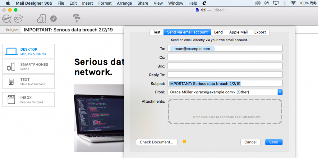
We hope you have found this post useful and that you're at least a little bit more inspired when it comes to creating your subject lines for your next email campaign. Remember that Mail Designer 365 offers you a subject optimisation tool so you can test your subject line alongside your email design. Happy designing!
Until next time,
Your Mail Designer 365 Team
Give Mail Designer 365 a try today for free...