When it comes to business email design, professionalism, brand consistency, and readability are key. While many stick to the familiar “safe” system fonts, doing so can limit your creative options. Fortunately, there’s a wide range of modern email fonts — including web-safe Google Fonts — that look polished and render well across most email clients.
Here's our quick guide on the best Google fonts for business designs.
Quick reminder
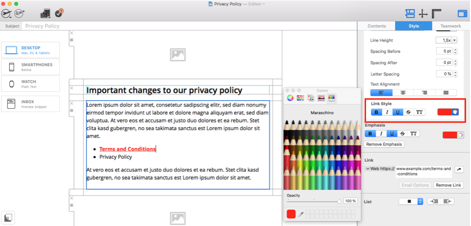
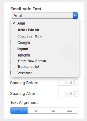
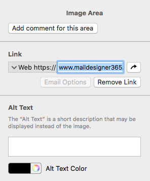
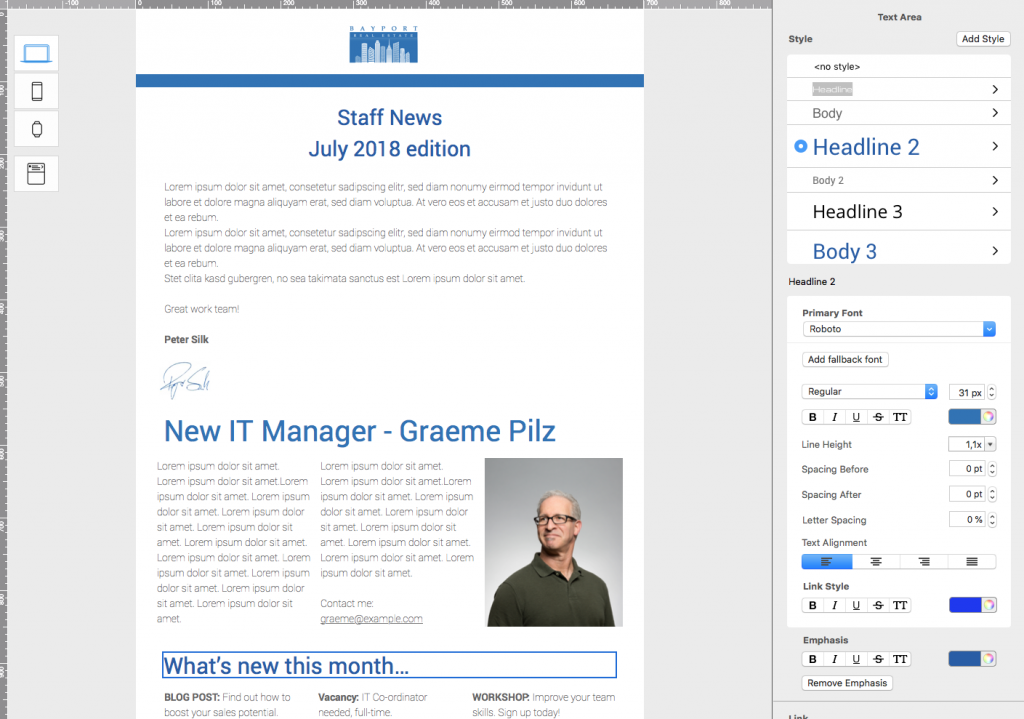
Before you get started, as much as we encourage you to try out these business-style email fonts, please remember to include at least one fallback font in the style section of your design. While the majority of email clients nowadays do support web fonts, there are still some that don't (*ahem* we're looking at you Outlook...) You can easily configure a fallback email font for every text style in Mail Designer 365 by clicking on "Add fallback font." This font will then be displayed if the web font is not supported by the email client.
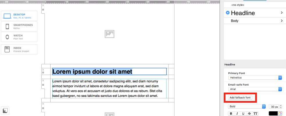
Always add an email-safe fallback font to your text style
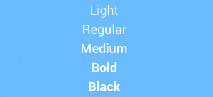
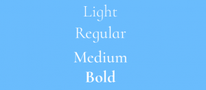
Open Sans
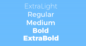
To kick things off, we're starting with our go-to font, Open Sans. Open Sans is a great choice for minimalist business designs. With a variety of different styles available, there is something for everyone. Use the "Light" style for modern, stylish feel in your meeting minutes, or go all out and define key points with "Bold" or "Extrabold."

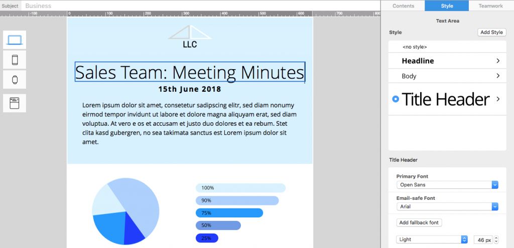
Open Sans is great for minimalist business designs
Roboto
Similar to Open Sans, Roboto is a very simple all-rounder. This clear, easy to read font style is perfect for the main text of your newsletter and still makes a change from the likes of Arial and Times New Roman. Because this is such a simple typeface, it is easy to pair with another, more unique font (e.g. your logo or typical brand font) without appearing to clash or be distracting.
Roboto is a clean option for professional newsletter text
Athithi
Athithi is a nice choice for a tech newsletter. If your business is tech oriented or you work in the IT business, you might want to try using this font to add a modern twist to your design while still remaining serious and professional. Try using "Medium" or "Bold" to give your headlines some emphasis.

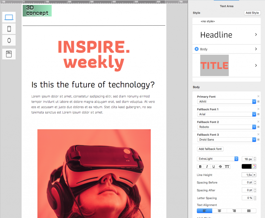
Athithi is a stylish choice for tech firms
Cormorant Infant
Breaking away from the sans serif styles, Cormorant Infant is a serif font which offers a much more traditional feel. While sans serif fonts are more modern and simplified, serif fonts are great for the more classical business vibe. Try using "Bold" for an assertive headline for your business consultancy agency or legal practice. Alternatively, "Light" and "Regular" work well for a twist on standard newsletter text while still remaining clear and elegant.
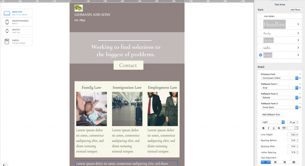
A very traditional serif business font. Great for legal practices.
Montserrat
Another highly popular Google font, Montserrat brings a bit more attitude to your design. This font choice would work extremely well as a CTA for your email newsletter.
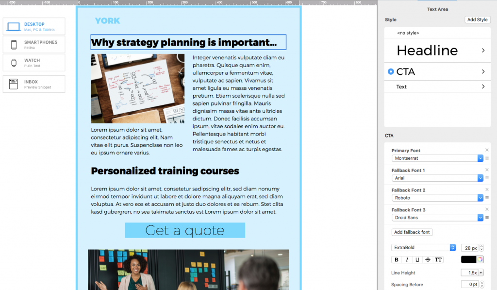
A powerful typeface to bring definition to your CTA
Playfair Display
A slightly more interesting choice, Playfair Display is an elegant, serif typeface, well-suited to announcements, updates, or company news. Give this font a go in your shareholders' newsletter or your monthly round up.

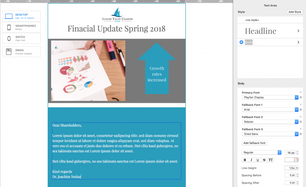
An elegant font great for business announcements
Try These Email Fonts in Your Next Design
We hope you’ve found these tips on using Google email fonts for business designs helpful — and that you’ll try them out in your next email newsletter. As you’ve seen, switching things up from the usual Times New Roman or Arial can give your emails a fresh, modern edge. All the fonts mentioned are license-free and ready to use in Mail Designer 365.
Here's some additional help choosing the right font for your email design.
Until next time,
Your Mail Designer 365 Team!
Give Mail Designer 365 a try today for free...