
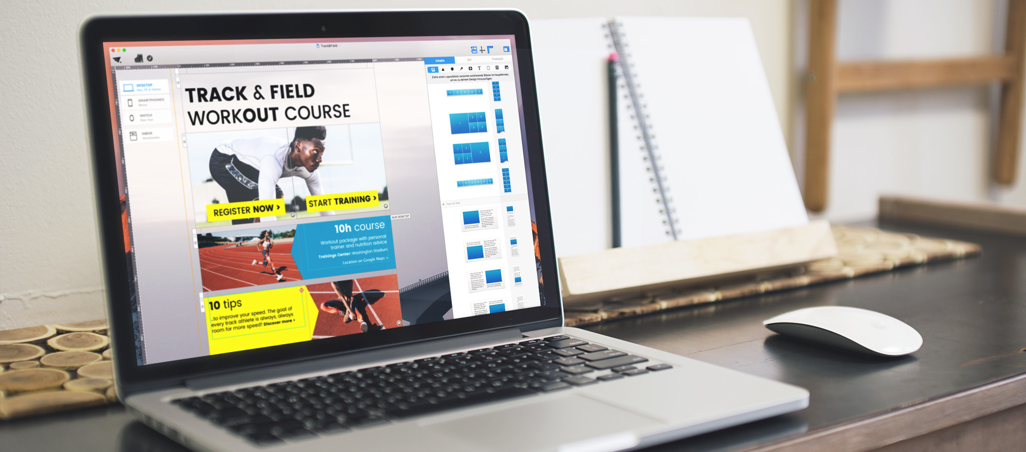
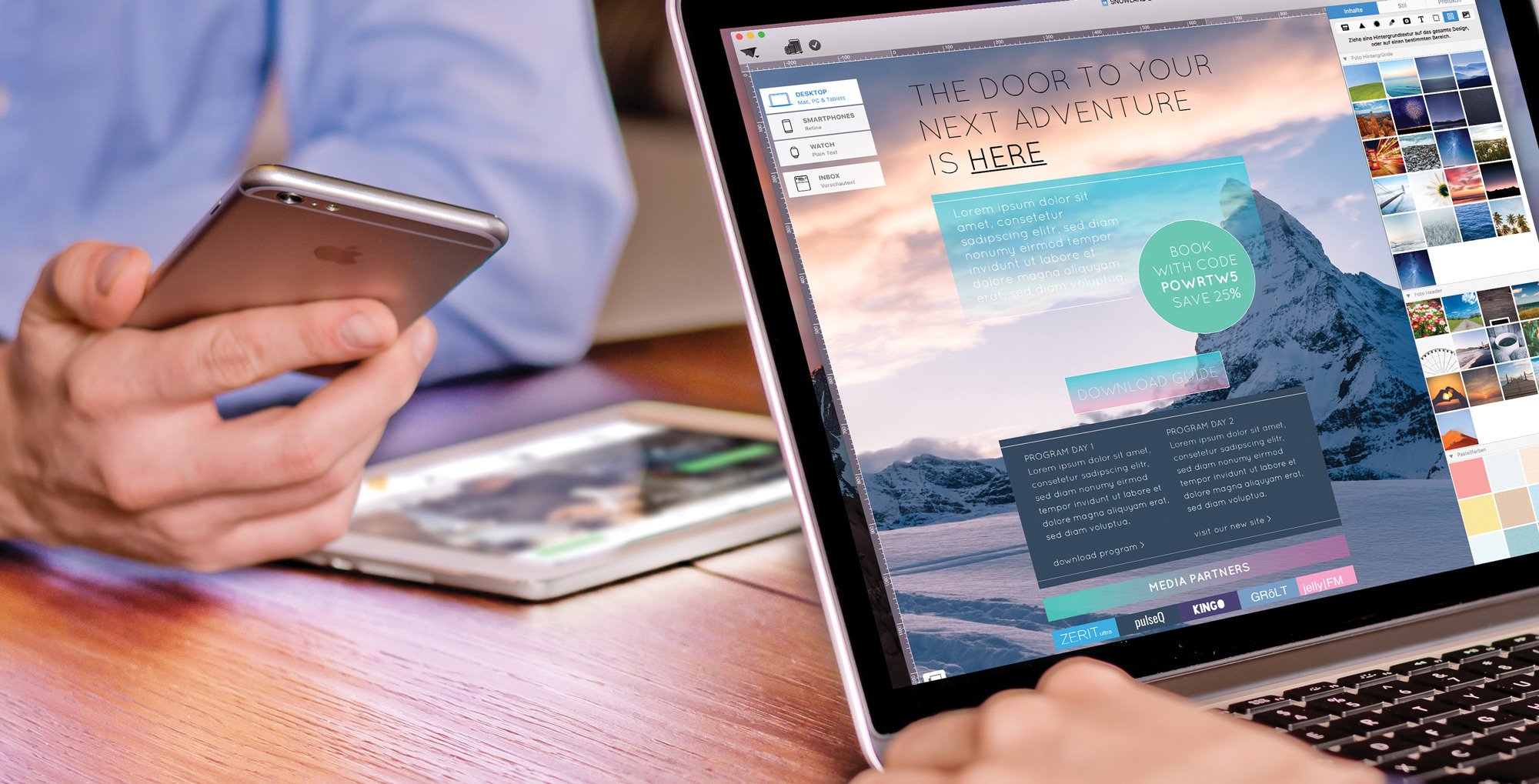
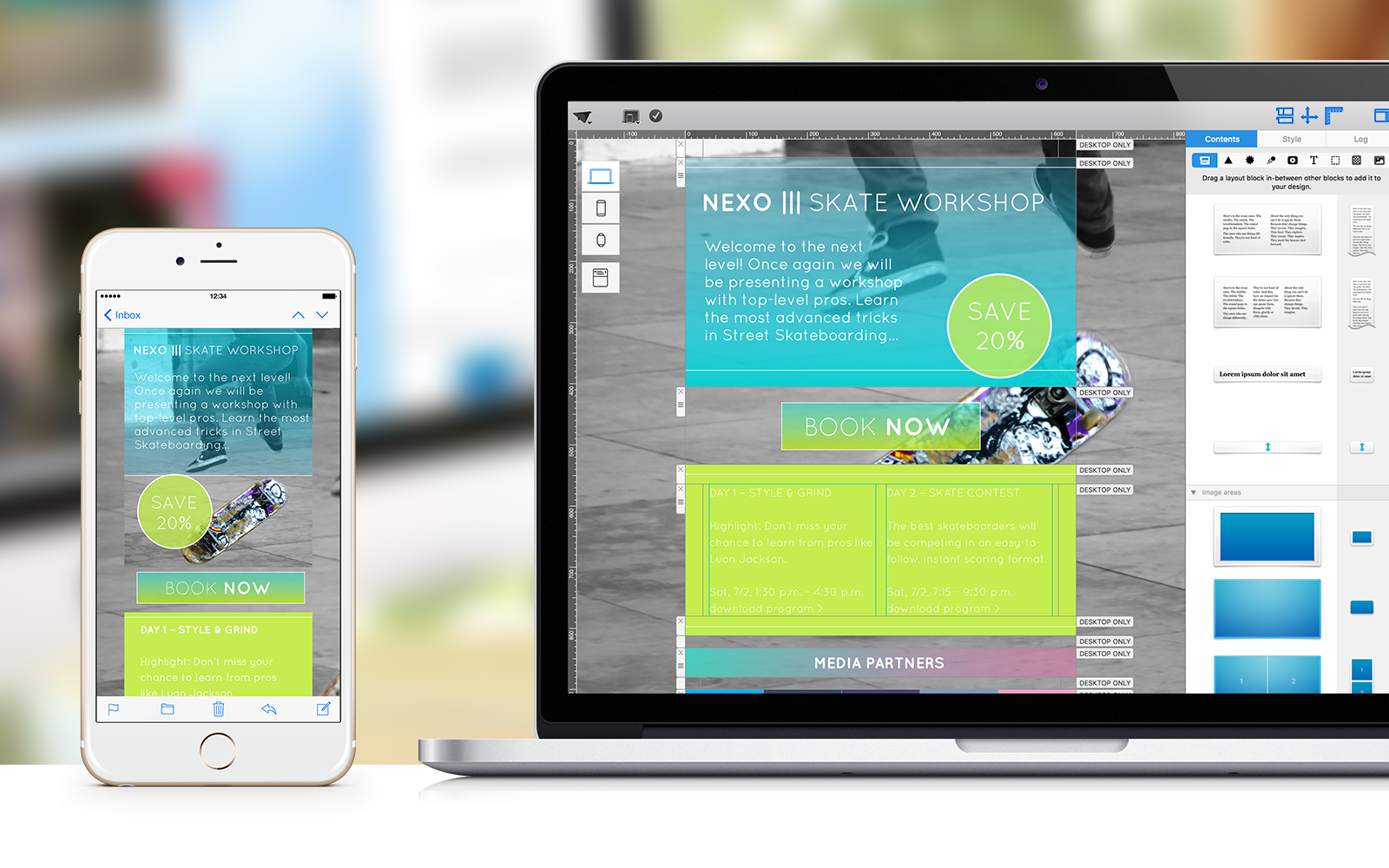
 Layout blocks are the main building blocks in any Mail Designer newsletter. They help you build your content's structure and let you design with structure and style. We're going to highlight 6 techniques you can create using different layout blocks.
 Perfect newsletter design with Mail Designer Pro: more Mail Designer tips can be found on our Mail Designer Pro Tutorial Page.
 There’s a lot more to Mail Designer Pro then you think. These power tips will open the door to new, incredible possibilities.
Mail Designer Pro 2.6
We’re excited to launch Mail Designer Pro 2.6 – it’s got some great new features and a lot of improvements we hope you’re going to love. Let’s dive in:
Flashback – Close your eyes. Can you remember the smartphone you had 5-6 years ago? You know, those times when you strolled around the city while surfing the web on your iPhone with 3GS? Back then, an iPhone had a measly resolution of only 480x320 pixels. Now hop back into the time machine! In the meantime, the iPhone 6s Plus has reached a whopping resolution of 1920x1080 pixels! Smartphone screens have become so much sharper, quicker, and more sensitive. Whether you’re carrying an iPhone 6s, a Nexus 6 or a Galaxy 7, the pixel density is so high that you’ll hardly believe your eyes.
This is even more reason why your mobile friendly newsletters need to stay crisp and sharp, down to the last detail. Here are 3 Mail Designer Pro tips to help you achieve just that:

Digital mailboxes are the catwalk for today’s email marketers. You only have a short time to make an impression for your Spring SALE or your up-coming event. It’s time to get your email design into shape! These 7 Mail Designer tips are sure to make your next campaign a hit!

Instead of the same tired web-safe fonts you see in newsletters, Mail Designer Pro offers over 350 font choices that are dynamically loaded so they show up great in modern email clients. Email design has never been more creative. And Email fonts have been more diversified.
Email layout made easy!
Mail Designer Pro includes a wide variety of email layout blocks, designed so you can create almost any type of layout.
But if you have HTML and CSS experience, you can get your hands dirty 😉
With Mail Designer Pro, you can create your own custom layout blocks, that you can simply drop into your design.

The mobile opening rate for emails has increased by 30% within the past 5 years. Far more than half of all newsletters are being read while on the go. It’s even more likely that your newsletter will first be previewed in quick scan mode on a mobile device than comfortably clicked and opened by the recipient from his/her personal Mac while sipping a peppermint tea.
For companies who rely on newsletters, this realistic scenario of recipients checking their emails on an iPhone can be compared to an action game where every newsletter has to battle to survive in the inbox. And as we know, in the end, only the strongest survive.
Mobile features, such as the new 3D Touch experience on the iPhone 6s, increasing resolutions, and expanding screen sizes, put an even greater importance on the details and content of your newsletters. With a short Peek and Pop, iPhone 6s users can quickly preview your Mails, without completely opening them. Yet another reason to be sure your newsletter Designs make a solid and convincing first impression.