
More and more people are opening their emails with their smartphones. Mobile users can benefit from a smart video experience with YouTube and Vimeo links. If you add YouTube and Vimeo links into the mobile version of your Mail Designer 365 newsletter, your readers are directly forwarded to the corresponding YouTube or Vimeo apps for the iOS or the Android. This makes it easier for your readers to watch your videos while on-the-go. In this tutorial, we will show you how to add videos for mobile users with Mail Designer 365.
Let us show you how...
 Perfect newsletter design with Mail Designer Pro: more Mail Designer tips can be found on our Mail Designer Pro Tutorial Page.
Flashback – Close your eyes. Can you remember the smartphone you had 5-6 years ago? You know, those times when you strolled around the city while surfing the web on your iPhone with 3GS? Back then, an iPhone had a measly resolution of only 480x320 pixels. Now hop back into the time machine! In the meantime, the iPhone 6s Plus has reached a whopping resolution of 1920x1080 pixels! Smartphone screens have become so much sharper, quicker, and more sensitive. Whether you’re carrying an iPhone 6s, a Nexus 6 or a Galaxy 7, the pixel density is so high that you’ll hardly believe your eyes.
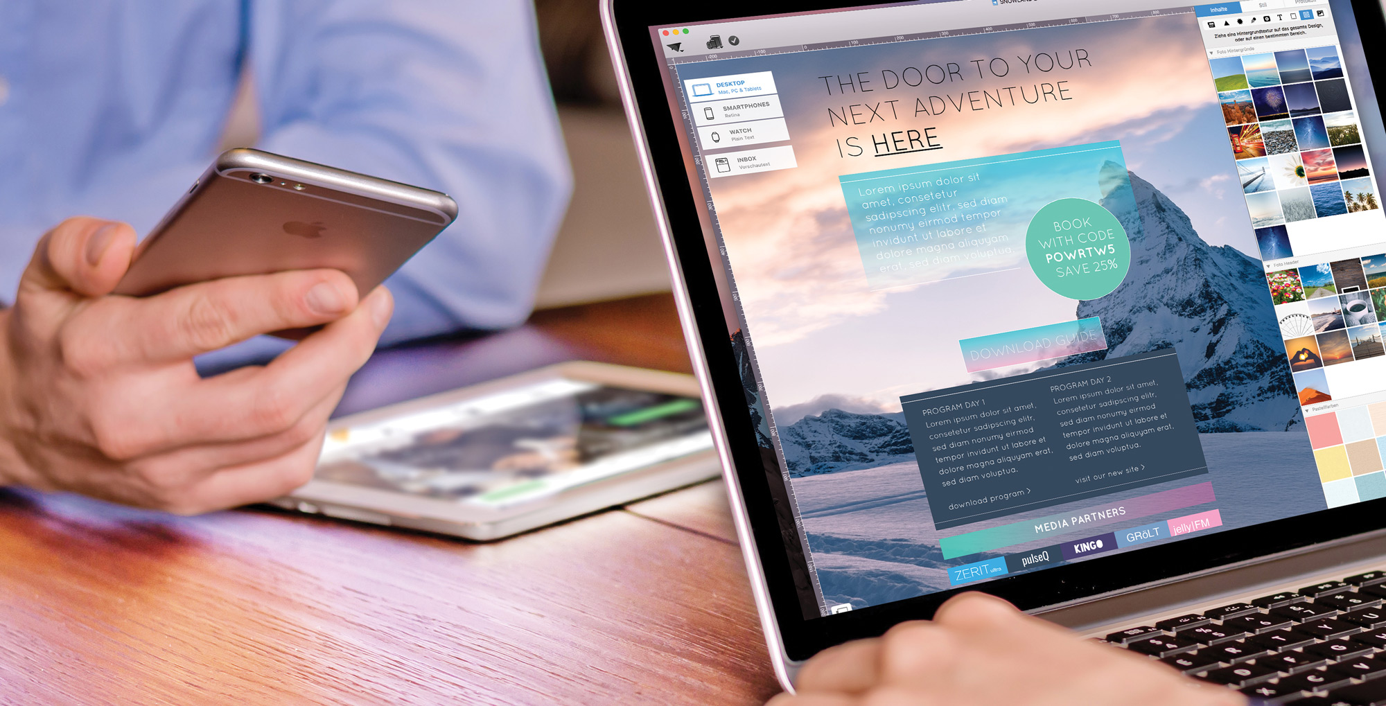
This is even more reason why your mobile friendly newsletters need to stay crisp and sharp, down to the last detail. Here are 3 Mail Designer Pro tips to help you achieve just that:

Mail Designer Pro offers an improved link formatting tool which makes it easier to create links formatted just the way you want them.
Stay up-to-date, grow your newsletter list
Start your own curated link lists, which is the latest newsletter trend. Turn your favorite industry news and links you might post on social media into a so-called “curated newsletter.” This is the latest and hugely popular newsletter craze.
Stylish, curated newsletters with themed link collections are already a huge hit in. Bloggers, entrepreneurs, and resourceful start-ups quickly recognized the potential of link formatting. Everyone is taking advantage of this craze by keeping their followers up-to-date with weekly. Some are even going about and beyond by sending daily newsletters.