
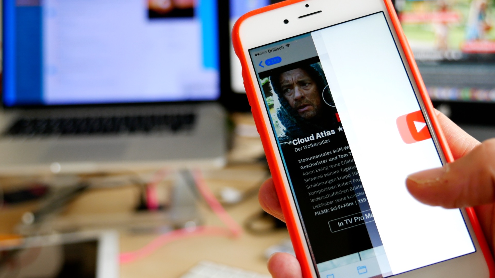
The mobile opening rate for emails has increased by 30% within the past 5 years. Far more than half of all newsletters are being read while on the go. It’s even more likely that your newsletter will first be previewed in quick scan mode on a mobile device than comfortably clicked and opened by the recipient from his/her personal Mac while sipping a peppermint tea.
For companies who rely on newsletters, this realistic scenario of recipients checking their emails on an iPhone can be compared to an action game where every newsletter has to battle to survive in the inbox. And as we know, in the end, only the strongest survive.
Mobile features, such as the new 3D Touch experience on the iPhone 6s, increasing resolutions, and expanding screen sizes, put an even greater importance on the details and content of your newsletters. With a short Peek and Pop, iPhone 6s users can quickly preview your Mails, without completely opening them. Yet another reason to be sure your newsletter Designs make a solid and convincing first impression.
Read More

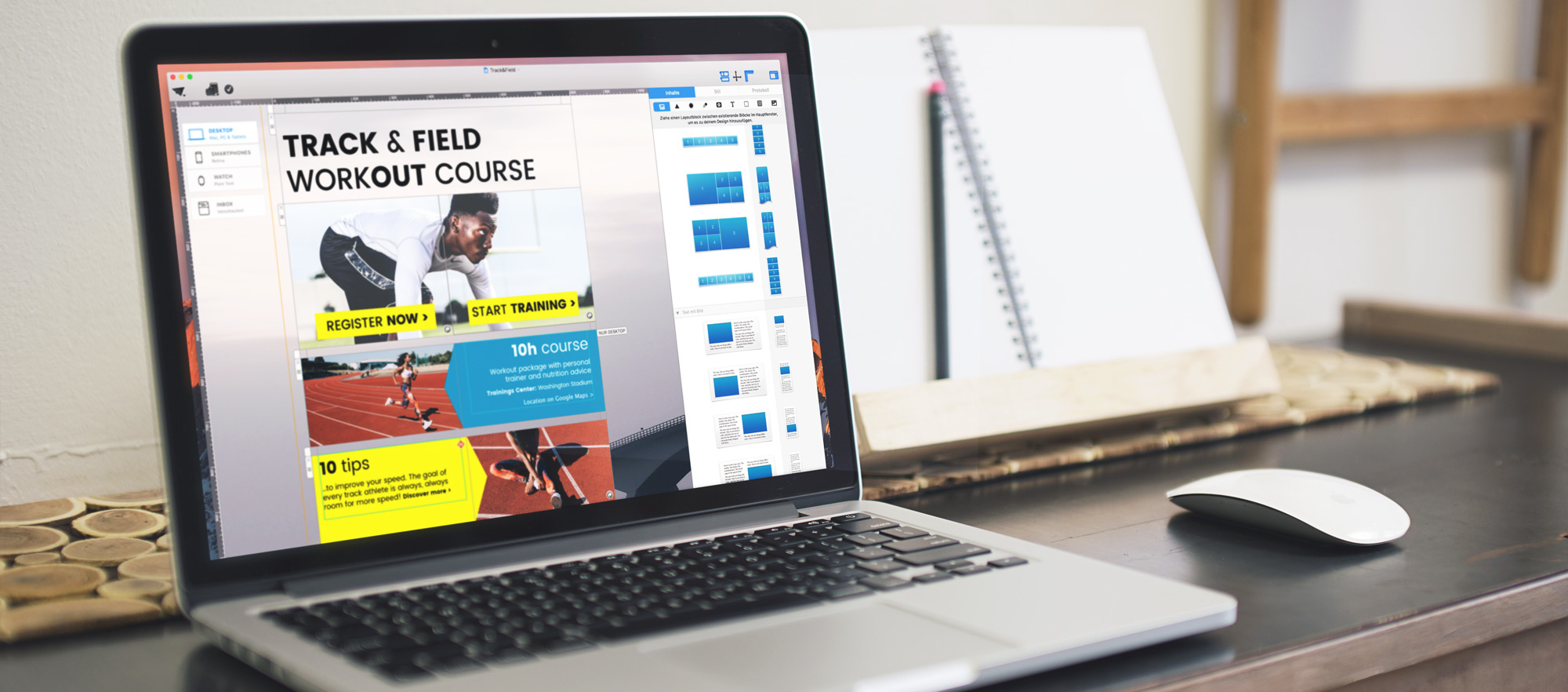 Layout blocks are the main building blocks in any Mail Designer newsletter. They help you build your content's structure and let you design with structure and style. We're going to highlight 6 techniques you can create using different layout blocks.
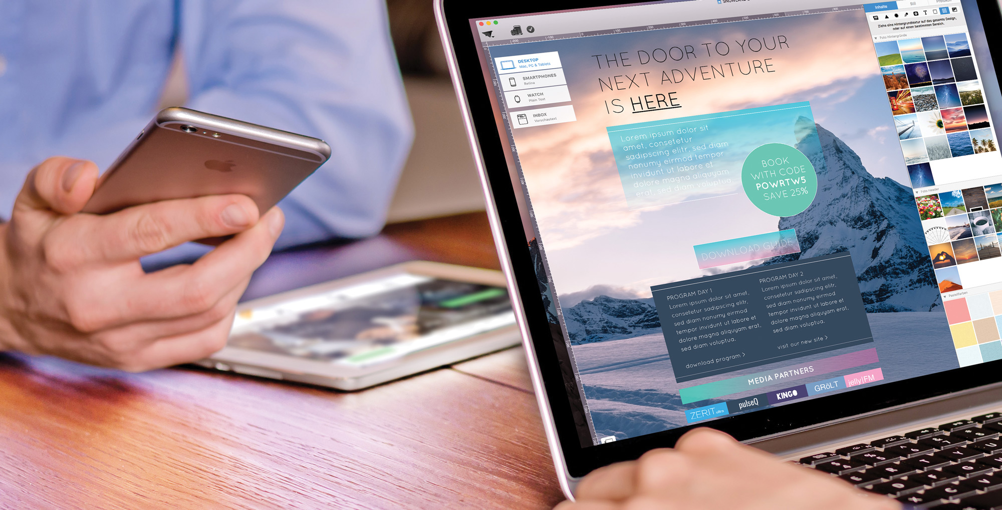 Perfect newsletter design with Mail Designer Pro: more Mail Designer tips can be found on our
 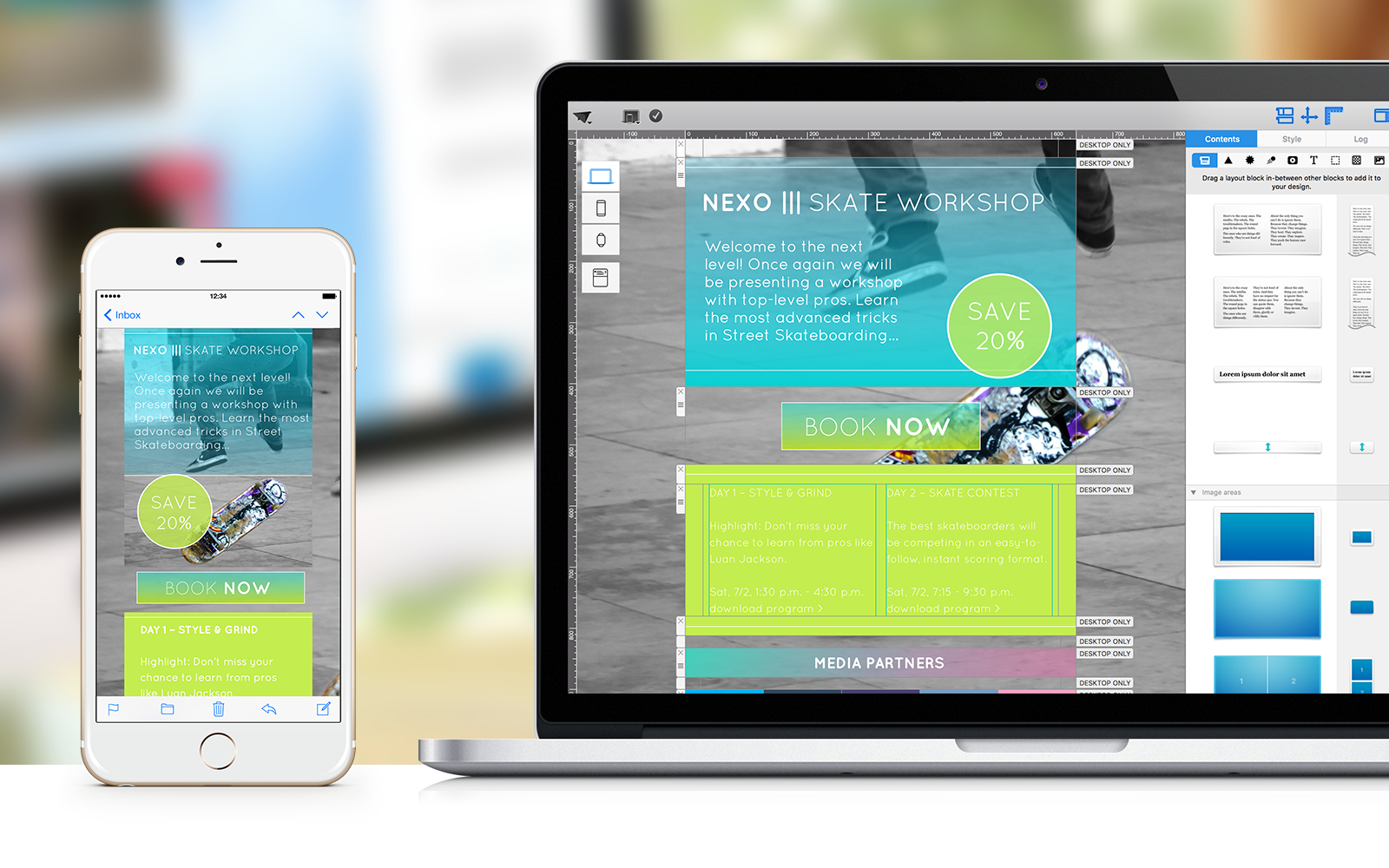 There’s a lot more to Mail Designer Pro then you think. These power tips will open the door to new, incredible possibilities.
