
 Perfect newsletter design with Mail Designer Pro: more Mail Designer tips can be found on our Mail Designer Pro Tutorial Page.
What are you trying to accomplish with your newsletter? You want to win hearts, clicks, fans, and followers, right? On average, your recipients only have an attention span of about 8 seconds. An intelligently constructed, image heavy newsletter is sure to increase sales.
The leaves have begun to change color and fall, triggering an eager, optimistic target group becoming even more enthusiastic to buy. As they snuggle under their fleece blankets on the comfy couch, by the glow of their iPhone screens, thoughts of the upcoming holidays fill their minds. It’s high time to power-up your email marketing campaigns - Halloween, Thanksgiving, Black Friday, Christmas, and New Year’s are right around the corner!
Clever Designs with Mail Designer Pro, increase your potential for success. We’ll show you how...
Take it up a notch with Wallpaper Mode – Backgrounds with a bang!
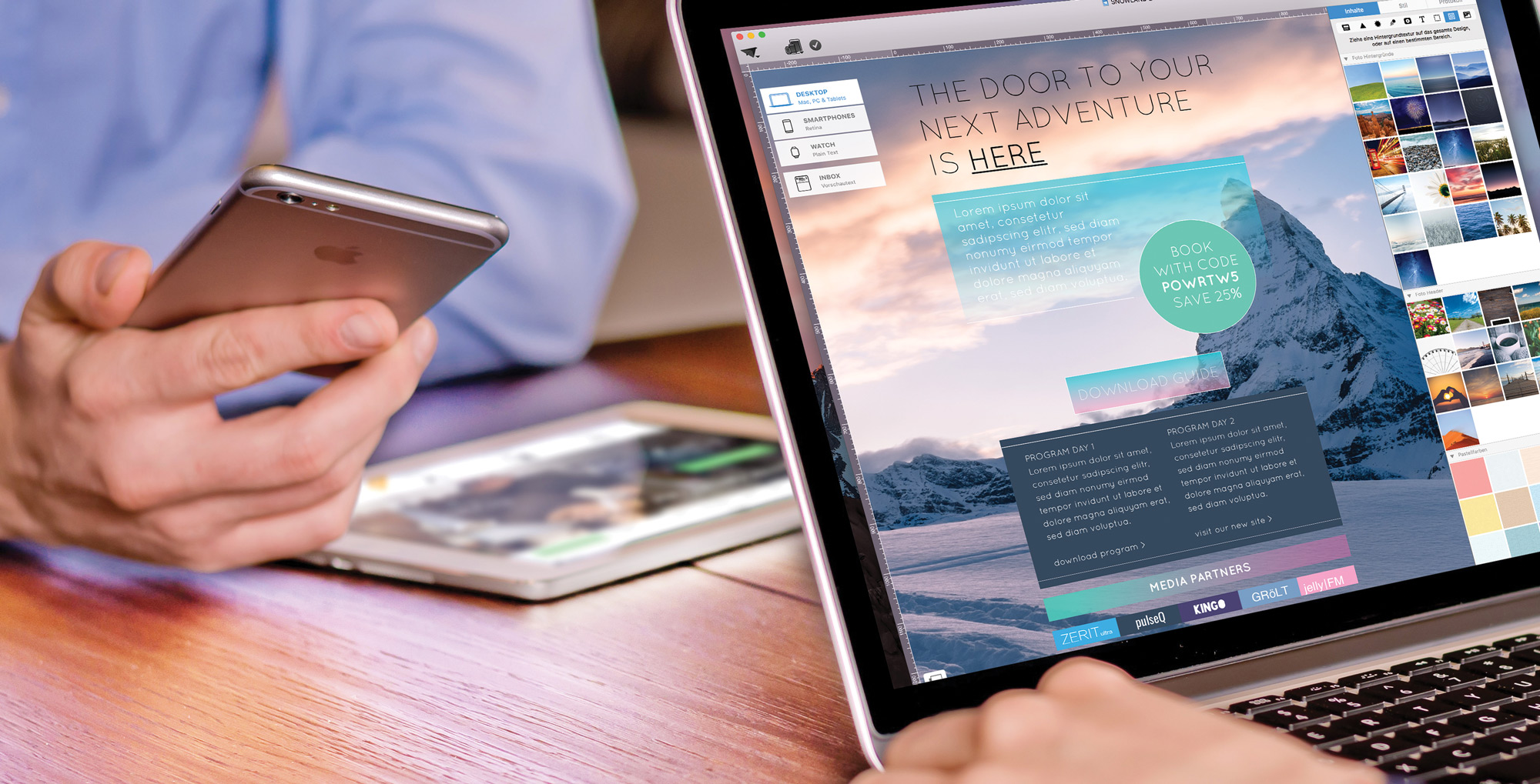
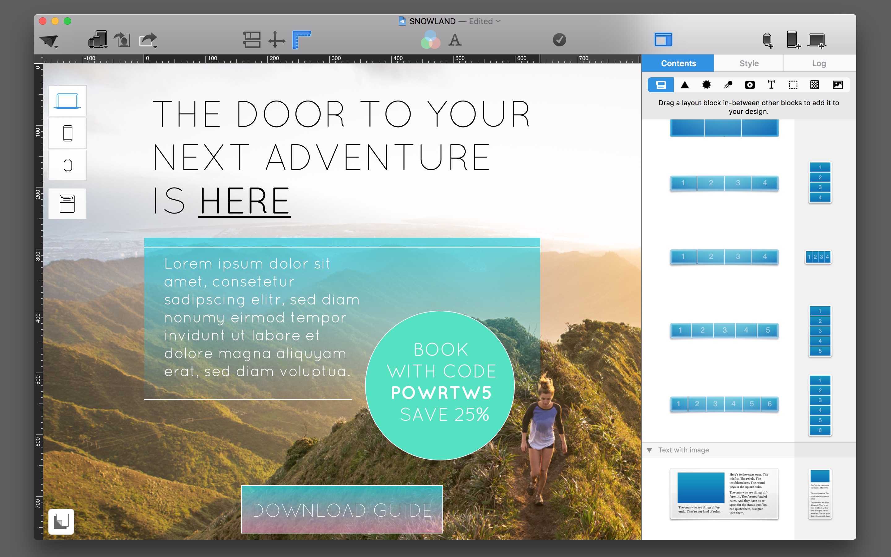
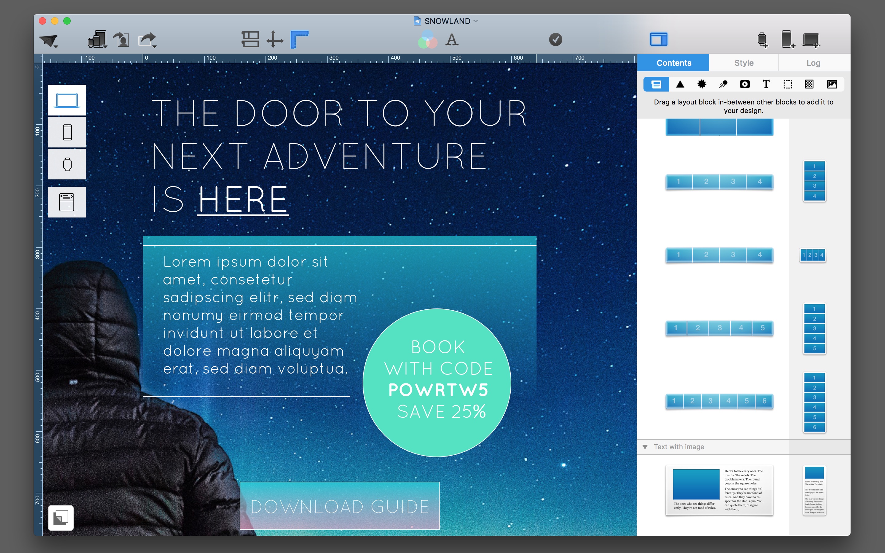
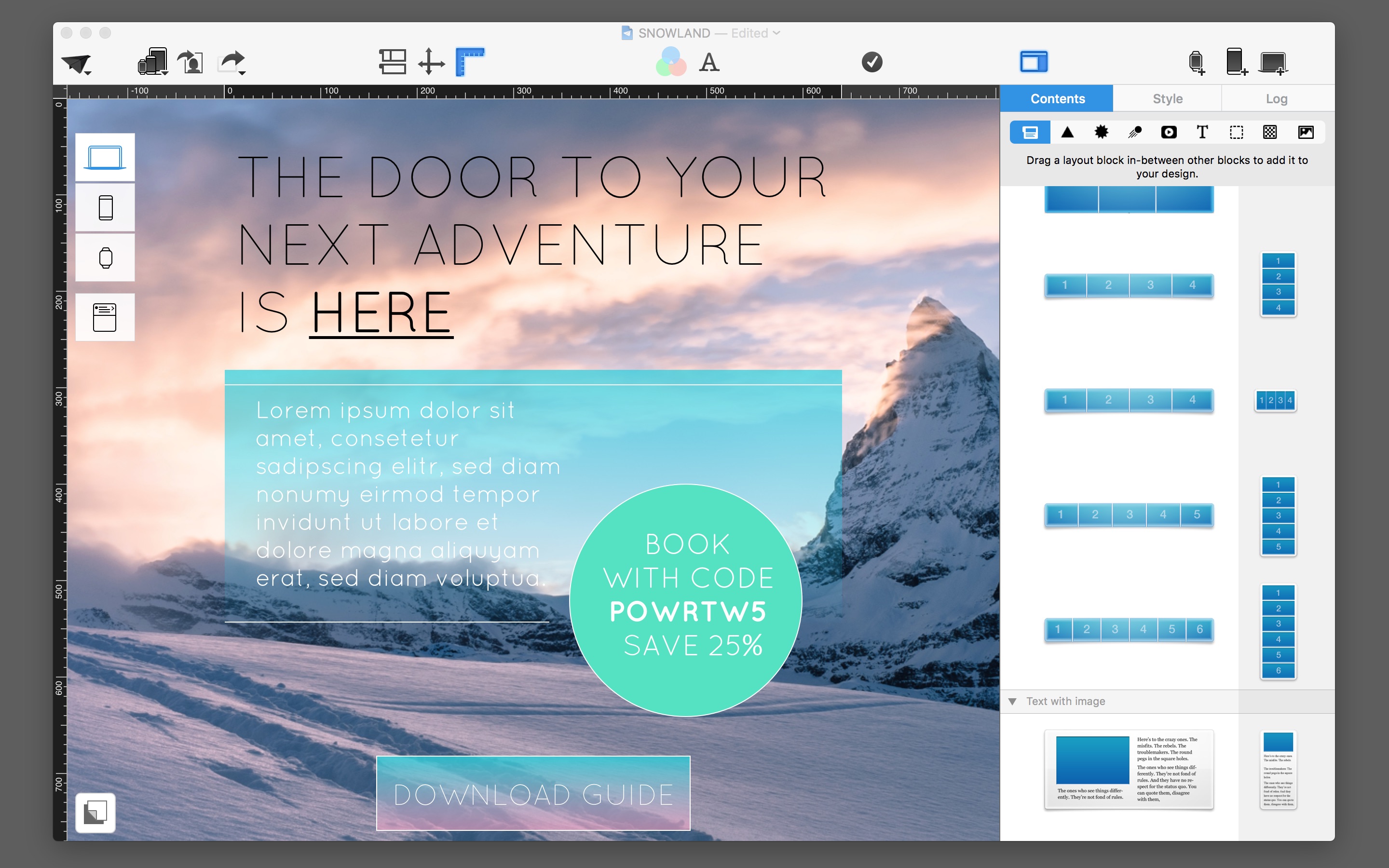
A picture is worth a thousand words, and boy do they sell! Pictures put readers in the right mood and give potential customers a stronger emotional connection to your products or sales. With the improved background features from Mail Designer Pro, you can create brilliant, breathtaking effects with full surface hero images. Be creative and stretch mood pictures over an entire email. A catchy slogan and large fonts will help give your newsletter that extra umpf.
Tip: It’s important to use an image that works well in Mobile Mode because when viewed on a smartphone, your recipient will be scrolling. Basically, within 8 minutes of viewing your newsletter,, your readers should get into the right mood, recognize your style, and understand the offer and promotional period at hand.
 Pictures add an extra value to the style of your newsletter: A special fall menu for your restaurant, an invitation to an Open House, or a last minute weekend sale - the right background adds a subtle, but meaningful reinforcement to your message.
A little bit of taste is helpful for bringing across the right message. We’ll show you how to use background art for your desktop and mobile versions.
Find the right background image
Bigger is better. Ideally, you should look for pictures that are at least 4000px wide. This gives you more leeway for positioning and the picture will remain sharp for Retina displays
Extra leeway: Keep in mind that you will most likely want to include text boxes on top of your picture. Therefore, it is not recommended to use a picture with lots of details throughout but instead one with depth, colors, or slightly blurred. This way it’s easier to find appropriate spots for Headlines and texts.
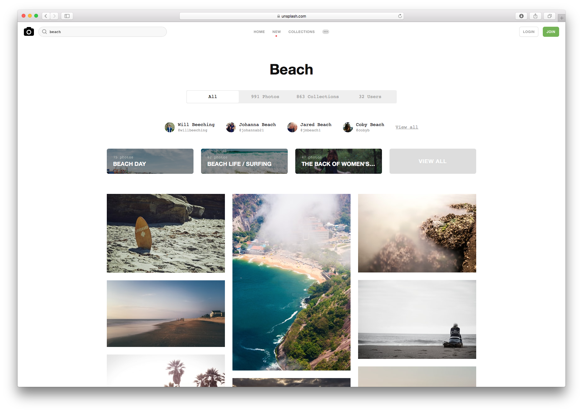 Picture databases as inspiration: If you search the web for pictures, you’re sure to find some good image databases for downloading pictures, such as these:
Sometimes, simply browsing through the different images can give you inspiration for your newsletters. Of course it’s always best if you start off with your own ideas.
Layout cheat sheet: Create emails with backgrounds
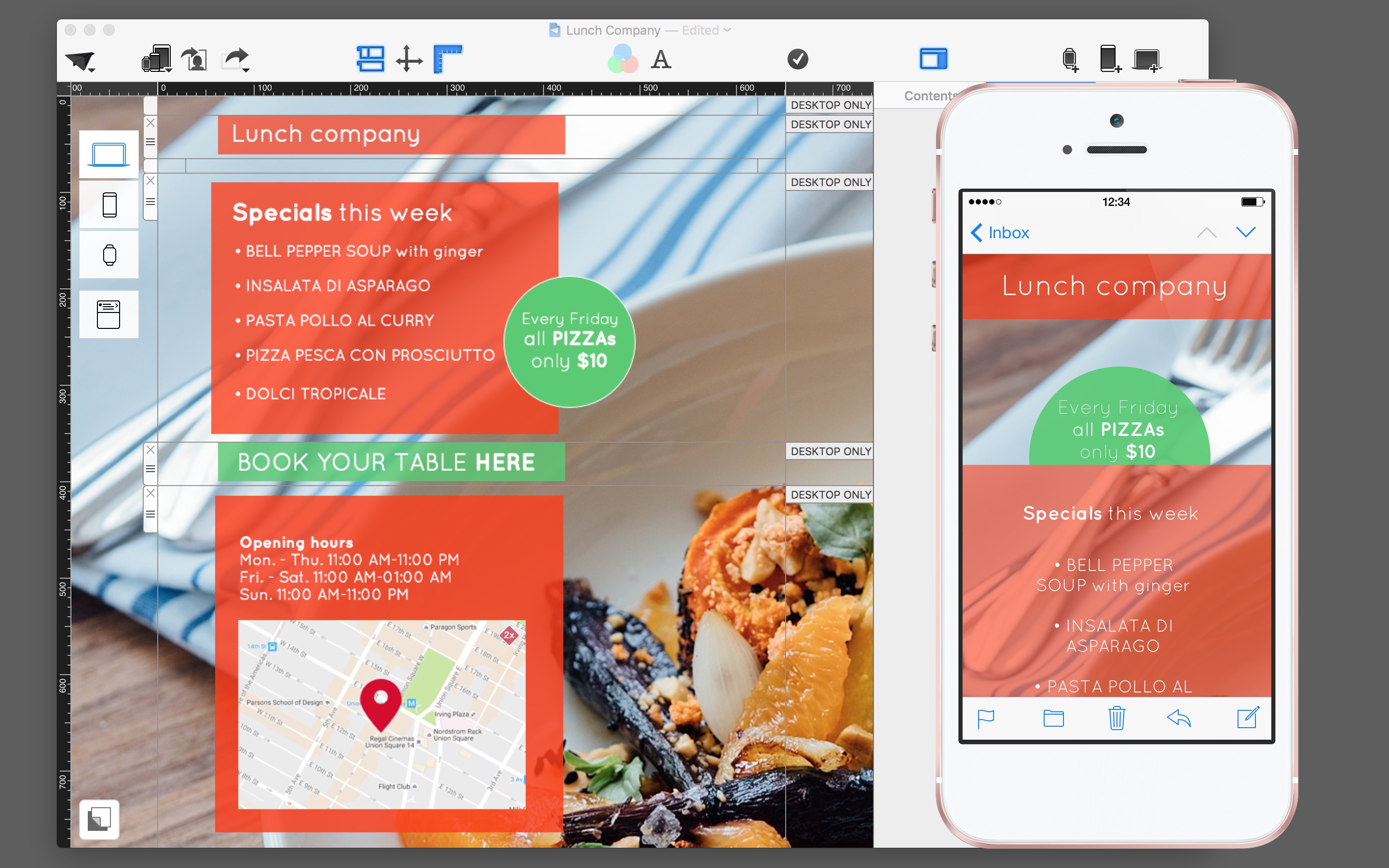
More or less text? Before you start, it’s best to decide if you want to work with transparent text boxes or with non-transparent layout blocks. The latter variety is appealing when you'll be including a longer text.
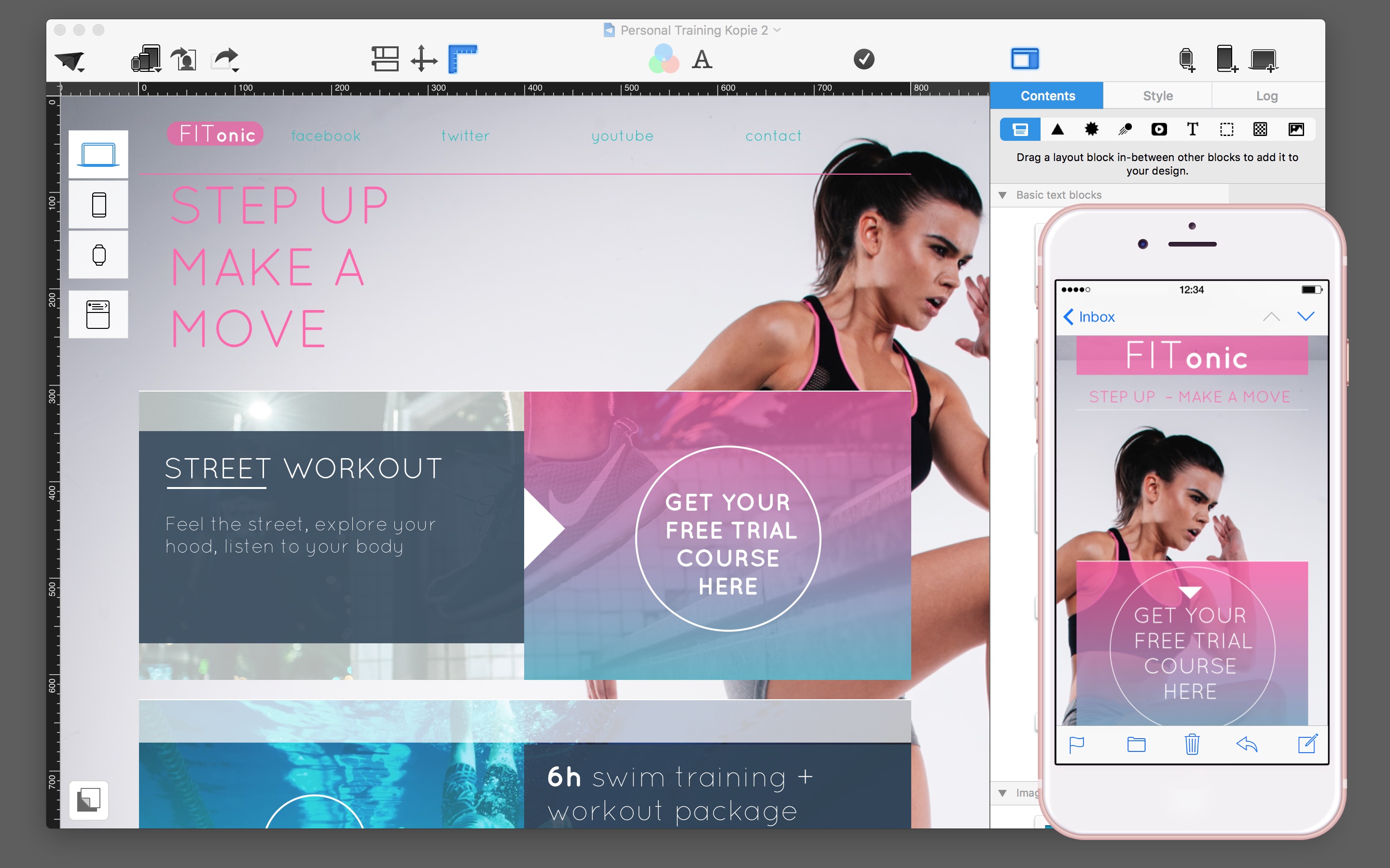
Give your background space: Try to keep the top and up to the first third of your newsletter free. This space is important to let the background image make its impression. For texts, you could use a text/picture layout block and reduce it, such as seen in the following example: Texts should be at least 16px big so that the work well on mobile screens.
 Style with transparent layers: If you use minimal text, as in: Quick information, sales, transaction emails - you can give your background picture even more room. Try working with picture layout blocks which you can include layer by layer for your texts.
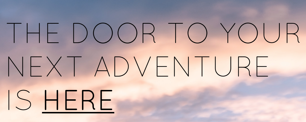
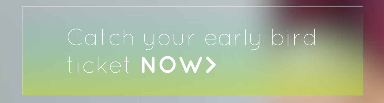
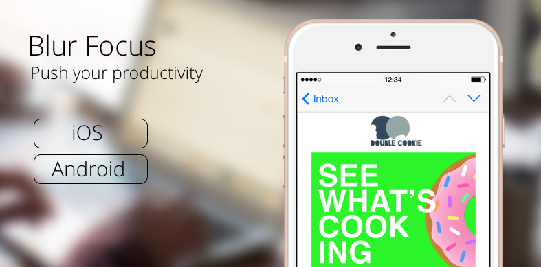
Check out these 3 examples to see how different the moods can be depending on how a background is used…
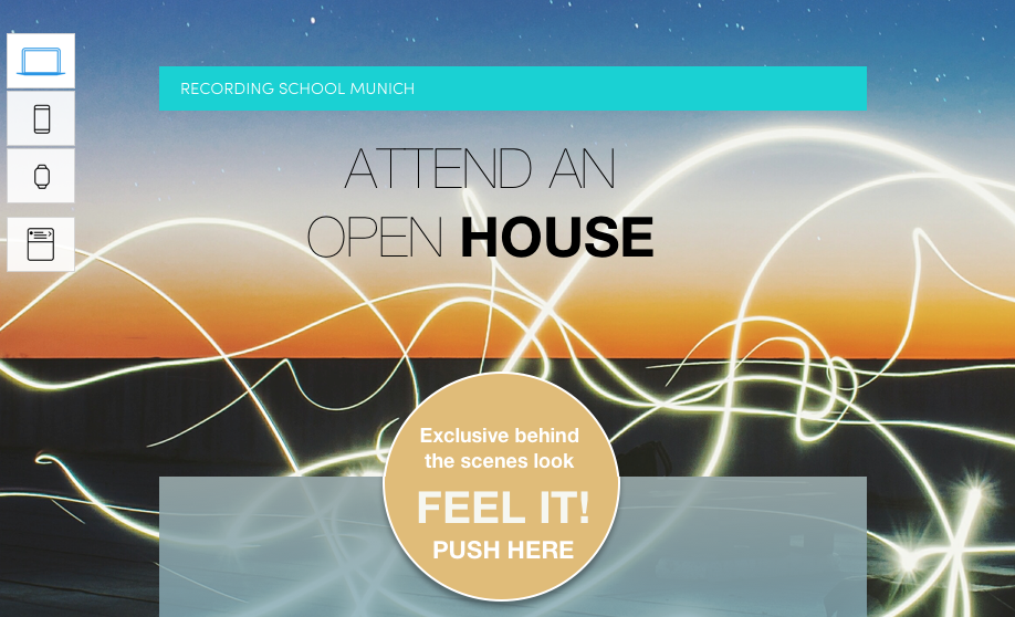
For the layers, drag a square or circle onto your picture layout block from the Graphic Tools. Turn the opacity down to around 80% so that it is slightly see-through. With this method, it requires a bit more work to create the mobile versions.
Tip: Increase your click rate: Try this method as well to help push your Call-to-Actions. Adjust the picture so that the background drags attention to one of your links.
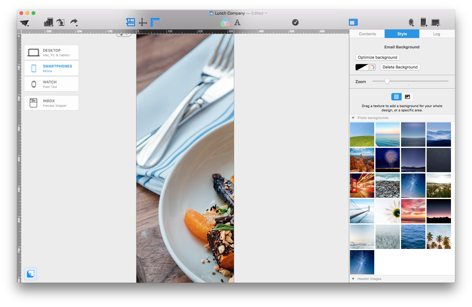
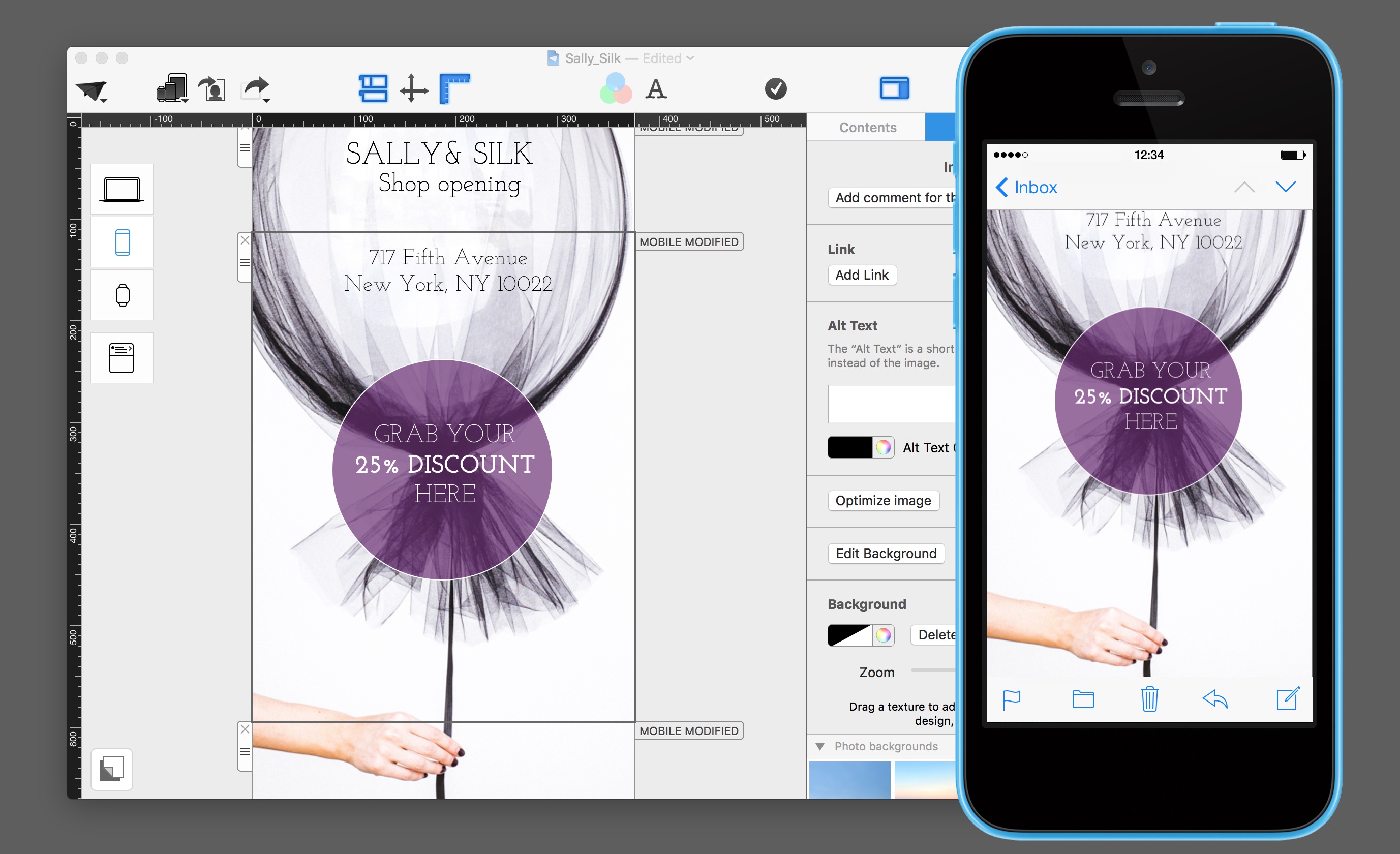
Apply, position, and optimize the background for your desktop version
To position a background, click on the background icon link at the bottom. Now you can pull the edges of your background to adjust the size. With the zoom feature, you can adjust the background image to fit your newsletter exactly. By holding the mouse button while you drag, you can move the inner area of your background picture.
Tips: Background images can increase the volume of data in your newsletters. Using Optimize Background, you can further compress the image. Decouple and adjust the background for the mobile version.
Detach and adjust the background for the mobile version
You’ll most likely need to choose a smaller section of the background picture to use for the smartphone version. Go to the Mobile Layout View for Smartphones and then to Background Mode.
By slightly moving the background picture, Mail Designer asks if you’d like to decouple the background from the desktop Design. After decoupling, you can adjust the background exactly to fit the narrow smartphone screen.
5 tips for catchy CTAs with a good conversion
When it comes to a Call to Action (CTA), it’s best to get inspired by the modern webtrends. The same rule applies here: The CTA must first work on the mobile version before you transfer it to the desktop one.
 One single CTA in a newsletter makes more of an impact than five. The fewer choices your recipient has, the better.
Here are five helpful CTA Design tips for you:
• Slogan booster: Use a modern web font. Position your text on your lead picture and highlight one motivational word in which you build in your CTA. Tip: Using special characters such as “>” actually help to boost your text link.
 • Transparent surfaces and button graphics give your CTA a modern look
 • Light lines: Try using simple, (1pt), lightly rounded outline in combination with a thin font (for example: Open Sans) positioned on top of a lead picture.
 • High contrast: It’s not only about the color of a CTA, but the contrast. According to a recent study, an online shop increased its sales by 30% simply by changing their buttons to green. Due to the contrast with the background, they became much more visible.
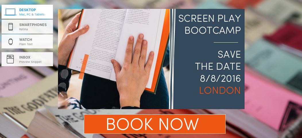 • Make it different Surprise them with nonconventional button shapes and postions. Who says you can’t use a round button?
 Check your hero image: Does it help if you move your hero image to a differnt section? Find the best position to make it a real eye-catcher. Does the content flow? Are the recipients in the zone? Then this is the right spot for an effective CTA.
If you like Mail Designer Pro, we’d appreciate a short review on the Mac App Store.
To get the latest version of Mail Designer Pro, click here.
If you have any questions or comments, please contact us.
Until next time,
Your Mail Designer Pro team