Plan better back to school email campaigns with practical timing and content tips, inspiring brand examples, and ready-to-use email templates.
Read More
Switching your email account to Microsoft 365 can sometimes cause unexpected issues, especially when sending emails via SMTP through third-party apps like Mail Designer 365. Many users report that after the migration, their newsletters or other outgoing emails fail to send, even though login credentials remain correct. This article explains why this happens and provides you with a straightforward fix to help get you back on track.
Many Microsoft 365 plans no longer provide traditional SMTP access in the way third-party apps expect. In some cases, SMTP is completely blocked, or it requires complex OAuth2 authentication. The classic login method, using just a username and password for SMTP, IMAP, or POP3, is often disabled by default after migration. This means that even if your app password is correct, third-party apps may fail to authenticate with Microsoft’s servers.
Mail Designer 365's SMTP send feature relies on a working SMTP connection to send emails. If your SMTP connection is blocked or requires a protocol the app doesn’t support, the login to the mail server will fail, and sending emails will not work. Users often encounter error messages indicating authentication failures, which can be confusing if email credentials work in other apps like Apple Mail or Outlook.
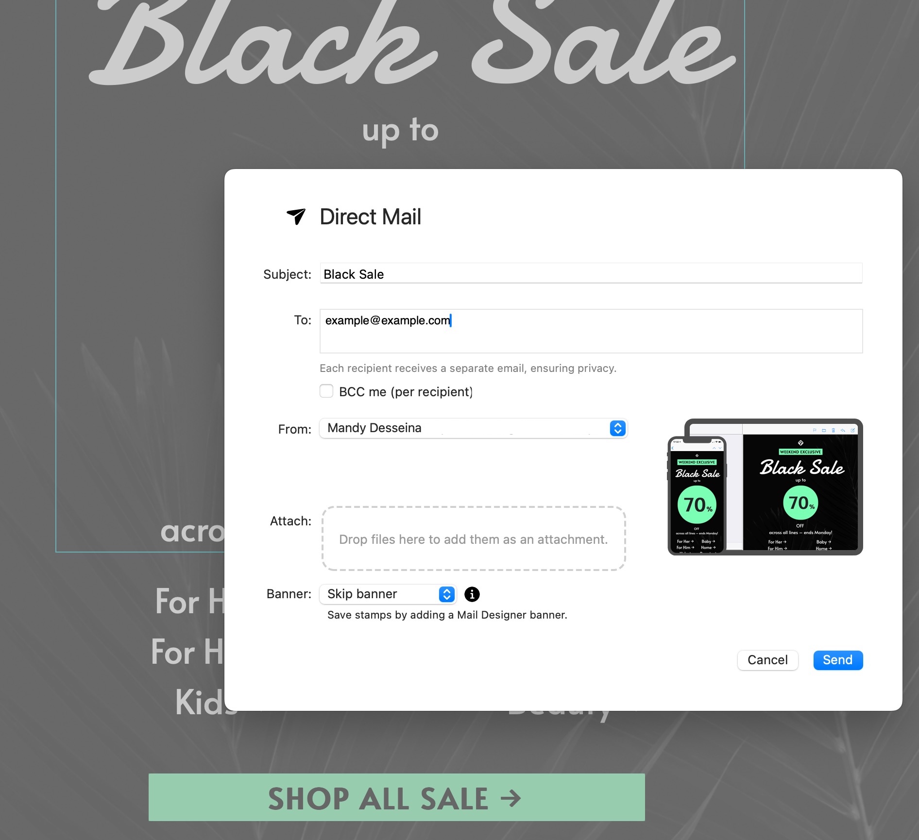
If SMTP sending is no longer available with your Microsoft 365 account, Mail Designer 365 offers a built-in sending service that avoids these limitations altogether.
Mail Designer 365 provides two integrated sending options:
Both options allow you to send emails without relying on your email provider’s SMTP access, making sending more reliable and easier to maintain as provider requirements continue to change.
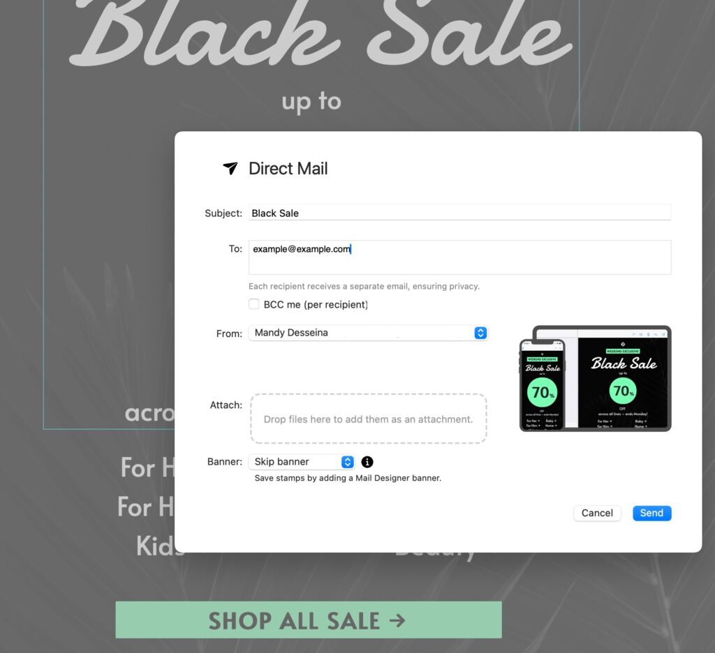
With Mail Designer 365 Direct Mail, you can send professional HTML emails directly from your Mac without relying on SMTP
Good to know: All Mail Designer 365 design plans include a base sending allowance, so you can get started right away and send up to 20 Direct Mails a month, at no additional cost.
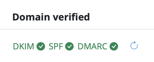
By using Mail Designer 365’s sending service, you can continue sending professional emails and newsletters with confidence, even as email platforms evolve and restrict traditional SMTP access.
Thunderbird is a popular free email client used by individuals and small businesses around the world. One of the most common questions users ask is whether it’s possible to create and send an HTML email Thunderbird. The short answer is yes — Thunderbird does allow you to use HTML templates. However, once you start designing and sending more professional messages, you’ll quickly run into limitations that make the process frustrating and time-consuming.
Yes — Thunderbird does support HTML emails. You can import a custom template or even write your own code directly inside the editor. For users who just want to test a simple HTML email Thunderbird workflow, this can work fine. At first glance, it looks like Thunderbird could handle newsletters or business updates by using HTML templates. If you want to try it out yourself, follow our step-by-step guide on how to export HTML emails from Mail Designer 365.
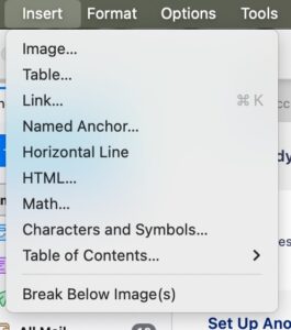
In Thunderbird, you can choose the HTML option from the Insert menu to add custom code to your email.
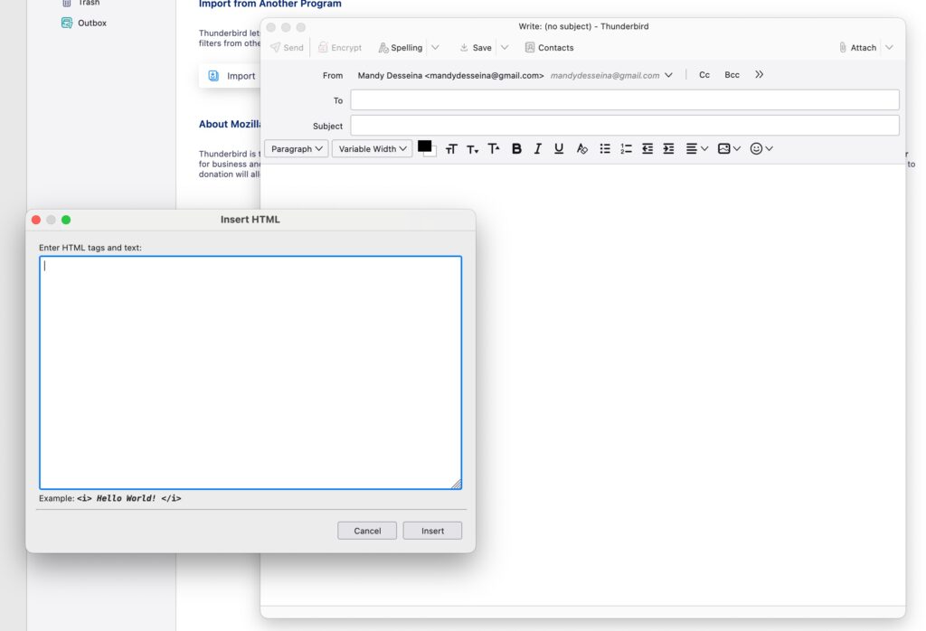
Thunderbird allows you to paste custom HTML code into your message — but editing and formatting remain limited.
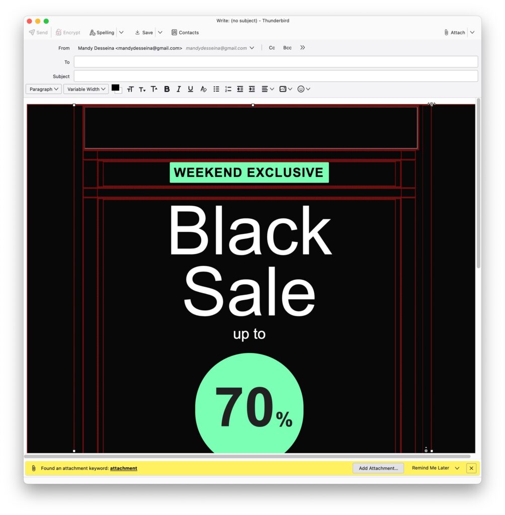
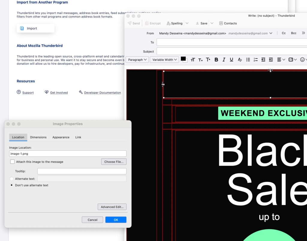
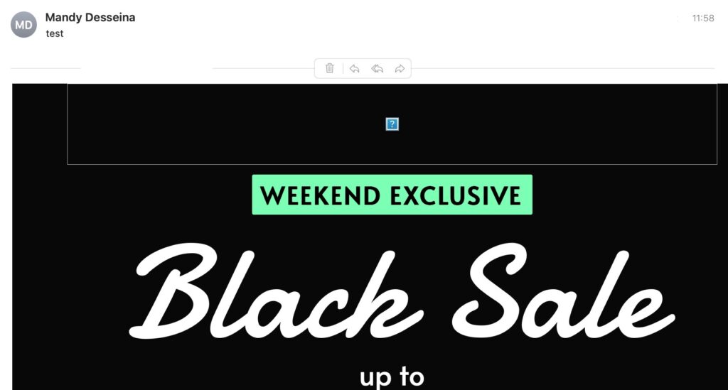
When sending out business communications, appearance and reliability matter. Using HTML email in Thunderbird may work for simple messages, but the limitations can cause real problems:
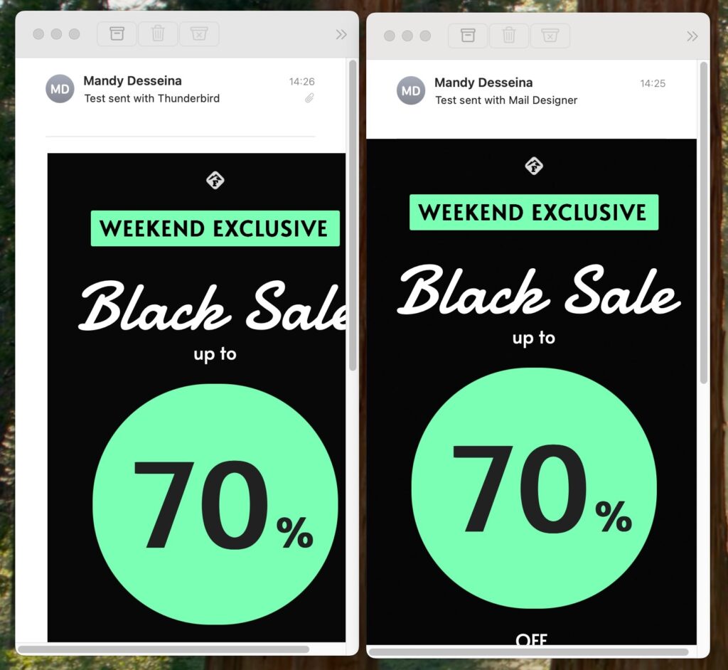
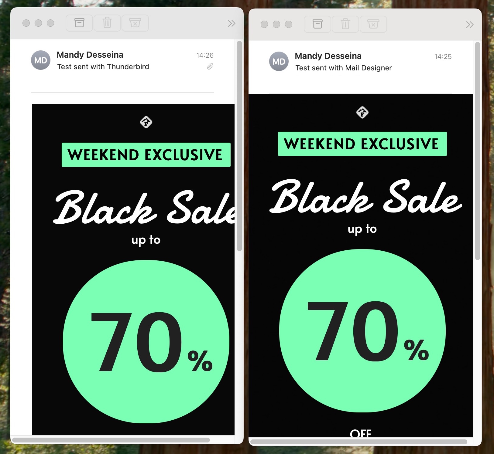
The same HTML email sent with Thunderbird (left) shows formatting issues and requires image attachments, while Mail Designer 365 (right) delivers a clean, professional result.
With Mail Designer 365 Direct Mail, you can send professional HTML emails directly from your Mac — without broken layouts, missing images, or large attachments.
Creating and sending HTML email Thunderbird is technically possible, but the experience is far from smooth. From broken layouts to constant image reconnecting, Thunderbird’s limitations make it difficult to achieve a professional result.
If your goal is to send emails that look polished, work reliably across devices, and provide insights into performance, Thunderbird will quickly feel restrictive.
That’s where Mail Designer 365 comes in. With powerful design tools and the integrated Direct Mail function, you can create beautiful HTML emails and send them directly — without the headaches.
Try Mail Designer 365 today and experience a better way to design and send professional emails.
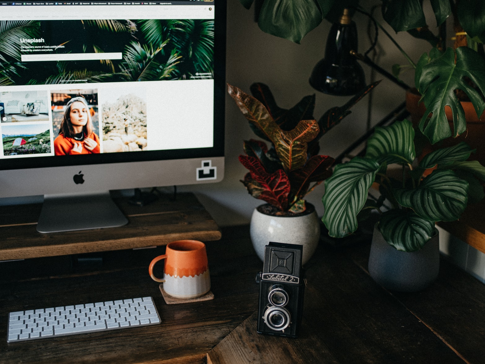
From utilising AI to checking over your spelling and grammar to creating fun email content, there are many free marketing tools out there with a wide array of different functions available. Sometimes, you can even benefit from using free marketing tools as a useful supplement to the tools that you are already using.
Keep reading to discover some of our favorite free marketing tools to help your email campaigns — all of which pair perfectly with an email template creator like Mail Designer:
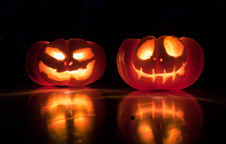
For a lot of businesses, Halloween is one of the most exciting events on the marketing calendar. Building a Halloween email campaign gives you the chance to get super creative and try out loads of exciting new ideas. Like all holidays, it's also a great opportunity for holding a sale or special promotion.
However, it can also be daunting to try and come up with a new idea when the stakes are so high. To help you get inspired, we've collected some of the very best Halloween email campaign examples, as well as easy-to-follow tips and tricks on how to recreate them...
P.S: Don't forget to check out our spooky Halloween template collection - ready for you to edit in Mail Designer 365 on your Mac and send via Delivery Hub...
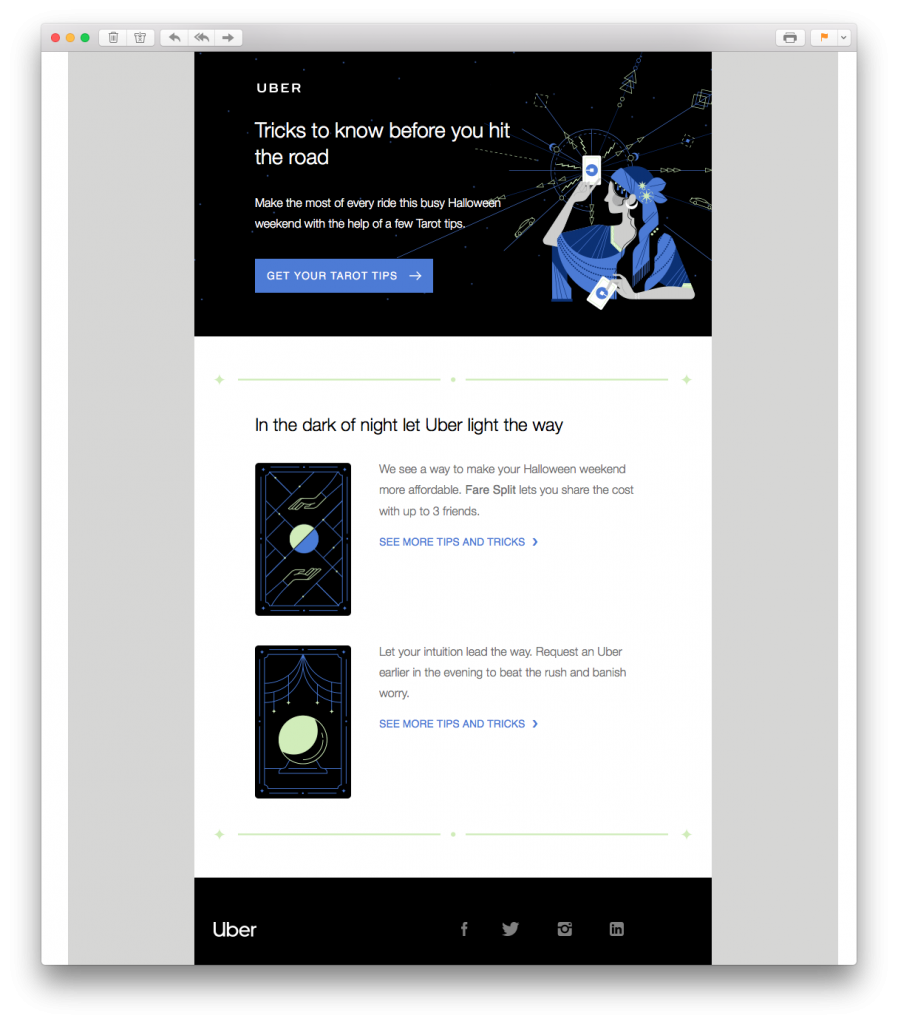
This tarot themed email design by Uber is a great way to kick off our examples. Although not necessarily a traditional Halloween theme, Uber still manage to incorporate some spookiness into their email to keep readers interested.
What we love: Including Halloween survival tips is something many customers will massively appreciate.
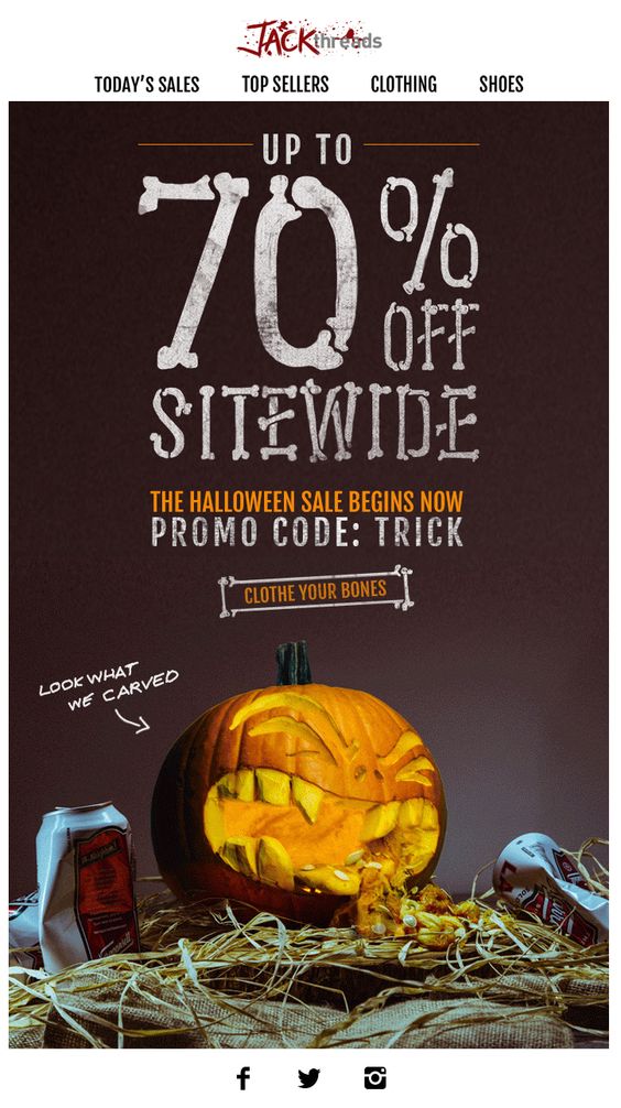 In this email promotion, JackThreads have opted for the classic Halloween sale. 70% off is impressive and will instantly pique readers' interest. The funny pumpkin graphic is also a clever way to grab the attention of the reader and get them in the Halloween spirit.
What we love: The skeleton font is super unique and perfect for Halloween. We also love the blood spatter effect they've used on their logo to make the email even more scary.
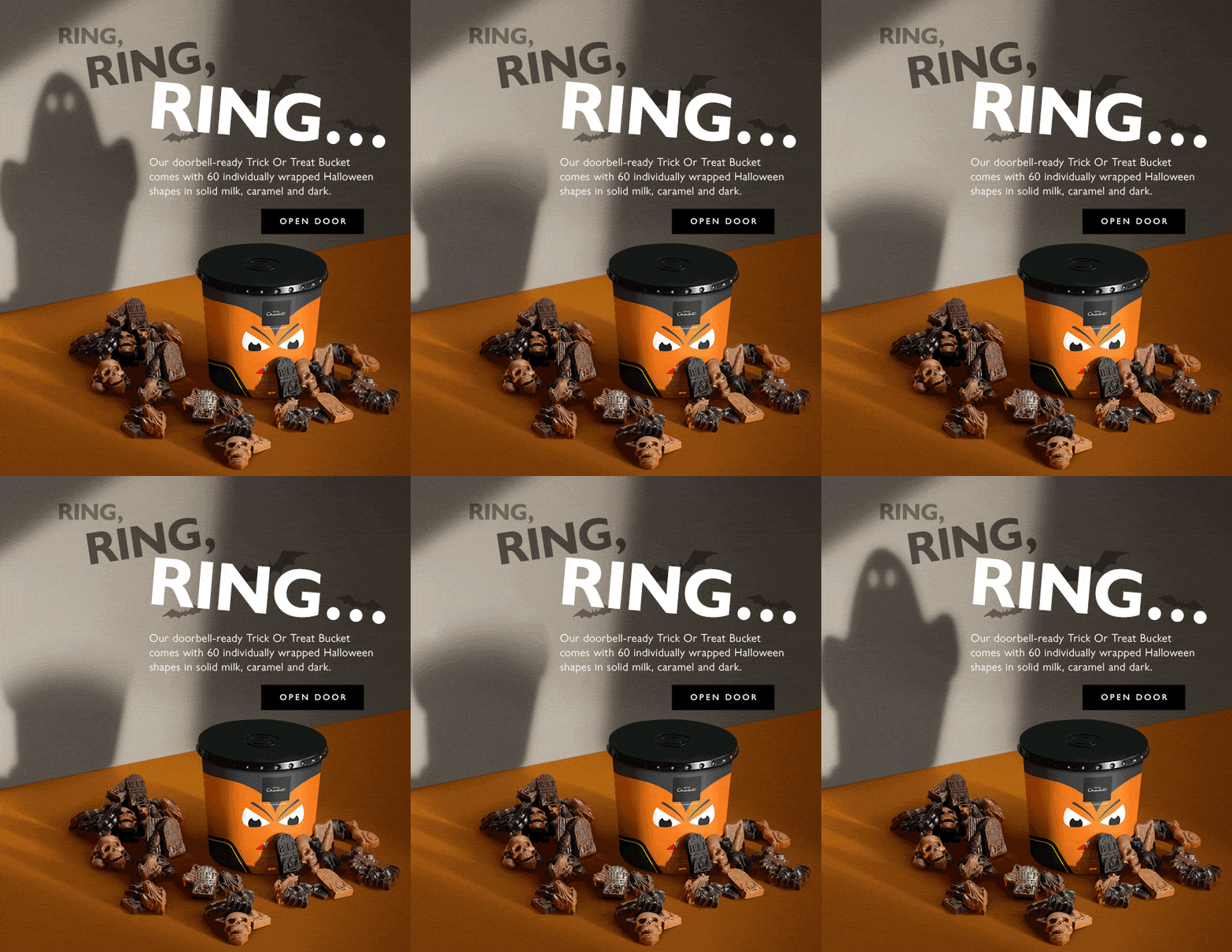
Bring on the first of the GIFs! This simple yet effective email by Hotel Chocolat is super clever and plays on the classic trick or treat theme which everyone associates with Halloween. The spooky ghost in the background paired with the creepy "ring, ring, ring..." makes the design extra exciting.
What we love: The playful CTA button (call-to-action) is smart in this email design. Using a less serious CTA makes readers more willing to play along at Halloween.
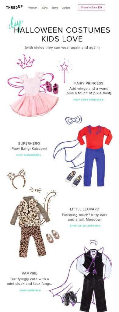 This email by thredUP is a bit less on the scary side, but still seriously cool. Dressing up and having fun is what Halloween is all about so these DIY costume ideas are ideal for kids and parents alike. The CTA links are also easy to locate, making shopping for the perfect costume even easier!
What we love: The costume tips are really inspiring for parents planning a fun Halloween for their kids. thredUp also stresses how the clothes can be worn again and again (not just on the big day) which we think is super productive.
Tip: Build a similar layout in Mail Designer 365 using combi text-image layout blocks:
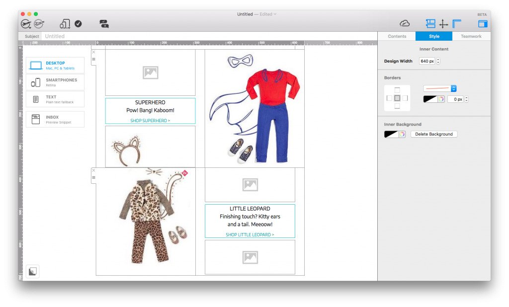
Use Mail Designer 365's combination layout blocks to create easy-to-follow catalogue layouts.
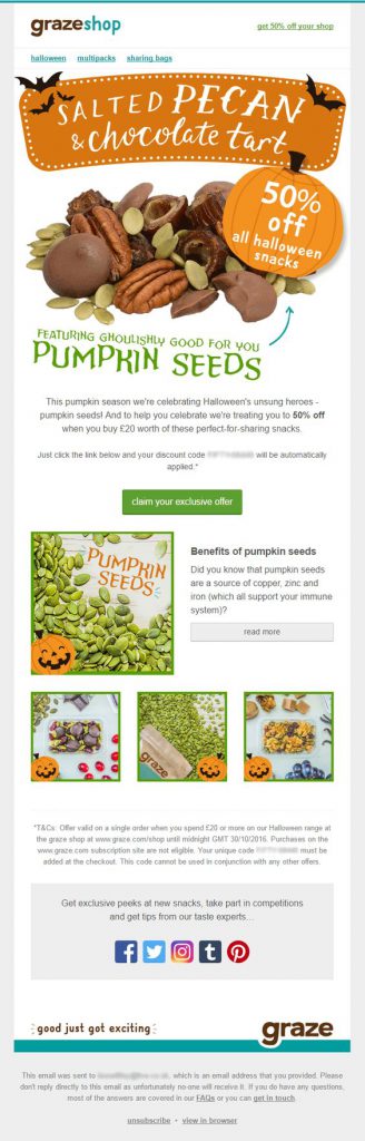 Graze are making us hungry with this snack-themed Halloween email! Concentrating on the health benefits of pumpkin seeds is smart at this time of the year and gets readers hungry to find out more about this nutritious snack. The little pumpkins scattered throughout the design also help add to the seasonal theme without going overboard.
What we love: The pumpkin shaped eye-catcher at the top of the design instantly introduces the Halloween theme and helps Graze show off their special offer.
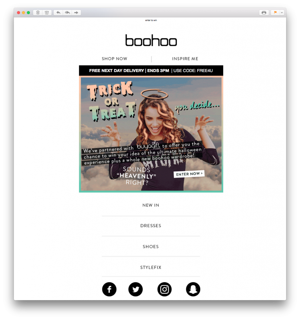
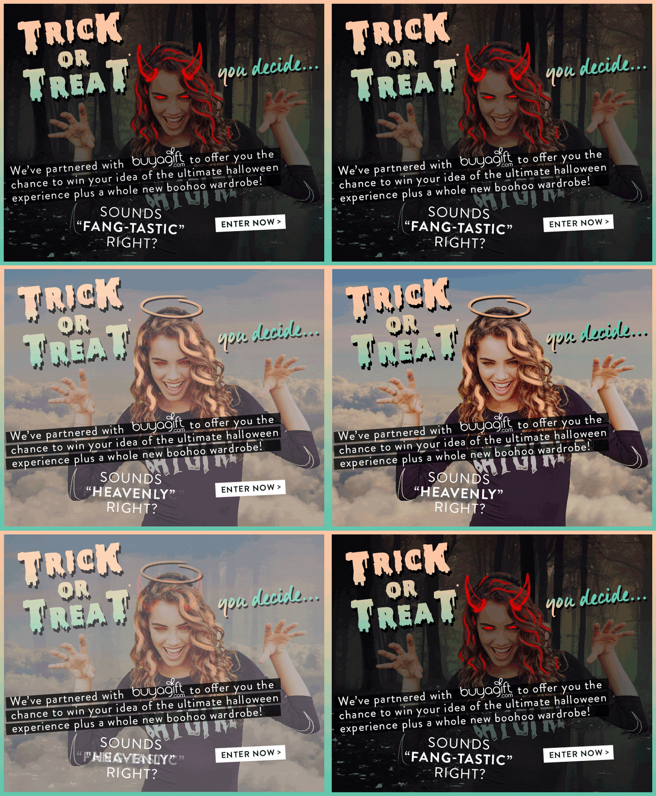 Boohoo also get creative with GIFs in yet another trick or treat inspired email design. Although the rest of the email is pretty simple, the main eye-catcher is the heaven vs. hell GIF animation at the top of the design which instantly makes the theme clear.
What we love: As well as the really clever GIF, the retro Halloween font choice in this email is also great. Using all of these aspects together helps Boohoo create the perfect basis to advertise their Halloween competition.
Tip: Try out the range of web fonts in Mail Designer 365 to create cool text effects like the one in this email. We personally recommend "Nosifer" or "Creepster" for this time of the year!
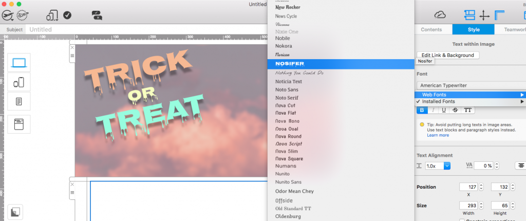
Use a Halloween style webfont such as Nosifer to recreate the spooky text effect used by Boohoo.
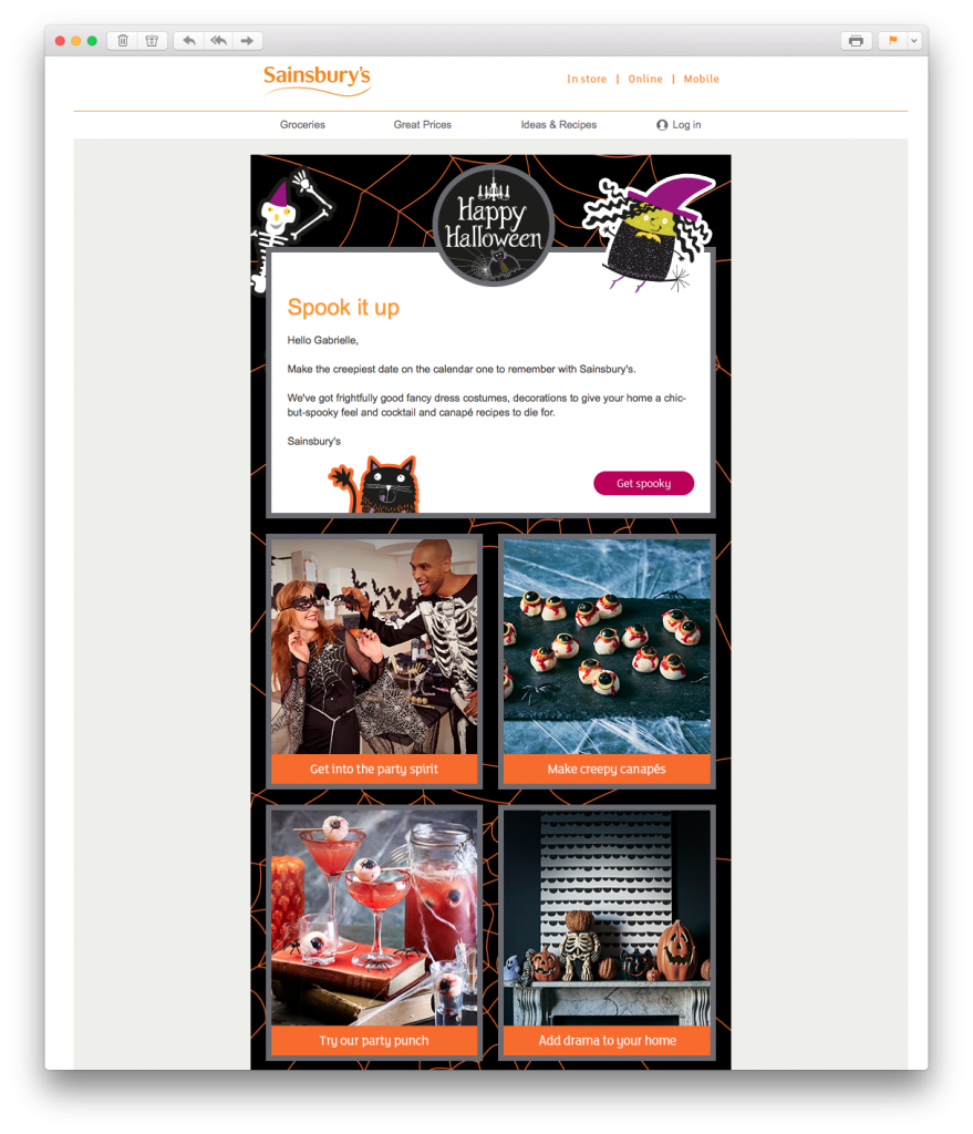 This email from Sainsbury's is yet another example of how you can use your Halloween email campaigns to offer customers practical tips and advice. The email has a great balance of text, images, fun graphics and CTA buttons.
What we love: The call-to-actions in this email work perfectly with the rest of the design. The orange stands out against the dark background, but also is completely on point for the season. It's also super effective how they're placed under eye-catching, Halloween themed images.
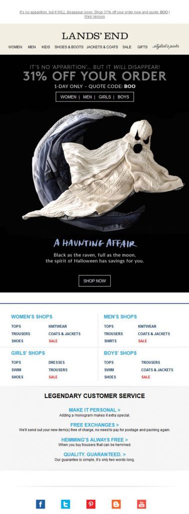 Land's End have pulled out all the stops on this email design. The 31% offer paired with the spooky ghost and the "Boo" discount code makes it no secret what the theme of this campaign is...
What we love: The ghost, obviously! The ghost feature image made out of clothing is a clever way for Land's End to incorporate Halloween into their usual branding.
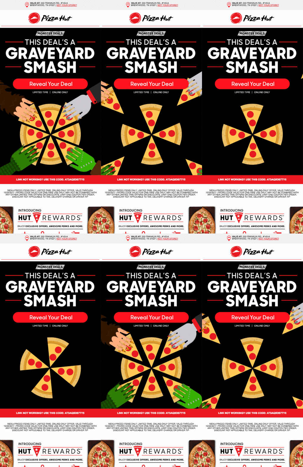 We've found yet another food-themed email! Pizza Hut have embraced the Halloween theme with this vibrant email design. The CTA is super tempting and makes the reader want to click straight away to discover their exclusive deal.
What we love: In this email, it's the color combination of red and black which stands out the most. We also love the fun pizza GIF which helps get readers in the party mood, as well as subtly making them crave pizza!
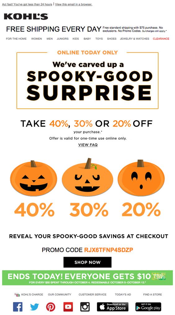 Kohl's have hit the nail on the head with their Halloween themed discount draw. There is a lot going on in this promotion. As well as the mystery discount offer, they also offer money off a threshold spend. All of these offers go along with the exciting nature of Halloween and encourage readers to get shopping.
What we love: Including a sense of urgency was a great way for Kohl's to make sure they attract as many customers to their website as possible. After all, it's now or never! The three pumpkins are also a great, central eye-catcher to keep the email in line with the theme.
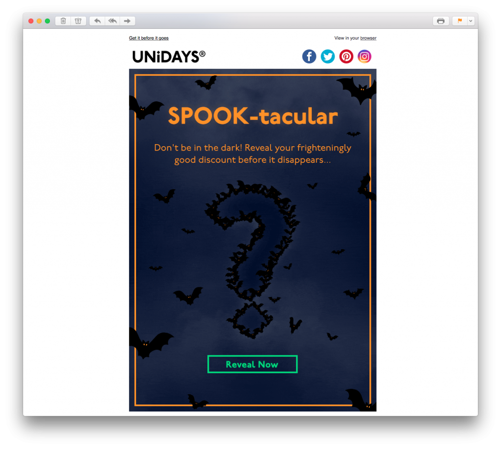 This email by Unidays is a similar concept to the previous email. In this example, there is even more of a sense of mystery thanks to the question mark graphic. The glowing green CTA button is also super prominent and entices the reader to click.
What we love: Thanks to the bats, the whole vibe of this email is really creepy mysterious. This adds even more to the overall effect of the promotion. The orange border paired with the headline font also helps make the design pop; giving it that Halloween feel.
Tip: Recreate this unique border effect in Mail Designer 365 with the borders tool. Customise the color, width and style of your border to suit your spooky email.
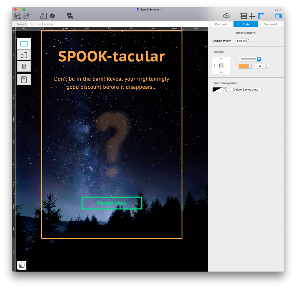
Use the borders tool in Mail Designer 365 to create spooky Halloween emails that really stand out.
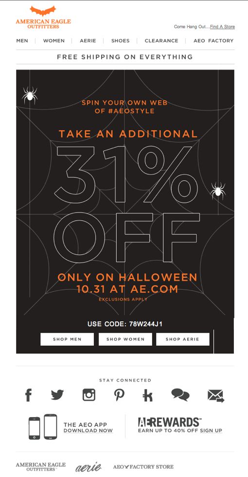 Look away now if spiders aren't your thing! This design by American Eagle Outfitters is pretty simplistic, but perfectly captures the Halloween theme thanks to the spooky spiderweb graphic. Also notice the little bat icon in the top left corner which they've swapped their usual eagle logo for. Just small changes like this can be super effective during the holidays.
What we love: The 31% off discount is clever because it differs from the norm and relates perfectly to Halloween. They have also managed to create a sense of urgency with the "only on Halloween" tagline.
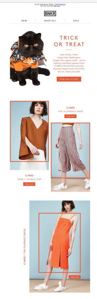
Last but not least, BKNR have gone for a more laid back approach in this email rather than concentrating too much on horror and spooky imagery. The subtle, orange accents throughout the email are great for Halloween and the trick or treat theme is also super effective.
What we love: The email is bang on trend for the Halloween season without going overboard. The quirky orange frames and bold CTA buttons mean customers are instantly drawn to the new products. We also give 10/10 for the Halloween kitty!
Tip: Use the shape creator in Mail Designer 365 to create a similar frame and CTA effect for your images. The color picker will give you exactly the shade of orange you are looking for to make your design Halloween ready.
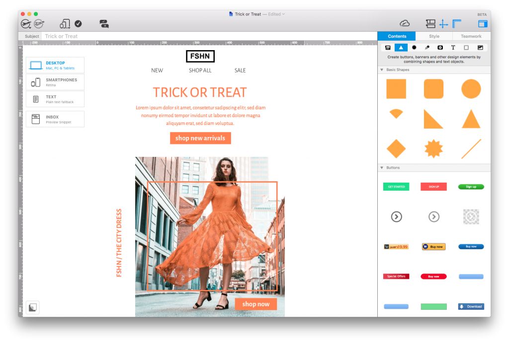
Use the shape creator in Mail Designer 365 to recreate quirky frame accents and build strong CTA buttons.
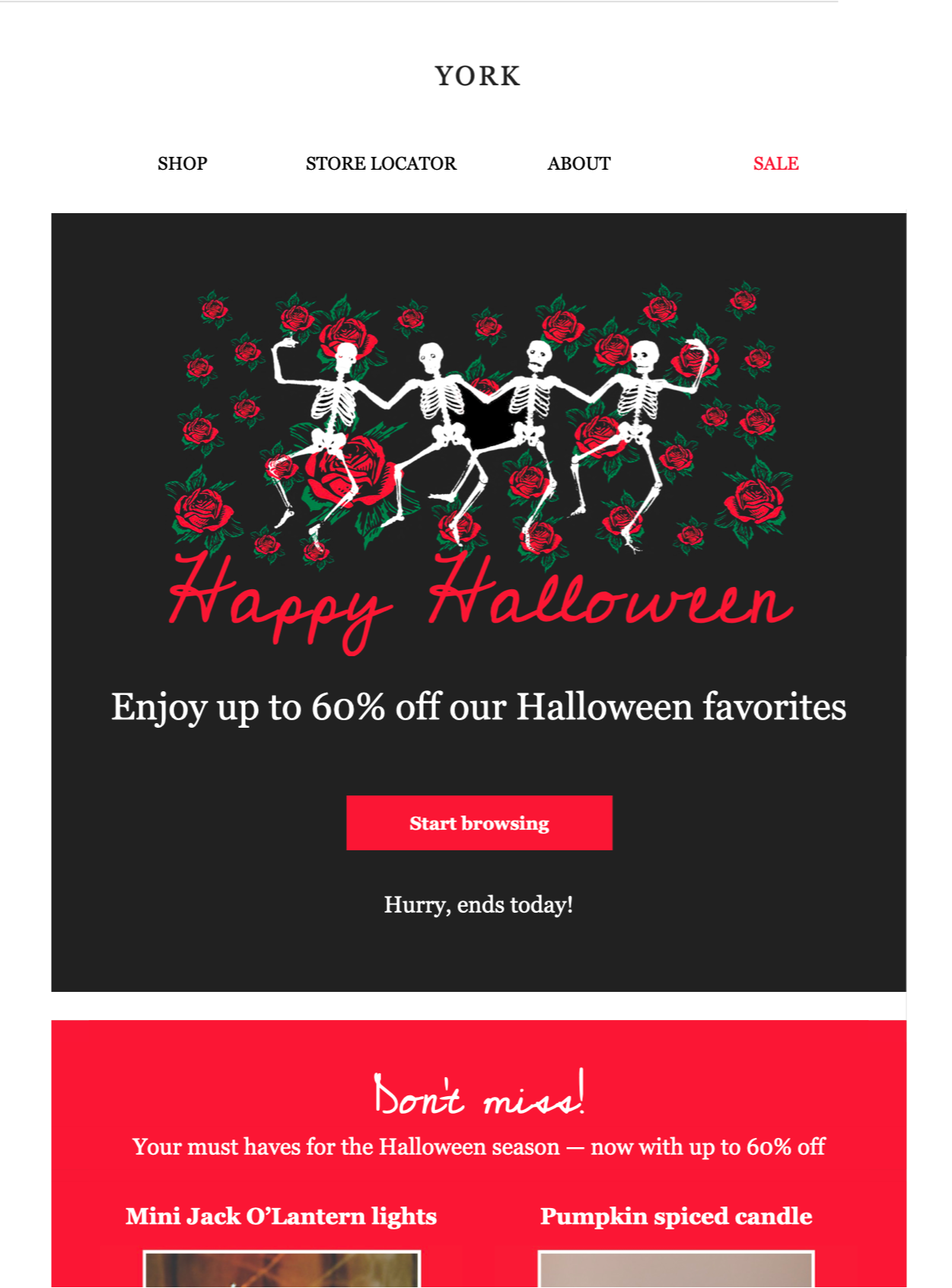
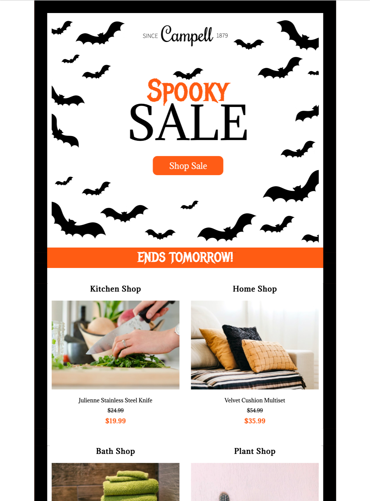
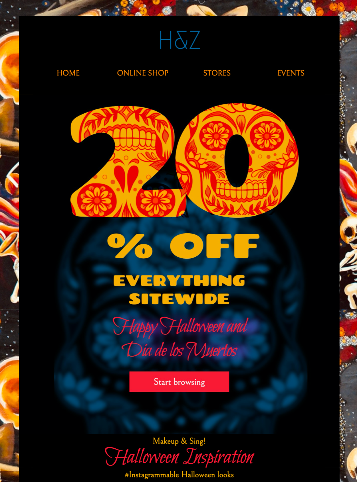
We hope you've enjoyed these great examples of Halloween email designs. We've also got two exciting, Halloween templates for you over in Mail Designer 365! Get inspired and edit them in the app today!
Hungry for more Halloween tips? Check out our other awesome guides:
Happy Halloween!
Your Mail Designer 365 Team
Get more inspirational tips, tricks, and best practice examples in the Mail Designer 365 Newsletter Academy -
your one stop hub for all things email marketing strategy and newsletter design.
A great email design makes the message easy to understand, represents the brand clearly, and gives readers a useful next step. Finding fresh inspiration can still be difficult, so this collection examines ten memorable email examples and the practical details that make each one work. Use the ideas as prompts for your own Mail Designer 365 layouts rather than copying another brand’s campaign.
Strong examples usually combine clear hierarchy, readable type, purposeful imagery, brand consistency, and one obvious action. As you review the campaigns below, look at how each design directs attention and consider which technique fits your own audience, content, and goal.
A welcome email is your first opportunity to introduce new customers to your brand and show them what you're all about. We think Starbucks have done a great job in this example. The email design is simplistic, cool, on brand and immediately makes the customer aware of what benefits the company can offer them.
Our favorite part: We love the handwritten "welcome" on the coffee cup as a classic twist on their signature gesture of writing customers' names on their drinks!

Show customers what they should expect from your business in your welcome email.
Using color in email designs is an effective way to quickly convey your email's main message. In this instance, Sephora have really gone the extra mile with their color blocking design. Instantly eye-catching and vibrant; this is a great way to grab the reader's attention and highlight your products. It can be easily recreated using shapes and image areas in Mail Designer 365!
Our favorite part: We love the angular layout of this design. The products are perfectly arranged and aligned to fit in with their color block; making it easier for customers to differentiate between the separate items.
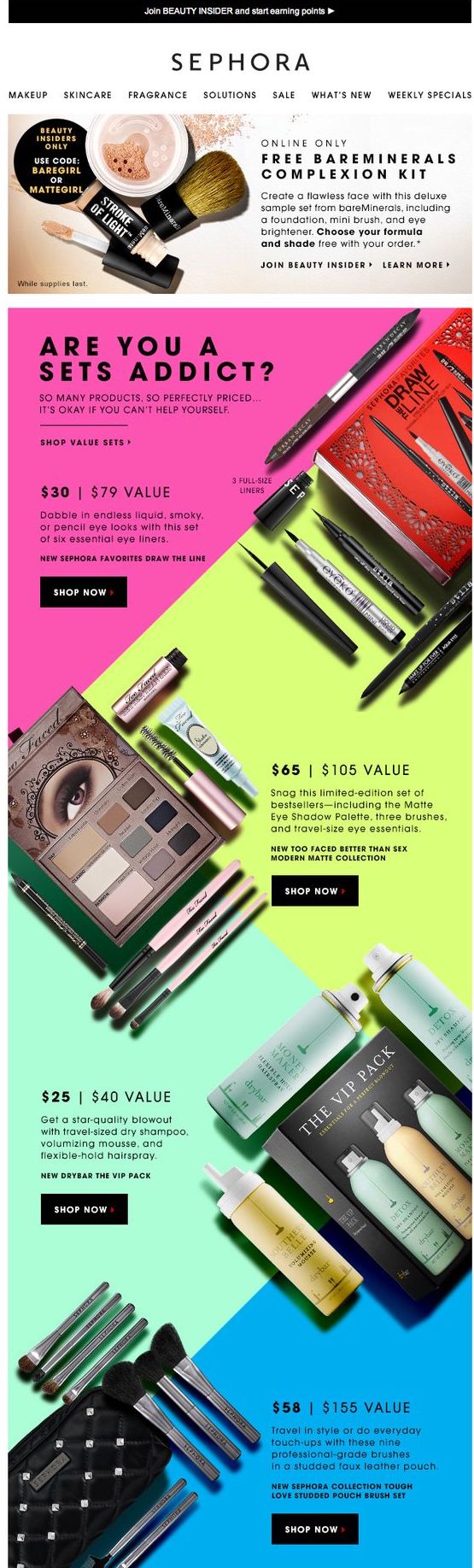
Use colors and unique layouts to create an eye-catching email design and showcase your products.
GIFs are the ultimate eye-catchers. Using a GIF in your email design increases click-through rates and means your readers are sure to pay attention to what you're trying to say. In this vibrant email design, Boden do a great job of showing off their products and creating fun effect.
Our favorite part: The bright yellow background is perfect for the summer theme of the email and goes hand in hand with the promotion of T-shirts. We're warming up already!
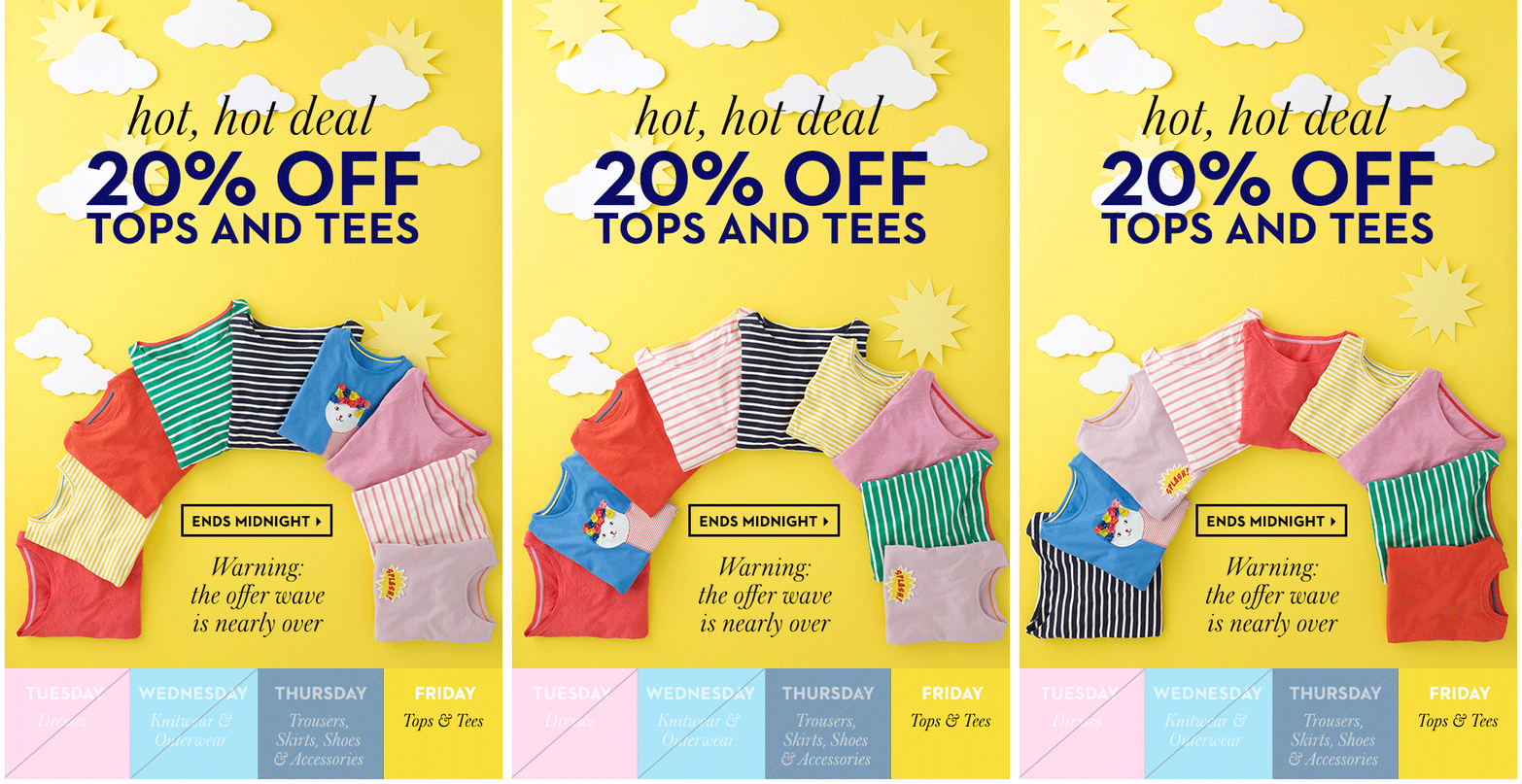
Using GIFs is a great way to grab readers' attention and make your email design more fun.
Wishing your customers a happy birthday is an effective way of showing them you care whilst also adding a personal touch to your marketing campaign. Anthropologie have really gotten on board with this trend and offer their customers a special birthday reward of 15% off.
Our favorite part: The cute party hat design is minimalistic, but gets straight to the point of celebrating; leaving readers in a party mood.
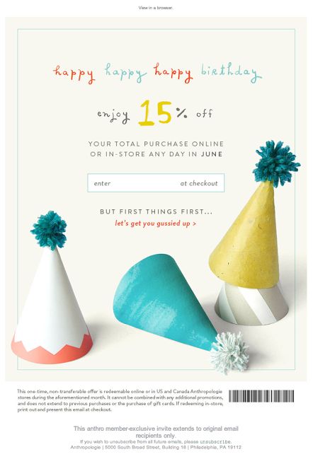
Make your customers feel valued by wishing them a Happy Birthday.
Sometimes, even the best of us get it wrong, but it's ok. If you have an awesome apology design like this one from Urban Outfitters, you'll brush off your mistake in style. Using effective imagery and a bold and friendly font is super effective in this design as it clearly conveys the apology to readers in a lighthearted fashion.
Our favorite part: The cats, of course! Not only are they super cute, the kitties in this email design lighten the mood and add more power to the apology. Purrfect!
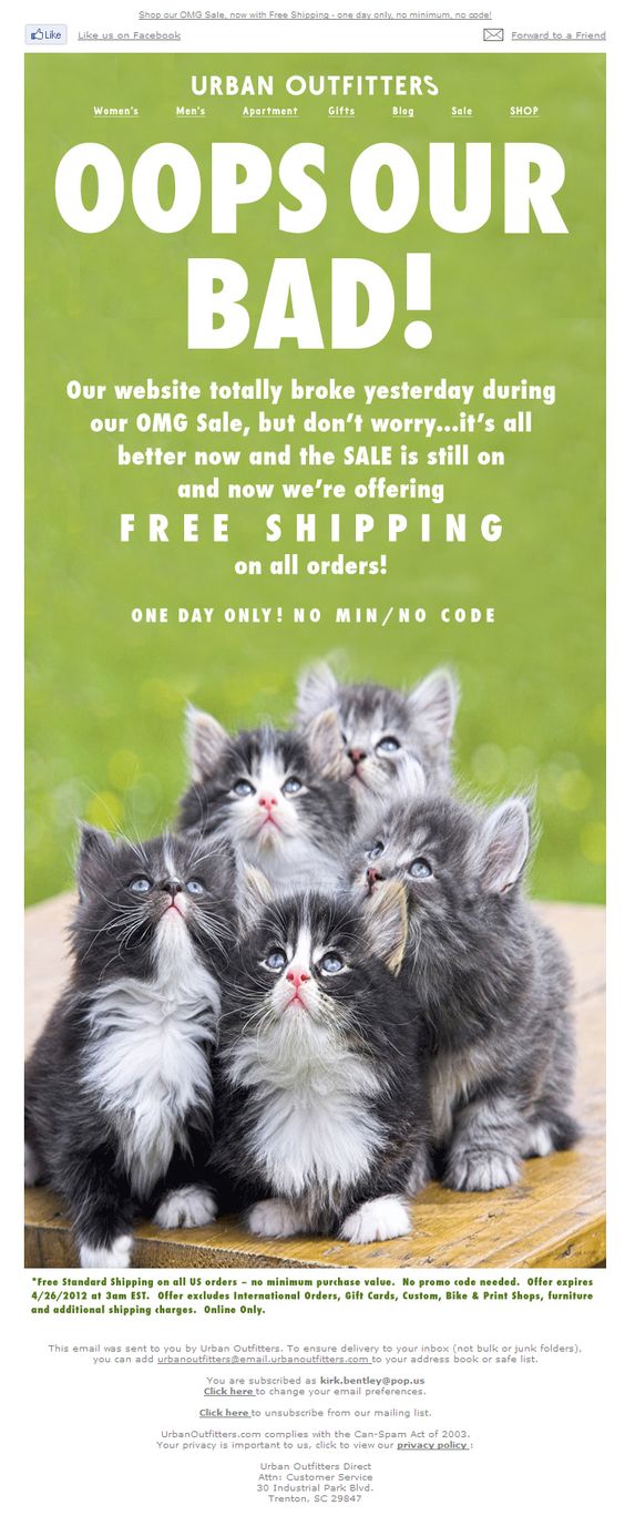
If something's gone wrong, win back your customers through effective design.
Email designs don't always have to be complex to get their point across. As proven by De Beers, simple can also do the trick. This email design clearly promotes the brand's sale and even manages to create a sense of urgency by including a time reference.
Our favorite part: The gift box is a great addition, as it creates a sense of mystery and makes readers inquisitive but, at the same time, also represents the luxury nature of the jewellery brand and promote their festive sale. A great example of less is more!
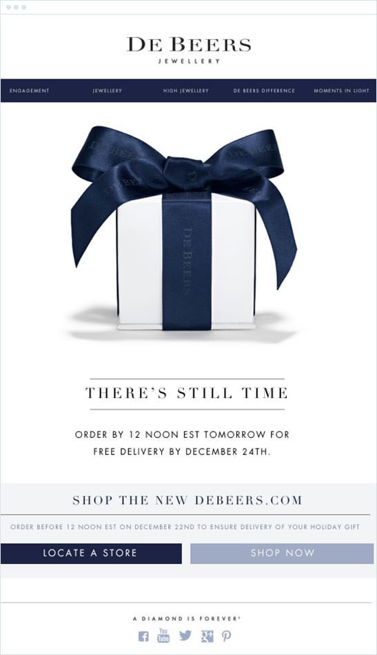
Simple designs are also effective when you want to get straight to the point.
One of the most common uses of email marketing is advertising a sale or special offer to your customers, and Tarte Cosmetics really show us how it's done in this bold and bright email design. The use of the phrase "secret sale" adds to the exclusivity of the event and makes customers more excited.
Our favorite part: The simple envelope animation accentuates the main point of the email (i.e. the sale) and we love the fun and feminine use of color and imagery in making the design more effective towards the brand's target market.
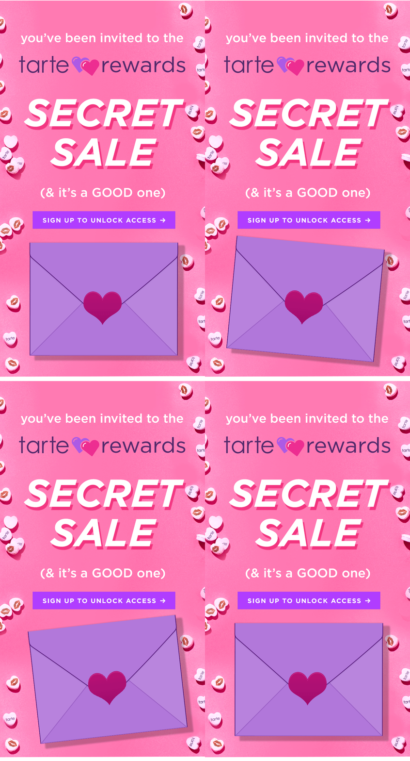
When it comes to sales: go big or go home. The trick is to get as many readers on your site as possible.
An email marketing must-have... there's no reason you can't make this type of email fun like ASOS have done! As we mentioned in an earlier post on this topic, it's important to tempt your customer back to your site by promoting offers, benefits, and the abandoned product itself, and this design ticks all of the boxes!
Our favorite part: We love the use of personification in this email, which literally allows the product to speak to the customer. There is also a clear and central image of the abandoned product which reminds the customer why they were tempted in the first place.
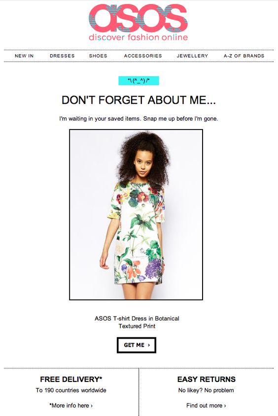
This abandoned cart email ticks all the boxes and shows the customer exactly what they're missing out on.
We've seen simple and minimalistic designs, but how about the designs which really push the boat out, like this one from Kate Spade? This super original idea of including paper cut outs is unique, eye-catching and also just really fun! Abstract designs such as this really set your emails aside from other competitors and could be the deciding factor when a customer is deciding whether or not to visit your site.
Our favorite part: This paper-cutout style is great for the occasion, as it is symbolic of handmade gifts often made by children on Father's Day. We also find it super cool that no actual photos were included in the email design. The brand's confidence in their products shines through and encourages customers to click the CTA and see what's on offer.
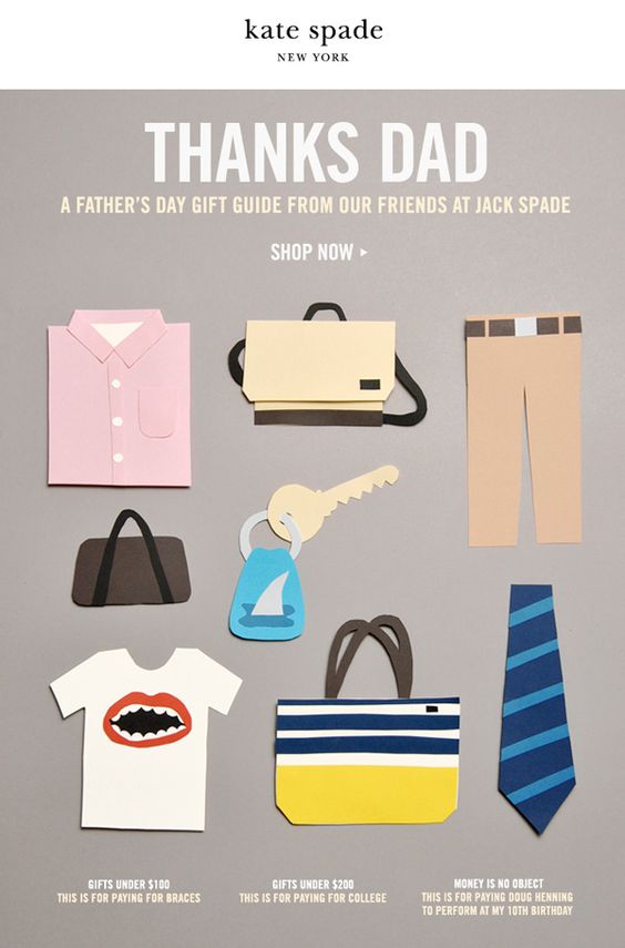
Abstract email designs can be a colorful and creative way to generate some interest around your business.
Last but not least, the re-engagement email. New Look have created a very simple and straight to the point email design here which clearly outlines the benefits of being subscribed to their mailing list.
Our favorite part: New Look confidently offer their readers the option to stay subscribed, or to stop receiving emails. This is a very transparent approach and also means that their email list will be mainly made up of people who want to receive emails.
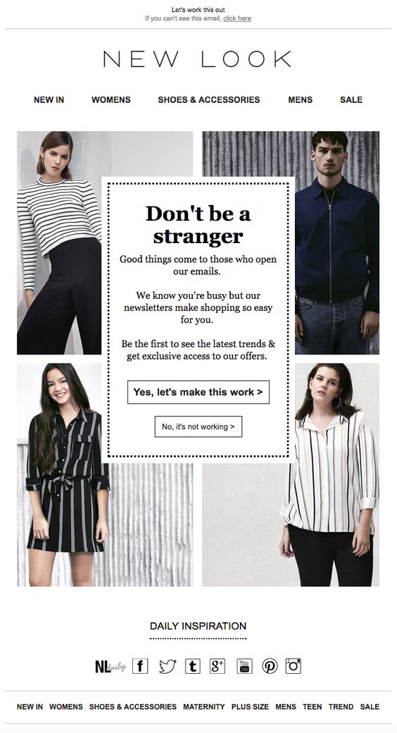
Make your reengagement emails clear and concise so that your readers can make the decision to stay subscribed without any distractions.
We hope you're feeling inspired to create and follow in the footsteps of these awesome email designs! As shown, a design can be as simple, or as abstract as you want it to be. Make your designs unique, true to your brand, and relevant to your customers, and you'll be on to a winner! For more design inspiration, you can check out our Pinterest page, which we regularly update with real life creative and effective email designs.
Until next time,
Your Mail Designer 365 Team