With the rise of Facebook, Twitter, and Instagram, there's no doubt that the power of social media is increasing every day. Linked with your existing email strategy, a vibrant social media presence provides the finishing touch to a modern and engaging online marketing campaign.

Use Email to Grow Your Subscriber List
Linking to your social media sites
Your email newsletters offer you the perfect chance to inform customers about your social media sites. For many people, following a business on social media is a more convenient and straightforward way to receive regular updates in easy-to-process posts.
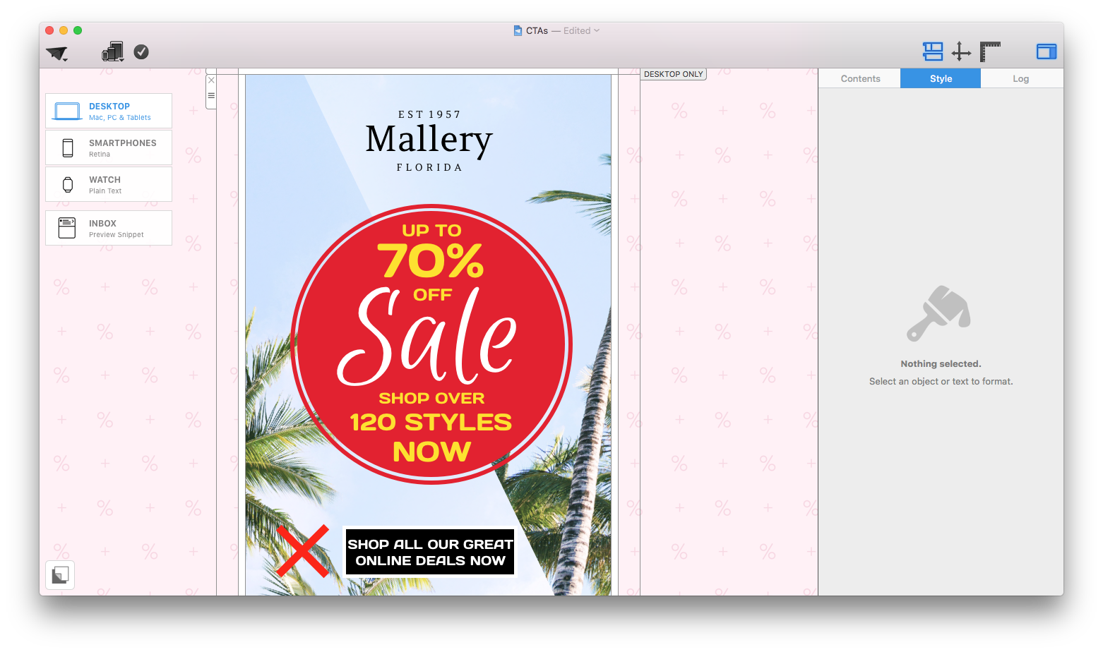
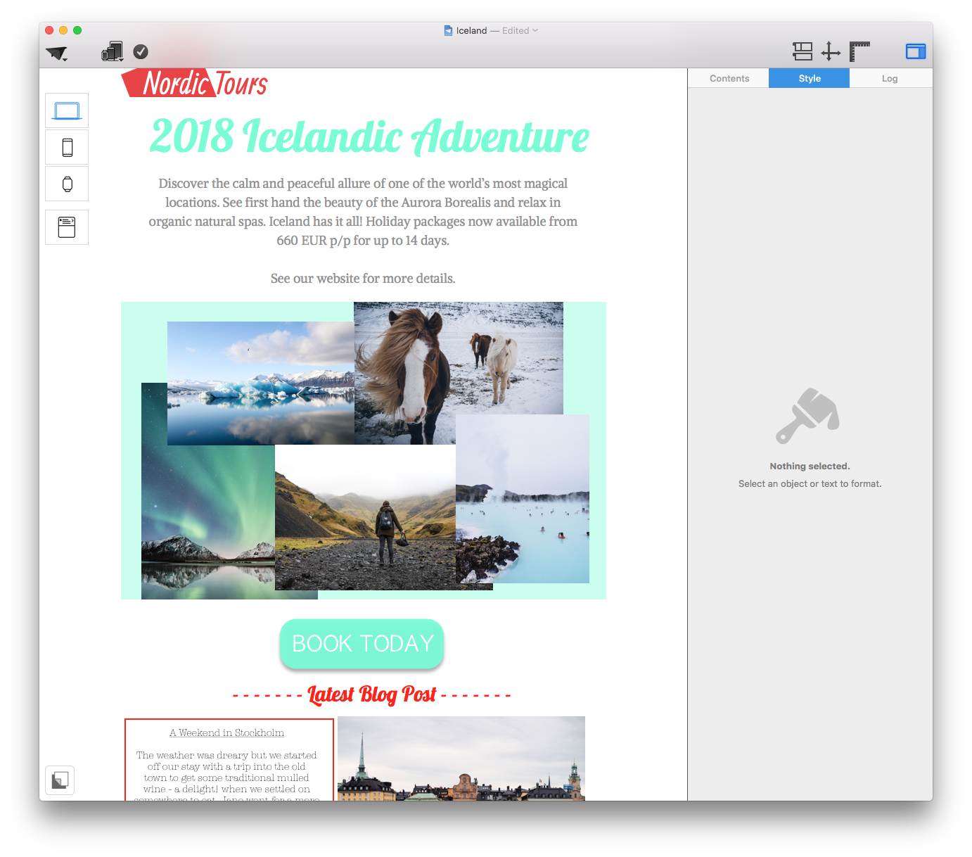
Mail Designer 365's instant layout blocks feature allows you to quickly insert pre-made social media buttons into any design, then adapt it for your own business, and save to reuse in your future designs. Here's how!
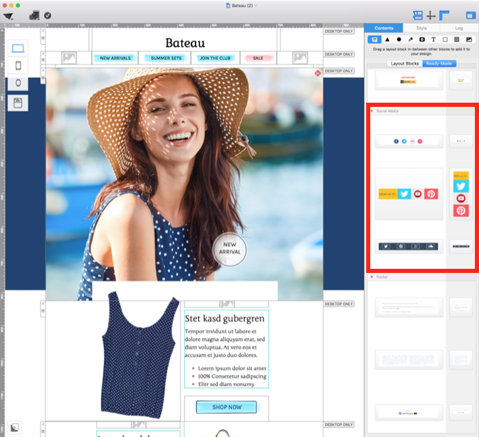
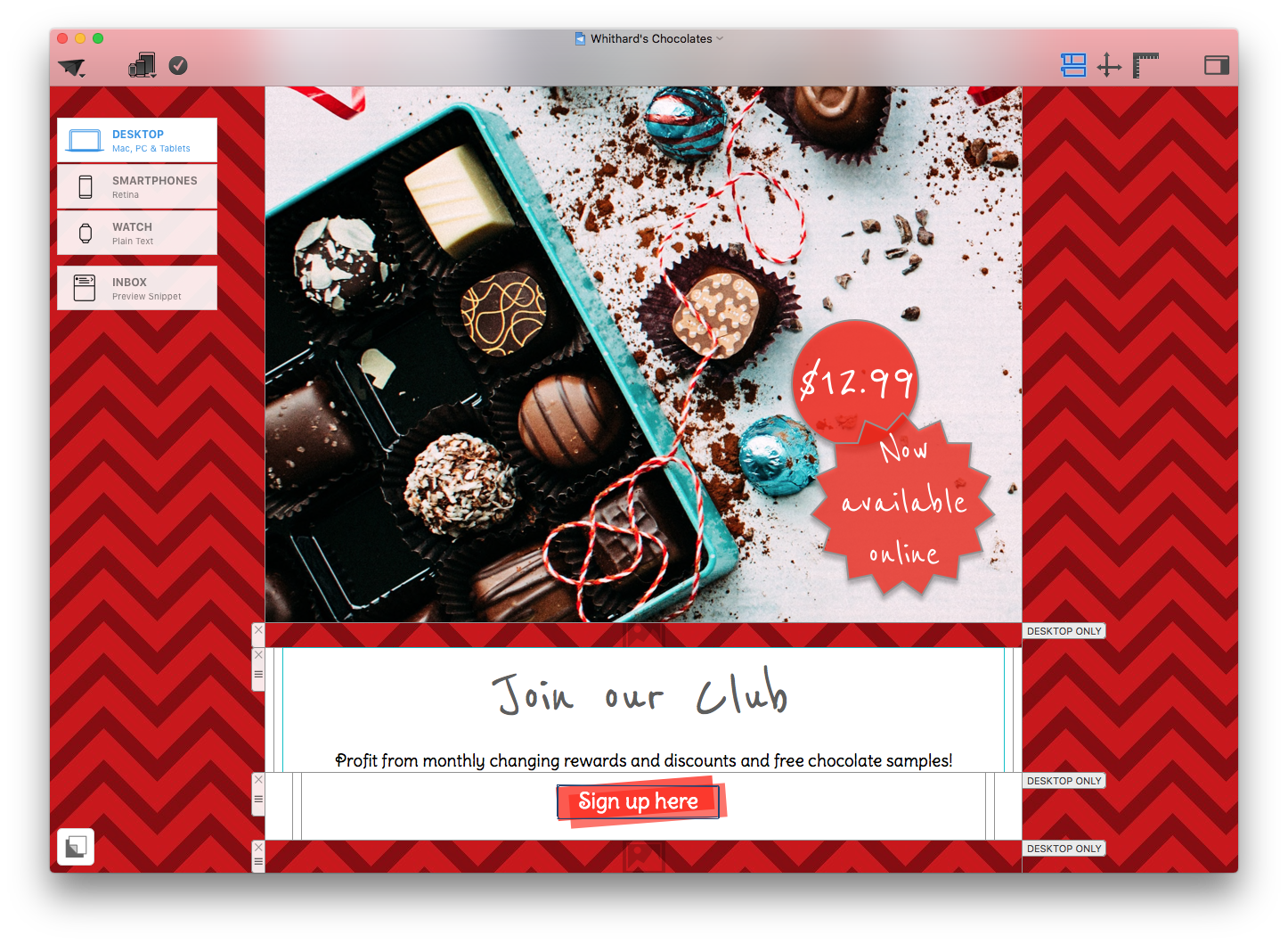
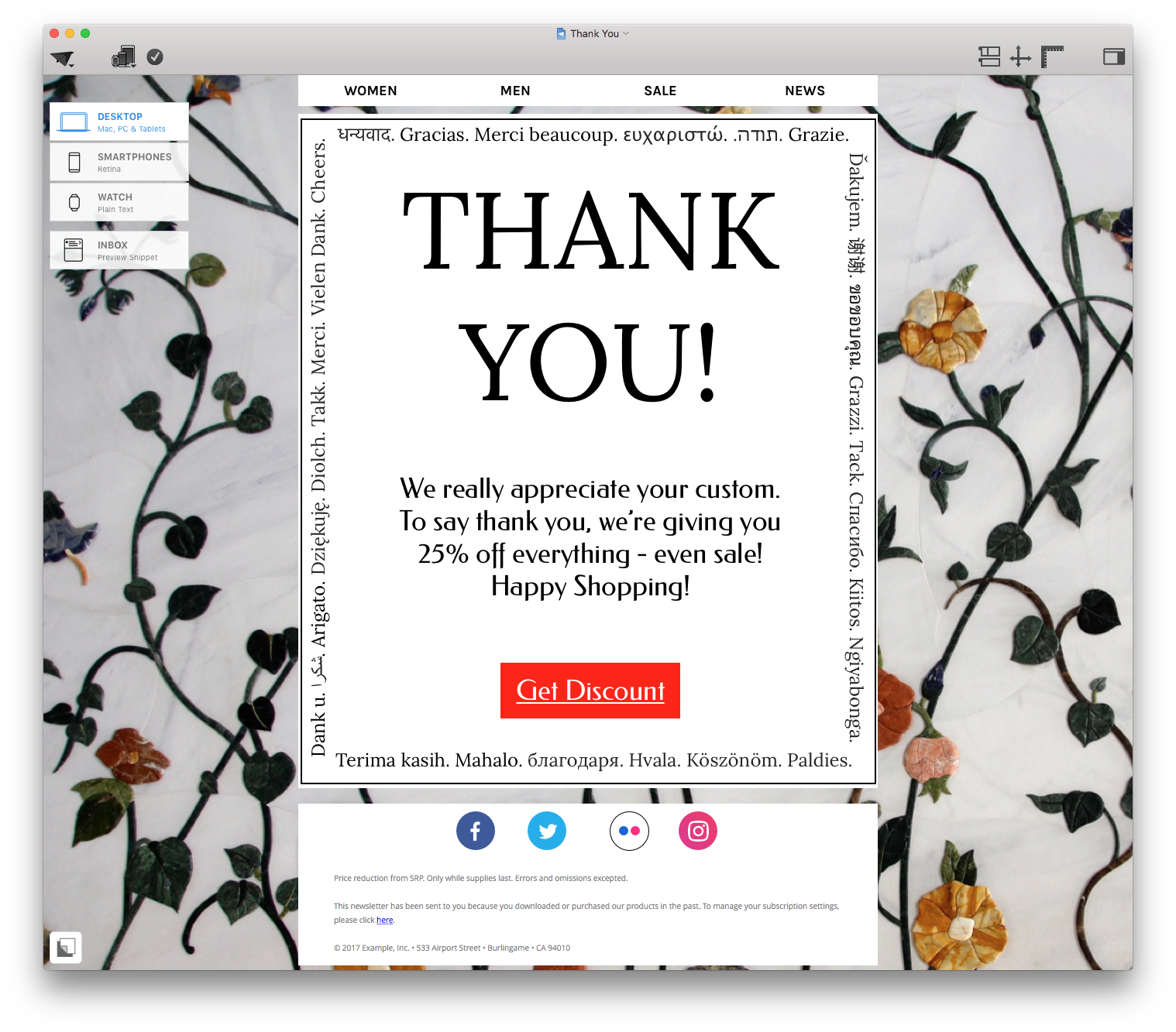
Use our ready-made social media footers to conveniently link your social media platforms in your emails.
Create giveaways and competitions
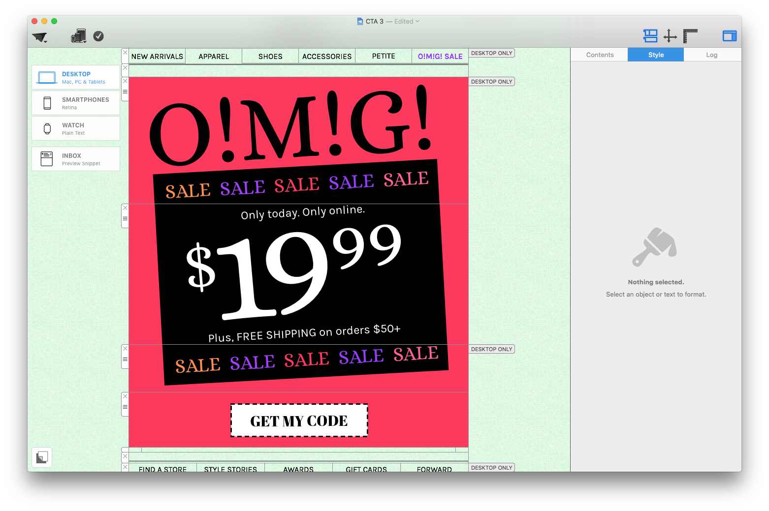
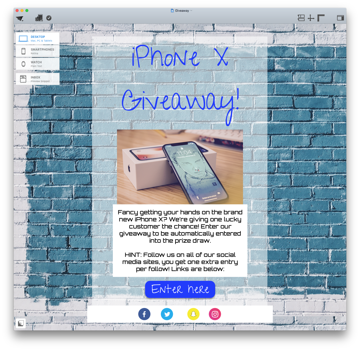
People love free things, and most of us are willing to get involved if it means winning a great prize. Make the most of this opportunity by creating a giveaway competition for one or more of your products.
How to get started
Set up the requirements needed to enter the competition (e.g follow us on Twitter, Like us on Facebook, share our last video, subscribe to our mailing list, etc) and then pick your winner at random. You'll be blown away by the number of interactions and new followers!
To be extra effective, try sending your subscribers a quick email advertising your giveaway and showing them how to enter. Once they realize they're in with a chance to win one of your great products, they'll be engaging with your social media sites in no time!
Include snippets of social media content
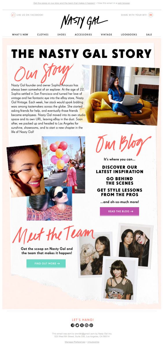
Who says you can't mix marketing platforms? Try integrating your latest tweets into your email design or linking to your new Pinterest board. Once your subscribers get an idea of what kind of content you post online, the chances are that they'll be inspired to follow you to see more!
In this Mail Designer 365 email newsletter, we included a link to our latest Pinterest board and noticed an increase in followers - Try it out!
Include snippets of your recent social media content in your emails to give readers a taste of what they can expect.
Use Your Social Media Pages to Help Your Email List
Similarly, you can also use your social media accounts to inform your followers there about your email newsletter. Try subtly advertising the benefits of being part of your mailing list (e.g. money off offers or promotions) and don't forget to include a sign up links for those who do want to get on board!
Distinguishing Between Different Social Media Platforms
As mentioned before, there is a multitude of social media sites available to use and promote your business through and none of them are a one-size-fits all kind of model. This whistle stop tour will take you through the basics of some of the most popular options and what you should consider for each one:
Facebook has great potential for you to set up a page for your business and truly connect with customers. You can post news stories, information about new products, and respond to customer feedback. Your customers can also leave you ratings reviews, which is a great opportunity to engage with them and work on ways to improve your business.
UK supermarket Tesco uses Facebook to post news, recipe ideas, and more. They also regularly respond to customer complaints and feedback!
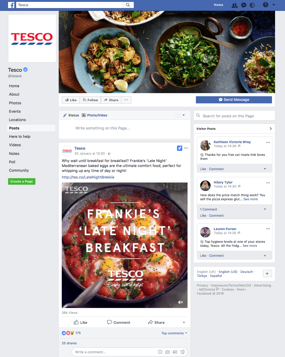
Facebook is a great platform for engaging with customers and responding to their comments and queries.
Twitter is an ideal medium for short and sweet news announcements or opinion polls. With its character limit, Twitter is great for those who quickly want to share information with their followers. Get on board with hashtags to see what's trending where you and your customers are.
UK bank Halifax do a great job of using their Twitter for flash announcements and replying to quick customer questions.
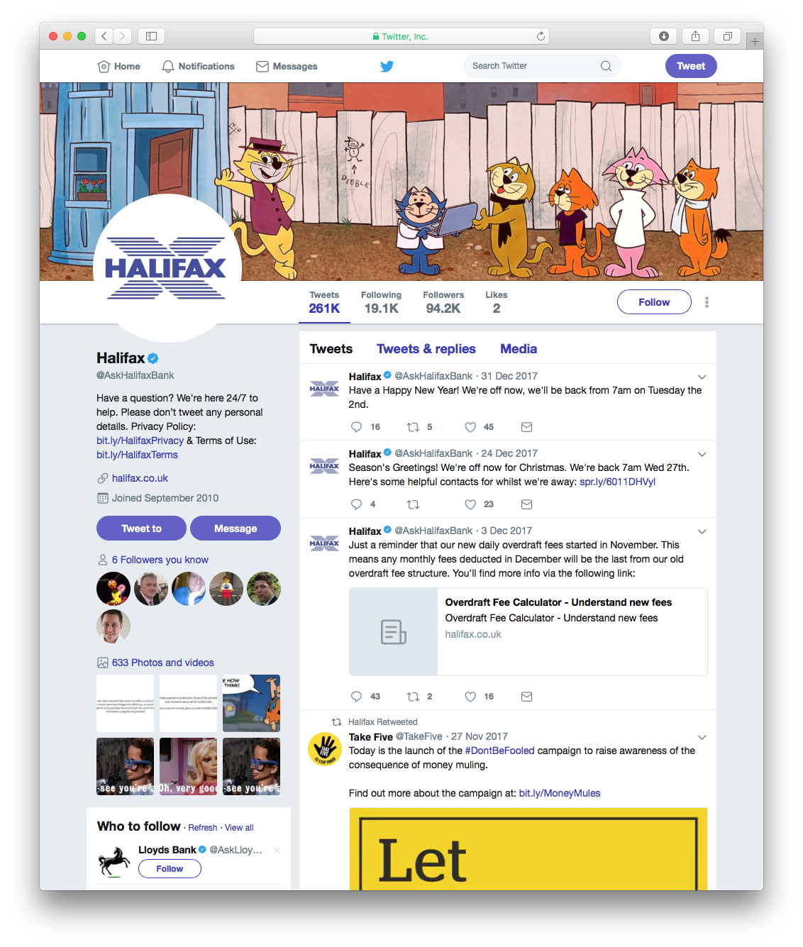
Twitter is a great platform to publish short and snappy news announcements and engage with trending topics.
Instagram is a great visual platform for the more creative among you. Use your Instagram page to show off new products and examples of your work. You can also insert buy now links to transport followers straight to your website where they can purchase your awesome products!
The team at Michael Kors uses their Instagram account to showcase their latest designs and new items in store in a glossy editorial style.
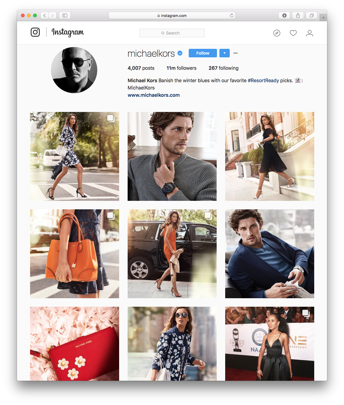
Use Instagram as a way to visually connect with your customers and show off your latest products.
A place for sharing ideas: Pinterest is perfect for those of you wanting to inspire your subscribers and help them. This is a great platform for many businesses, as you can share your own products as a source of inspiration for those looking for a particular idea.
The Food Network use their Pinterest account to share original recipes with their followers.
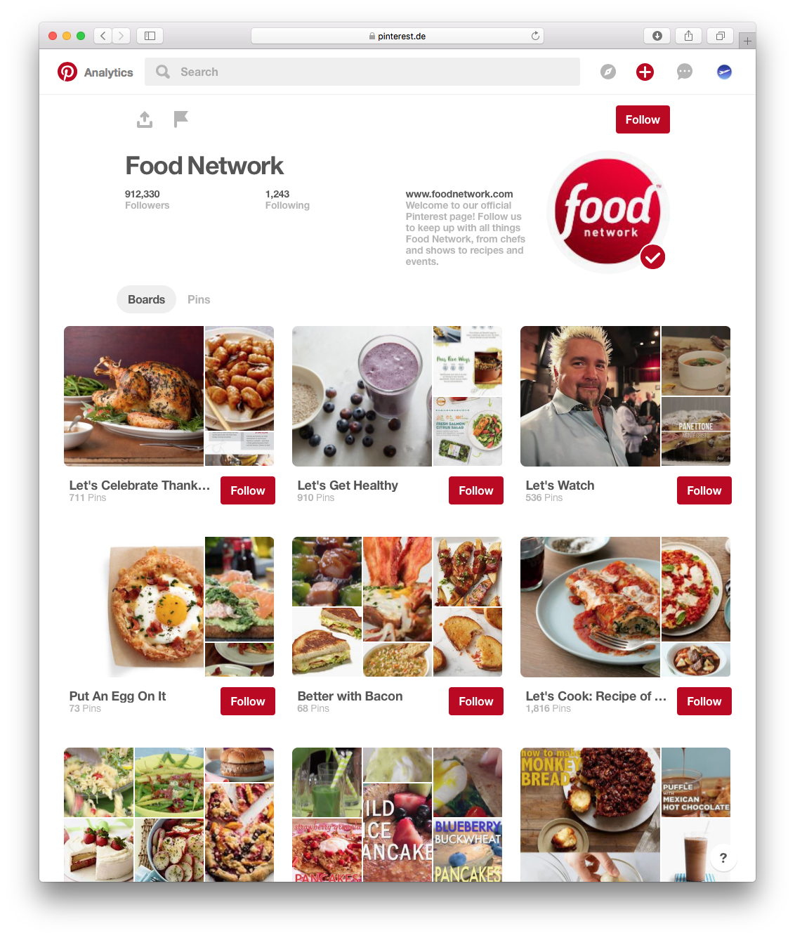
Use Pinterest to share tips, hints and ideas with your customers and inspire them to try out your business.
We hope you have found these quick tips for social media marketing useful! Integrated alongside a well-thought-out email strategy, social media is a great marketing tool to have in your arsenal.
Key Takeaways
- Make the most of social media as a constantly growing method of communication between you and your customers.
- Make your email subscribers aware of your social media content by adding in links to your social media pages to your emails
- Create giveaways and competitions as an incentive to subscribe
- Consider carefully which social media platforms you think fit best to your business and what you will use them for.
Until next time!
Your Mail Designer 365 Team
Give Mail Designer 365 a try today for free...