
To us email geeks, it seems like common knowledge that an all-image email is just not the way to go when it comes to email design best practice... So why is it that so many businesses (big and small alike) are still making this mistake as well as a variety of other "rookie" design errors?
To find out how big the problem really is, we've scoured the web for some of the most *facepalm* worthy email design fails and what you can do to actively avoid them!
Mobile respon-what?
In this day and age you'd think it would be obvious that anything digital/HTML based (we're talking websites, emails, etc.) should be optimized for viewing on smartphones. Mobile responsive design is massively important, as studies show that 81% of consumers check their emails most often on their smartphones. If this really is the case, why are businesses still forgetting to make their designs mobile-friendly?
I hope you've got your magnifying glasses at the ready, because here are a few painful examples of brands who did not get the mobile memo...
If you're wondering how to avoid this mishap without using any complex coding methods, Mail Designer 365 automatically creates a mobile optimized version of every email design. Switch to the mobile view and you can create content especially for people viewing your email on a smartphone. Clever right? Things like shorter text segments, single-column layouts, and mobile-friendly fonts are all great for your responsive design.
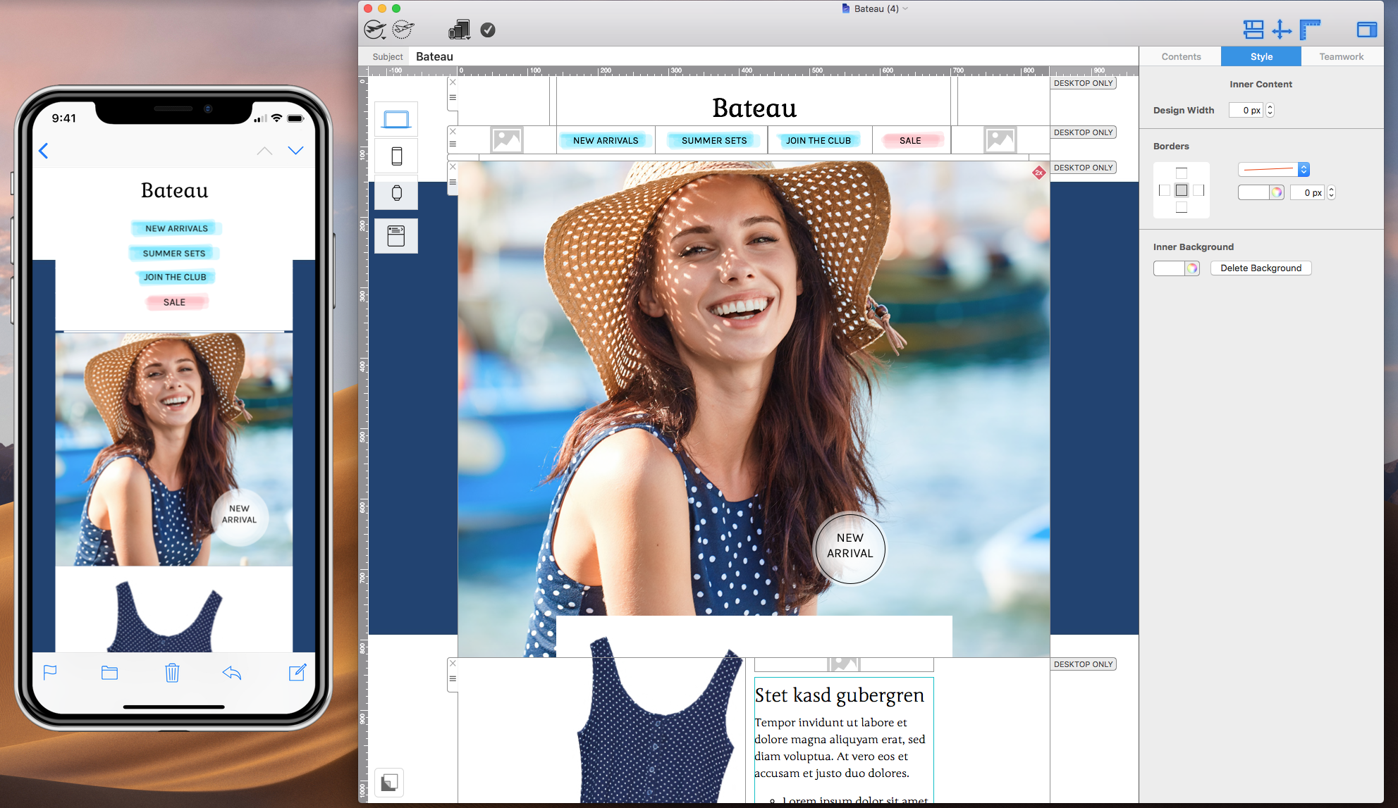
Mobile view preview
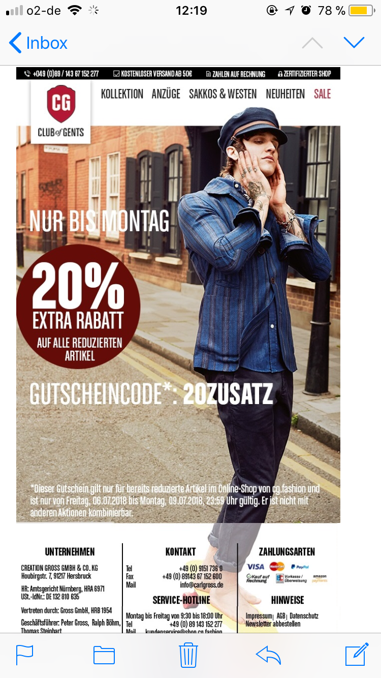
A picture DOES NOT speak one thousand words...
...If your customer's email client doesn't automatically display images! We know it's tempting to create email designs that are all image based. They look cool and you can probably enjoy more design freedom, but it's not good practice. Here's a few reasons why you should avoid image based emails where possible:
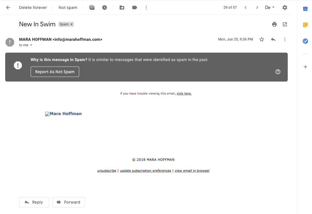
They're way more likely to end up in the spam folder
Spam filters are getting stricter and most spam filters are programmed to watch out for all image emails; probably because it's not good practice and not something to expect from a pro designer! Once your emails start landing in the spam folder, your deliverability rates are going to start going downhill, and the content you spent so long working on will be missed. Is it worth it? Definitely not!
This email design from Mara Hoffman sure looks cool, but it would have been 10x more effective if it didn't land in my spam folder.
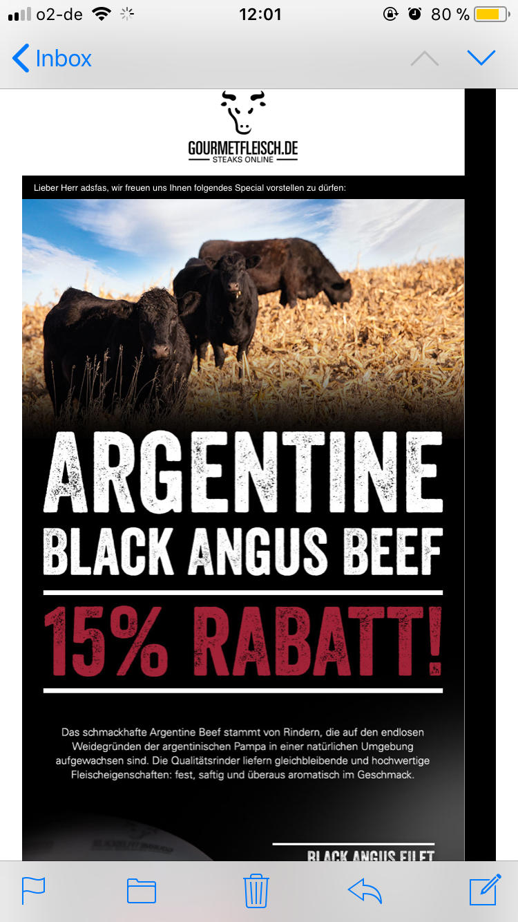
They load much slower
It's fairly clear that an image (especially a high resolution image) will load slower than text. This is why we always advise a healthy balance of both image and text in email newsletters. The images keep things interesting, whereas the text ensures readers still have some content to consume if the images take too long to load - especially important when using a slow public WiFi or mobile data.
Obviously an all-image email won't provide this balance, and if it doesn't load, you're left with something like this...
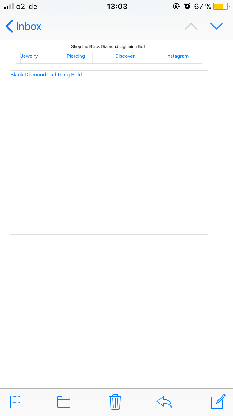
...Not really a great selling point for your product.
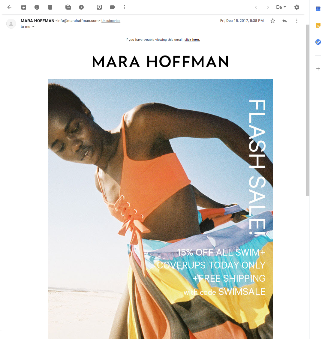
If you want to create a similar effect to the previous design from Mara Hoffman, try using a photo background. This way you can still incorporate real text in your email, as well as creative, colorful design.
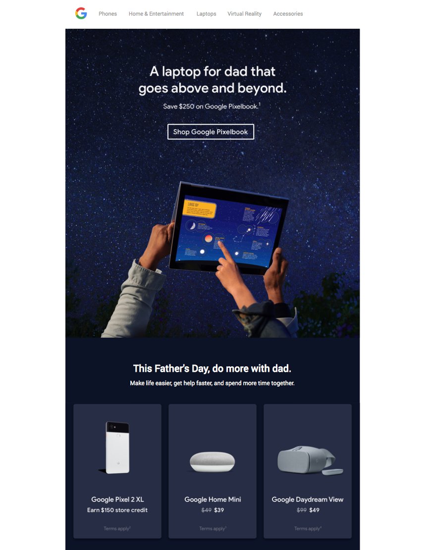
If you think this is bad, even big name brands are guilty of it too! Yes we're looking at you Google.. This all-image email design is definitely not on point.
HTML horror stories
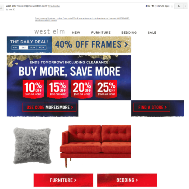
Many common email mistakes often arise from bad HTML or coding gone wrong. HTML can be tricky to work with. Even if you make one tiny mistake, it can have massive consequences on your email design. To save time and money, there are quite a few businesses who attempt to use DIY coding methods which don't always go to plan. This paired with a lack of proper testing can lead to email blunders such as this one from West Elm... This is exactly why a WYSIWYG editor is always a good idea guys!
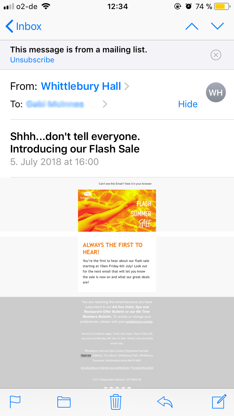
Segmentation Gone Wrong...
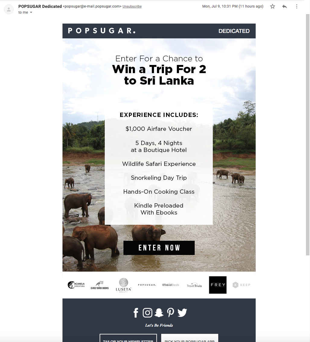
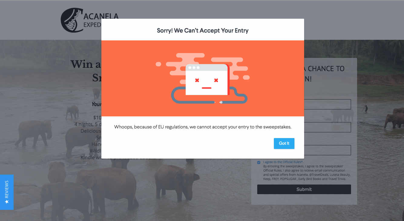
Segmentation can also be a huge problem when it comes to email marketing. Just one wrong click and your email could be sent to a completely different target group than what you expected. Take this example from PopSugar: "Win a trip for 2 to Sri Lanka" - sounds pretty exciting, right?! Too bad you can't enter because of your location... Oops!
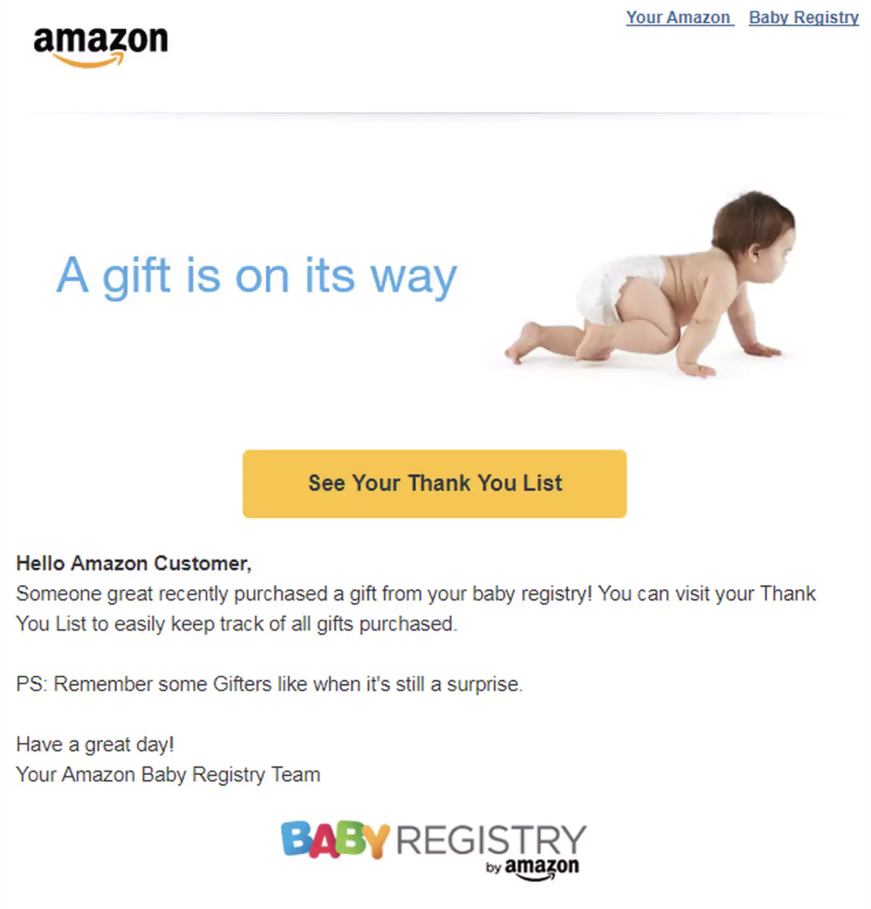
Another shudder-inducing example was the infamous baby registry email from Amazon a few years back. A harmless transactional-style email designed to inform parents-to-be of a new gift went terribly wrong and turned into a PR nightmare for the global brand. Instead of sending the email to expecting couples, it went to people not expecting a baby at all! Awkward for Amazon and another reason to pay close attention when hitting that send button.
Catastrophic Call-To-Actions
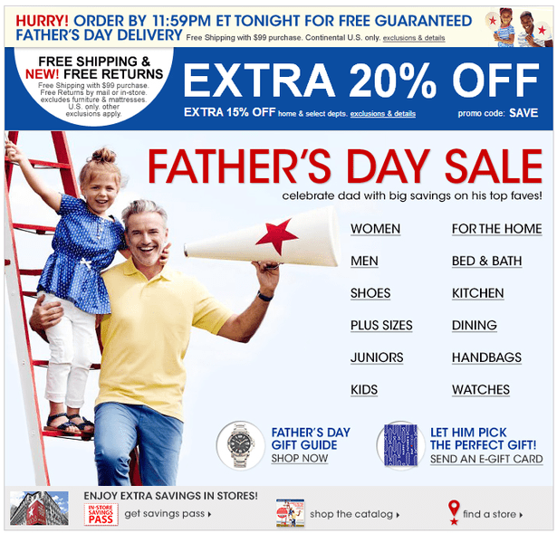
Any email marketer will tell you that the call-to-action (CTA) is the heart of your newsletter. If you get this wrong, then your email isn't likely to succeed. Despite having this drilled into them since day one, many designers still manage to get it wrong. Generally speaking, your CTA should be prominent and easy to find. In this design from Macy's, there are so many different CTAs that the customer doesn't know where to look (or click.) If it were me opening this email, I wouldn't be inclined to click through to their website. Too much choice is never a good thing when it comes to email marketing...
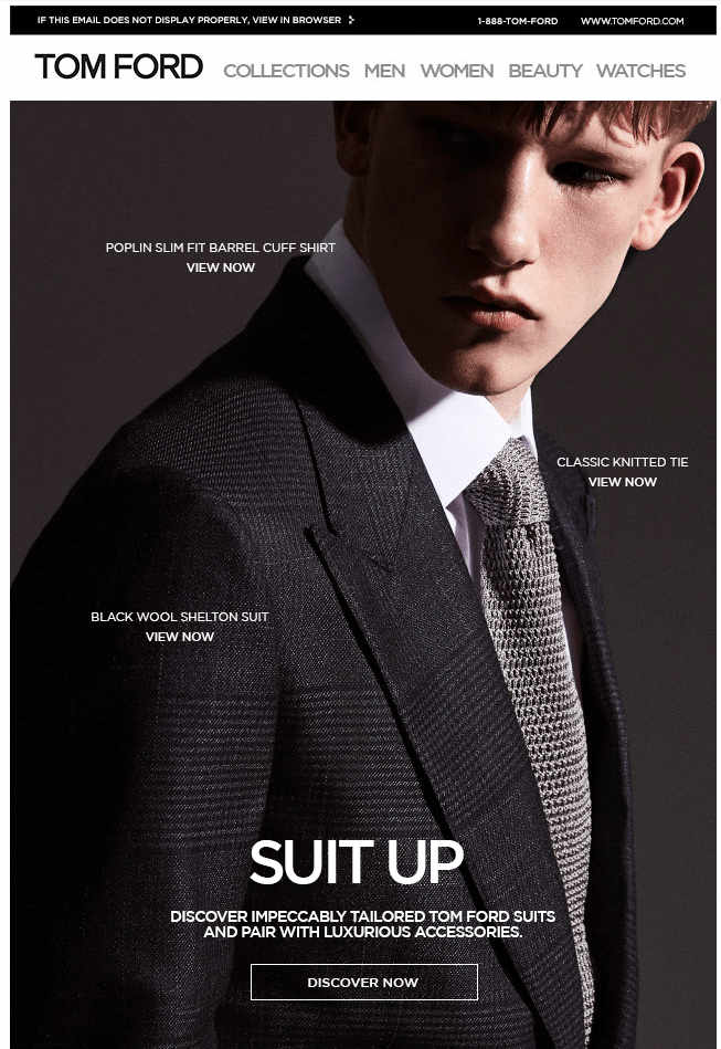
On the other hand, with this email from Tom Ford, it seems the designer was trying a little too hard to be minimalistic. So much, that the reader can barely find the CTA.. Your customers definitely won't click on your links if they can't even see them in the first place!
Hopefully you've found these epic newsletter fails somewhat amusing if not helpful! If you come across any more cringe-worthy email fails you want to share with us, drop us a tweet or send us an email!
Until next time!
Your Mail Designer 365 Team
Get started with Mail Designer 365 today
Enjoyed this post?
Get more inspirational tips, tricks, and best practice examples in the Mail Designer 365 Newsletter Academy -
your one stop hub for all things email marketing strategy and newsletter design.