It's every email marketer's worst nightmare: You've just sent your newsletter out to your mailing list and suddenly noticed an error in your design. It's too late to correct it now, but it's a good idea to come up with a way to prevent mistakes like this in future emails. With a little help from Mail Designer 365, you'll soon be well on your way to creating failsafe email designs...

Typo fails
There's not much that can top a typo in terms of embarrassing email mistakes! You can easily avoid typos in Mail Designer 365 by using the integrated spelling and grammar checker. To check your design for mistakes, head to "Edit" > "Spelling and Grammar" > "Check Document Now."
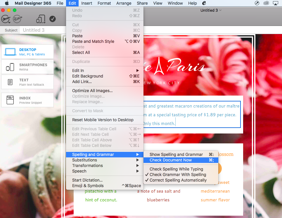
Avoid any spelling mistakes by using the built in spellchecker in Mail Designer 365
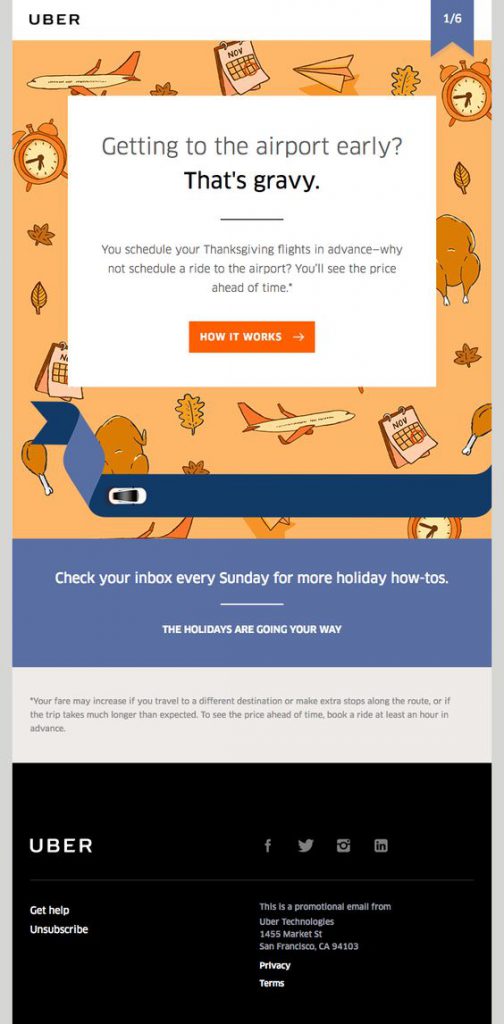
Picture perfect emails
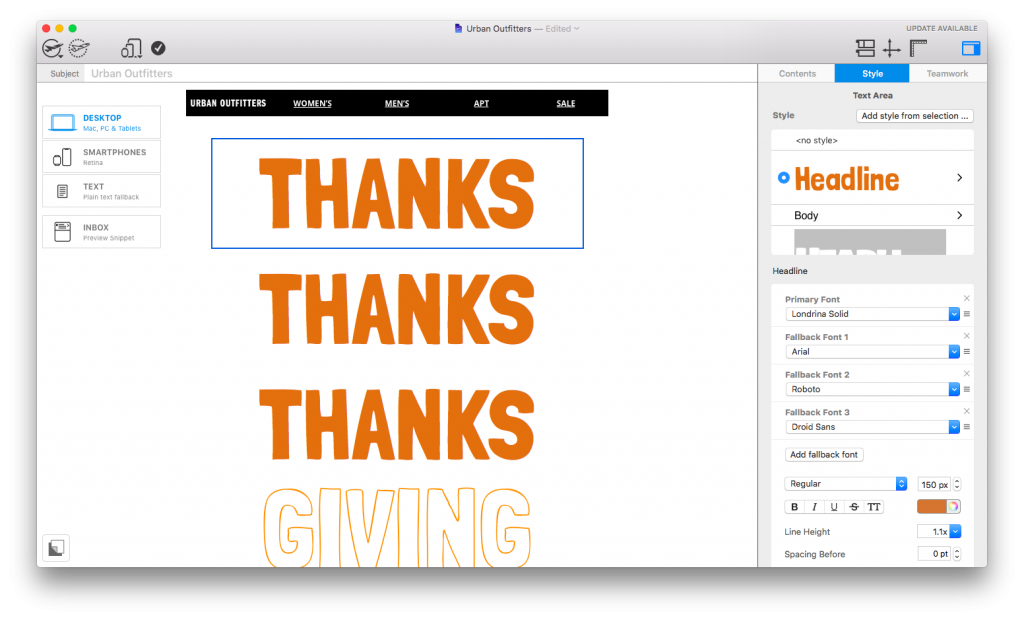
Your images are the central part of your email design and probably what your readers will notice first. For this reason you want them to appear sharp and clear to reflect positively on you and your business. Several problems can occur when using image in emails:
Blurred images
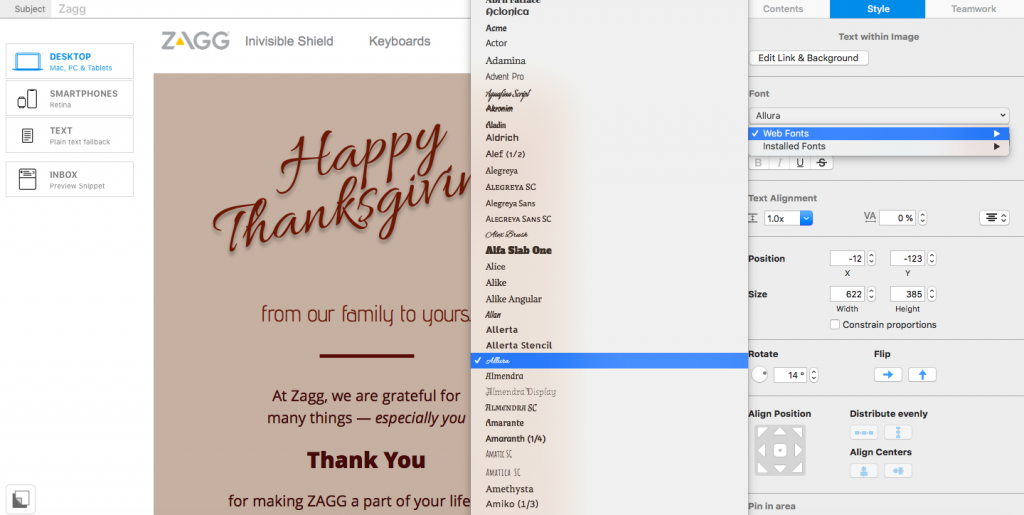
If your recipients are viewing your newsletter on a Retina Display (e.g. iPhone, Mac or iPad), it is possible that images which are not high-quality will appear blurred and out of focus.
To combat this issue, Mail Designer 365 generates an automatic warning when an image is at risk of appearing blurred or low resolution after being sent:
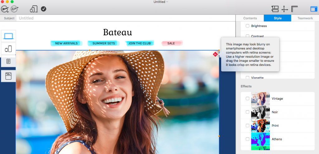
Mail Designer 365 generates a warning for images at risk of appearing blurred
Slow loading images
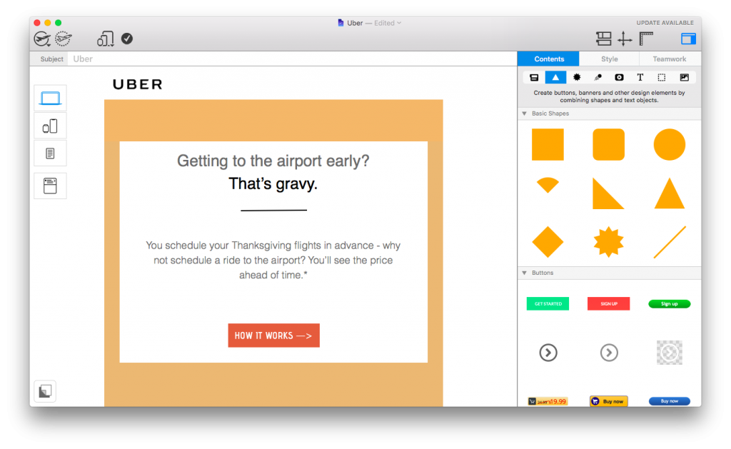
Another common problem is the use of images which are too large. Larger images are more at risk of loading slowly (or in some cases not at all!)
In Mail Designer 365, you can use the Image Optimization tool to apply the optimal settings to your images and reduce the risk of issues after sending. Simply click on your image, click on "Edit link and background" in the Style menu and select "Optimize image." Mail Designer 365 will automatically pick out the optimal settings for your image:
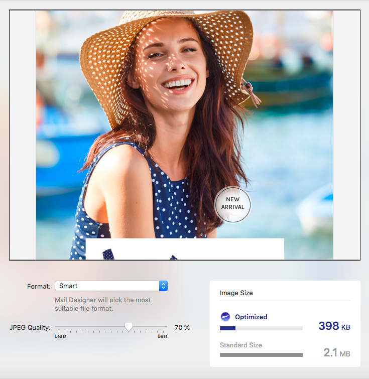
Mail Designer 365 applies the optimal settings to your images
Broken links
A broken link can cause countless problems for you and your email campaign. Luckily, checking broken links is included in Mail Designer 365's list of pre-flight checks. If you somehow manage to include an incorrect link in your email design, Mail Designer 365 will automatically detect this and inform you via the pre-flight check in the top menu:
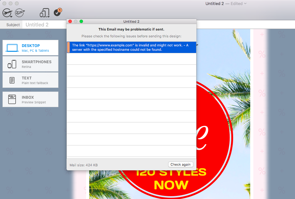
Mail Designer 365 automatically detects incorrect links for you
Mobile magic
A large amount of the email mistakes we see today are based on designs which haven't been correctly optimized for mobile devices. Here's how Mail Designer 365 can help you combat these errors:
Smartphone editor
A mobile responsive version of your email design is automatically created and can be edited separately from the desktop version in the Smartphone view.
Mobile previews
Your mobile optimized design can be previewed on the latest mobile devices, including the iPhone XS, iPhone XR, and Apple Watch Series 4 using our smartphone preview tool:
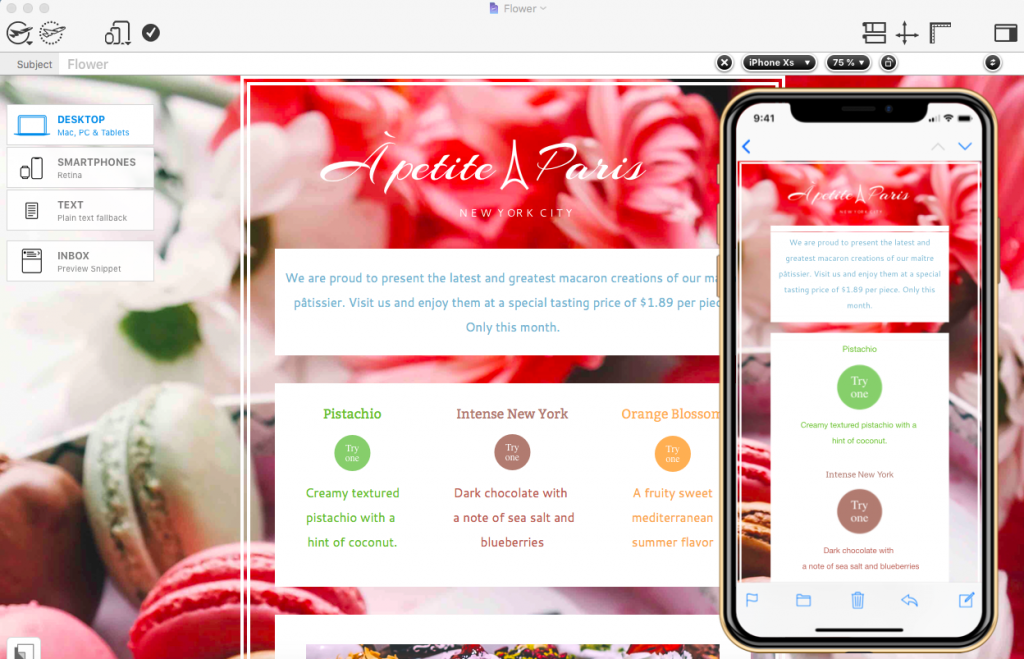
Mail Designer 365 automatically creates a mobile optimized version of your design
Inbox optimization tools
In order to check if your subject line fails or thrives, you can use the inbox optimization tools in Mail Designer 365.
Subject line editor:
You can come up with a clever subject line which you can view alongside your design at the top of the design window. In the inbox snippet section, you can preview how this will look in your readers' inbox.
Inbox snippet preview:
Many email marketers underestimate the power of an effective inbox snippet text. In the inbox snippet section in Mail Designer 365, you can come up with a creative text to display to readers in their inbox and entice them to open your email.
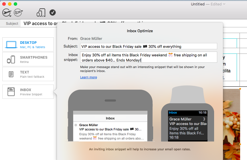
Use the inbox optimization tools to ensure your subject line and snippet are effective for readers
Testmail service
With the help of all these fail detection methods, you should be feeling pretty confident in your email designs. However, for ultimate peace of mind, we recommend sending a test version of your newsletter to yourself and your team.
This is made easier than ever with the Mail Designer 365 Testmail service. Simply click on the dotted aeroplane icon to open the Testmail service where you can enter the email addresses of your team:
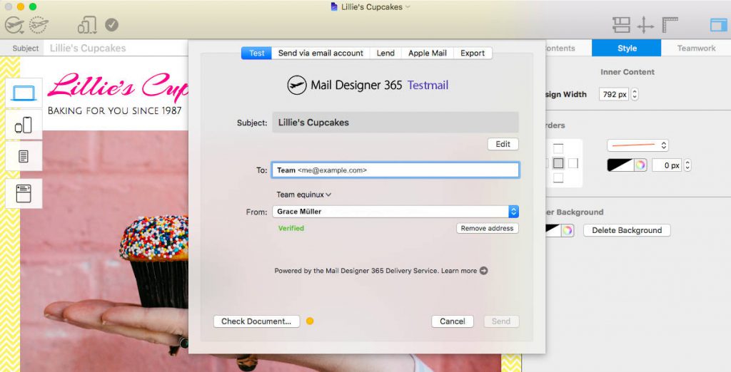
Use the Testmail service in Mail Designer 365 to send a test version of your design to your team
We hope you feel safer in the knowledge that Mail Designer 365 has your back when it comes to email errors! By taking advantage of our tried and tested fail detection methods, you can enjoy smooth sailing with your email designs from now on!
Until next time!
Your Mail Designer 365 Team
Give Mail Designer 365 a try today for free...