
Pricing tables are a must have for any business looking to help customers understand the key differences between product offerings. Whatever you're selling, it's crucial your customers understand the main selling points of that product or service.
Here are some of our top tips on how you can put together informative pricing tables which make the shopping process easier and, in turn, will help boost your sales.
Get expert email best practice tips delivered directly to your inbox!
Please check and try again.
We've just sent you an email for you to confirm your email address, if you haven't already.
Top Tips for Optimizing Your Pricing Tables
Use a clear font
A clear to read font is a must have for any pricing table.
Your customers need to be able to read and understand the information presented in your table. This means you should choose a font size which isn't too small and also aim to avoid any cursive, italic, or calligraphy style typefaces. We recommend using a sans serif font, as these are the clearest to read and also add a modern touch to your design.
Mail Designer 365 offers a wide range of sans serif fonts which you can easily apply to the text in your pricing table. Some of our favorites include: Open Sans, Encode Sans, and Martel Sans - all available under Web Fonts.
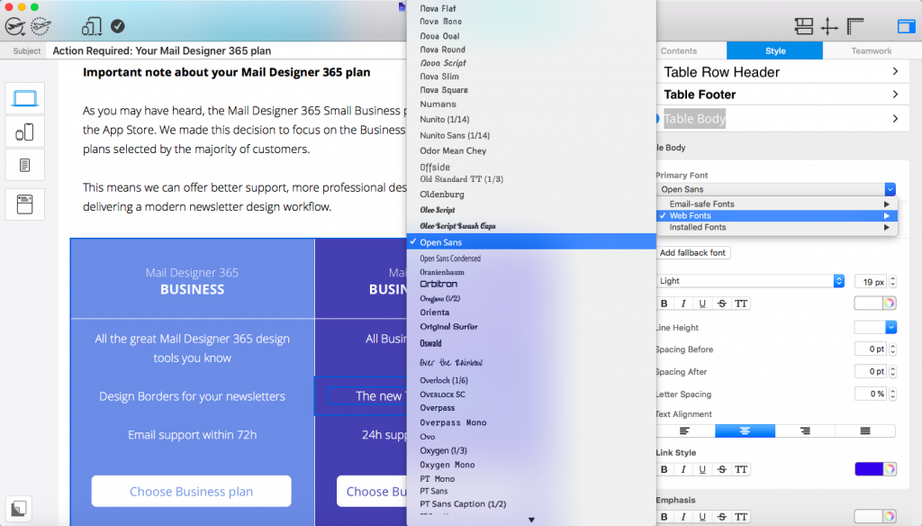
Find modern and stylish sans serif fonts for your pricing table in the Web Fonts section in Mail Designer 365.
Include product photos
Including a photo of your different product offerings is a great way to help customers visually distinguish them from each other. As the saying goes, a picture speaks 1000 words, and will make your tables much more interesting and informative. Having a picture is also more likely to entice customers to take more of an interest in the product.
Amazon often include useful product tables where shoppers can compare items based on their specifications and other criteria. These tables include images of the products to help shoppers visualise the product better:
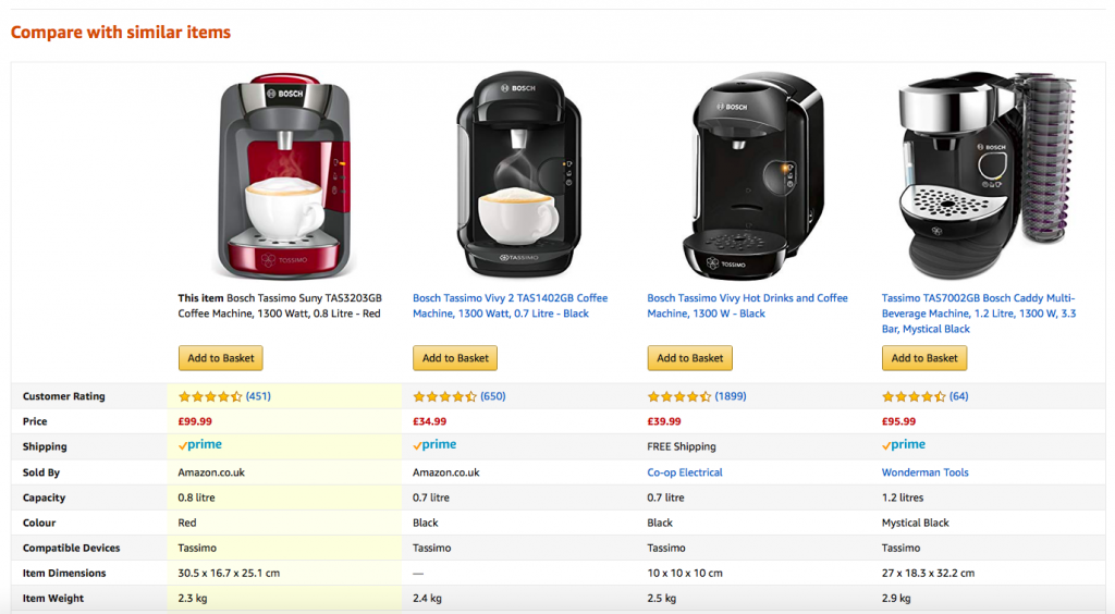
Amazon's comparison tables incorporate product photos to make them more informative for customers.
Top tip: In Mail Designer 365 you can created mixed text and image tables. This means it's easy to incorporate images of your best product offerings into your pricing table. Simply click on a cell to change its content type in the style menu.
Use color coding
Color coding is another visually effective way to make your various product or service offerings easier to compare. For example, if you are a service based business offering different tiers, you may find it useful to color code each tier based on the pricing. This makes it easier for your customers to remember the differences.
This price comparison table from Airtable subtly includes color coding to add value to their different plans. The two higher priced plans are labelled gold and black which clearly demonstrates that they are the more premium option:
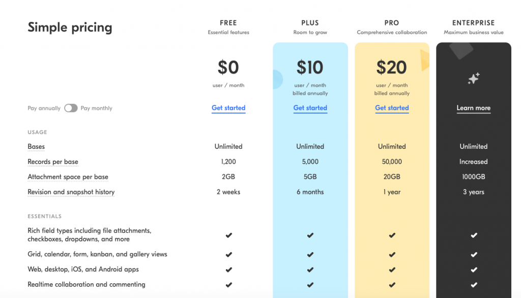
Try and label your plans according to their value. Gold and black stand out here.
Top tip: In Mail Designer 365 you can apply colors to your table by clicking on any cell, column or row, and adjusting the colors in the style menu.
Keep detail to a minimum
It's important for you to not include too much content in your tables. Overloading customers with unnecessary information can make the decision process more difficult.
Aim to only include the key information your customers need and link out to more detailed information if required.
You should also try and narrow down your comparison criteria to price and key features or characteristics. Generally, a bullet pointed list is more effective than paragraphs.
In this example from Spotify, they have narrowed down their criteria to the most important information which will be of interest to customers:
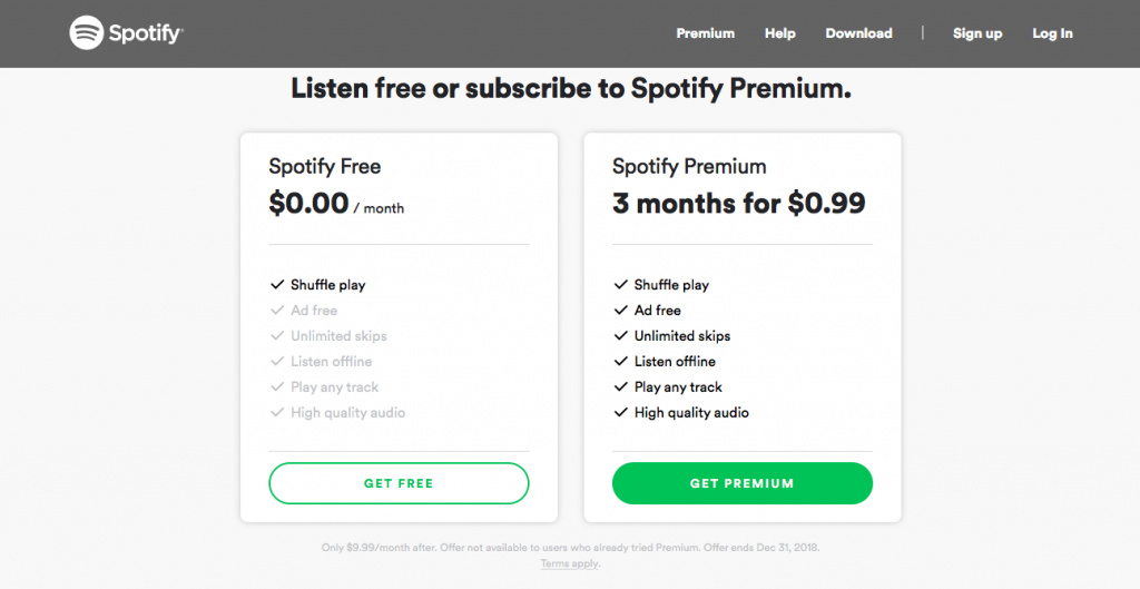
Bullet point the most essential information in your table.
Highlight the best option
If you have a plan or product option which you think your customers should be purchasing, let them know! You can use an eye-catcher to inform customers of which option you think they should go for. Phrases such as "most popular" or "best value" are particularly convincing.
Thanks to a clear eye-catcher, this pricing table from Litmus clearly demonstrates which plan is the best value for money. Not only is this helpful for their customers, it also encourages more people to buy the plan or product you want to sell more of.
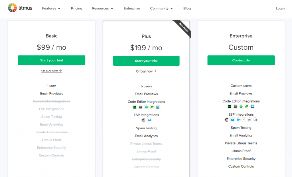
Highlight the best deal in your table to help your customers decide.
Don't forget the CTA
You've filled out the table with text and product photos, now it's time to integrate an effective call-to-action (CTA) button to show customers exactly how they can purchase your product. This is one of the most important parts of your table's design, as it helps to finalise the sales process.
Make sure your CTA button is visible by choosing a color which stands out from the rest of your design.
In their comparison table, Slack use a vibrant green for their upgrade CTA, which clearly shows customers how to go about purchasing one of their plan offers:
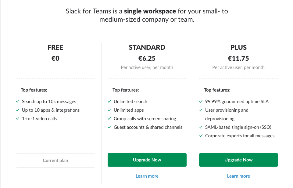
Make your CTAs vibrant so that they stand out to your customers.
Top tip: In Mail Designer 365, you can take advantage of pre-made CTA buttons, or use our range of shapes and text styles to easily create your own. Explore the Content menu to find out more.
Make it mobile
The last, but arguably most crucial part of your table design is making it mobile responsive. Because so much content is consumed on mobile devices, it's massively important to make sure your tables look just as good on mobile as they do on desktop.
In Mail Designer 365 this is easy, as the app automatically creates a mobile version of your table with a stylish card style. You can even edit mobile content separately in the Smartphone view:
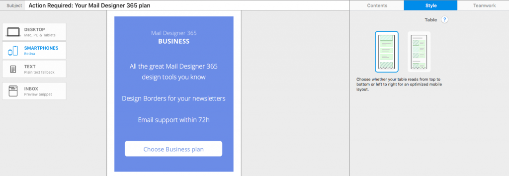
Mail Designer 365 creates a special card layout of your table for mobile.
We hope these tips for building effective pricing tables have been useful to you! Remember, you can use the Tables tool in Mail Designer 365 to quickly and easily build mobile responsive tables to integrate into your next email newsletter.
Get started with Mail Designer 365 today
Enjoyed this post?
Get more inspirational tips, tricks, and best practice examples in the Mail Designer 365 Newsletter Academy -
your one stop hub for all things email marketing strategy and newsletter design.