Email design for dark mode can seem like a jungle. With macOS, iOS, and many popular email clients now supporting system-wide dark mode, your newsletters can appear differently depending on your recipient’s settings.
In this guide, we’ll explore how to design emails that look great in dark mode, avoid common pitfalls, and use Mail Designer 365 to create emails that stay consistent across clients.
How Dark Mode Works in Email Clients
Unfortunately, there's no universal way that email clients deal with dark mode, but knowing the behavior of each client helps you anticipate how your design will render.
At the time of writing, the most popular email clients handle dark mode in the following ways:
| Client | Typical Dark Mode Behavior | Notes |
|---|---|---|
| Apple Mail (macOS & iOS) | Partial or no color change; supports CSS overrides | Backgrounds and text may invert depending on images and HTML/CSS |
| Gmail (Web/Desktop) | No color change | Email appears the same regardless of dark UI mode |
| Gmail (Mobile) | Partial or full color inversion | Backgrounds and text can be inverted; limited support for CSS overrides |
| Outlook (Windows Desktop) | Often full color inversion | Backgrounds and text can invert; images mostly preserved |
| Outlook (Web/Mac/Mobile) | Partial inversion | Backgrounds and text may invert; behavior varies by platform |
| Yahoo Mail | Full inversion | Light backgrounds become dark, text colors change accordingly |
| AOL / Legacy Clients | No change | Email appears the same as in light mode |
Email Design for Dark Mode: Common Issues
Text color and readability changes
When emails are displayed in dark mode, text colors can invert or shift automatically, which may reduce contrast and make your message harder to read. Light text on light backgrounds or dark text on dark backgrounds can appear unintentionally.
Image inversion or unexpected transparency
Some email clients invert colors in images or treat transparent areas differently, which can distort logos or design elements. Images with white or light-colored backgrounds may appear dark, and partially transparent graphics can render inconsistently.
Background colors appearing darker or lighter than intended
Background colors can shift unexpectedly in dark mode, sometimes making sections too dark or washing out lighter colors. This affects overall layout and the visual balance of your email.
Call-to-action buttons losing contrast
Buttons and other interactive elements may lose contrast when colors invert, reducing click-through rates. Dark text on a dark button or light text on a light button can become unreadable.
Best Practices for Dark Mode-Compatible Emails
If you're wondering how best to handle email design for dark mode, these best-practice tips provide a good basis:
Use universally-acceptable color palettes
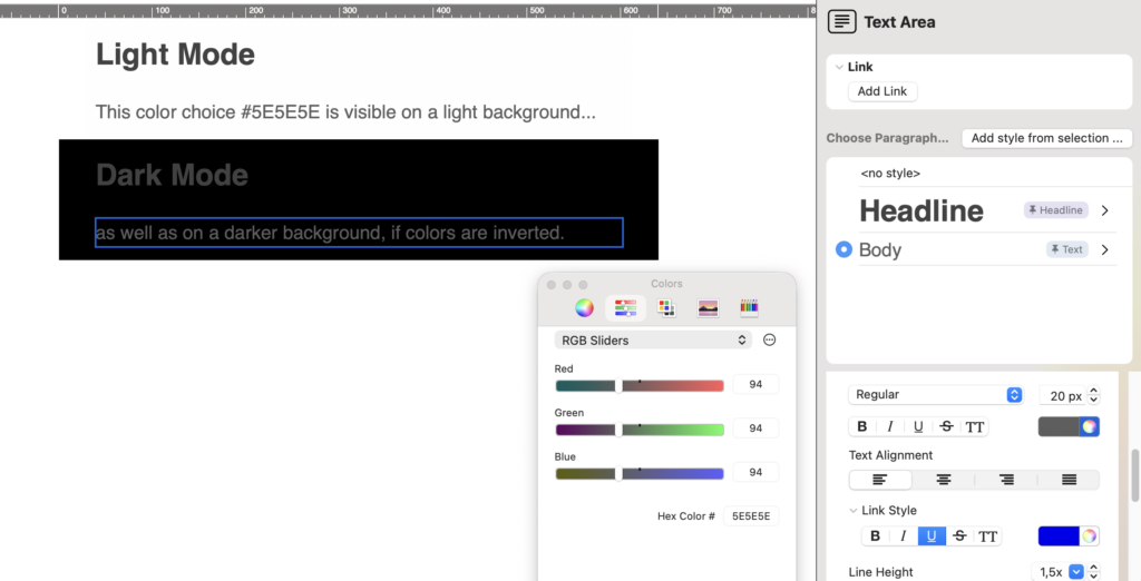
When colors are inverted, it can lead to rendering issues in dark mode. For this reason, it's advisable to choose colors that work in both light and dark modes to maintain readability and brand consistency.
Not all high-contrast combinations are safe. For example, pure black (#000000) text on a pure white (#FFFFFF) background, or the reverse, can create harsh visual contrast that strains the eyes and may invert unpredictably in some email clients. Instead, use slightly softer tones, such as dark gray (#111111) on off-white (#F9F9F9), or near-white (#FAFAFA) on very dark gray (#111111). These combinations maintain readability, look pleasant on all devices, and invert more gracefully in dark mode.

Do:
- Use dark gray shades instead of pure black for text
- Use off-white or very light gray instead of pure white for backgrounds
- Test your color combinations in multiple clients to ensure readability in both light and dark modes
Don’t:
- Avoid pure black on pure white or vice versa
- Avoid pastel colors on light backgrounds; they often lose contrast in dark mode
- Avoid bright neon or highly saturated colors that can invert unpredictably and reduce legibility
Keep branding simple
Avoid overly complex gradients, textures, or background patterns that invert poorly; simple designs translate better across clients.
Alt text for images
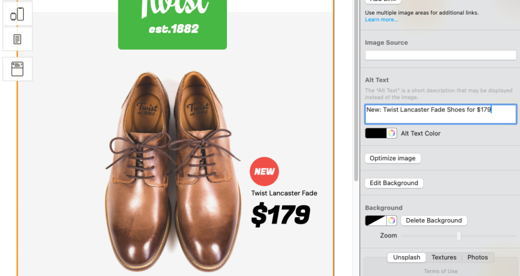
As well as being important for accessibility, alt text also works as an additional security net for ensuring your email renders effectively. Adding descriptive alt text means your message remains understandable even if images are altered or blocked in dark mode. For example:
- Icons for buttons – e.g., a dark “download” icon on a light button. If colors invert, the icon may vanish or be unclear
- Product images on light backgrounds. The product might get lost against a darkened background in dark mode
- Decorative or infographic images that convey information by color or shape; inversion can make them misleading
Use Mail Designer's alt text interface to easily add descriptive alt text for your newsletter images and ensure compatibility for dark mode.
Include a "View in browser" link
Provide a fallback so recipients can see your design as intended if dark mode alters the email. This is the ultimate backup plan for your emails, especially if you aren't sure which email clients your recipients are using.

Including a view in browser link is a good backup plan for dark mode
To add a view in browser link to your template, check out this HTML export guide.
Test across clients and devices
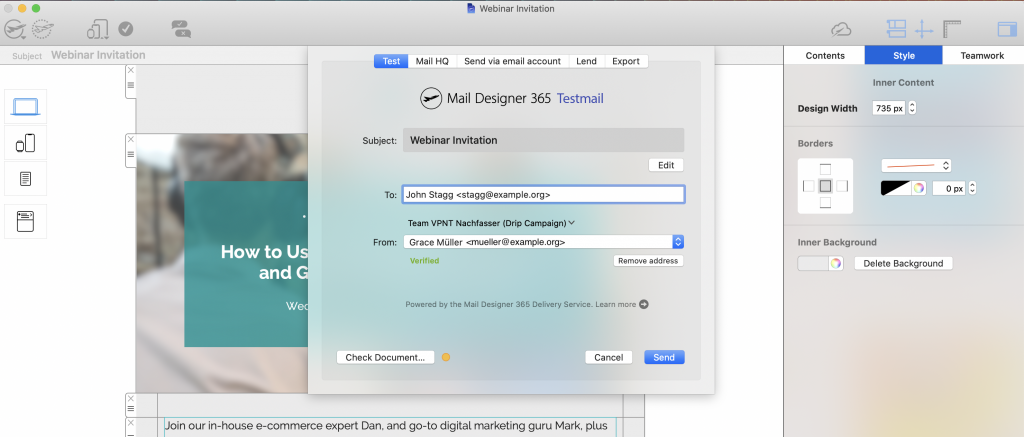
Mail designer 365 Testmail is a great dress rehearsal before sending out the real campaign to your audience so you can preview how your email renders in real inboxes on desktop and mobile before sending. More about Testmail →

Send a test version of your email via the Mail Designer 365 Testmail service
You can also preview your emails in multiple clients using tools like Litmus or Email on Acid to catch dark mode issues before sending.
Dark Mode Tips for Specific Email Clients
If you know a large segment of your audience is using a particular email client, you can use client-specific tweaks and testing methods to ensure widespread compatibility.
- Apple Mail: Light and dark versions may auto-switch; test plain-text sections separately.
- Outlook: Avoid dark mode auto-inversion issues by using consistent background colors and avoiding semi-transparent images.
- Gmail: Test for dark mode on web and mobile; inline CSS helps maintain colors.
- Others (Yahoo, ProtonMail, etc.): Keep designs simple; fallback colors ensure readability.
Email Design for Dark Mode: Quick Checklist
- ✅ Use high-contrast color palettes that work in both light and dark modes
- ✅ Avoid pure black on white (and vice versa); use soft gray tones instead
- ✅ Keep branding simple; avoid complex gradients or patterns that invert poorly
- ✅ Add descriptive alt text for all images, icons, and critical visual elements
- ✅ Include a visible “View in browser” link as a fallback
- ✅ Test your email in multiple clients and devices using Testmail, Litmus, or Email on Acid
Email design for dark mode is now a daily consideration for email designers. By using Mail Designer 365 features, following high-contrast design rules, and testing across clients, your newsletters can look polished and professional no matter what mode your readers are using.

