
Research shows that it takes just 0.05 seconds for a web page to make an impression on the average person; whether this is a good or bad impression is up to you. The visual appearance of your email is crucial in determining how readers will respond to your campaign. Here's how you can effectively use color schemes to optimise your email designs...
Monochromatic color schemes
A monochromatic design is made up of the different shades of just one main color. It's particularly effective if it highlights something within your email design and indicates a clear theme. Try this out for colors which are seasonal (e.g. red at Christmas or orange at Halloween) or for targeted product promotion.
This example from Morphe is highly effective. Not only does the hot pink stand out to readers, it also does a great job of promoting their lipgloss of the same color:
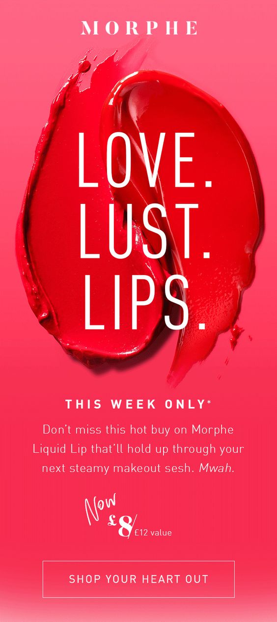
Monochromatic color schemes are a brilliant way to highlight the vibrant, colorful nature of your product.
Complementary color schemes
Complementary color schemes are made up of colors which are directly opposite each other in the color wheel. Some complementary pairing examples are red and blue, yellow and purple, and pink and green.
These colors create a strong contrast, but, when pulled off correctly, can add something special to your design. For example, this design from Cotton On utilises a complementary color scheme by clashing red and teal together to create an interesting effect for their otherwise ordinary sale advertisement.
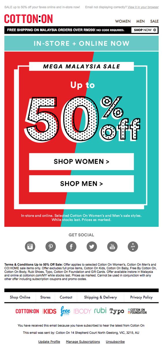
Use a vibrant complementary color scheme to bring an otherwise simple design to life.
Achromatic color schemes
For a particularly sleek and serious design, you should consider using an achromatic color scheme. This refers to color schemes made up of shades of black and white. In terms of branding, this is a sleek and stylish option for those of you striving to maintain a more sophisticated look in your emails.
Hudson Jeans are looking chic as ever in this achromatic welcome email. This design does a great job of introducing subscribers to the fashionable nature of the brand and remaining interesting at the same time.
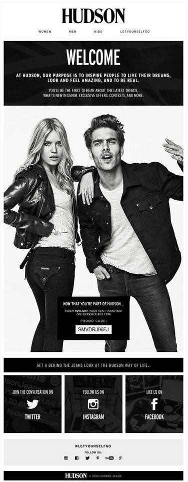
Achromatic color schemes add an element of style and edge - particularly for fashion brands.
Analagous color schemes
An analagous color scheme is made up of one main color and then the two colors either side of it on the color wheel. For example, red paired with deep orange and hot pink or blue paired with indigo and turquoise. This is a great color scheme to try out on a more standard design like a transactional email, where you don't want to be too experimental.
This brand have created a soft, yet effective color scheme for this design. The red paired with pink and orange is a nice way to incorporate color without going overboard.
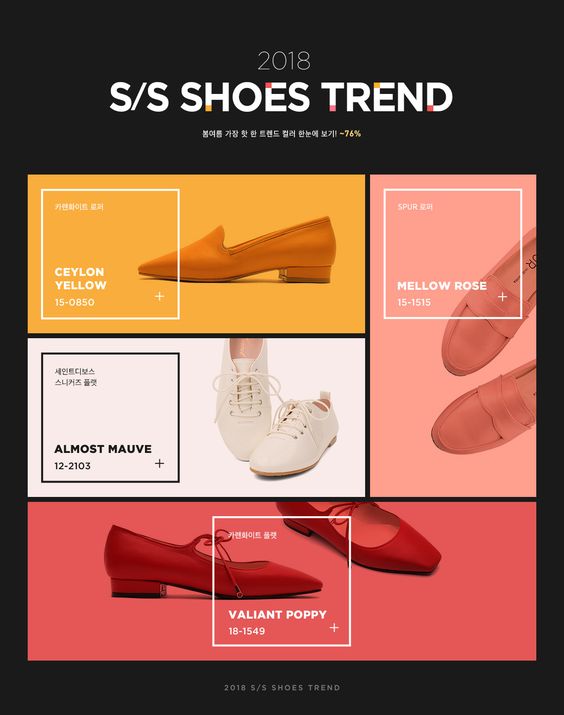
An analogous color scheme is a subtle yet stylish way to introduce different colors into your email designs.
We hope you take these color schemes into consideration for your next email campaign. Together with an understanding of seasonal trends and the effect of different colors, this is a great way to make sure your email design is effective as possible.
Until next time!
Your Mail Designer 365 Team
Give Mail Designer 365 a try today for free...