
Choosing the right colors for your email design can be tricky — especially during the busy holiday season. With countless festive colors and holiday color palettes to choose from, it’s easy to feel overwhelmed. Mail Designer 365 gives you full control with a complete color spectrum, intuitive color picker, and the ability to use precise RGB and hex codes. To help you get started, we’ve curated six stunning palettes filled with festive inspiration — perfect for your next seasonal design.
Get expert email best practice tips delivered directly to your inbox!
Please check and try again.
We've just sent you an email for you to confirm your email address, if you haven't already.
Before we begin...
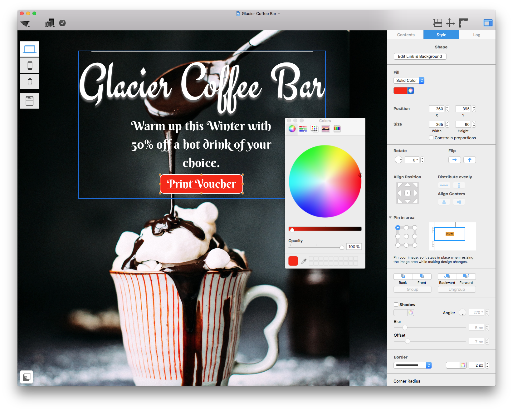
How to apply hex color codes in Mail Designer 365:
To use the colors we are mentioning in this post, carry out the following steps:
- Click on the design element you want to edit.
- Select the color tool
- Click on the "Color Sliders" tab
- Click the "Settings" icon and select "Generic RGB"
- In the space provided, type in the 6 digit hex code and hit "Enter"
- This will apply the color to your chosen design element
Get inspired by these super festive color palettes:
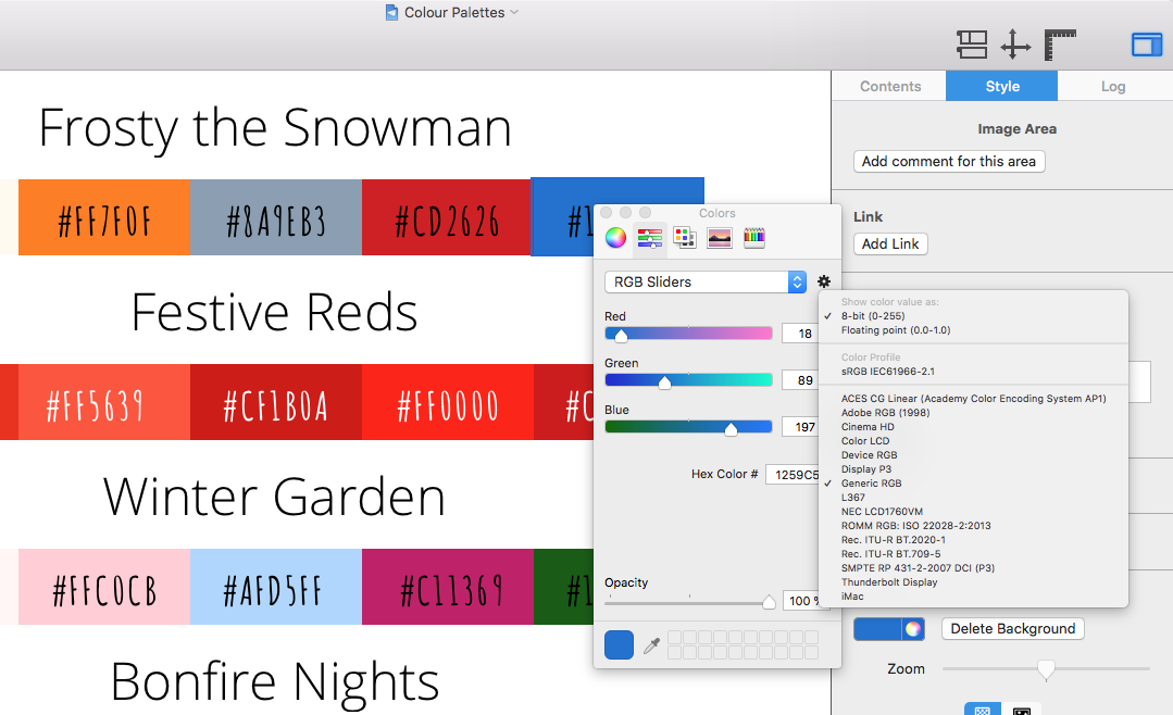
1. Frosty the Snowman
This subtle color palette is perfect for a warm, festive design that's not too out there - perfect for a business looking to keep it's professional tone while still celebrating the holidays. Use the gray or the blue for your main text, and the orange or red for a warming CTA or graphic. If you're not using a photo background, the soft cream color makes a nice change to plain white.

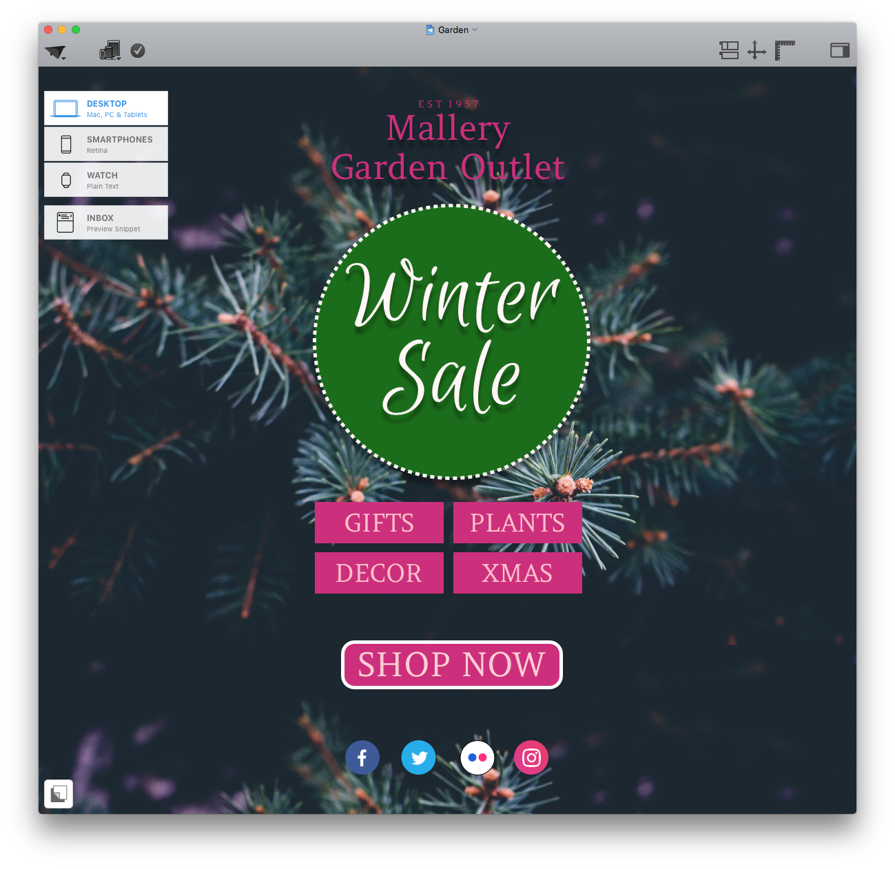
2. Winter Garden
Differing slightly to the traditional festive colors we are used to, the Winter Garden palette evokes images of frosted flowers and winter greenery. This would work well for your garden center's winter sale, or for a women's fashion store. Try the darker pink color for your CTAs with a soft pink text. The vibrant forest green works great for eye-catching headlines.

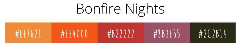
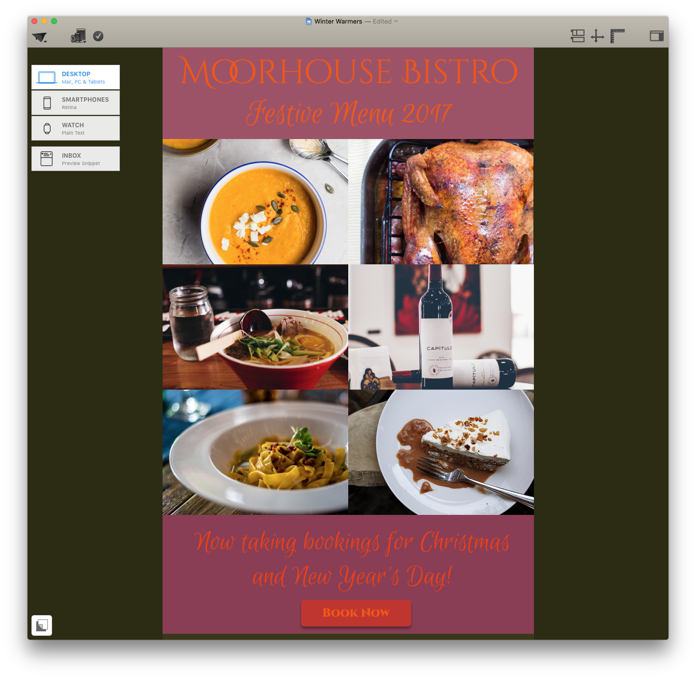
3. Bonfire Nights
This color palette has a more warm and cozy vibe to it, making it the perfect match for your bar or bistro's festive menu. Golden tones and deep reds will have your customers dying to warm themselves up with what you have to offer! Try the soft purple for a perfectly matched background to your headline, and the bright orange for labelling your star offers or special items.
4. Winter Holidays
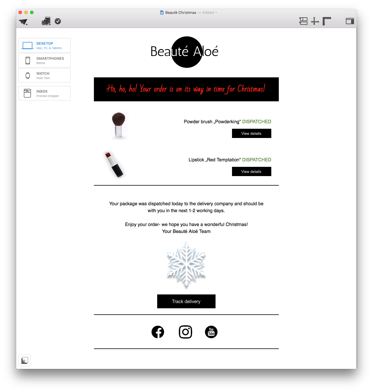
A very festive and traditional color palette, this is the perfect choice for those of you wanting to include some serious seasonal fun into your designs. Glowing reds and greens are perfect for standout headlines and CTAs, and the ice blue adds an ultra wintery feel as a border or eye-catcher.

5. Let's party
This bold and vibrant palette is perfect for those of you planning a holiday event this year! Golden yellows and rich purple tones ooze luxury and glamour - ideal for a sophisticated New Year's Eve party, or a Christmas ball. With this color choice, you'll have all of your customers rushing to find their dancing shoes!

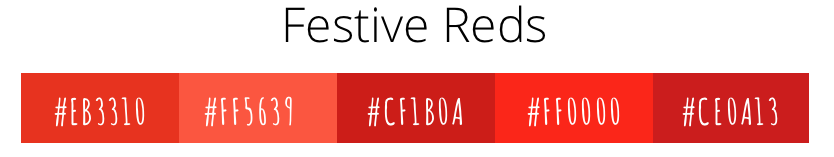
6. Festive Reds
Last but not least, for the minimalists among you, we've curated a selection of festive reds which you can use to subtly accentuate headlines and CTAs without adding too much color to your designs. This is a great choice for those of you wanting to nod to the holiday season but not go all out. You can apply these warming red shades to transactional or welcome emails for a hint of festive cheer.
Our top tips:
- Don't use more than three colors in your design or it can become distracting.
- Use the more vibrant colors in the palette for headlines or CTAs and the simpler colors for text and backgrounds.
- Be sure to have the color settings set to "Generic RGB" to get the same results as we did in our designs.
- Don't be afraid to adjust the transparency of these colors, experimentation is the best way to be creative!
P.S. You can find more color palette inspiration here!