Plane erfolgreiche Back-to-School-E-Mail-Kampagnen mit Tipps zu Timing und Inhalten, inspirierenden Beispielen und fertigen E-Mail-Templates.
Read More
Microsoft 365 SMTP funktioniert nicht mehr? Dieses Problem tritt nach dem Wechsel eines E-Mail-Kontos zu Microsoft 365 häufig auf, insbesondere beim Versand über Drittanbieter-Apps wie Mail Designer 365.
Der Wechsel deines E-Mail-Kontos zu Microsoft 365 kann in manchen Fällen zu unerwarteten Problemen führen, insbesondere beim Versand von E-Mails per SMTP über Drittanbieter-Apps wie Mail Designer 365. Viele Nutzer berichten, dass nach der Migration Newsletter oder andere ausgehende E-Mails nicht mehr gesendet werden können, obwohl die Zugangsdaten weiterhin korrekt sind. Dieser Artikel erklärt, warum es dazu kommt, und zeigt dir eine einfache Lösung, mit der du schnell wieder arbeitsfähig wirst.
Viele Microsoft-365-Tarife stellen den klassischen SMTP-Zugriff nicht mehr in der Form bereit, wie ihn Drittanbieter-Apps erwarten. In einigen Fällen ist SMTP vollständig deaktiviert oder nur noch über eine komplexe OAuth2-Authentifizierung nutzbar. Die klassische Anmeldung mit Benutzername und Passwort für SMTP, IMAP oder POP3 ist nach der Migration häufig standardmäßig deaktiviert. Das bedeutet, dass Drittanbieter-Apps selbst dann keine Verbindung herstellen können, wenn dein App-Kennwort korrekt ist.
Die SMTP-Sendefunktion von Mail Designer 365 ist auf eine funktionierende SMTP-Verbindung angewiesen, um E-Mails zu versenden. Ist diese Verbindung blockiert oder erfordert sie ein Protokoll, das nicht unterstützt wird, schlägt die Anmeldung am Mailserver fehl und der Versand ist nicht möglich. Häufig erscheinen dann Fehlermeldungen zur Authentifizierung, was besonders verwirrend ist, wenn dieselben Zugangsdaten in anderen Apps wie Apple Mail oder Outlook problemlos funktionieren.
Wenn der SMTP-Versand mit deinem Microsoft-365-Konto nicht mehr verfügbar ist, bietet Mail Designer 365 einen integrierten Versandservice, der diese Einschränkungen vollständig umgeht.
Mail Designer 365 stellt dafür zwei integrierte Versandoptionen bereit:
Beide Optionen ermöglichen dir den Versand von E-Mails, ohne auf den SMTP-Zugriff deines E-Mail-Anbieters angewiesen zu sein. Dadurch wird der Versand zuverlässiger und langfristig einfacher, selbst wenn sich die Anforderungen der Anbieter weiter verändern.
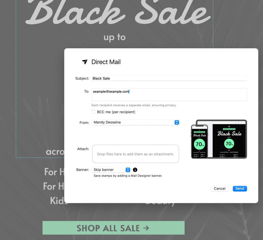
Mit Mail Designer 365 Direct Mail kannst du professionelle HTML-E-Mails direkt von deinem Mac aus versenden – ganz ohne SMTP
Gut zu wissen: Alle Mail-Designer-365-Design-Pläne enthalten ein Basis-Versandkontingent. So kannst du sofort starten und bis zu 20 Direct Mails pro Monat ohne zusätzliche Kosten versenden.
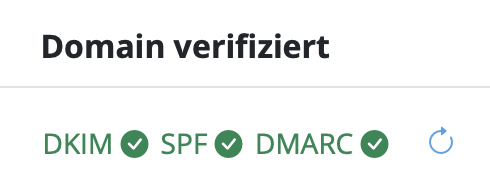
Durch die Nutzung des Versandservices von Mail Designer 365 kannst du weiterhin professionelle E-Mails und Newsletter mit Vertrauen versenden – auch wenn sich E-Mail-Plattformen weiterentwickeln und den klassischen SMTP-Zugriff zunehmend einschränken.
A great email design makes the message easy to understand, represents the brand clearly, and gives readers a useful next step. Finding fresh inspiration can still be difficult, so this collection examines ten memorable email examples and the practical details that make each one work. Use the ideas as prompts for your own Mail Designer 365 layouts rather than copying another brand’s campaign.

Strong examples usually combine clear hierarchy, readable type, purposeful imagery, brand consistency, and one obvious action. As you review the campaigns below, look at how each design directs attention and consider which technique fits your own audience, content, and goal.
A welcome email is your first opportunity to introduce new customers to your brand and show them what you're all about. We think Starbucks have done a great job in this example. The email design is simplistic, cool, on brand and immediately makes the customer aware of what benefits the company can offer them.
Our favorite part: We love the handwritten "welcome" on the coffee cup as a classic twist on their signature gesture of writing customers' names on their drinks!

Show customers what they should expect from your business in your welcome email.
Using color in email designs is an effective way to quickly convey your email's main message. In this instance, Sephora have really gone the extra mile with their color blocking design. Instantly eye-catching and vibrant; this is a great way to grab the reader's attention and highlight your products. It can be easily recreated using shapes and image areas in Mail Designer 365!
Our favorite part: We love the angular layout of this design. The products are perfectly arranged and aligned to fit in with their color block; making it easier for customers to differentiate between the separate items.
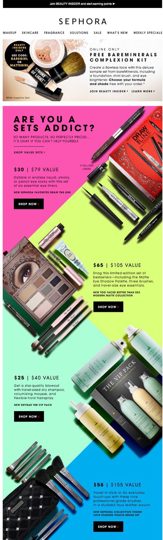
Use colors and unique layouts to create an eye-catching email design and showcase your products.
GIFs are the ultimate eye-catchers. Using a GIF in your email design increases click-through rates and means your readers are sure to pay attention to what you're trying to say. In this vibrant email design, Boden do a great job of showing off their products and creating fun effect.
Our favorite part: The bright yellow background is perfect for the summer theme of the email and goes hand in hand with the promotion of T-shirts. We're warming up already!
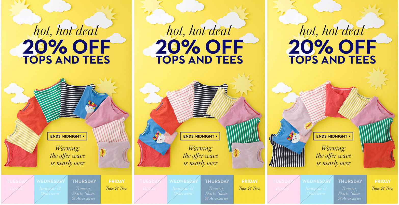
Using GIFs is a great way to grab readers' attention and make your email design more fun.
Wishing your customers a happy birthday is an effective way of showing them you care whilst also adding a personal touch to your marketing campaign. Anthropologie have really gotten on board with this trend and offer their customers a special birthday reward of 15% off.
Our favorite part: The cute party hat design is minimalistic, but gets straight to the point of celebrating; leaving readers in a party mood.
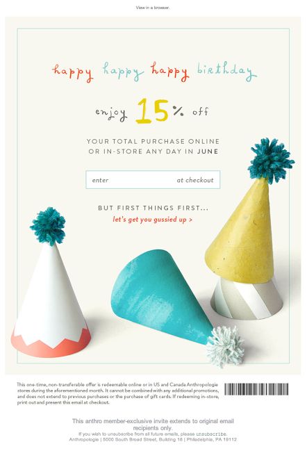
Make your customers feel valued by wishing them a Happy Birthday.
Sometimes, even the best of us get it wrong, but it's ok. If you have an awesome apology design like this one from Urban Outfitters, you'll brush off your mistake in style. Using effective imagery and a bold and friendly font is super effective in this design as it clearly conveys the apology to readers in a lighthearted fashion.
Our favorite part: The cats, of course! Not only are they super cute, the kitties in this email design lighten the mood and add more power to the apology. Purrfect!
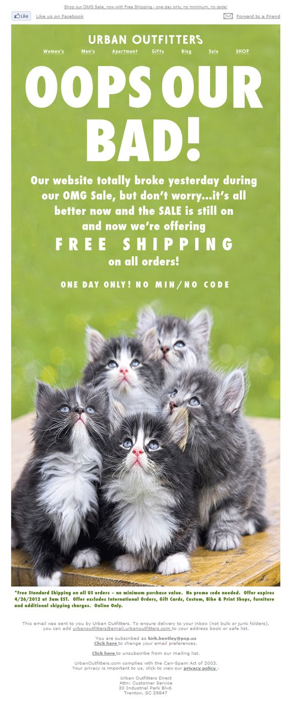
If something's gone wrong, win back your customers through effective design.
Email designs don't always have to be complex to get their point across. As proven by De Beers, simple can also do the trick. This email design clearly promotes the brand's sale and even manages to create a sense of urgency by including a time reference.
Our favorite part: The gift box is a great addition, as it creates a sense of mystery and makes readers inquisitive but, at the same time, also represents the luxury nature of the jewellery brand and promote their festive sale. A great example of less is more!
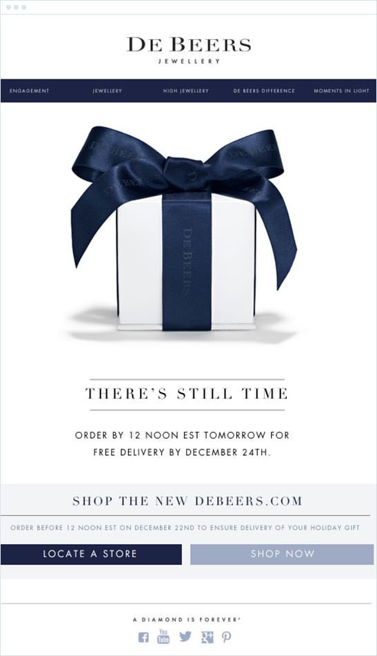
Simple designs are also effective when you want to get straight to the point.
One of the most common uses of email marketing is advertising a sale or special offer to your customers, and Tarte Cosmetics really show us how it's done in this bold and bright email design. The use of the phrase "secret sale" adds to the exclusivity of the event and makes customers more excited.
Our favorite part: The simple envelope animation accentuates the main point of the email (i.e. the sale) and we love the fun and feminine use of color and imagery in making the design more effective towards the brand's target market.
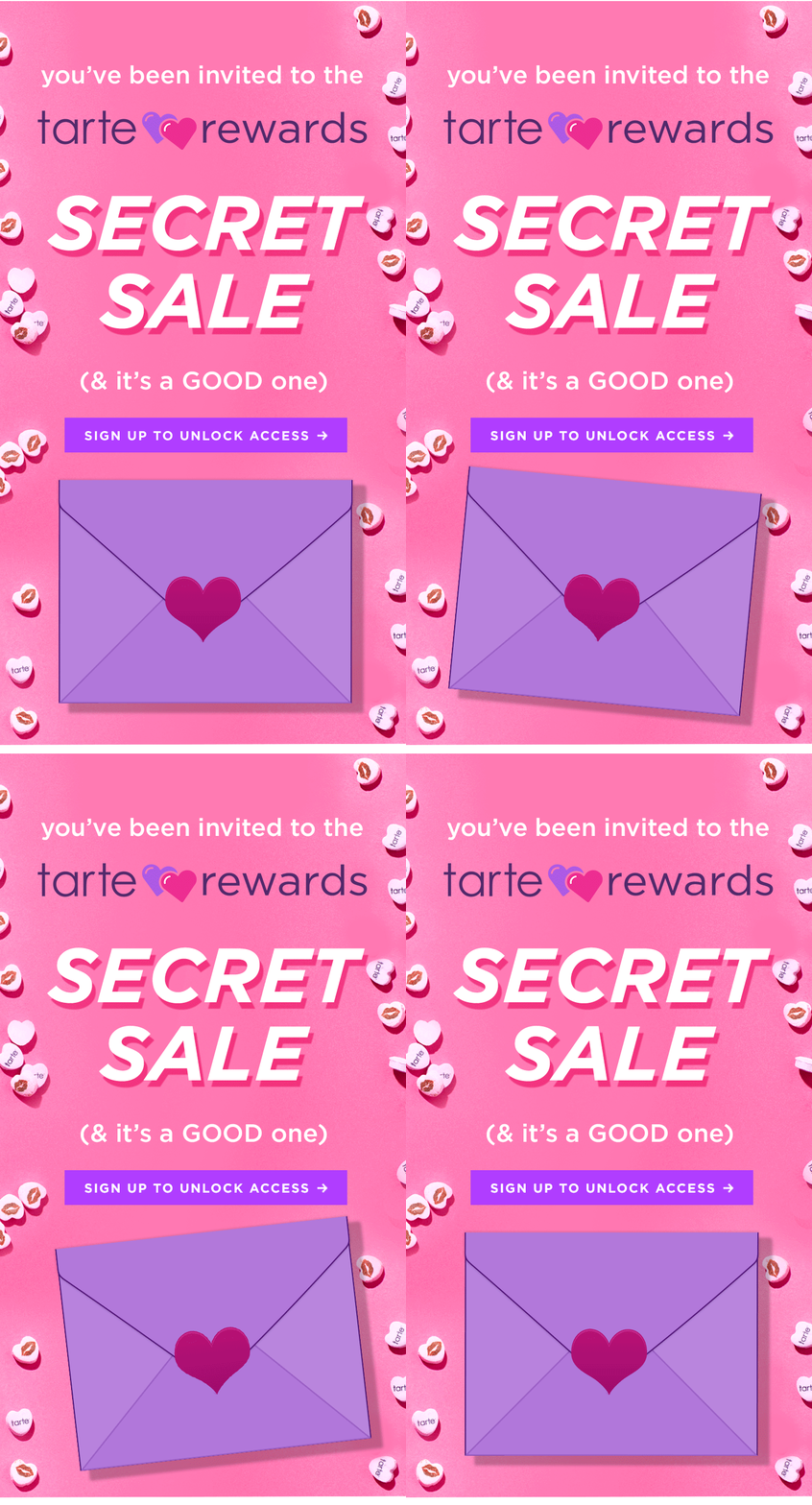
When it comes to sales: go big or go home. The trick is to get as many readers on your site as possible.
An email marketing must-have... there's no reason you can't make this type of email fun like ASOS have done! As we mentioned in an earlier post on this topic, it's important to tempt your customer back to your site by promoting offers, benefits, and the abandoned product itself, and this design ticks all of the boxes!
Our favorite part: We love the use of personification in this email, which literally allows the product to speak to the customer. There is also a clear and central image of the abandoned product which reminds the customer why they were tempted in the first place.
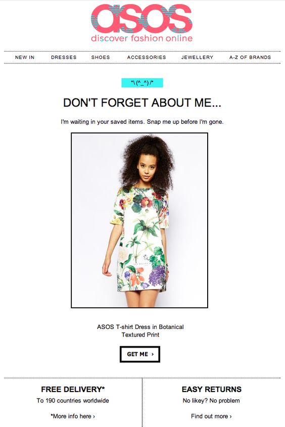
This abandoned cart email ticks all the boxes and shows the customer exactly what they're missing out on.
We've seen simple and minimalistic designs, but how about the designs which really push the boat out, like this one from Kate Spade? This super original idea of including paper cut outs is unique, eye-catching and also just really fun! Abstract designs such as this really set your emails aside from other competitors and could be the deciding factor when a customer is deciding whether or not to visit your site.
Our favorite part: This paper-cutout style is great for the occasion, as it is symbolic of handmade gifts often made by children on Father's Day. We also find it super cool that no actual photos were included in the email design. The brand's confidence in their products shines through and encourages customers to click the CTA and see what's on offer.
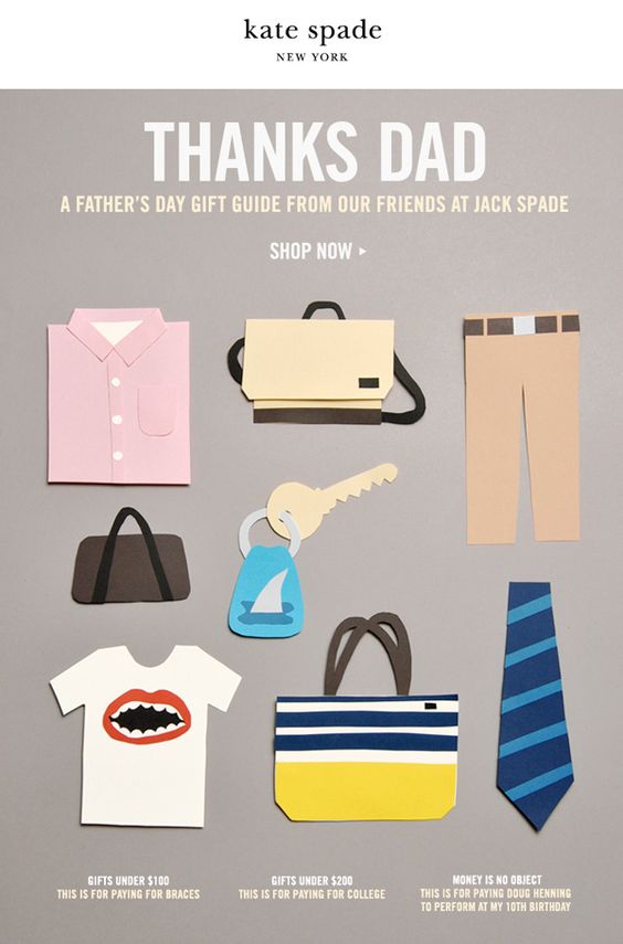
Abstract email designs can be a colorful and creative way to generate some interest around your business.
Last but not least, the re-engagement email. New Look have created a very simple and straight to the point email design here which clearly outlines the benefits of being subscribed to their mailing list.
Our favorite part: New Look confidently offer their readers the option to stay subscribed, or to stop receiving emails. This is a very transparent approach and also means that their email list will be mainly made up of people who want to receive emails.
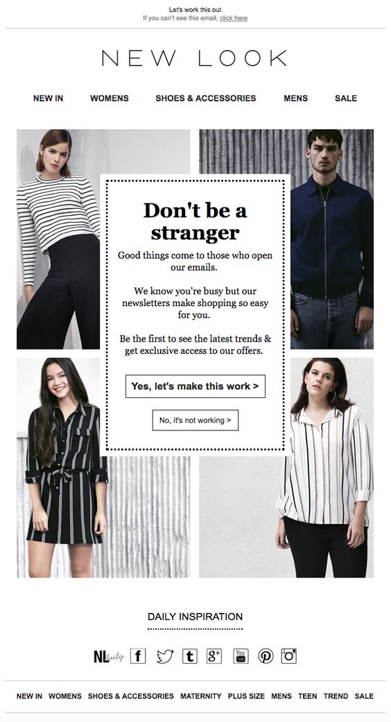
Make your reengagement emails clear and concise so that your readers can make the decision to stay subscribed without any distractions.
We hope you're feeling inspired to create and follow in the footsteps of these awesome email designs! As shown, a design can be as simple, or as abstract as you want it to be. Make your designs unique, true to your brand, and relevant to your customers, and you'll be on to a winner! For more design inspiration, you can check out our Pinterest page, which we regularly update with real life creative and effective email designs.
Until next time,
Your Mail Designer 365 Team