Holiday email design has to balance seasonal warmth with practical information. These five adaptable checks help teams build campaigns that remain useful when customer priorities, delivery conditions, opening hours, or event plans change.
This article was originally published during the 2020 pandemic. The temporary health rules from that period have been replaced with evergreen planning guidance, while the central lesson remains relevant: acknowledge the reader's situation, verify every operational detail, and make changes easy to understand.
1. Set the tone for your holiday email design
Start with the relationship and message, not the decoration. A customer promotion, employee update, community thank-you, and event invitation need different levels of warmth and urgency. Decide what readers should understand or do, then write a short opening that supports that purpose.
Positive seasonal language can work without ignoring difficult circumstances. Avoid generic pressure or exaggerated cheer when service interruptions, weather, delivery delays, or local events affect the audience. State the useful facts, acknowledge changes calmly, and keep the promise proportionate to what the business can deliver.
Subject lines and preview text should set the same expectation as the email. If the message is about a shipping deadline, say so. If it is a greeting, do not disguise it as an urgent offer. Our guide to email preview text explains how those two inbox elements can support each other.
2. Build a clear seasonal visual hierarchy
Traditional colors and motifs can establish the holiday context quickly, but the message still needs a readable hierarchy. Use one main headline, a concise supporting sentence, and one primary action. Secondary offers should be visually quieter so they do not compete with the main purpose.
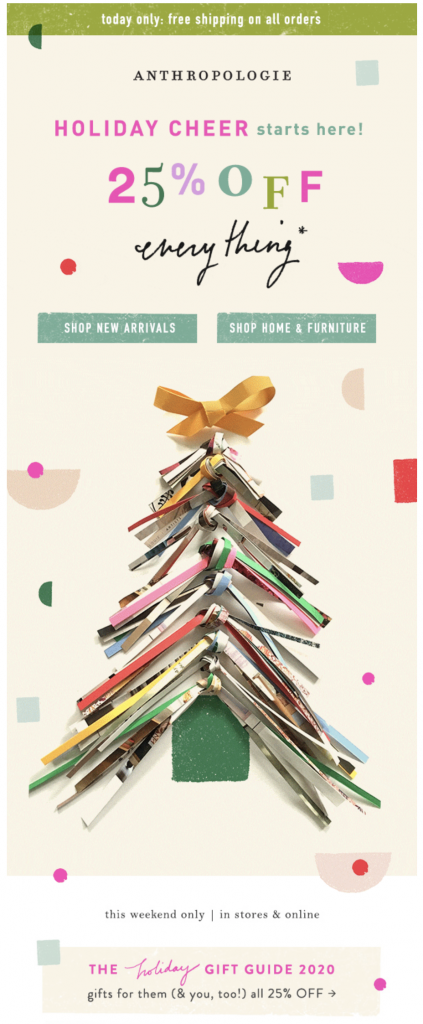
A modern Christmas tree motif creates a clear seasonal frame for a gift guide.
This example uses a recognizable tree shape while keeping the product story central. Apply the same principle to your own campaign: choose imagery that supports the nearby copy, crop products consistently, and reserve high-contrast button styling for the most important destination. For more color planning, explore these holiday color palettes.
3. Confirm fulfillment and service details
Holiday promotions often depend on dates and availability. Confirm the final order date, delivery region, pickup window, stock status, return policy, gift-wrapping terms, currency, and discount conditions before sending. If the campaign is for an event or appointment, include the full date, time zone, location, accessibility information, and cancellation path.
Do not copy last year's operational details into a new campaign. Link to the current policy or service page when information may change, but keep the most important deadline visible in the email itself. If the offer applies only to certain products or locations, state that condition next to the action rather than hiding it at the bottom.
4. Connect every call to action to the right destination
Button labels should describe what happens next. “Shop the gift guide,” “Reserve a pickup time,” or “View holiday opening hours” is clearer than “Click here.” The landing page must reflect the same offer, price, date, and availability shown in the email.
Before sending, test every product, policy, social, contact, and unsubscribe link. Check that tracking parameters identify the campaign consistently and that redirects do not send readers to an unrelated page. A short purchase or registration path reduces confusion and makes it easier to diagnose a broken step.
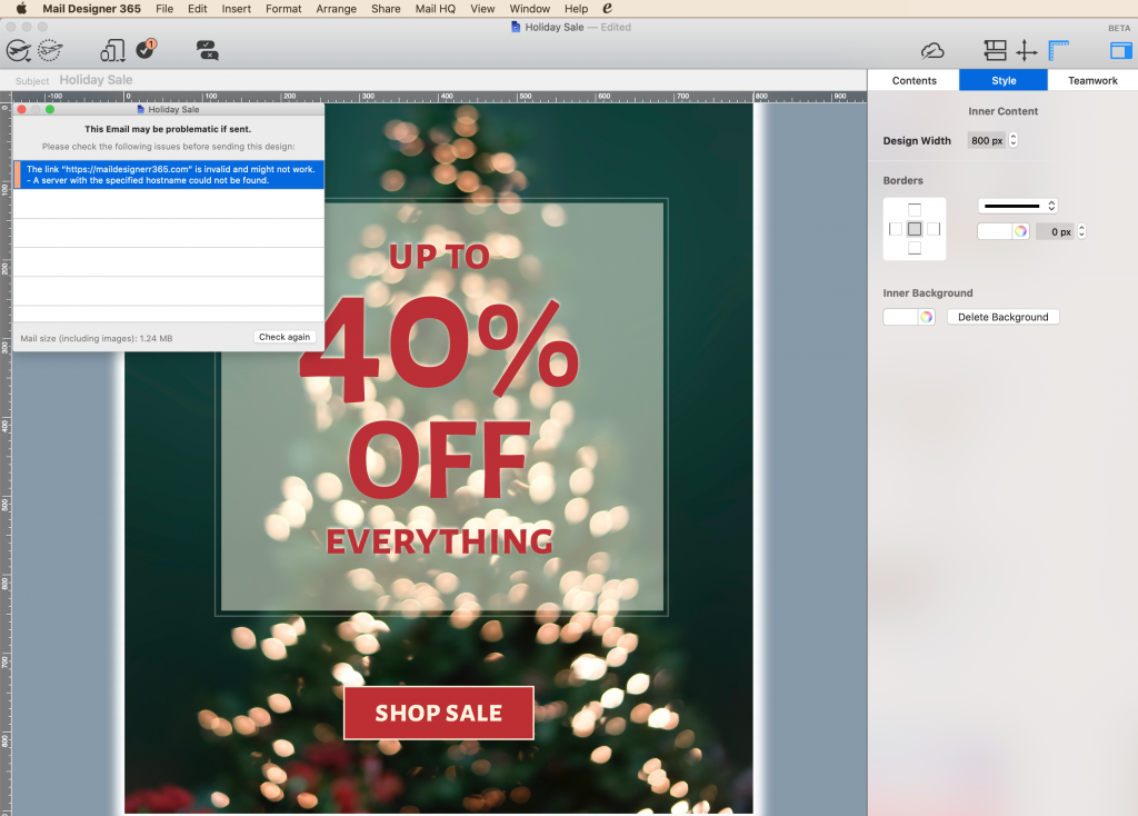
A pre-send link check helps identify incorrect destinations before the campaign goes out.
5. Prepare for changing conditions
Weather, capacity, inventory, transport, and local operating changes can affect a holiday campaign after it has been approved. Assign one person to confirm the final facts and define how the team will communicate an update. A short service notice with a clear timestamp is often more useful than silently changing a landing page.
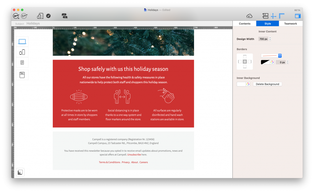
A dedicated information block keeps time-sensitive customer guidance easy to find.
Review the campaign on desktop and mobile, then test it with images blocked. The offer, deadline, service information, and main action should remain understandable as text. Use concise alt text for meaningful images and sufficient contrast for buttons and copy. The W3C accessibility design tips provide a practical review reference.
Archive the approved email with its dates and operational assumptions. When the next season arrives, reuse the structure but revalidate every offer, link, image, policy, and tracking value.
Build a clear holiday campaign