
Why mobile email marketing?
Mobile devices have become an essential part of our lives. In the morning, do you check your mobile at least once? Do you normally use a smartphone to talk to your loved ones via text, call, or a messenger app? Do you place your mobile phone next to your bed when you're going to sleep? You probably answered yes to at least one of the questions, if not all of them.
Since our lives have become increasingly dependent on mobile devices, it's important for email marketers to recognize the advantages of mobile email marketing. The reality is that email marketing is no longer bound to desktops, laptops, and tablets. Today, businesses can reap the benefits of email marketing from mobile users.
Apply the ultimate mobile marketing strategy with our 7 mobile email marketing tips:
1. Keep your email short
When it comes to the mobile version of your email design, keep your email copy short. Mobile screens are much smaller than desktops or laptops. So if you were to create a lengthy email, then mobile users may need to keep scrolling down to read your content - which is not likely going to happen.
Don’t write essays. Be straight and to the point.
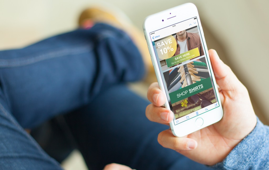
2. Make sure buttons look clickable on mobile screens
Our brains are wired to know when you are able to tap or click on an object. So when it comes to your CTA buttons, ask yourself, “does my button look like a button?” People should easily be able to tell that they can click/tap on your button.
To make buttons look clickable:
- Set a color for your button background that is different from your email background. Buttons should never “blend in.” People should easily be able distinguish that this object is different from the rest of the content.
- Use contrasting text. The color of the text should help the button’s message stand out. Choose a font and a font color that will make the message look clear and easy-to-read.
- Add a border or a shadow. Borders and shadows help add depth. They are also great signals that scream “Hey, I’m a button. Click me!”
A streamlined design is key — especially on smaller screens. Using an email template creator that supports mobile-optimized layouts makes it easier to build emails that look great and function perfectly on any device.
3. Create a valuable headline
Don’t judge an email by its headline? I’m afraid that’s not the case. You have a limited time to make an impression to mobile users. Your headline can be the deciding factor whether your subscriber clicks the trash button or reads the rest of your email.
Here are 3 easy ways to add some value to your headline:
- Like your email copy, keep your headlines short. Headlines need to look great on mobile devices, which means that they can’t be too long that mobile users will need to keep scrolling down just to read it.
- Describe what is the purpose of your email. Stay away from slogans - often times, they are too generic. They do not help specify what your email is all about.
- And don’t forget to check the layout of your headline. Make sure that the text is big enough that mobile users can easily read it but not too big that it looks awkward on a mobile screen.
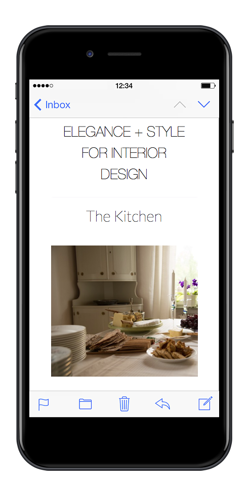
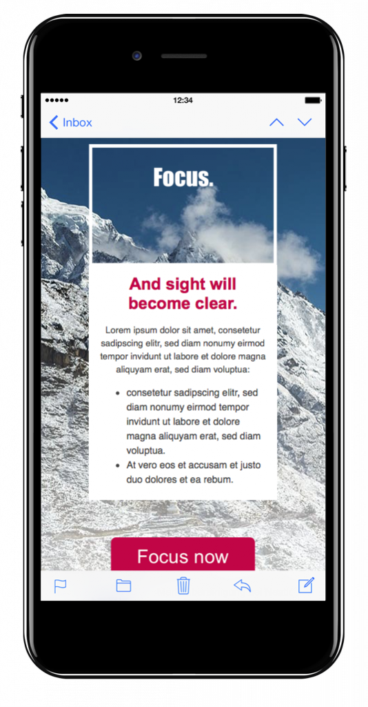
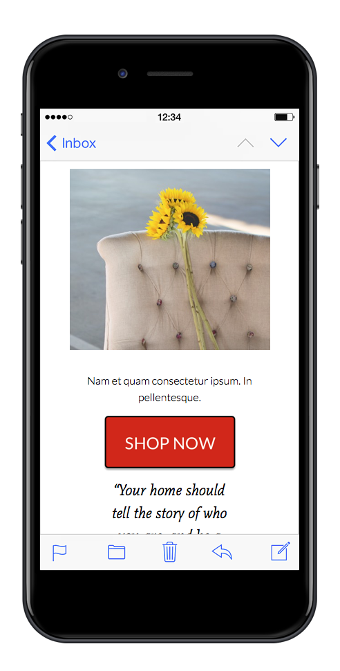
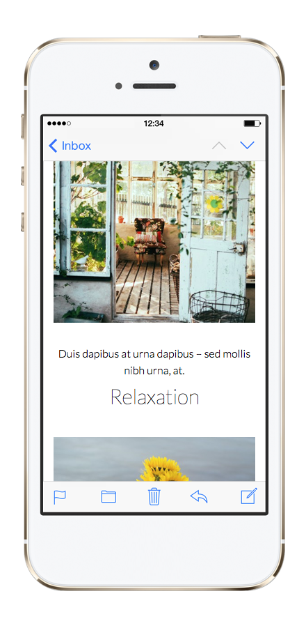
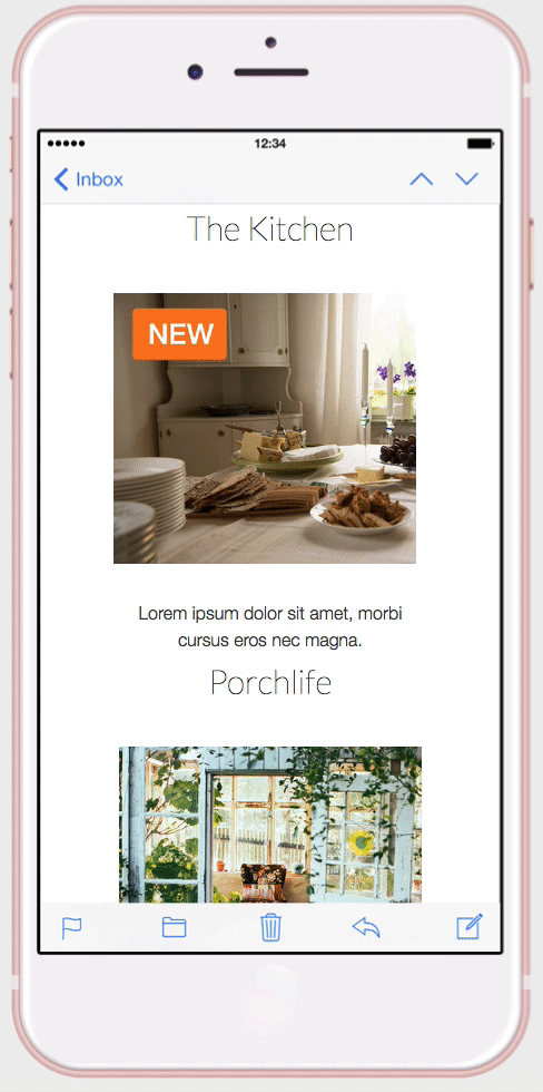
4. Say yes to images!
Let your photos do most of the talking. Don’t bombard mobile users with text. Instead, cut down on words and use images to help convey your message.
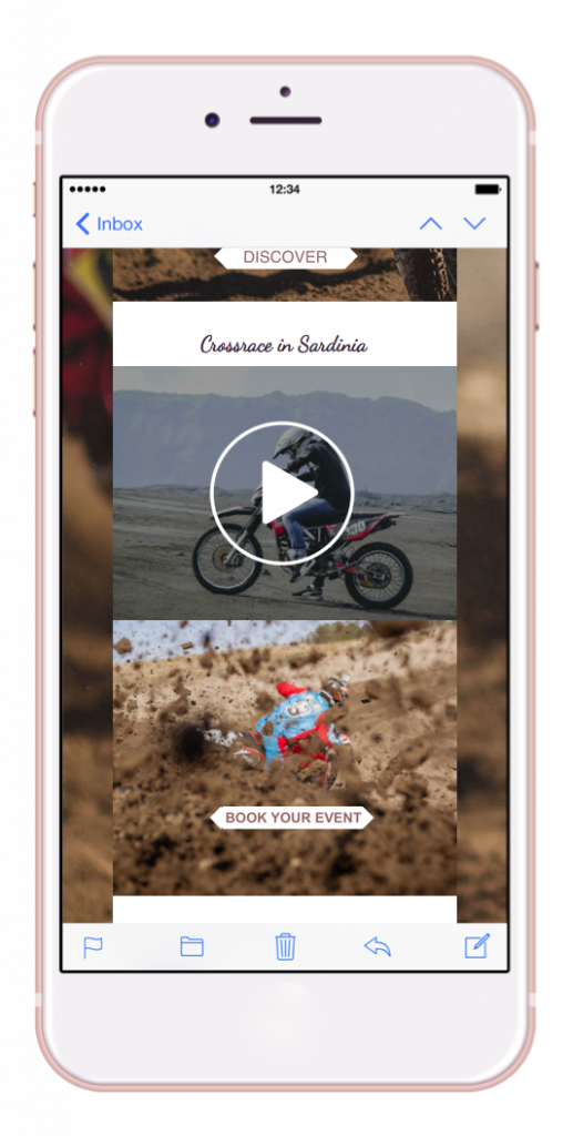
5. Only 2 GIFs max
When it comes to opening emails on the mobile version, too many things going on at once can be too distracting. It’s best to refrain from adding more than 2 GIFs. If your GIF is large enough that it can take up the majority of the mobile screen, then try to only limit yourself to 1 GIF. Too many animations can hurt the quality of your email copy. So when you design the mobile version of your email newsletter, pick the GIF that makes your email stand out the most. If you need help in deciding what kind of GIF to include, get inspired with our fun tips.
#6 Don't embed videos. Instead, link to videos.
When using videos, we recommend linking to videos rather than embedding videos within the email template. Email clients handle videos very differently. Therefore, your videos may not work for a subscriber if you directly embed it within the email newsletter. So our best practice suggestion is to upload your videos to a third party host like YouTube or Vimeo. Then, share to your subscribers by adding a link within your email template.
Now, you can optimize video experience for mobile users with YouTube or Vimeo videos. You can find more detailed information on our "Optimizing your videos for mobile users!" tutorial.
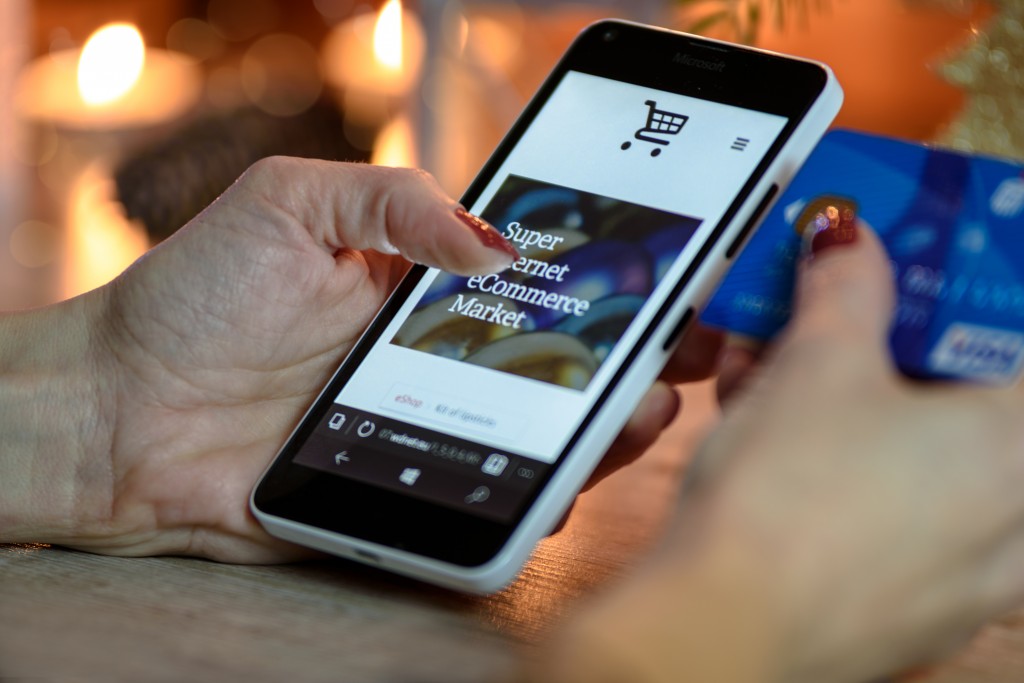
7. Make your website and store mobile-friendly
While using a mobile device, if a subscriber clicks on a button within your email newsletter, he or she should be led to a landing page that looks and works great on a mobile device. An essential part of mobile email marketing is to make sure that the mobile user experience remains smooth.
Check your website and online store for smartphone compatibility. Mobile-friendly websites are no longer a suggestion in today's competitive market - they're a must! The graphics and layout of your website and online store should look perfect when viewed on a smartphone and when viewed on a computer. Also, create a checkout process that is mobile-friendly. Users should be able to make a purchase using their smartphone without a problem.
Extra tip: When it comes to your online store, you can also turn the online checkout process into a subscribers list building opportunity. Uncover how you can build your subscribers list using the point of sale here.
For your in-store shoppers, be open to having mobile payment methods available like Apple Pay, Venmo, PayPal, etc. And if possible, use a POS system that makes it easy for your customers to pay using a mobile payment method. For instance, you can try Square, ShopKeep, Bindo POS, etc. There are plenty of POS systems available in the market today that allow mobile payments. Research what types of features you need for your business and see which POS system meets your criteria. This will help ensure that the mobile user experience stays smooth throughout the process, from when they receive an email campaign to when they make a purchase online or in-store.
Key takeaways:
- Create short email copies.
- Buttons must be big and have contrasting colors. Use a border/shadow.
- Write a short headline that indicates the purpose of your email.
- Use less words and more photos.
- Limit your GIFs to 2 max per newsletter.
- Add links to videos instead of embedding them.
- Keep your website and store mobile-friendly.
Until next time,
Your Mail Designer 365 team