
Planning a Fourth of July email template gives you a lot more room than one big red, white, and blue sale banner. The best seasonal emails usually start with a specific job: bring people to an event, make a discount easy to understand, show a product range, or send a simple holiday greeting that keeps your brand present.
These five 4th July email template ideas show different ways to approach the same holiday without making every campaign feel identical. Use them as starting points for your own Independence Day newsletter, then adapt the images, products, copy, and call-to-action to fit your brand.
- A summer event invitation
- An outdoor living sale
- A simple savings announcement
- A direct discount campaign
- A festive holiday greeting
Why should I make a 4th of July email template?
A 4th of July email template gives your campaign a clear seasonal frame before you start writing from scratch. The holiday is already linked with summer plans, outdoor entertaining, travel, food, and limited-time offers, so a well-designed template helps your message feel timely without needing a complicated concept. It also gives you a reusable structure for future Independence Day campaigns: update the offer, swap in new products or event details, adjust the CTA, and you have a fresh email that still feels consistent with your brand. For busy teams, that combination of seasonal relevance and repeatable layout can save a lot of production time.
A summer event invitation
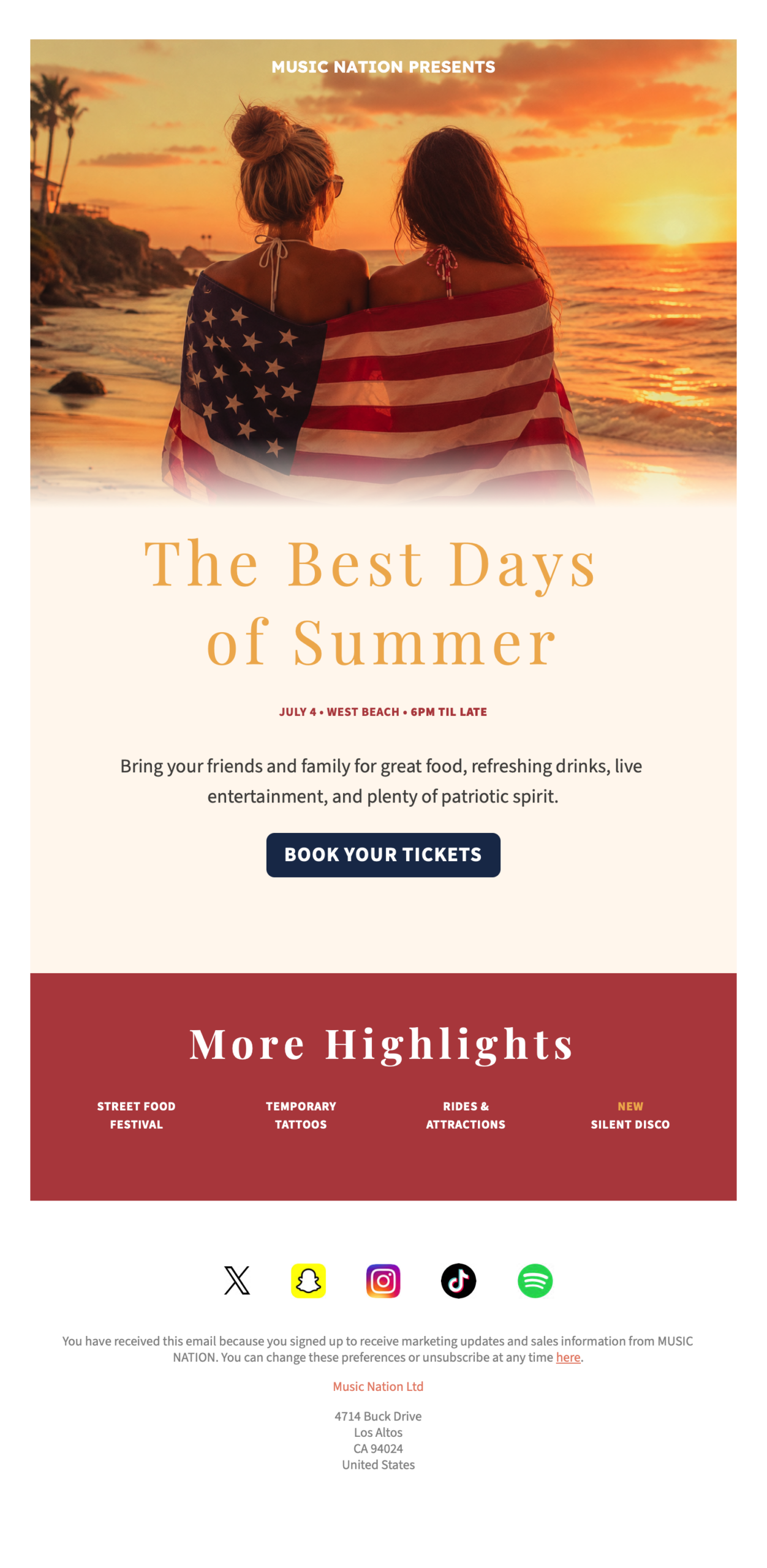
The first design treats the holiday as an experience rather than a promotion. A warm beach photo sets the scene, followed by a calm headline, event details, a short description, and one clear button: book your tickets.
This kind of template works especially well for restaurants, local venues, hotels, beach clubs, music events, and community celebrations. The design does not need to shout to feel seasonal. The American flag in the hero image, the July 4 date, and the sunset colors do enough work, leaving the rest of the email clean and readable.
For your own version, keep the event information close to the top. Readers should be able to understand the date, place, time, and main reason to attend before they scroll. A short highlights section can then answer the natural follow-up question: what will be happening there?
An outdoor living sale
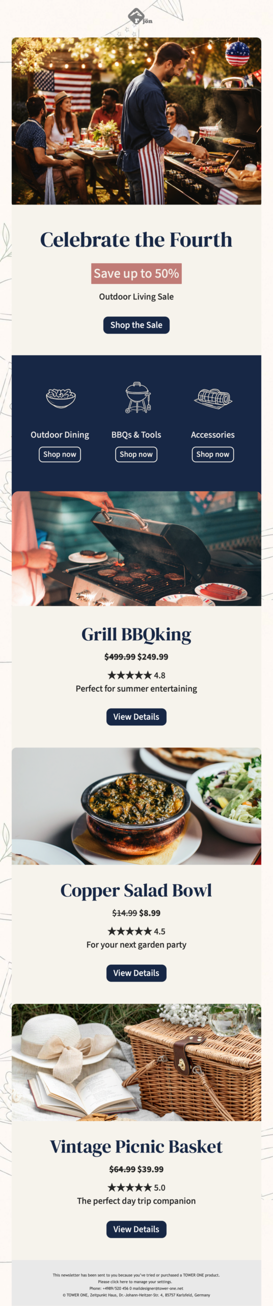
The second template turns 4th July into a shoppable summer campaign. The opening image shows a backyard gathering, which immediately connects the sale to a real holiday moment: grilling, dining outside, and spending time with friends.
What makes this layout useful is the combination of category shortcuts and individual product sections. The reader can jump to outdoor dining, BBQ tools, or accessories, then continue into specific product offers with pricing, ratings, and short benefit copy.
This is a strong format for home and garden stores, outdoor brands, food and drink retailers, and lifestyle shops. If you are using a similar structure, keep the category labels short and make sure each product block has one clear next step. Too many competing buttons can make a long sales email feel busy; repeated, consistent CTAs make it easier to scan.
A simple savings announcement
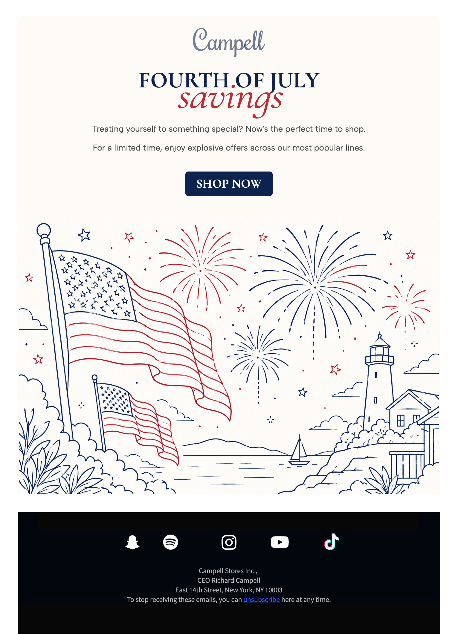
The third design is the most minimal of the set. It uses a centered headline, a short offer message, one shop button, and a large illustrated fireworks scene. There are no product cards, no detailed pricing blocks, and no long explanation.
This approach is useful when the offer is broad and easy to understand. If your sale applies across a full store, a product line, or a seasonal collection, a simple announcement can be stronger than trying to list everything at once.
The illustration also gives the email a lighter tone. Instead of using a dense photo collage or heavy discount graphics, the line-art style creates a festive mood while keeping the layout spacious. That extra breathing room can be helpful on mobile, where crowded seasonal graphics often become hard to read.
A direct discount campaign
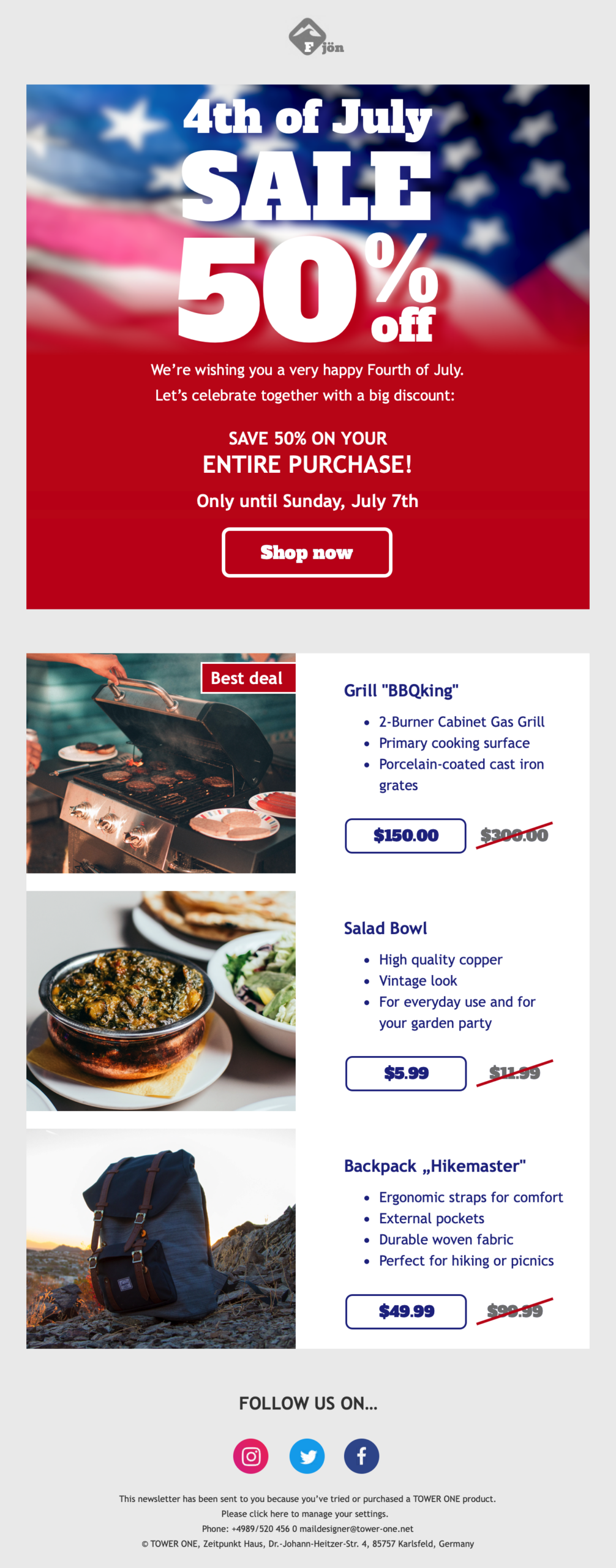
The fourth template is built for urgency. It puts the discount front and center, adds a deadline, then supports the offer with product examples, crossed-out prices, and short feature lists.
This is the right direction when the campaign goal is immediate conversion. The headline is unmistakable, the percentage is large, and the product blocks give readers reasons to click before the offer expires.
For a 4th July email like this, clarity matters more than clever copy. Make the discount easy to spot, state the deadline plainly, and avoid hiding important conditions in tiny text. If some products are excluded, say so near the CTA or in a short note close to the offer.
A festive holiday greeting
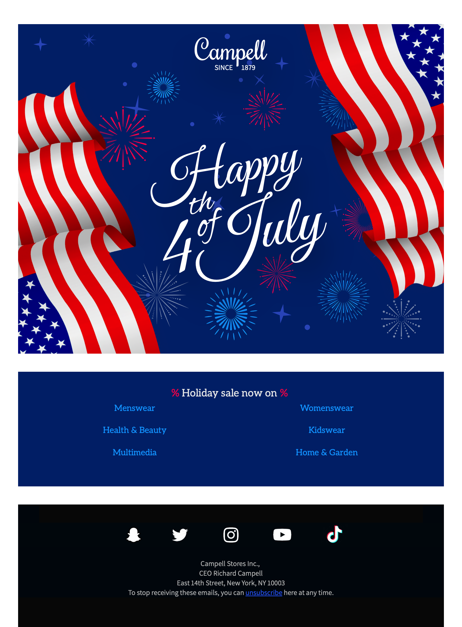
The fifth template is closer to a greeting card with a light promotional section underneath. The large illustrated flag and fireworks hero creates a celebratory first impression, while the category links below give readers a path into the shop without turning the whole message into a hard sell.
This format is useful when you want to acknowledge the holiday and stay visible, but you do not have one single offer to promote. A greeting-style layout can work for fashion, beauty, department stores, lifestyle brands, and ecommerce newsletters with several active categories.
Keep this type of email concise. The hero image carries most of the emotional weight, so the supporting copy can stay short. If you add category links, choose the most relevant seasonal areas rather than listing every department.
Design tips for stronger 4th July emails
Independence Day campaigns are easy to overdecorate. Stars, flags, fireworks, discount badges, and red-blue color blocks can all work, but they need hierarchy. Decide what should be noticed first, then let the rest support that message.
- Use one primary CTA per section, especially on mobile.
- Keep offer details close to the headline so readers do not have to hunt for the value.
- Balance patriotic colors with neutral space to protect readability.
- Match the tone to the campaign goal: warm for events, direct for discounts, polished for brand greetings.
- Check image weight before sending, especially if your design uses large hero images or several product photos.
If your campaign uses dark sections, bright buttons, or detailed imagery, preview the email in multiple inboxes before sending. The Mail Designer 365 guides to dark mode email design, common email rendering issues, and reducing email size are useful checks before a seasonal send.
Build your own Independence Day campaign
A good 4th July email template should make the campaign goal obvious at a glance. If you are promoting an event, lead with the experience. If you are running a sale, make the offer easy to understand. If you simply want to send a festive greeting, keep the design polished and the message short.