
Frequently Asked Questions
How to View Your Email Campaign Performance Report
So you've sent out your email campaign and now want to see how well it has performed – no problem! Mail Designer Delivery Hub offers you a detailed performance report for all your sent campaigns.
How it works
You can access performance reports for any given campaign under https://my.maildesigner365.com/team/deliveries/campaigns/finished.
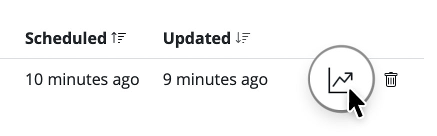
Find your chosen campaign and click the statistic icon to open its performance report:
During the delivery
As soon as an email campaign is sent, you can use Delivery Hub's live reporting tools to track the progress of your newsletter in real time. This includes email deliveries, bounces, and opens.
The numbers in the overview will be updated live as your email is delivered to your target group.
After the delivery
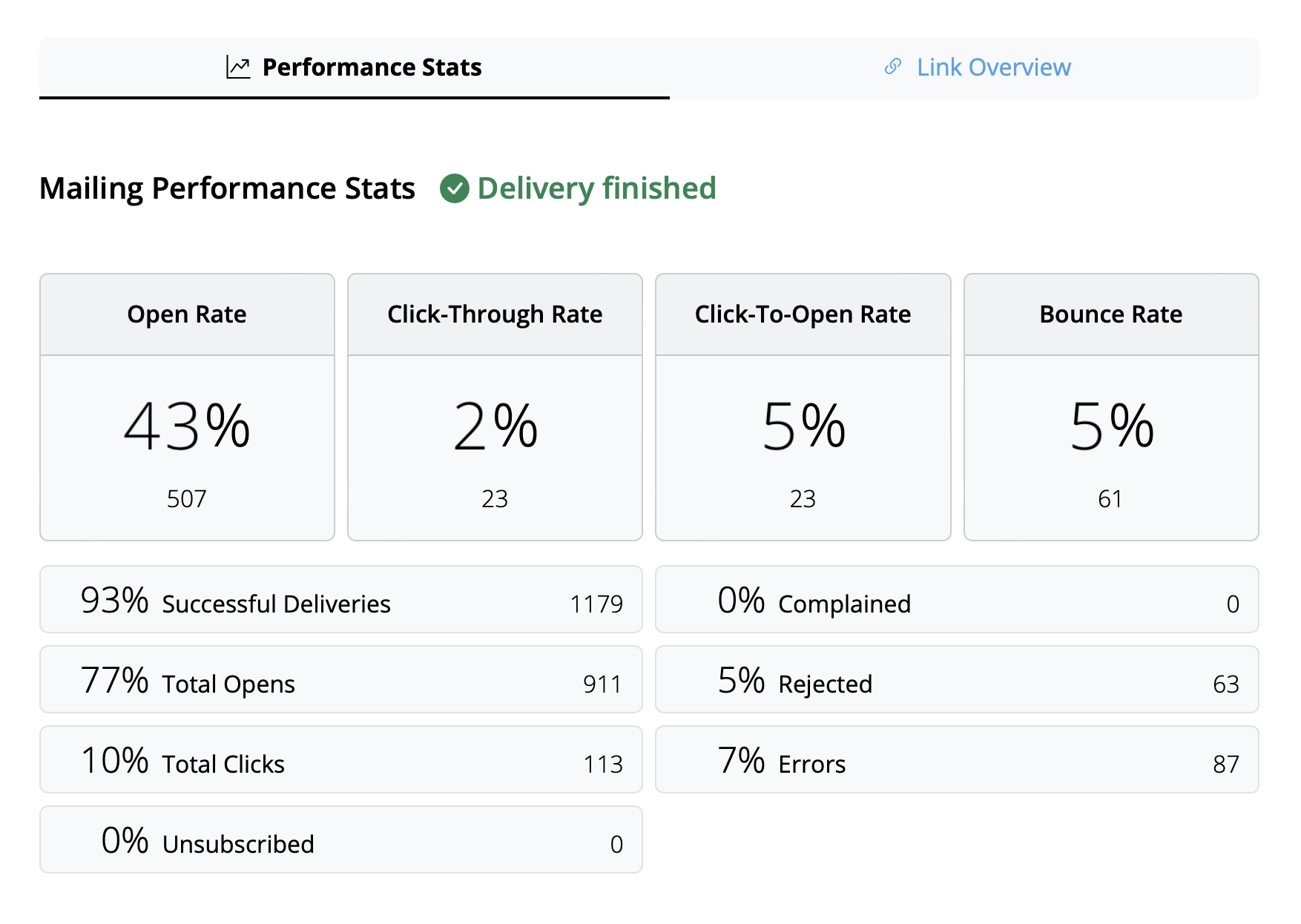
Once delivery has completed, you can view an overview of all campaign statistics.
Tip: For best results, we recommend carrying out your final analysis from 24 hours after delivery. This helps ensure all recipients have had time to read and interact with your campaign.
Interpreting email metrics
The performance report covers a wide range of analytics data which aim to help you better understand how your campaign did and what you can improve on next time.
Here is a breakdown of the most important email metrics, what they represent and some current industry benchmarks:
- Open Rate: The number of times your email was opened compared to the amount of successful deliveries. The benchmark for this can vary depending on industry but anything above 25% can be considered a good result.
- Click-Through Rate: The number of email link clicks compared to the number of successful deliveries. This value is often quite low, with an average of around 2–3% across all industries.
- Click-To-Open Rate: The number of email link clicks compared to the number of email opens. This helps you understand how your email content resonated with readers. A good benchmark to aim for here is 10%.
- Bounce Rate: The percentage of emails which were not successfully delivered to the recipient – e.g. because the email address is incorrect or inactive. Here, the lower the number, the better. Anything above 3–5% should be cause for concern.
- Unsubscribe Rate: The percentage of recipients who unsubscribed from your email list after receiving this email. Again, you want this number to be as low as possible – ideally 0! However, anything under 0.5% can be considered a good result.
Tip: If you are noticing higher unsubscribe rates, you should take a look at the type of content you are sending, the frequency of your emails, and also consider segmenting your audience appropriately.
Other useful statistics
These metrics are also worth a mention and shouldn't be overlooked in your email analysis:
- Complained Rate: This calculates the number of recipients who marked your email as spam. This is never a good sign and if you notice your emails being marked as spam, check out this post for our tips →
- Rejected Rate: This calculates the number of times your email was rejected by an email provider (e.g. Gmail, Outlook, Yahoo, etc.) and can be an indicator for a more serious issue. If your emails are being rejected, please ensure you are sending from a verified email domain. More information →