
Borders can create sophisticated layouts, organize content, and give email designs a clean, intentional finish. You can create frames to display as picture holders. Or you can create frames to highlight different texts and headlines.
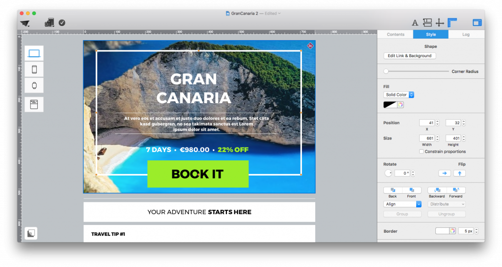 With Mail Designer 365’s graphics elements, it's easy to create frames. Here’s how:
- Drag a quadrilateral graphic element and drop it into an image area. Remember, you can only only add a shape graphic element into an image area and not a text area.
- To create a border, go to the border section under the “Style” tab.
- Change the pixel size of the border. (Quick tip: You can create very fine edges with only 1px or you can size up to massive 40px edges.)
- You can change the color or your border with the help of Mail Designer 365’s color picker tool.
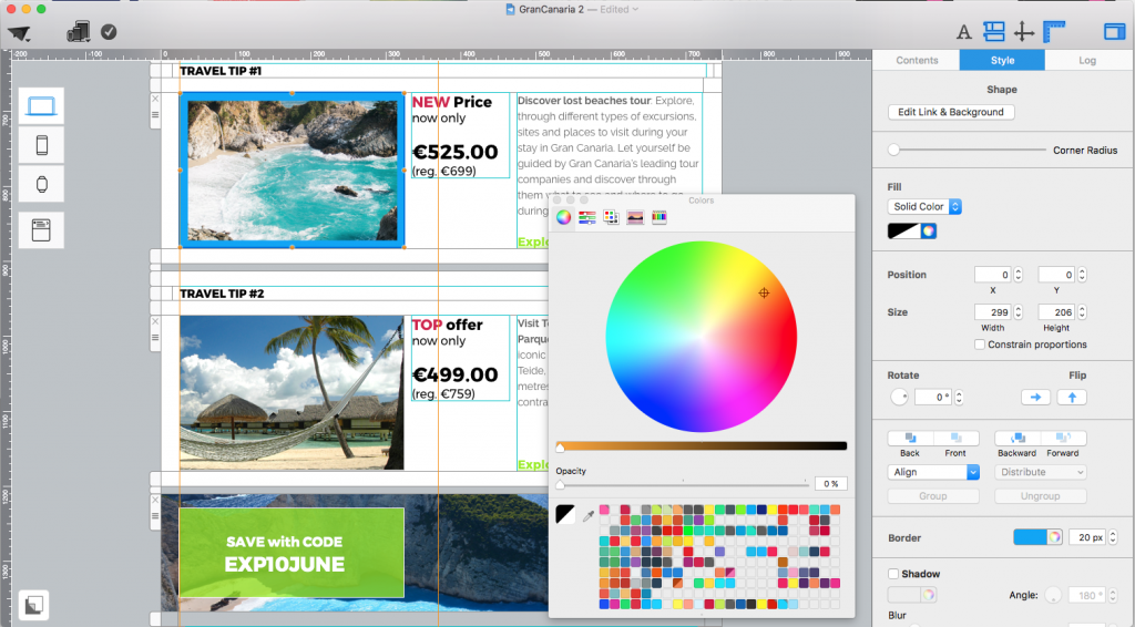
- Next, you can control the opacity of the shape down to 0 percent, making the shape transparent.
- As a result, only the border remains, creating a frame effect.
- Then, you can adjust and reposition the frame as you like.
Additional Tips:
Shadow: Want to draw more attention to your framed contents, you can try adding a shadow effect to your frame. Just click on your frame and then check the box next to “Shadow” under the “Style” section. Try playing around with the blur effect or the shadow effect of the shadow.
Thick Outlines: From thin to thick edges, you can design how you like. We recommend trying thick borders for small feature images. Add thick borders to smaller images within your email newsletter template. This is a great technique to highlight specials or promotions. First, drag a quadrilateral shape from the graphic elements section and drop it into the image area that has your the proper image that you want to add frames to. Then, resize the shape. Make it transparent by changing its opacity. Afterwards, play around with different border thicknesses. Remember to add contrasting colors to your borders so that it does not blend with the photo or the background.
Eye-catcher: You can also create a nice eye-catcher with the help of borders. Drag a quadrilateral shape and drop it onto an image area. Change the color to a color that pops. This time, try to lower the opacity of your bordered shape but don’t make it completely transparent. Then, add your message and make sure that the text has a contrasting color from the semi-transparent shape. This way, the shape pops and the text remains legible.
Rounding: You can also apply rounded corners to your frame. Just drag and drop a quadrilateral shape into an image area. Adjust the shape to the size that you want. Then, adjust the corner radius slider to change the rounding of the shape. With thick edges, you get powerful and bold frames. With slim edges, you can get modern and minimalistic frames.
Until next time,
Your Mail Designer 365 team
Borders that improve an email layout
Borders are most useful when they clarify the relationship between elements. A thin line can separate a headline from supporting copy, while a framed image area can turn a product photo or announcement into a clear focal point. Keep the visual weight consistent with the surrounding typography so the frame supports the message instead of competing with it.
Use generous spacing inside a frame. Text and buttons placed too close to an edge can feel cramped on smaller screens, even when the desktop version looks balanced. Preview the design at mobile width and reduce decorative details if they make the content difficult to scan.
Choose border color and thickness carefully
Subtle borders work well for content groups, quotes, product details, and event information. Stronger colors are better reserved for a single important area, such as a primary offer. Check contrast in both light and dark inbox environments, and avoid relying on a border alone to communicate meaning.
Finally, test the complete message before sending. Review how borders appear around images, confirm that rounded corners and background colors remain consistent, and make sure every framed section still has a clear purpose. Reusing a small set of border styles helps future campaigns feel connected without making every newsletter look identical.