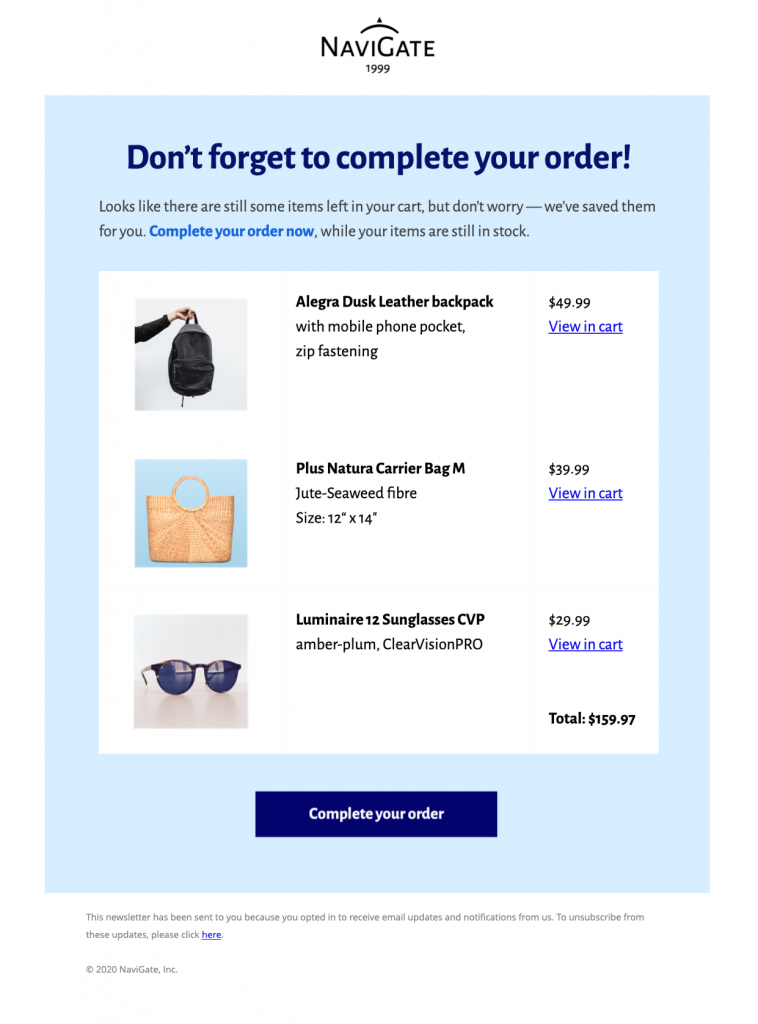
What to include in an abandoned cart email template
This abandoned cart email template is intended for online stores that want to remind interested shoppers about products they left behind without making the message feel pushy. It provides a practical starting point in Mail Designer 365 while leaving the wording, branding, links, and campaign details under your control.
Essential information to include
Before sending, check the saved product, price or variant information, a direct return-to-cart button, customer-service contact details, and any accurate delivery or availability information. Keep the most important information near the beginning and make every date, condition, address, and destination specific to the recipient’s situation.
Design strengths for this campaign
The template uses a product-led layout with a clear visual hierarchy that brings the unfinished purchase and return action into immediate view. Its responsive structure helps the core message remain readable across common screen sizes, while editable content areas make it suitable for a branded campaign.
Customize the template in Mail Designer 365
When customizing this abandoned cart email template, use the drag-and-drop tools to insert product images, match buttons and type to the shop brand, personalize the message, and connect the primary button to the correct cart or checkout destination. Preview the finished email on desktop and mobile, test every link, and send a proof before delivering the campaign to your audience.
Review the finished email before sending
Read the message once from the recipient’s perspective. Confirm that the sender name is recognizable, the subject and preview text match the content, personalization has a sensible fallback, and the main action leads to the intended page. Check spelling, dates, times, prices, offer conditions, and contact information. A test send should also confirm that the design remains readable when images are blocked and that important information is available as text.
Make the message easy to use
Use descriptive button text, readable type sizes, sufficient color contrast, and concise image alt text. Do not place essential dates, instructions, or offer conditions only inside an image. Keep the reading order logical and avoid several competing buttons. These choices help recipients understand the campaign quickly and make the template more resilient across different email apps and accessibility settings.
Use this abandoned cart email template as a focused starting point and keep the final version centered on one use case and one primary action. Clear information and a recognizable sender are more useful than adding unrelated sections simply to make the email longer.