

Email Table Design with Mail Designer 365
Create a clear email table design and integrate stylish table layouts into your email newsletters with the Tables tool — exclusively available in Mail Designer 365 Business Premium plans.
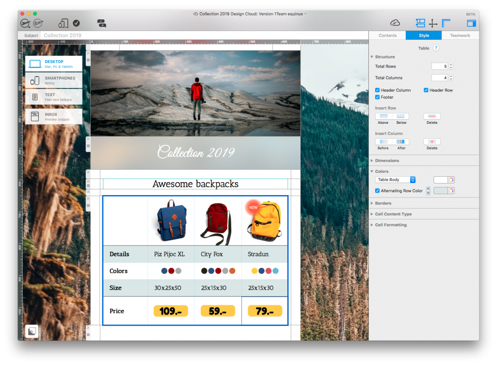
BUILD PROFESSIONAL TABLES
Insert stylish table layouts into your designs
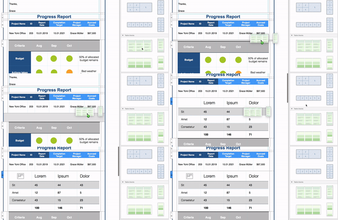
Give your design a clear structure
Using a mobile-optimized table layout in your email helps you present information clearly and stylishly to your customers.
Drag and drop a table layout block into your design and build your table to suit your needs.
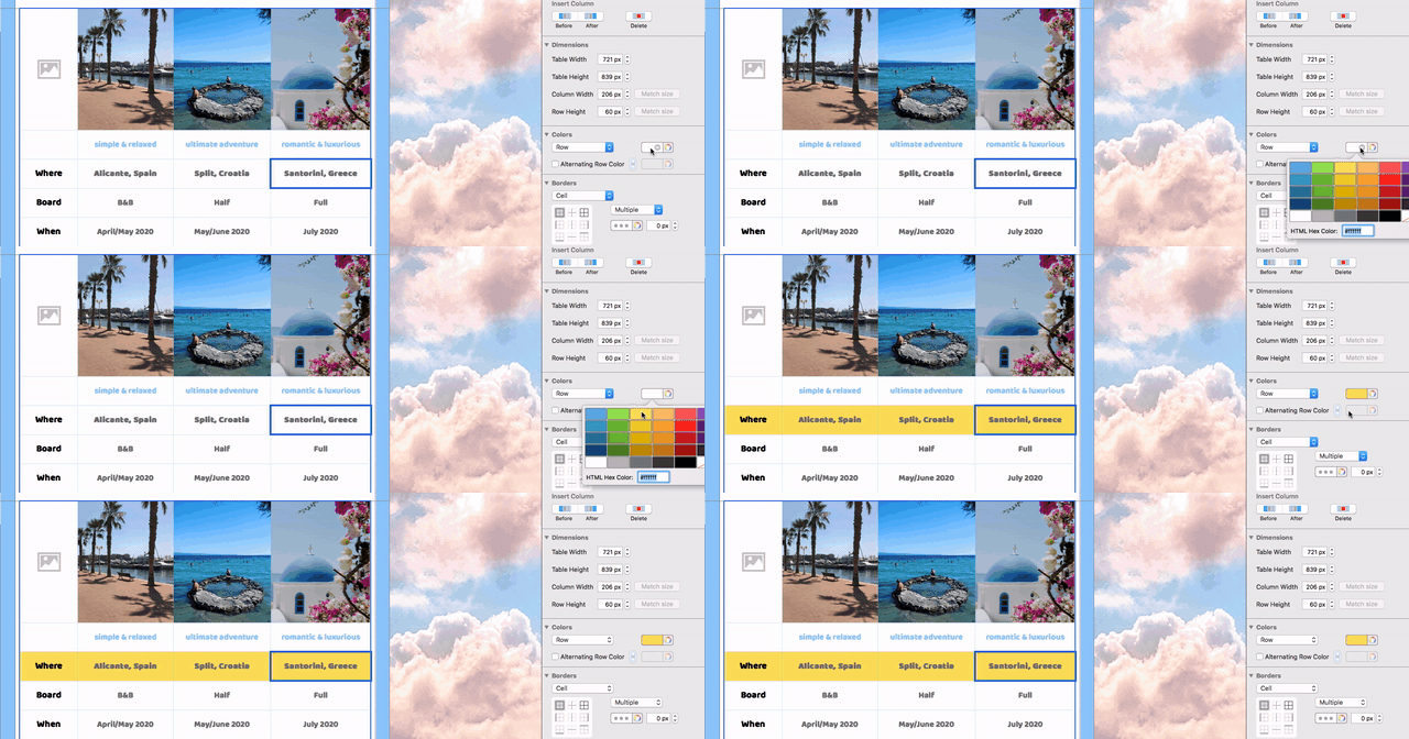
Make it your own
Explore a wide range of formatting options to build your table layout exactly as you need.
Tip: Save your finished table layouts under "My Layout Blocks" to use as a ready-to-go template for future emails.
GET THE TABLES TOOL
Discover Business Premium
Upgrading to a Mail Designer 365 Business Premium plan gives you exclusive access to Tables and other advanced design features. Explore all Business Premium features.
How to upgrade
Carry out the following steps to cross-upgrade to a Business Premium plan:
- Go to your my.maildesigner365.com portal. We have already preselected an annual Mail Designer 365 Business Premium plan.
- Review your payment interval and the number of licenses you wish to purchase.
- Select your payment method and complete your purchase.
- Your new plan is now available to your team.
P.S. Don't have a team plan? Here's how to convert your plan.
Plan an accessible email table design
Email table design works best for compact, comparable information such as schedules, feature lists, price options, event details, and small data summaries. Decide which information readers need to compare and remove columns that do not support that task. A narrow, focused table is easier to understand on desktop and mobile.
Write short column labels and place the most important information first. Avoid squeezing long paragraphs into cells. If a table becomes too wide, split it into two smaller sections or use stacked content blocks instead. Tables should organize information, not serve as a substitute for the complete newsletter layout.
Customize rows, columns, colors, and spacing
After inserting a table layout, update the sample content and apply the campaign's approved typography and colors. Use consistent alignment for similar values, enough padding around text, and clear visual separation between headings and data. Check that borders and background colors remain visible in light and dark inbox themes.
Do not rely on color alone to communicate a status or category. Pair color with a text label such as “Available,” “Sold out,” or “Recommended.” Keep contrast strong enough for comfortable reading and avoid very small type, especially in dense schedules or pricing comparisons.
Design tables for mobile email
Preview the email at phone width before sending. Long labels, large prices, and several columns can force awkward wrapping. Shorten the content, reduce the number of columns, or divide the information into separate tables when necessary. Keep links and buttons large enough to tap and place a plain-text explanation nearby if the table contains essential instructions.
Test the table with realistic data rather than short placeholders. A layout that looks balanced with “Item 1” may break when a real product name or event title is inserted. Include the longest likely value during testing so the final design remains stable.
When not to use a table
Use normal headings, paragraphs, lists, and image blocks for narrative content. A table is appropriate when row-and-column relationships help the reader compare information. It is usually not the right tool for building the entire email, arranging decorative elements, or simulating a complex spreadsheet.
Test the email table before sending
- Send a proof to common desktop and mobile inboxes.
- Check every row, column, link, price, date, and unit.
- Preview light and dark modes and view the email with images disabled.
- Confirm that text remains readable when the screen is narrow or zoomed.
- Ask another reviewer to compare the table with the source information.
Troubleshooting table layouts
If text wraps unexpectedly, shorten the value or give the relevant column more room. If a table appears crowded, increase cell padding or remove nonessential columns. If colors disappear in an inbox, strengthen borders and contrast and retest. If mobile readability remains poor, replace the wide table with two smaller tables or a stacked list.
Use the Tables tool when readers need to compare structured information in rows and columns. For full-layout design, Mailchimp-specific instructions, or individual campaign examples, use the dedicated tools and guides for those tasks.